
共用元素轉場效果可讓您在內容一致的可組合函式之間順暢轉換。這類轉換通常用於導覽,讓您在使用者瀏覽不同畫面時,以視覺化方式連結這些畫面。
舉例來說,在下列影片中,你可以看到零食的圖片和名稱從產品資訊頁面分享到詳細資料頁面。
在 Compose 中,有幾個高階 API 可協助您建立共用元素:
SharedTransitionLayout:實作共用元素轉場效果時,最外層的必要版面配置。並提供SharedTransitionScope。可組合項必須位於SharedTransitionScope中,才能使用共用元素修飾符。Modifier.sharedElement():這個修飾符會向SharedTransitionScope標記應與另一個可組合函式相符的可組合函式。Modifier.sharedBounds():這個修飾符會向SharedTransitionScope標記,指出這個可組合函式的界線應做為轉換發生的容器界線。與sharedElement()不同,sharedBounds()適用於視覺上不同的內容。
在 Compose 中建立共用元素時,重要概念是這些元素如何與疊加層和裁剪功能搭配運作。如要進一步瞭解這個重要主題,請參閱裁剪和疊加層一節。
基本用法
本節將建構下列轉場效果,從較小的「清單」項目轉場至較大的詳細項目:
搭配 AnimatedContent、AnimatedVisibility 或 NavHost 使用 Modifier.sharedElement() 是最佳做法,因為這會自動管理可組合函式之間的轉場效果。
起點是現有的基本 AnimatedContent,其中包含 MainContent 和 DetailsContent 可組合函式,然後再加入共用元素:
AnimatedContent,不含任何共用元素轉場效果。如要讓共用元素在兩個版面配置之間產生動畫效果,請在
AnimatedContent可組合函式周圍加上SharedTransitionLayout。SharedTransitionLayout和AnimatedContent的範圍會傳遞至MainContent和DetailsContent:var showDetails by remember { mutableStateOf(false) } SharedTransitionLayout { AnimatedContent( showDetails, label = "basic_transition" ) { targetState -> if (!targetState) { MainContent( onShowDetails = { showDetails = true }, animatedVisibilityScope = this@AnimatedContent, sharedTransitionScope = this@SharedTransitionLayout ) } else { DetailsContent( onBack = { showDetails = false }, animatedVisibilityScope = this@AnimatedContent, sharedTransitionScope = this@SharedTransitionLayout ) } } }
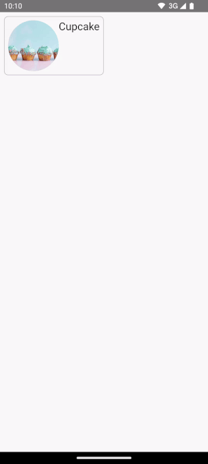
在相符的兩個可組合函式中,將
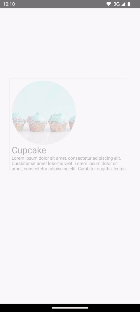
Modifier.sharedElement()新增至可組合函式修飾符鏈。建立SharedContentState物件,並使用rememberSharedContentState()記住該物件。SharedContentState物件會儲存專屬鍵,決定要共用的元素。提供可識別內容的專屬鍵,並使用rememberSharedContentState()記住項目。AnimatedContentScope會傳遞至輔助鍵,用於協調動畫。@Composable private fun MainContent( onShowDetails: () -> Unit, modifier: Modifier = Modifier, sharedTransitionScope: SharedTransitionScope, animatedVisibilityScope: AnimatedVisibilityScope ) { Row( // ... ) { with(sharedTransitionScope) { Image( painter = painterResource(id = R.drawable.cupcake), contentDescription = "Cupcake", modifier = Modifier .sharedElement( rememberSharedContentState(key = "image"), animatedVisibilityScope = animatedVisibilityScope ) .size(100.dp) .clip(CircleShape), contentScale = ContentScale.Crop ) // ... } } } @Composable private fun DetailsContent( modifier: Modifier = Modifier, onBack: () -> Unit, sharedTransitionScope: SharedTransitionScope, animatedVisibilityScope: AnimatedVisibilityScope ) { Column( // ... ) { with(sharedTransitionScope) { Image( painter = painterResource(id = R.drawable.cupcake), contentDescription = "Cupcake", modifier = Modifier .sharedElement( rememberSharedContentState(key = "image"), animatedVisibilityScope = animatedVisibilityScope ) .size(200.dp) .clip(CircleShape), contentScale = ContentScale.Crop ) // ... } } }
如要取得共用元素是否相符的相關資訊,請將 rememberSharedContentState() 擷取至變數,然後查詢 isMatchFound。
這會產生下列自動動畫:
您可能會發現整個容器的背景顏色和大小仍使用預設的 AnimatedContent 設定。
共用邊界與共用元素
Modifier.sharedBounds() 類似於 Modifier.sharedElement()。
不過,修飾符有以下差異:
sharedBounds()適用於視覺上不同的內容,但應在狀態之間共用相同區域,而sharedElement()則預期內容相同。- 使用
sharedBounds()時,進入和離開畫面的內容會在兩種狀態之間的轉場期間顯示,而使用sharedElement()時,只有目標內容會顯示在轉換的界線中。Modifier.sharedBounds()具有enter和exit參數,可指定內容的轉場效果,與AnimatedContent的運作方式類似。 sharedBounds()最常見的用途是容器轉換模式,而sharedElement()的用途範例是英雄轉場效果。- 使用
Text可組合函式時,建議使用sharedBounds()支援字型變化,例如在斜體和粗體之間轉換,或變更顏色。
以上述範例為基礎,在兩種不同情境中將 Modifier.sharedBounds() 新增至 Row 和 Column,即可共用兩者的界線並執行轉場動畫,讓兩者之間可以互相成長:
@Composable private fun MainContent( onShowDetails: () -> Unit, modifier: Modifier = Modifier, sharedTransitionScope: SharedTransitionScope, animatedVisibilityScope: AnimatedVisibilityScope ) { with(sharedTransitionScope) { Row( modifier = Modifier .padding(8.dp) .sharedBounds( rememberSharedContentState(key = "bounds"), animatedVisibilityScope = animatedVisibilityScope, enter = fadeIn(), exit = fadeOut(), resizeMode = SharedTransitionScope.ResizeMode.scaleToBounds() ) // ... ) { // ... } } } @Composable private fun DetailsContent( modifier: Modifier = Modifier, onBack: () -> Unit, sharedTransitionScope: SharedTransitionScope, animatedVisibilityScope: AnimatedVisibilityScope ) { with(sharedTransitionScope) { Column( modifier = Modifier .padding(top = 200.dp, start = 16.dp, end = 16.dp) .sharedBounds( rememberSharedContentState(key = "bounds"), animatedVisibilityScope = animatedVisibilityScope, enter = fadeIn(), exit = fadeOut(), resizeMode = SharedTransitionScope.ResizeMode.scaleToBounds() ) // ... ) { // ... } } }
瞭解範圍
如要使用 Modifier.sharedElement(),可組合函式必須位於 SharedTransitionScope 中。SharedTransitionLayout 可組合函式會提供 SharedTransitionScope。請務必將其放置在 UI 階層中,與要共用元素所在的頂層點相同。
一般來說,可組合函式也應放在 AnimatedVisibilityScope 內。除非您手動管理顯示狀態,否則通常會使用 AnimatedContent 在可組合項之間切換,或直接使用 AnimatedVisibility,或使用 NavHost 可組合函式來提供這項功能。如要使用多個範圍,請將所需範圍儲存在 CompositionLocal 中、在 Kotlin 中使用內容接收器,或將範圍做為參數傳遞至函式。
如果您要追蹤多個範圍,或是階層結構非常深層,請使用 CompositionLocals。CompositionLocal 可讓您選擇要儲存及使用的確切範圍。另一方面,使用內容接收器時,階層中的其他版面配置可能會意外覆寫提供的範圍。舉例來說,如果您有多個巢狀 AnimatedContent,範圍可能會遭到覆寫。
val LocalNavAnimatedVisibilityScope = compositionLocalOf<AnimatedVisibilityScope?> { null } val LocalSharedTransitionScope = compositionLocalOf<SharedTransitionScope?> { null } @Composable private fun SharedElementScope_CompositionLocal() { // An example of how to use composition locals to pass around the shared transition scope, far down your UI tree. // ... SharedTransitionLayout { CompositionLocalProvider( LocalSharedTransitionScope provides this ) { // This could also be your top-level NavHost as this provides an AnimatedContentScope AnimatedContent(state, label = "Top level AnimatedContent") { targetState -> CompositionLocalProvider(LocalNavAnimatedVisibilityScope provides this) { // Now we can access the scopes in any nested composables as follows: val sharedTransitionScope = LocalSharedTransitionScope.current ?: throw IllegalStateException("No SharedElementScope found") val animatedVisibilityScope = LocalNavAnimatedVisibilityScope.current ?: throw IllegalStateException("No AnimatedVisibility found") } // ... } } } }
或者,如果階層結構未深入巢狀化,您可以將範圍做為參數傳遞:
@Composable fun MainContent( animatedVisibilityScope: AnimatedVisibilityScope, sharedTransitionScope: SharedTransitionScope ) { } @Composable fun Details( animatedVisibilityScope: AnimatedVisibilityScope, sharedTransitionScope: SharedTransitionScope ) { }
與「AnimatedVisibility」共用的元素
先前的範例說明如何搭配 AnimatedContent 使用共用元素,但共用元素也適用於 AnimatedVisibility。
舉例來說,在這個延遲格線範例中,每個元素都會包裝在 AnimatedVisibility 中。點選項目時,內容會產生視覺效果,彷彿從使用者介面拉出到類似對話方塊的元件中。
var selectedSnack by remember { mutableStateOf<Snack?>(null) } SharedTransitionLayout(modifier = Modifier.fillMaxSize()) { LazyColumn( // ... ) { items(listSnacks) { snack -> AnimatedVisibility( visible = snack != selectedSnack, enter = fadeIn() + scaleIn(), exit = fadeOut() + scaleOut(), modifier = Modifier.animateItem() ) { Box( modifier = Modifier .sharedBounds( sharedContentState = rememberSharedContentState(key = "${snack.name}-bounds"), // Using the scope provided by AnimatedVisibility animatedVisibilityScope = this, clipInOverlayDuringTransition = OverlayClip(shapeForSharedElement) ) .background(Color.White, shapeForSharedElement) .clip(shapeForSharedElement) ) { SnackContents( snack = snack, modifier = Modifier.sharedElement( sharedContentState = rememberSharedContentState(key = snack.name), animatedVisibilityScope = this@AnimatedVisibility ), onClick = { selectedSnack = snack } ) } } } } // Contains matching AnimatedContent with sharedBounds modifiers. SnackEditDetails( snack = selectedSnack, onConfirmClick = { selectedSnack = null } ) }
AnimatedVisibility」共用的元素。修飾符順序
使用 Modifier.sharedElement() 和 Modifier.sharedBounds() 時,修飾符鏈的順序很重要,這點與其餘 Compose 相同。如果影響大小的修飾符位置不正確,共用元素比對期間可能會發生非預期的視覺跳動。
舉例來說,如果您在兩個共用元素的不同位置放置邊框間距修飾符,動畫就會出現視覺差異。
var selectFirst by remember { mutableStateOf(true) } val key = remember { Any() } SharedTransitionLayout( Modifier .fillMaxSize() .padding(10.dp) .clickable { selectFirst = !selectFirst } ) { AnimatedContent(targetState = selectFirst, label = "AnimatedContent") { targetState -> if (targetState) { Box( Modifier .padding(12.dp) .sharedBounds( rememberSharedContentState(key = key), animatedVisibilityScope = this@AnimatedContent ) .border(2.dp, Color.Red) ) { Text( "Hello", fontSize = 20.sp ) } } else { Box( Modifier .offset(180.dp, 180.dp) .sharedBounds( rememberSharedContentState( key = key, ), animatedVisibilityScope = this@AnimatedContent ) .border(2.dp, Color.Red) // This padding is placed after sharedBounds, but it doesn't match the // other shared elements modifier order, resulting in visual jumps .padding(12.dp) ) { Text( "Hello", fontSize = 36.sp ) } } } }
相符的範圍 |
不相符的邊界:請注意,共用元素動畫會稍微偏離,因為需要調整大小才能符合不正確的邊界 |
|---|---|
共用元素修飾符之前使用的修飾符會為共用元素修飾符提供限制,然後用於衍生初始和目標界限,以及後續的界限動畫。
共用元素修飾符之後使用的修飾符,會使用先前的限制條件來測量及計算子項的目標大小。共用元素修飾符會建立一系列動畫限制,逐步將子項從初始大小轉換為目標大小。
但如果您使用 resizeMode = ScaleToBounds() 進行動畫,或在可組合函式中使用 Modifier.skipToLookaheadSize(),則不在此限。在本例中,Compose 會使用目標限制條件配置子項,並使用縮放比例因數執行動畫,而非變更版面配置大小本身。
專屬鍵
處理複雜的共用元素時,建議建立非字串的鍵,因為字串容易比對錯誤。各個金鑰不得重複,才能進行比對。舉例來說,在 Jetsnack 中,我們有下列共用元素:
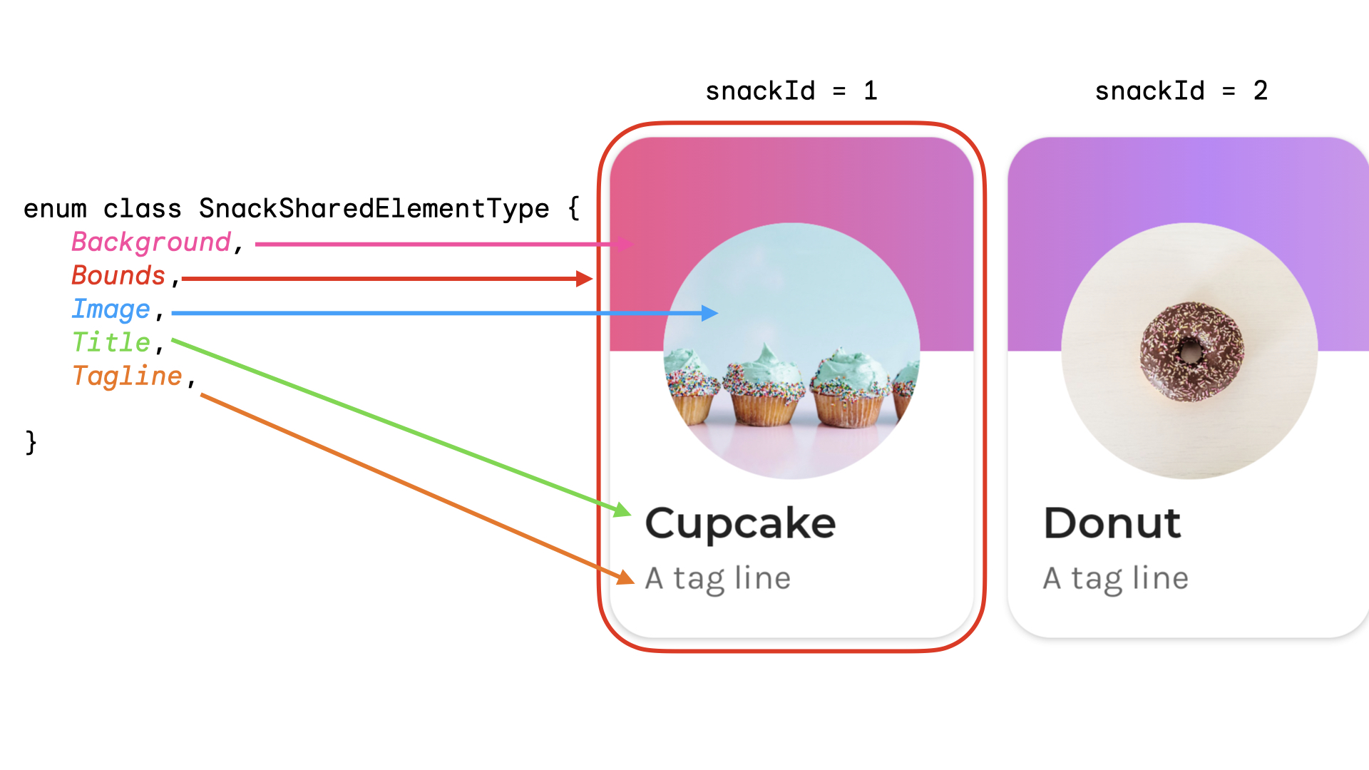
您可以建立列舉,代表共用元素類型。在這個例子中,零食資訊卡也可能出現在主畫面上的多個不同位置,例如「熱門」和「推薦」部分。您可以建立含有 snackId、origin (「熱門」/「建議」) 和要共用元素 type 的鍵:
data class SnackSharedElementKey( val snackId: Long, val origin: String, val type: SnackSharedElementType ) enum class SnackSharedElementType { Bounds, Image, Title, Tagline, Background } @Composable fun SharedElementUniqueKey() { // ... Box( modifier = Modifier .sharedElement( rememberSharedContentState( key = SnackSharedElementKey( snackId = 1, origin = "latest", type = SnackSharedElementType.Image ) ), animatedVisibilityScope = this@AnimatedVisibility ) ) // ... }
建議使用資料類別做為鍵,因為這類別會實作 hashCode() 和 equals()。
手動管理共用元素的顯示狀態
如果未使用 AnimatedVisibility 或 AnimatedContent,可以自行管理共用元素的顯示設定。使用 Modifier.sharedElementWithCallerManagedVisibility() 並提供您自己的條件,決定項目是否應顯示:
var selectFirst by remember { mutableStateOf(true) } val key = remember { Any() } SharedTransitionLayout( Modifier .fillMaxSize() .padding(10.dp) .clickable { selectFirst = !selectFirst } ) { Box( Modifier .sharedElementWithCallerManagedVisibility( rememberSharedContentState(key = key), !selectFirst ) .background(Color.Red) .size(100.dp) ) { Text(if (!selectFirst) "false" else "true", color = Color.White) } Box( Modifier .offset(180.dp, 180.dp) .sharedElementWithCallerManagedVisibility( rememberSharedContentState( key = key, ), selectFirst ) .alpha(0.5f) .background(Color.Blue) .size(180.dp) ) { Text(if (selectFirst) "false" else "true", color = Color.White) } }
目前限制
這些 API 有一些限制。最值得注意的是:
- 系統不支援 Views 和 Compose 之間的互通性。包括任何包裝
AndroidView的可組合項,例如Dialog或ModalBottomSheet。 - 系統不會自動為下列項目套用動畫:
- Shared Image 可組合函式:
ContentScale預設不會產生動畫。並會自動對齊設定的結尾ContentScale。
- 形狀剪裁 - 系統不支援在形狀之間自動產生動畫,例如在項目轉換時,從正方形動畫轉換為圓形。
- 如為不支援的情況,請使用
Modifier.sharedBounds(),而非sharedElement(),並在項目上新增Modifier.animateEnterExit()。
- Shared Image 可組合函式: