
Compose에는 일반적인 애니메이션 사용 사례를 처리하기 위한 기본 제공 컴포저블 및 수정자가 함께 제공됩니다.
기본 제공 애니메이션 컴포저블
Compose는 콘텐츠 표시, 사라짐, 레이아웃 변경에 애니메이션을 적용하는 여러 컴포저블을 제공합니다.
표시 및 사라짐 애니메이션
AnimatedVisibility
컴포저블은 콘텐츠 표시와 사라짐을 애니메이션 처리합니다.
var visible by remember { mutableStateOf(true) } // Animated visibility will eventually remove the item from the composition once the animation has finished. AnimatedVisibility(visible) { // your composable here // ... }
기본적으로는 콘텐츠는 페이드인 및 확장 방식으로 표시되고 페이드아웃 및 축소 방식으로 사라집니다.
EnterTransition 및 ExitTransition 객체를 지정하여 이 전환을 맞춤설정합니다.
var visible by remember { mutableStateOf(true) } val density = LocalDensity.current AnimatedVisibility( visible = visible, enter = slideInVertically { // Slide in from 40 dp from the top. with(density) { -40.dp.roundToPx() } } + expandVertically( // Expand from the top. expandFrom = Alignment.Top ) + fadeIn( // Fade in with the initial alpha of 0.3f. initialAlpha = 0.3f ), exit = slideOutVertically() + shrinkVertically() + fadeOut() ) { Text( "Hello", Modifier .fillMaxWidth() .height(200.dp) ) }
이전 예에서 볼 수 있듯이 + 연산자를 사용하여 여러 EnterTransition 또는 ExitTransition 객체를 결합할 수 있으며 각 객체에 선택적 매개변수를 사용하여 동작을 맞춤설정할 수 있습니다. 자세한 내용은 참조 페이지를 확인하세요.
들어가기 및 나가기 전환 예시


AnimatedVisibility 는 MutableTransitionState 인수를 사용하는 변형도 제공합니다. 이를 통해 AnimatedVisibility 컴포저블이 컴포지션 트리에 추가되는 즉시 애니메이션을 트리거할 수 있습니다. 애니메이션 상태를 관찰하는 데도 유용합니다.
// Create a MutableTransitionState<Boolean> for the AnimatedVisibility. val state = remember { MutableTransitionState(false).apply { // Start the animation immediately. targetState = true } } Column { AnimatedVisibility(visibleState = state) { Text(text = "Hello, world!") } // Use the MutableTransitionState to know the current animation state // of the AnimatedVisibility. Text( text = when { state.isIdle && state.currentState -> "Visible" !state.isIdle && state.currentState -> "Disappearing" state.isIdle && !state.currentState -> "Invisible" else -> "Appearing" } ) }
하위 요소의 들어가기와 나가기 애니메이션
AnimatedVisibility 내 콘텐츠(직접 또는 간접 하위 요소)는 animateEnterExit 수정자를 사용하여 각각의 다른 애니메이션 동작을 지정할 수 있습니다. 이러한 각 하위 요소의 시각적 효과는 AnimatedVisibility 컴포저블에 지정된 애니메이션과 하위 요소의 자체 들어가기 및 나가기 애니메이션의 조합입니다.
var visible by remember { mutableStateOf(true) } AnimatedVisibility( visible = visible, enter = fadeIn(), exit = fadeOut() ) { // Fade in/out the background and the foreground. Box( Modifier .fillMaxSize() .background(Color.DarkGray) ) { Box( Modifier .align(Alignment.Center) .animateEnterExit( // Slide in/out the inner box. enter = slideInVertically(), exit = slideOutVertically() ) .sizeIn(minWidth = 256.dp, minHeight = 64.dp) .background(Color.Red) ) { // Content of the notification… } } }
하위 요소가 각각 animateEnterExit로 고유한 자체 애니메이션을 보유하도록, AnimatedVisibility가 애니메이션을 전혀 적용하지 않도록 하려는 경우가 있습니다. 이렇게 하려면 AnimatedVisibility 컴포저블에 EnterTransition.None과 ExitTransition.None을 지정하세요.
맞춤 애니메이션 추가
기본 제공 들어가기 및 나가기 애니메이션 외에 맞춤 애니메이션 효과를 추가하려면 AnimatedVisibility의 콘텐츠 람다 내의 transition 속성을 통해 기본 Transition 인스턴스에 액세스합니다. Transition 인스턴스에 추가된 애니메이션 상태는 AnimatedVisibility의 들어가기 및 나가기 애니메이션과 동시에 실행됩니다. AnimatedVisibility 는 콘텐츠를 삭제하기 전에 Transition의 모든 애니메이션이 완료될 때까지 기다립니다.
Transition과는 별개로 만들어진 나가기 애니메이션 (예: animate*AsState 사용)의 경우 AnimatedVisibility는 이를 고려할 수 없으므로 완료되기 전에 콘텐츠 컴포저블을 삭제할 수 있습니다.
var visible by remember { mutableStateOf(true) } AnimatedVisibility( visible = visible, enter = fadeIn(), exit = fadeOut() ) { // this: AnimatedVisibilityScope // Use AnimatedVisibilityScope#transition to add a custom animation // to the AnimatedVisibility. val background by transition.animateColor(label = "color") { state -> if (state == EnterExitState.Visible) Color.Blue else Color.Gray } Box( modifier = Modifier .size(128.dp) .background(background) ) }
Transition을 사용하여 애니메이션을 관리하는 방법을 자세히 알아보려면 전환으로 여러 속성을 동시에 애니메이션 처리를 참고하세요.
타겟 상태를 기반으로 애니메이션
AnimatedContent
컴포저블은 타겟 상태에 따라 콘텐츠가 변경될 때 콘텐츠에 애니메이션을 적용합니다.
Row { var count by remember { mutableIntStateOf(0) } Button(onClick = { count++ }) { Text("Add") } AnimatedContent( targetState = count, label = "animated content" ) { targetCount -> // Make sure to use `targetCount`, not `count`. Text(text = "Count: $targetCount") } }
기본적으로 초기 콘텐츠는 페이드 아웃되고 타겟 콘텐츠가 페이드 인됩니다
. 이 동작을
페이드 스루라고 합니다.
transitionSpec 매개변수에
ContentTransform
객체를 지정하여 이 애니메이션 동작을 맞춤설정할 수 있습니다. with 중위 함수를 사용하여 ExitTransition 객체
와 EnterTransition 객체를 결합하여 ContentTransform 인스턴스를 만들 수 있습니다. SizeTransform
중위 함수를 사용하여 ContentTransform 객체에 연결하여 적용할 수 있습니다.using
AnimatedContent( targetState = count, transitionSpec = { // Compare the incoming number with the previous number. if (targetState > initialState) { // If the target number is larger, it slides up and fades in // while the initial (smaller) number slides up and fades out. slideInVertically { height -> height } + fadeIn() togetherWith slideOutVertically { height -> -height } + fadeOut() } else { // If the target number is smaller, it slides down and fades in // while the initial number slides down and fades out. slideInVertically { height -> -height } + fadeIn() togetherWith slideOutVertically { height -> height } + fadeOut() }.using( // Disable clipping since the faded slide-in/out should // be displayed out of bounds. SizeTransform(clip = false) ) }, label = "animated content" ) { targetCount -> Text(text = "$targetCount") }
EnterTransition 은 타겟 콘텐츠가 표시되는 방식을 정의하고 ExitTransition은 초기 콘텐츠가 사라지는 방식을 정의합니다. AnimatedVisibility에서 사용할 수 있는 모든 EnterTransition 및 ExitTransition 함수 외에도 AnimatedContent는 slideIntoContainer와 slideOutOfContainer를 제공합니다.
이는 초기 콘텐츠 크기와 AnimatedContent 콘텐츠의 타겟 콘텐츠에 따라 슬라이드 거리를 계산하는 slideInHorizontally/Vertically와 slideOutHorizontally/Vertically의 편리한 대안입니다.
SizeTransform은 초기 콘텐츠와 타겟 콘텐츠 사이에 크기가 애니메이션되는 방식을 정의합니다. 애니메이션을 만들 때 초기 크기와 타겟 크기에 모두 액세스할 수 있습니다. SizeTransform 은 애니메이션 중에 콘텐츠를 구성요소 크기로 잘라야 하는지도 제어합니다.
var expanded by remember { mutableStateOf(false) } Surface( color = MaterialTheme.colorScheme.primary, onClick = { expanded = !expanded } ) { AnimatedContent( targetState = expanded, transitionSpec = { fadeIn(animationSpec = tween(150, 150)) togetherWith fadeOut(animationSpec = tween(150)) using SizeTransform { initialSize, targetSize -> if (targetState) { keyframes { // Expand horizontally first. IntSize(targetSize.width, initialSize.height) at 150 durationMillis = 300 } } else { keyframes { // Shrink vertically first. IntSize(initialSize.width, targetSize.height) at 150 durationMillis = 300 } } } }, label = "size transform" ) { targetExpanded -> if (targetExpanded) { Expanded() } else { ContentIcon() } } }
하위 요소 들어가기 및 나가기 전환 애니메이션
AnimatedVisibility와 마찬가지로 animateEnterExit
수정자는 AnimatedContent 콘텐츠 람다 내에서 사용할 수 있습니다. 이를 사용하여 EnterAnimation과 ExitAnimation을 직접 하위 요소 또는 간접 하위 요소 각각에 별도로 적용합니다.
맞춤 애니메이션 추가
AnimatedVisibility와 마찬가지로 transition 필드는 AnimatedContent 콘텐츠 람다 내에서 사용할 수 있습니다. AnimatedContent 전환과 동시에 실행되는 맞춤 애니메이션 효과를 만드는 데 사용합니다. 자세한 내용은
updateTransition을 참고하세요.
두 레이아웃 간 애니메이션
Crossfade는 크로스페이드 애니메이션을 사용하여 두 레이아웃 사이의 전환을 애니메이션 처리합니다. current 매개변수로 전달된 값을 전환하면 콘텐츠가 크로스페이드 애니메이션을 사용하여 전환됩니다.
var currentPage by remember { mutableStateOf("A") } Crossfade(targetState = currentPage, label = "cross fade") { screen -> when (screen) { "A" -> Text("Page A") "B" -> Text("Page B") } }
기본 제공 애니메이션 수정자
Compose는 컴포저블에서 특정 변경사항을 직접 애니메이션 처리하기 위한 수정자를 제공합니다.
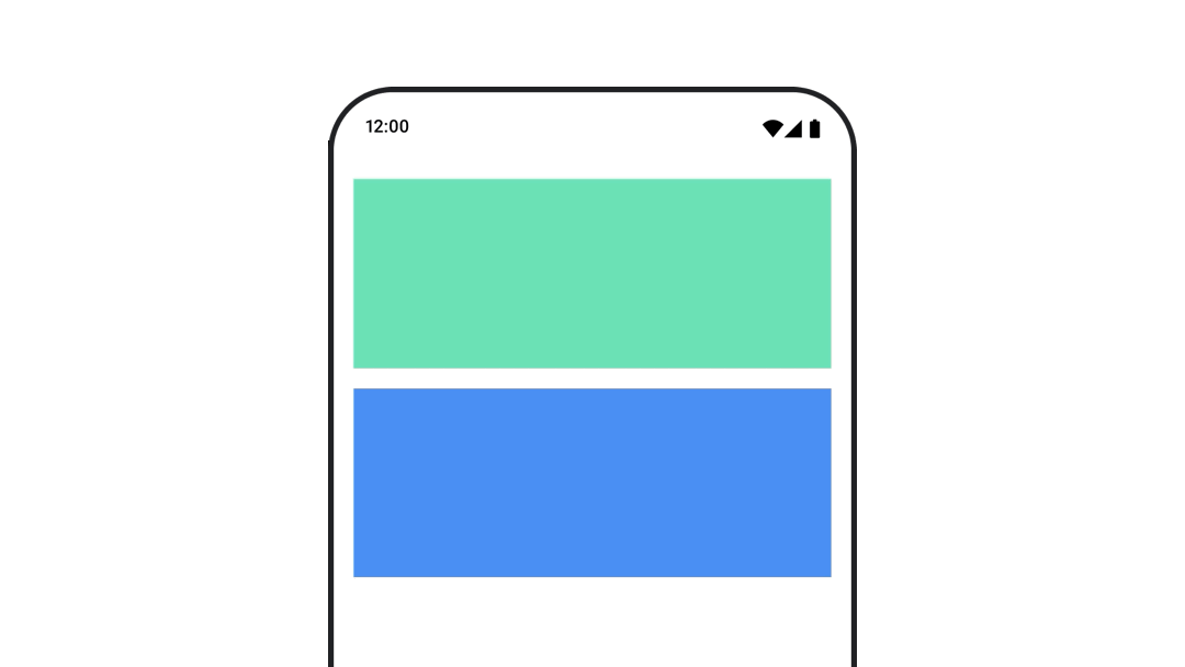
컴포저블 크기 변경 애니메이션
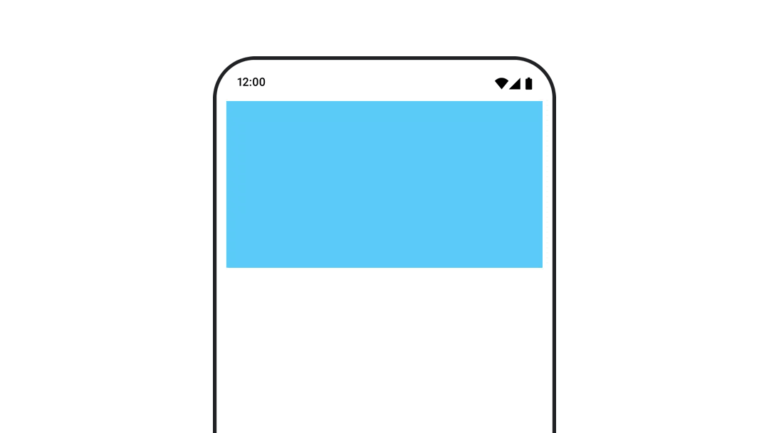
animateContentSize 수정자는 크기를 변경하는 애니메이션을 표시합니다.
var expanded by remember { mutableStateOf(false) } Box( modifier = Modifier .background(colorBlue) .animateContentSize() .height(if (expanded) 400.dp else 200.dp) .fillMaxWidth() .clickable( interactionSource = remember { MutableInteractionSource() }, indication = null ) { expanded = !expanded } ) { }
목록 항목 애니메이션
지연 목록 또는 그리드 내에서 항목 재정렬에 애니메이션을 적용하려면 지연 레이아웃 항목 애니메이션 문서를 참고하세요.
추천 서비스
- 참고: JavaScript가 사용 중지되어 있으면 링크 텍스트가 표시됩니다.
- 가치 기반 애니메이션
- Compose의 애니메이션
- 애니메이션 도구 지원 {:#tooling}