商品の階層、状態、ブランドを示す、よりアクセスしやすく、パーソナライズされたカラーパターンを作成します。ウェアラブル向けにデザインする場合、特に小さい画面では、色は視認性、ユーザビリティ、視覚的な魅力、表現を高めるために重要な役割を果たします。
次の原則は、テーマ全体で色を使用する方法を説明しています。
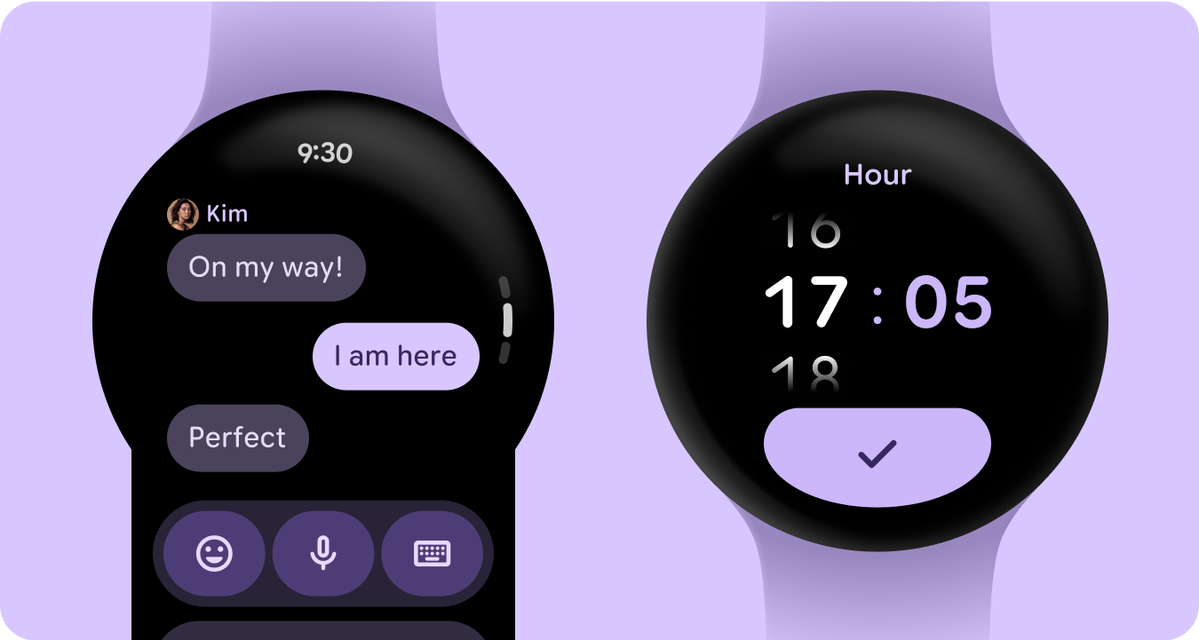
ベースは黒
スマートウォッチは、スマートフォン デバイスで使用される色付きの背景ではなく、黒い背景で設計されています。ダークモードは暗い環境向け、ライトモードは日中向けですが、スマートウォッチの UI は昼夜を問わずシームレスに機能する必要があります。そのため、スマートウォッチのカラートークンは、特別に調整する必要があります。
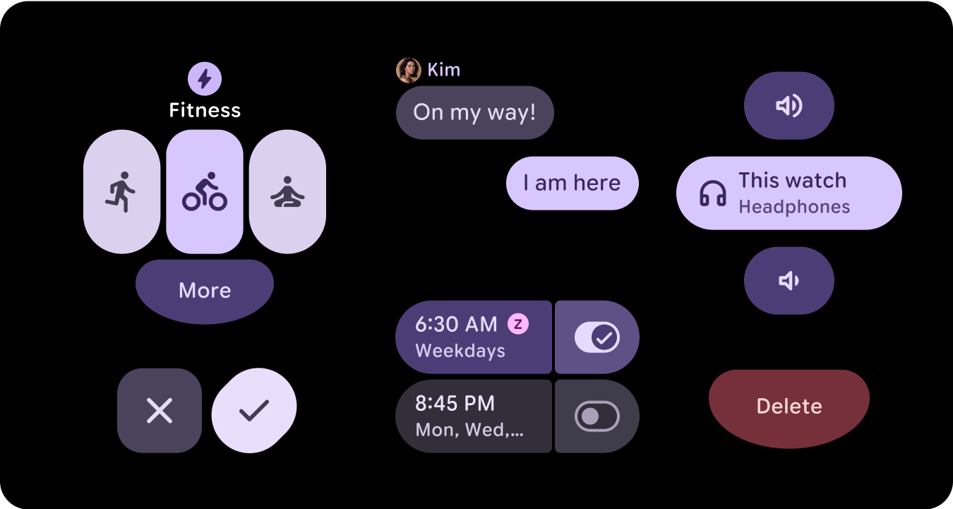
新しいカラーロール
マテリアル 3 のカラーシステムは、3 つのアクセント カラーと 2 つのニュートラル サーフェス カラーの構造を維持していますが、アクセント ロール内にコンテナ カラーを導入しています。これらの新しいロールにより、視覚的な階層を乱すことなく表現力を高めることができます。基本的には、クロマを増やしてサーフェスの色の変化を提供します。コンテナロールは、切り替えボタンなどの状態をハイライト表示する場合や、プライマリ アクセントがすでに使用されている場合に補完的なスタイルを提供する場合に特に便利です。
意味
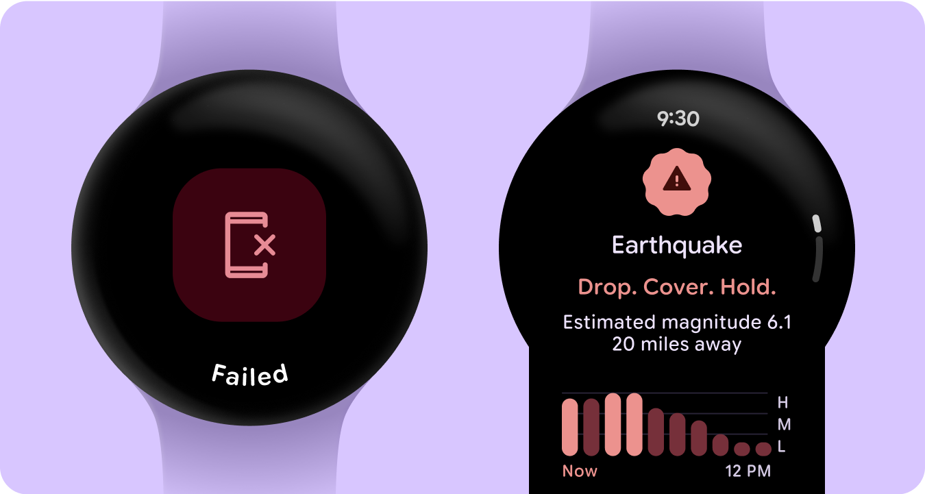
スマートウォッチの UI では、色によって意味を明確かつ直感的に伝える必要があります。たとえば、赤はエラー、緑は成功を示します。これにより、ユーザーは追加の説明を必要とせずに、アクションや状態をすばやく把握できます。このように色をセマンティックに使用すると、ユーザーは UI を操作し、安心してアクションを実行できます。
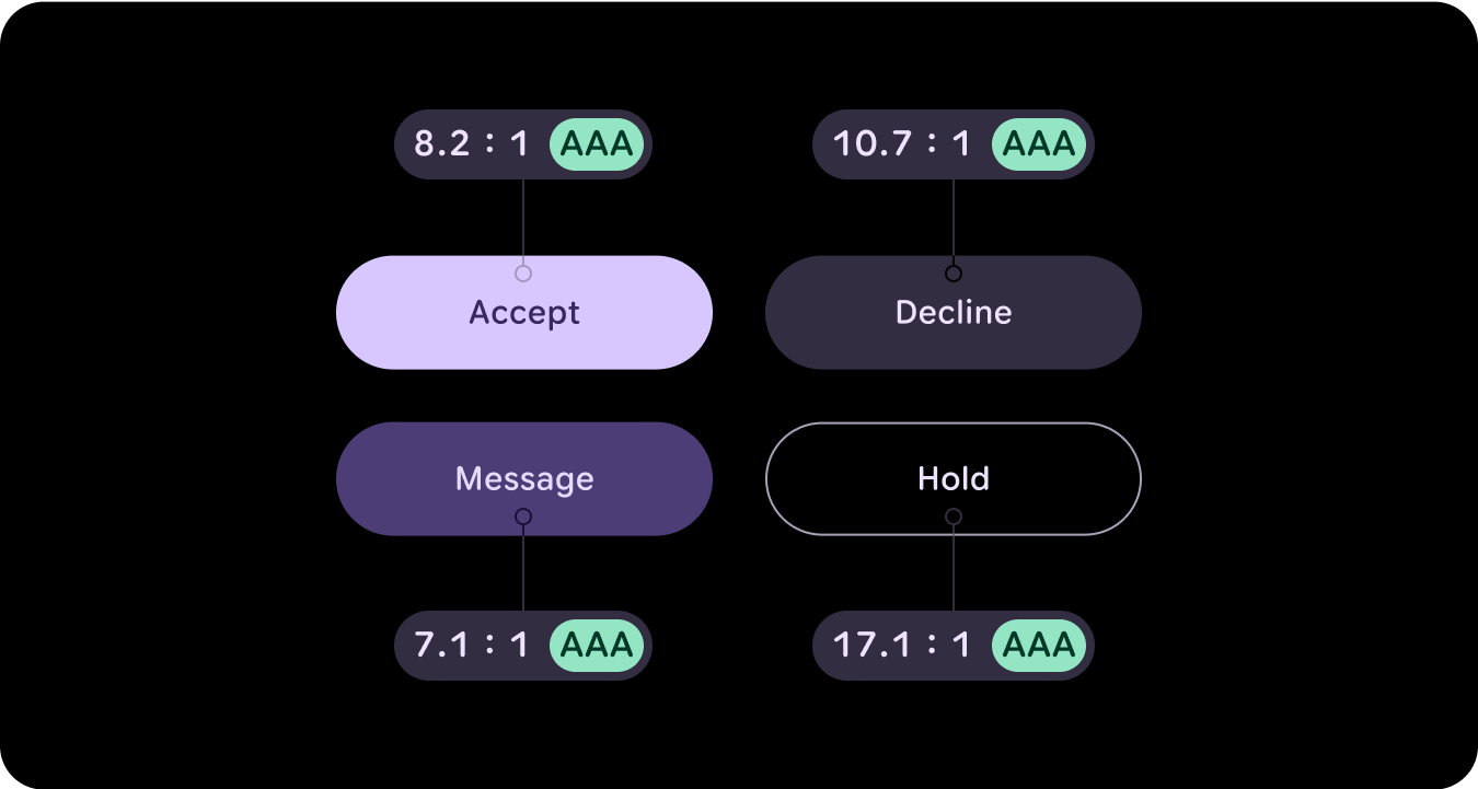
色のユーザー補助(コントラストへの準拠)
スマートウォッチの UI では、色によって意味を明確かつ直感的に伝える必要があります。たとえば、赤はエラー、緑は成功を示します。これにより、ユーザーは追加の説明を必要とせずに、アクションや状態をすばやく把握できます。このように色をセマンティックに使用すると、ユーザーは UI を操作し、安心してアクションを実行できます。
新機能
ビジュアル デザイン システムと、スタイル基盤、コンポーネント、タイル デザイン ライブラリの更新を通じて表現を高める方法が大幅に更新されています。
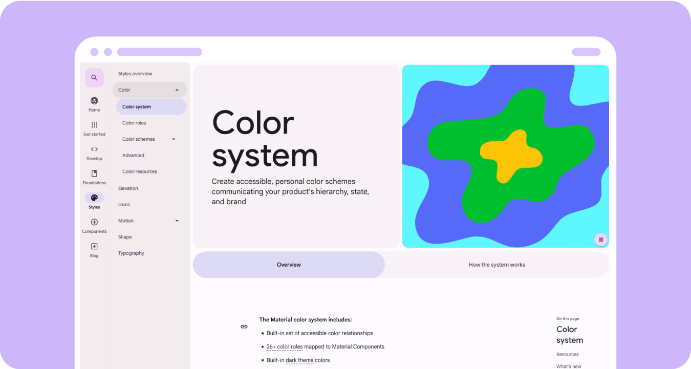
マテリアル 3 の表現力豊かなカラーシステムには、次の機能があります。
- アクセシブルな色の関係が組み込まれている
- マテリアル コンポーネントにマッピングされた 28 以上のカラーロール
- 黒から作成するためのダークモードの色が組み込まれている
- 無効な色値の改善
- その他のエラーの色
- 各色ロールにデフォルトの色が割り当てられた静的ベースライン カラー
- システム/ウォッチフェイス、画像ベースのカラーテーマなどのダイナミック カラー機能
リソース
詳細については、次のリソースをご覧ください。
マテリアル デザインのカラー ガイドライン
マテリアル 3 Expressive を使用した色パターンの最新のベスト プラクティスについて学ぶ。