
When designing for adaptive layouts on the round screen, scrolling and non-scrolling views each have unique requirements for scaling UI elements and maintaining a balanced layout and composition. The images below are broad suggestions; examples are for illustrative purposes only. View each component or surface page for detailed, contextual and responsive guidance.
More content at a glance
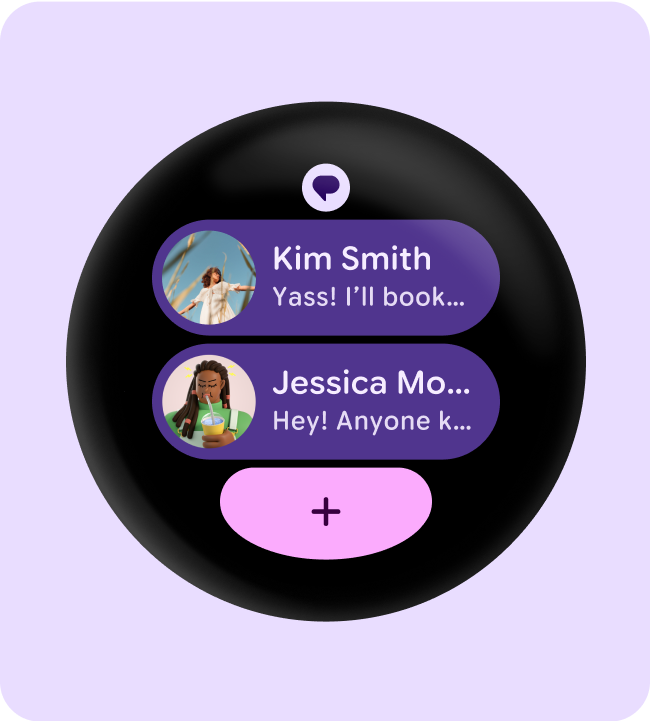
Responsive layouts allow for more chips, cards, lines of text, and buttons to fit on a single screen.
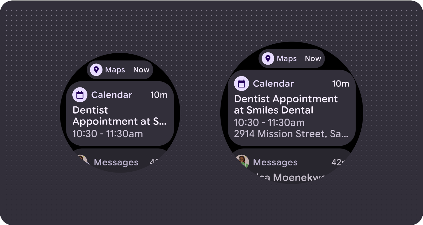
More content elements visible
Use new layouts, applied at defined screen size breakpoints, to allow for the introduction of content when possible, giving the user additional value on devices with larger screen sizes.
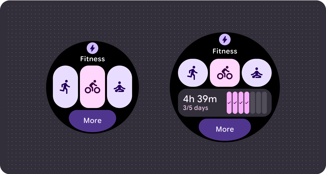
Improved glanceability
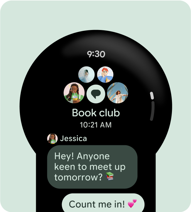
Use extra screen space to provide larger containers, larger text, thicker rings, and more granular data visualization for better glanceability.

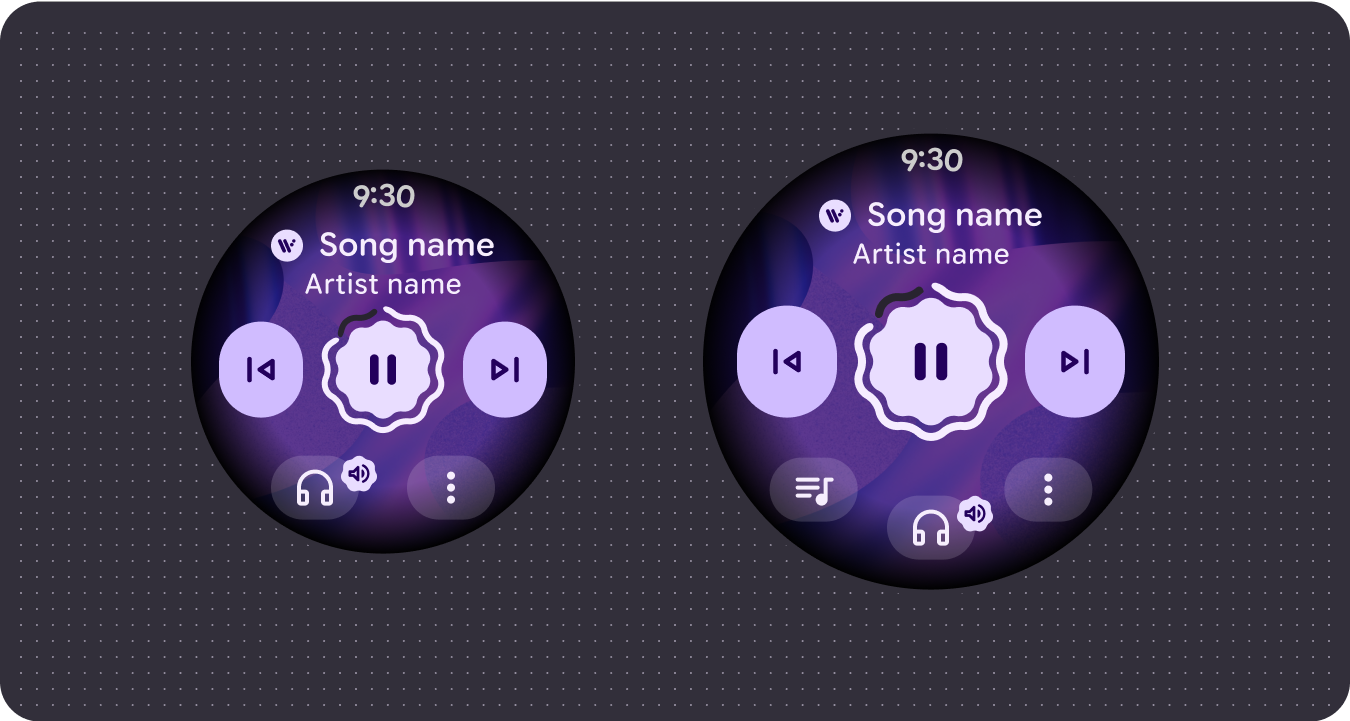
Improved usability
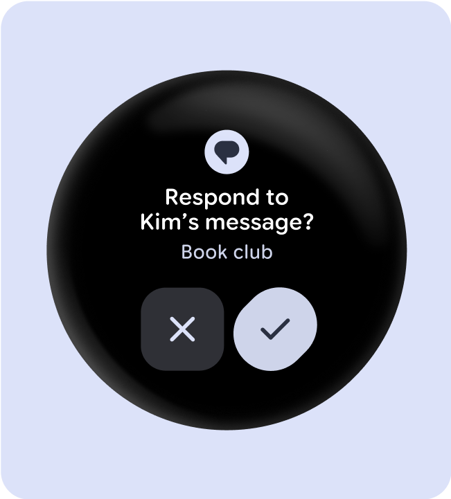
Use extra screen space to provide bigger tap targets, greater visual hierarchy, and padding between content items so interfaces are accessible and engaging.
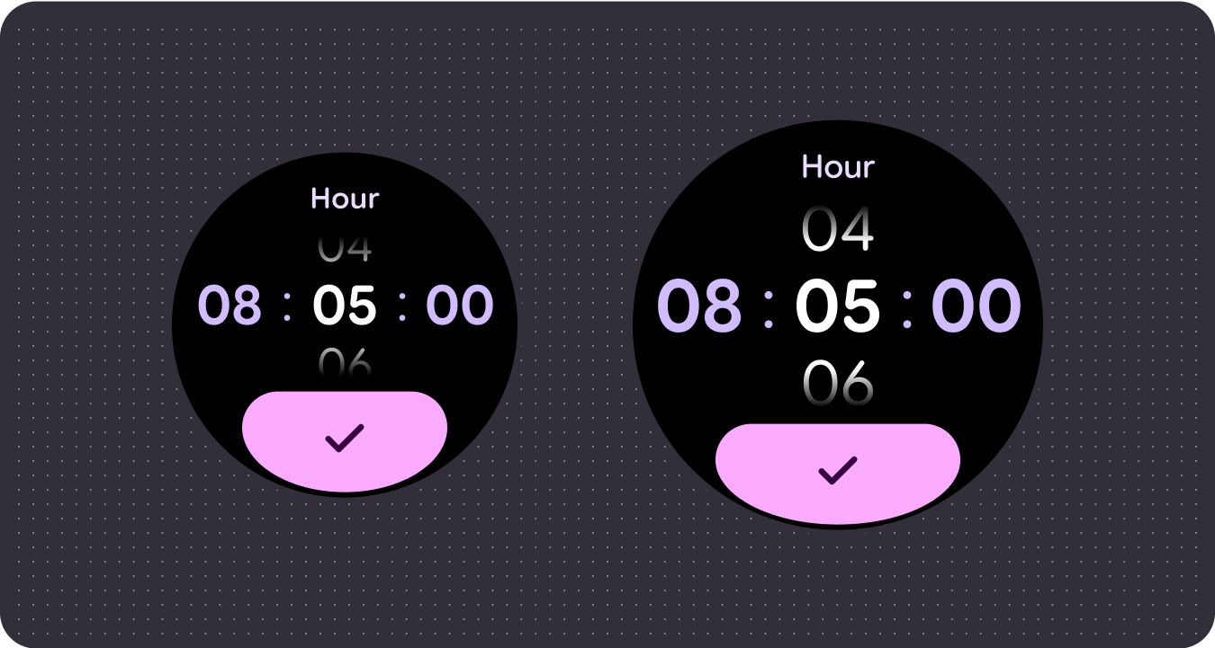
Optimized compositions
Utilize our updated components and templates to offer a better look and feel for our UIs across all screen sizes.
Use established canonical layouts
Leverage established canonical layouts to help your UIs adapt smoothly across a range of device sizes. Our canonical layouts have been developed thoughtfully to offer a high quality experience across all screen sizes.
Tiles (non-scrolling layouts)
App scrolling layouts
Apps non-scrolling layouts