
The Material 3 Expressive color framework uses dynamic color theming, based on two seed colors mapped on the HCT (Hue, Chroma and Tone) color system.
Essential terms
- Color role
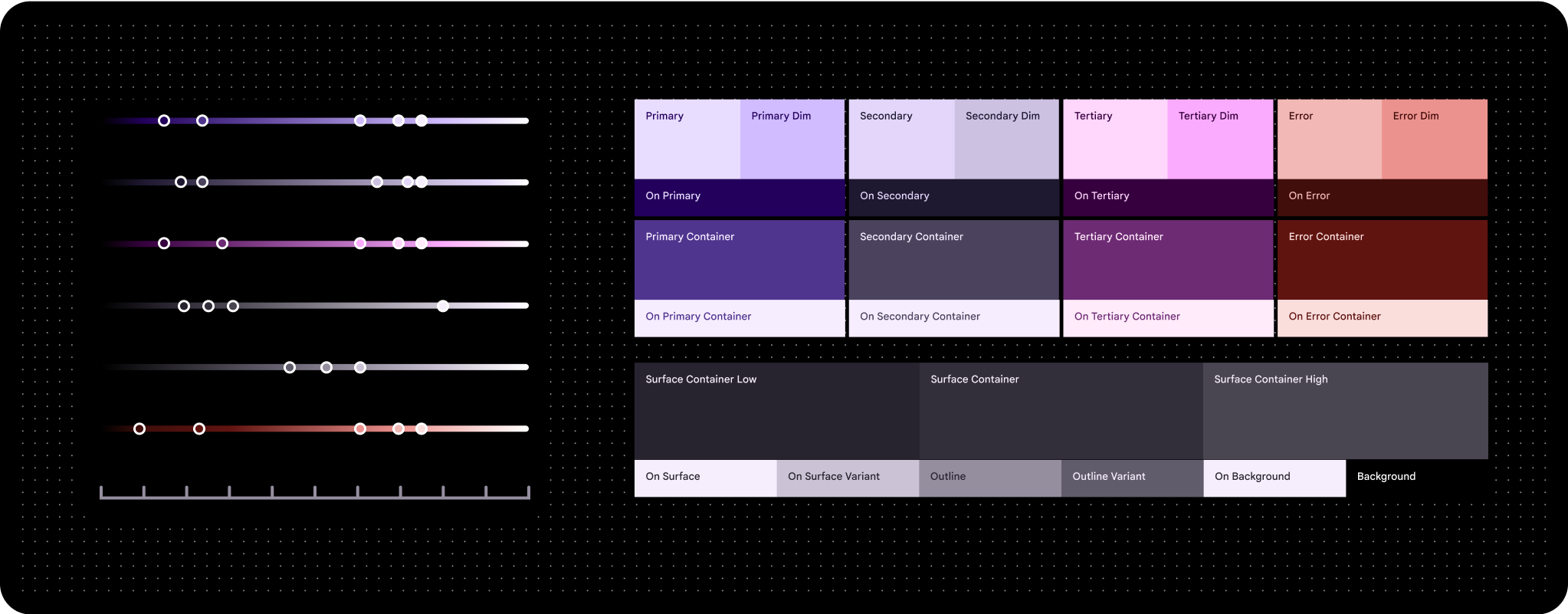
- Like the "numbers" on a paint-by-number canvas, color roles are assigned to specific UI elements. They have names like primary, on primary, and primary container. The same color role is used for both light and dark themes. See all color roles
- HCT
- HCT stands for hue, chroma, and tone.
Define colors with hue, chroma, and tone (HCT)
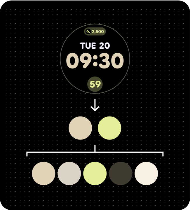
HCT color generator creating a set of color palettes from one seed color to creates a three-dimensional color model that defines colors based on their hue (color), chroma (saturation), and tone (lightness)
There are three main accents colors: primary, secondary and tertiary. Neutral shades, such as various tones of gray with a hint of primary color, are ideal for use as container colors for rich content due to their monochromatic nature.
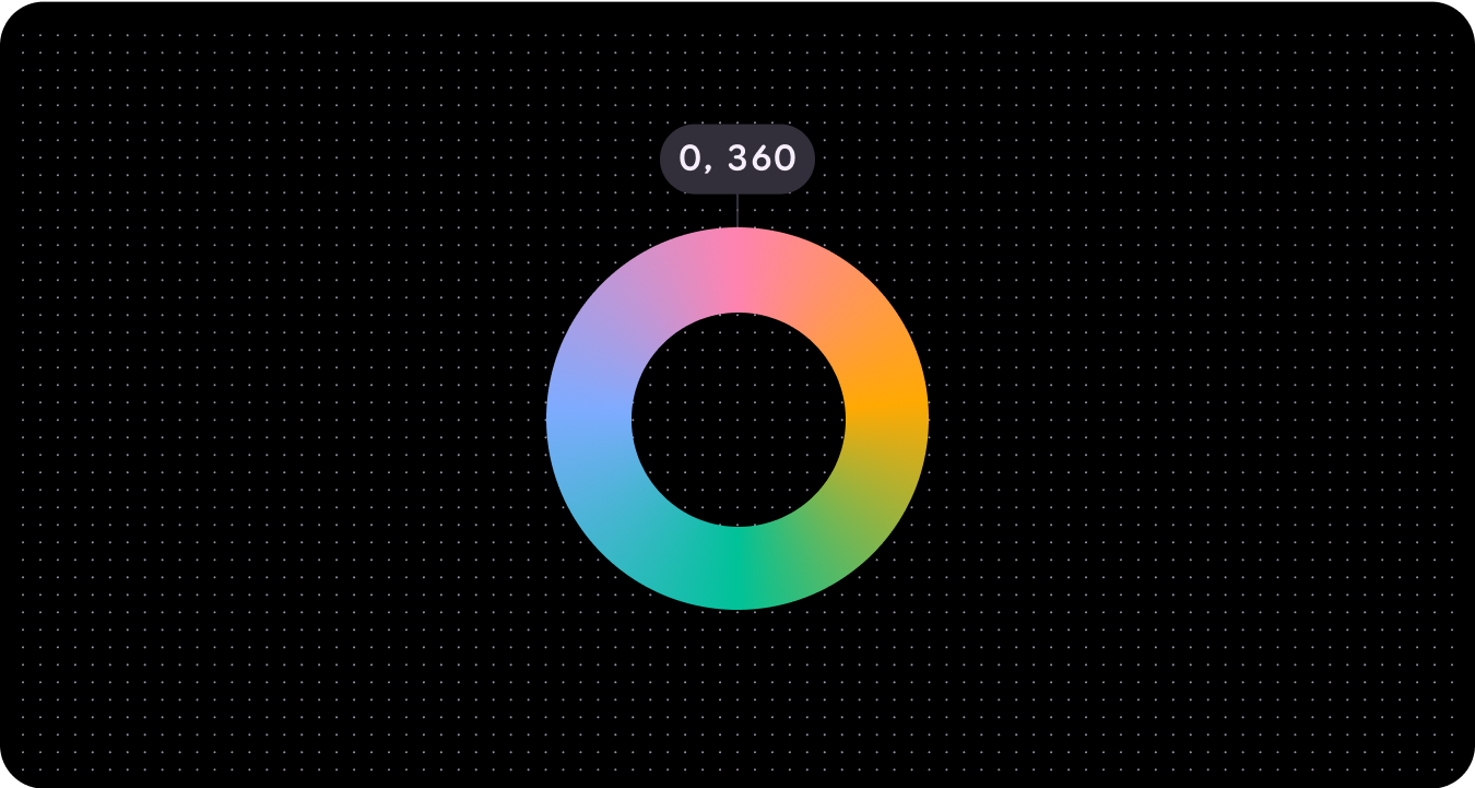
Hue
Hue is the perception of a color, such as red, orange, yellow, green, blue, and violet. Hue is quantified by a number ranging from 0-360 and is a circular spectrum (values 0 and 360 are the same hue).
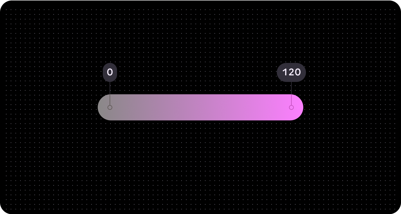
Chroma
Chroma is how colorful or neutral (gray, black or white) a color appears. Chroma is quantified by a number ranging from 0 (completely gray, black or white) to infinity (most vibrant), though chroma values in HCT top out at roughly 120.
Because of biological and screen rendering limitations, different hues and different tones will have different maximal chroma values.
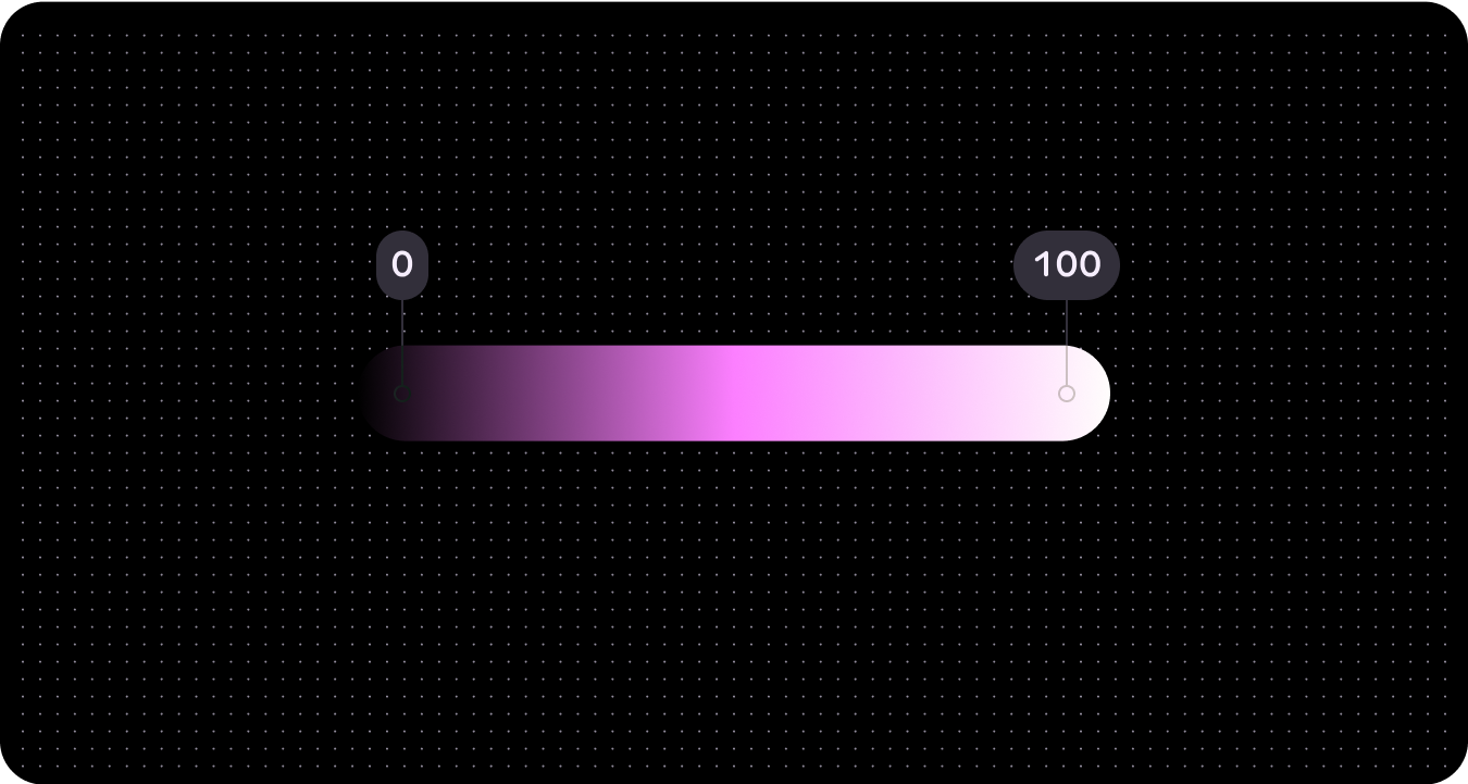
Tone
Tone is how light or dark a color appears. Tone is sometimes also referred to as luminance. Tone is quantified by a number ranging from 0 (pure black, no luminance) to 100 (pure white, complete luminance).
Tone is crucial for visual accessibility because it determines contrast. Colors with a greater difference in tone create higher contrast, while those with a smaller difference create lower contrast.
Dynamic color (color theming)
Wear OS implements a theming system compliant with Web Content Accessibility Guidelines (WCAG)-AAA, derived from two designated seed colors. Specifically, these seed colors serve as the basis for primary and tertiary palettes. Using these two initial colors, the system generates a comprehensive color palette encompassing primary, secondary, tertiary, and surface palettes. Subsequently, this generated theme is applied across Wear OS components, System UI elements, tiles, and apps.

Depending on your preference, you can use either a specific seed color or a brand color to derive your dynamic color.
From seed color
Dynamic color will automatically create an accessible color scheme based on a specific seed color.
Because the UI could end up with any number of different source colors, it's best to initially design using the baseline color scheme so you can ensure the right color roles are mapped to the right components in your product. Use the Material Theme Builder to see how your UI mocks look across a range of source colors and adjust settings as needed.
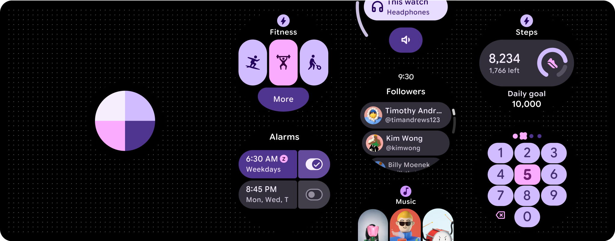
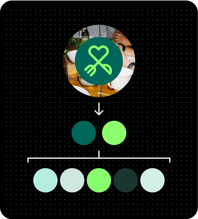
Color palette (from Watch face seed colors)
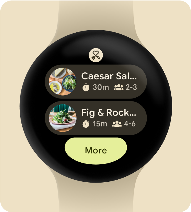
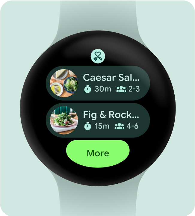
Color theme applied to a Tile
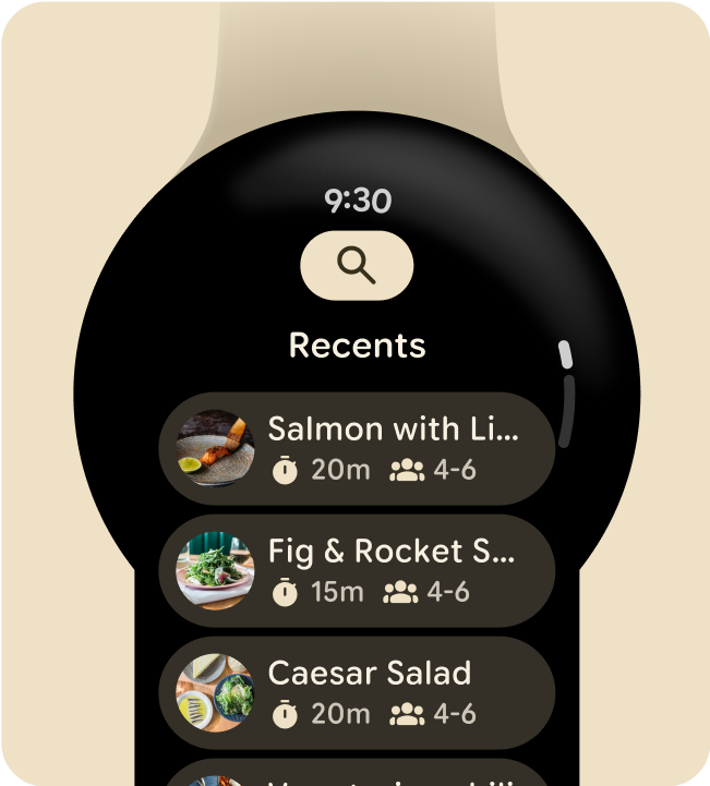
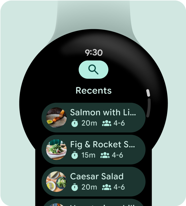
Color theme applied to an app screen
From brand color
Similar to the way Material 3 Expressive treats color roles, Wear OS applies color to individualized experiences with dynamic and accessible color expression. Wear OS uses only the dark theme because the wearable interface is built on a black background. Being a platform that runs on touch devices, Wear OS also has a more limited color palette as it doesn't require as many hover and focus states. Use the Wear OS-specific color theme building tools to build a custom theme around your brand and generate the full reference palettes and assigned color roles that support Material Design tokens and are built to work seamlessly with system UI components.
Color palette (from artwork seed colors)
Color theme applied to a Tile
Color theme applied to an app screen