
Material 3 Expressive for Wear OS establishes visual hierarchy by assigning different hue, chroma, and tone values to its color roles, effectively distinguishing bold accent colors from neutral surface colors. The system's inclusion of primary, secondary, and tertiary accent roles not only enhances expressive possibilities but also offers more granular control over visual hierarchy through distinct color choices. This intentional use of color ensures a consistent and cohesive feel within the Watch UI, even with theming.
Example of different layouts, components and UIs in various themes, but still maintaining adequate color contrast.
Pair and layer colors
To maintain visual accessibility, apply colors only in the intended pairs color tokens. Combining colors improperly may break contrast necessary for visual accessibility, particularly when colors are adjusted through dynamic color.
Pair and layer colors correctly
In order to ensure proper visuals and accessibility, make sure you are mapping the correct token to its correct position. An improper color mapping can lead to unintended visuals and break accessibility.

Do
Pair and layer color roles correctly to ensure proper visuals and accessibility.
In this example, buttons with (2) on-primary on (1) primary or (4) on-primary-container on (3) primary-container stay legible as the contrast level changes and have an AAA rating with a contrast ratio of 7:1 or more.

Don't
Improper color mappings can lead to unintended visuals and break accessibility.
In this example, buttons with (2) primary-container on (1) primary or (4) primary-dim on (3) primary-container become illegible as contrast levels shift and don't follow the 7:1 contrast ratio minimum for normal text. These contrast levels apply to primary, secondary and tertiary roles.
Recommended color pairings
Primary + Primary Dim
Use Primary for main actions, and Primary-Dim for complementary items. This creates depth while ensuring the primary action stands out.
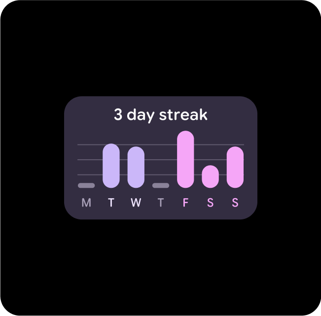
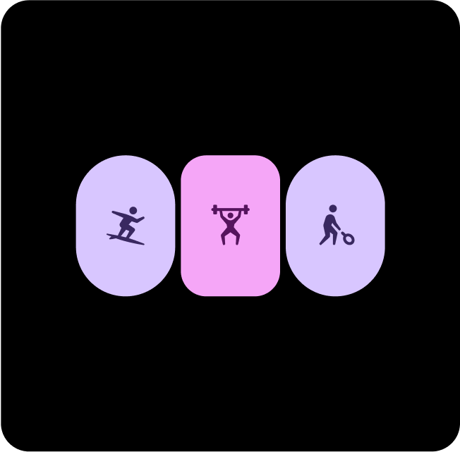
Primary-Dim + Tertiary
Use Primary-Dim to highlight important elements and Tertiary to provide standout feedback, such as tap responses.

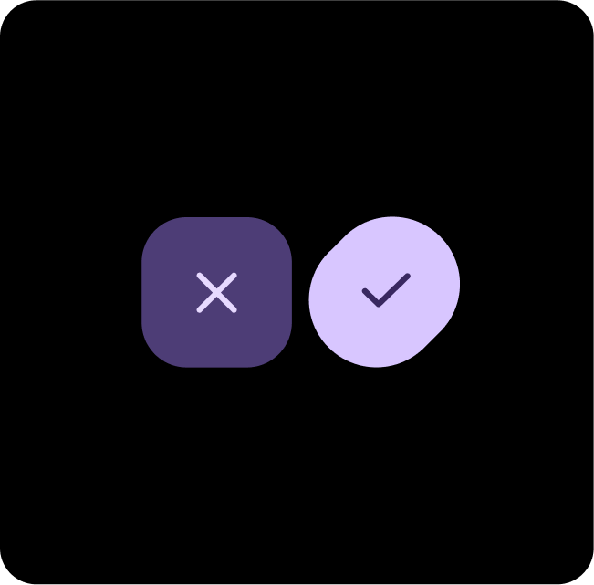
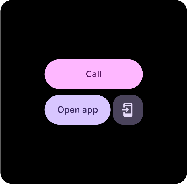
Primary + Secondary-Container
Use Secondary-Container for less prominent content, while Primary is applied to key elements to ensure they stand out and grab attention.
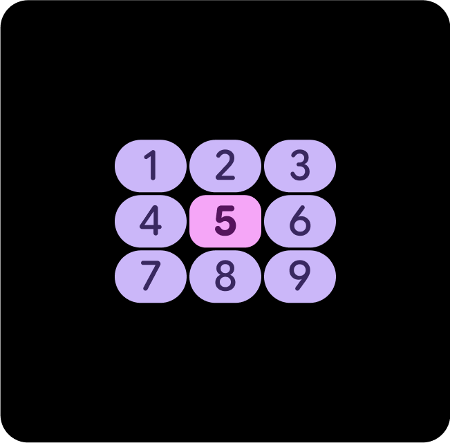
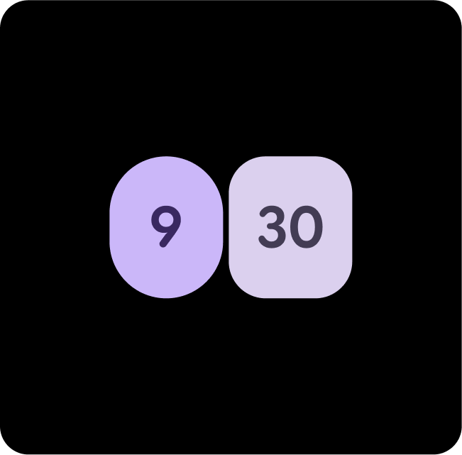
Primary + Primary-Container
Use Primary for main actions, and Primary-Container for complementary or secondary items. This creates depth while ensuring the primary action stands out.
Primary-Dim + Tertiary-Dim
Use Primary-Dim to highlight important elements and Tertiary-Dim to provide standout feedback, such as a goal being met.
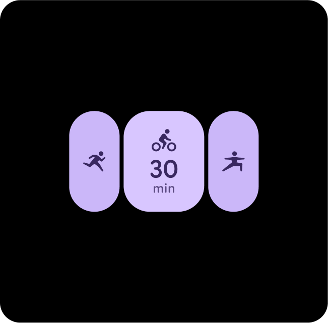
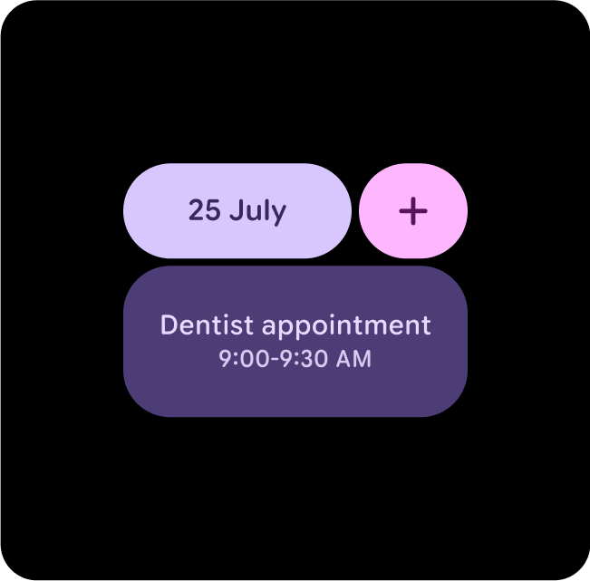
Tertiary + Primary + Secondary-Container
When it's not clear what the main action is, use a combination of Tertiary and Primary for a main actions and Secondary-Container for a complementary actions.
Secondary + Primary-Container
Use Primary-Dim and Secondary when you want to show two equally as important options or containers, but still have contrast between the two.
Primary + Tertiary + Primary-Container
When it's not clear what the main action is, use a combination of Tertiary and Primary for a main actions and Primary-Container for a complementary actions.
Primary + Tertiary-Dim
Use Primary for main actions and Primary Dim for complementary items. This creates depth while helping the primary action to stand out.