Apps that create a user experience specifically tailored to the size of the screen, leveraging new layouts, implemented at a key screen size breakpoint,* to derive additional value for users of devices with larger screens, enabling a user experience that devices with smaller screens can't match.
*In user interface (UI) design, a breakpoint refers to a specific screen width or viewport size at which the layout and presentation of content are altered to optimize the user experience across various devices. Developers use code (like CSS media queries) to define these points, and it is advisable to supply two designs at these breakpoints in your design specs. Wear OS screen sizes start from 192dp with a default breakpoint for larger screens at 225dp.
Use breakpoints on Wear OS
Employing a breakpoint (BP) at 225dp can help optimize layouts across a range of sizes.
Do
- Design custom layouts and behaviors at 225dp+ to use the additional screen real-estate.
- Add value after the breakpoint whenever possible.
- Use the larger component options after the BP for a more glanceable UI.
- Be expressive and bold.
Don't
- Design for just one device size. Test your designs across multiple screen sizes.
- Only rely on responsive behavior.
- Let your app or tile be unremarkable.
Examples
The following images show examples of apps that are adaptive and differentiated.
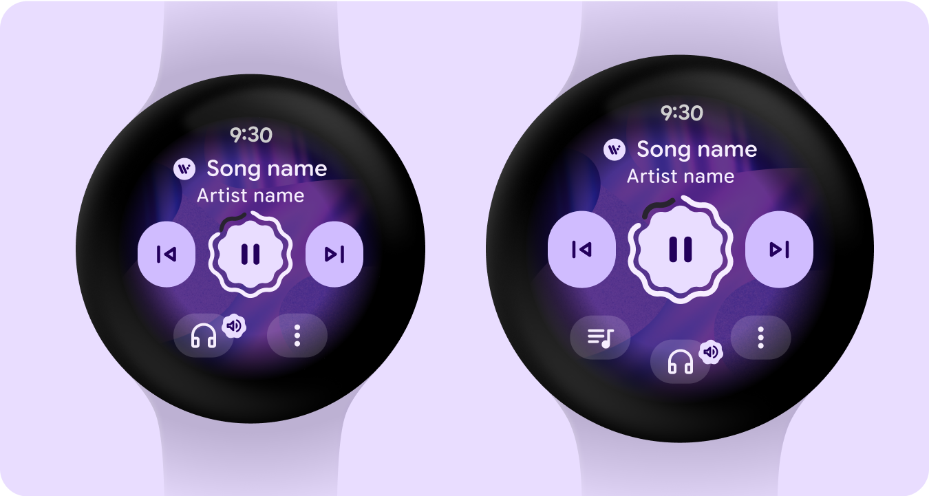
Media player
Increase in main control sizes and additional bottom button after the 225dp breakpoint - adding value, better utilizing the additional space on larger screens and improving glanceability.
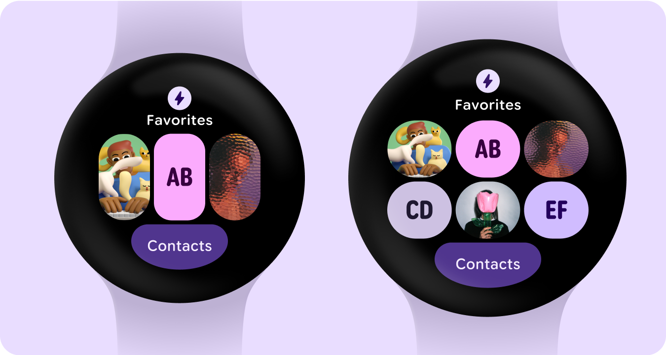
Tile with button groups
Additional row of buttons after the 225dp breakpoint - adding value through additional buttons.
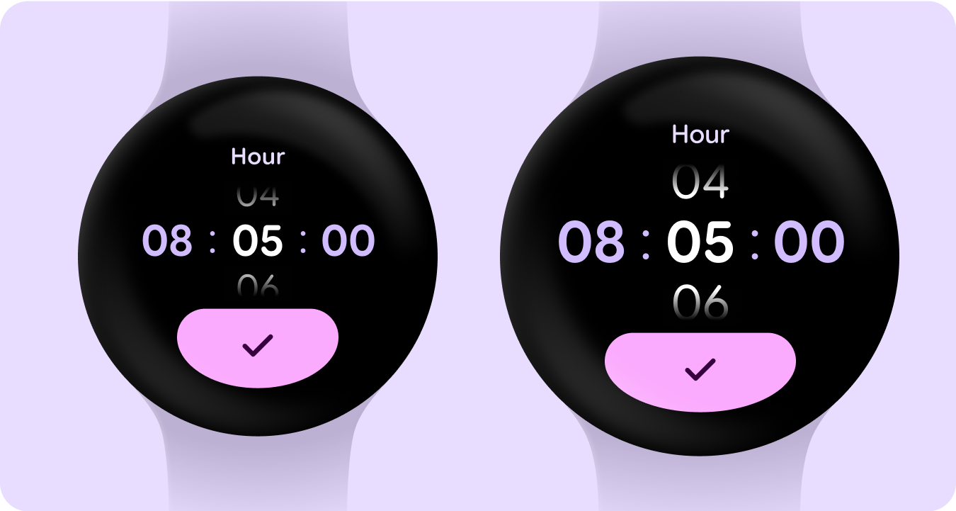
Picker
Numbers increase in size after the 225dp breakpoint - better utilizing the additional space on larger screens and improving glanceability.
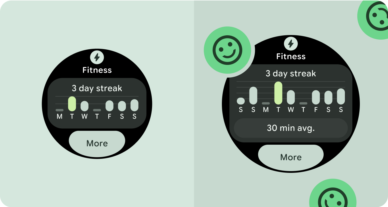
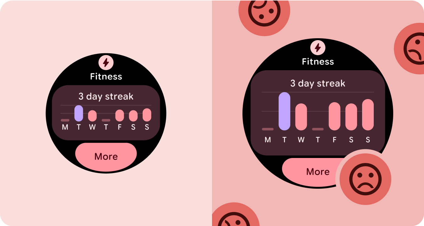
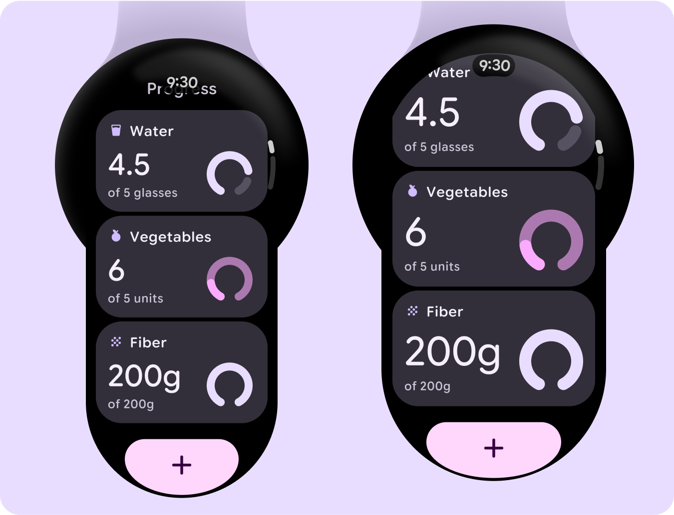
List of cards with graphs
Increase in main number and graph after the 225dp breakpoint - better utilizing the additional space on larger screens and improving glanceability.
Tile with cards
Additional row with a card after the 225dp breakpoint - adding value through additional cards.
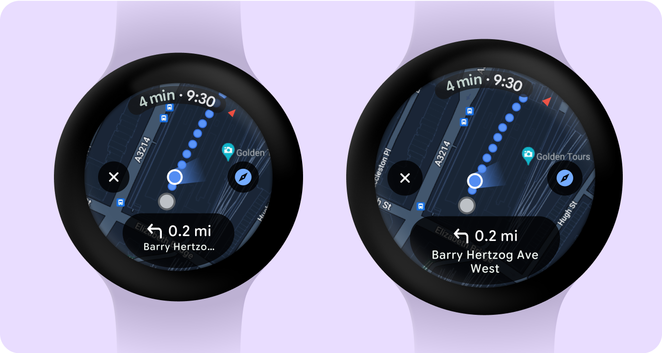
Maps
Additional row with a card after the 225dp breakpoint - adding value through additional cards.
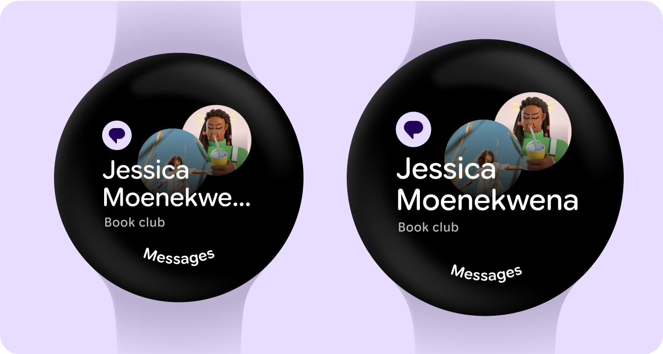
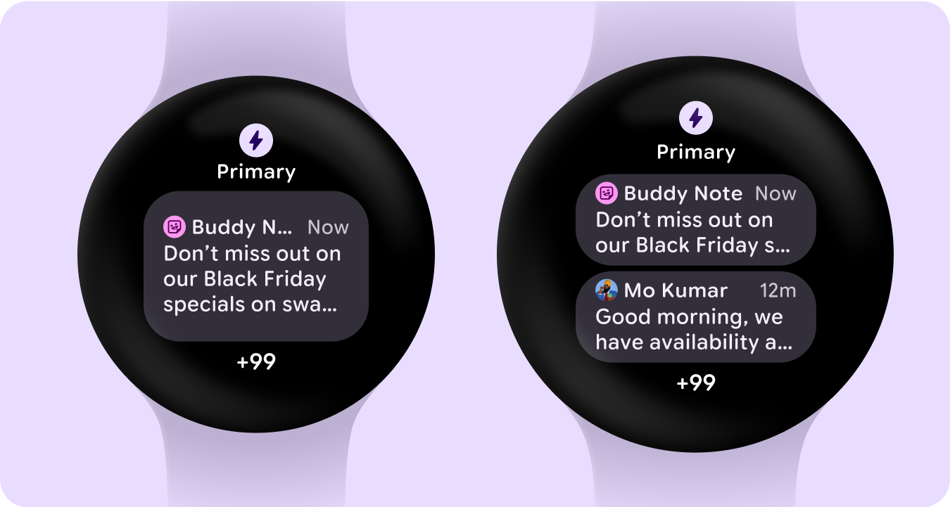
Glanceable notifications
Increase in image, app icon and text after the 225dp breakpoint - better utilizing the additional space on larger screens and improving glanceability.