
To accommodate the increasing screen size, we've incorporated responsive behavior into the ProtoLayout Material layout templates and Figma design layouts, allowing the slots to automatically adapt. In essence, slots are designed to fill the available width. Our margins are set as percentages, with additional inner margins added to slots at the bottom and top of the screen, accounting for fluctuations in the curve of the screen as it enlarges.
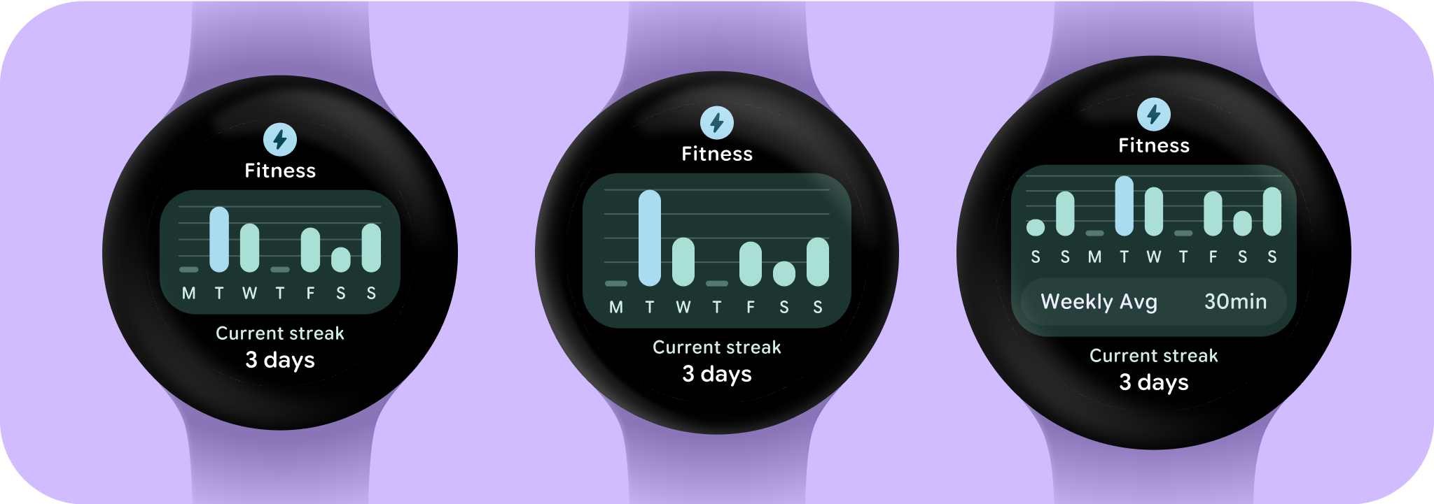
To maximize the larger screen size and additional space, consider utilizing the extra screen space to provide more value by allowing users to access additional information or options. Achieving these layouts requires additional customization beyond the built-in responsive behavior. This can be accomplished by adding more helpful content to the layout after the breakpoint. It's important to note that the recommended breakpoint is set at the 225dp screen size.
Essential terms
Responsive design: A design approach in which layouts dynamically format and position elements such as buttons, text fields, and dialogs for an optimal user experience. Automatically offer users additional value on larger screens by utilizing responsive design practices. Whether it's more text visible at a glance, more actions on screen, or larger, more accessible tap targets, responsive practices provide an enhanced experience for users of large screens.
Adaptive design: A design approach in which the interface changes based on known user, device, or environmental conditions. Adaptive design in Material includes layout and component adaptations.
Building responsive and optimized designs
To ensure your design layouts adapt to larger screen sizes, we have updated the behavior of our layouts and components to have built-in responsive behavior, including percentage-based margins and padding. If you are using our ProtoLayout templates, you can inherit these updates automatically through the ProtoLayout API and the beta release notes, and only need to supply layouts where you have added additional content or components after a screen size breakpoint. For full guidance and recommendations on how to take advantage of a larger screen size, view our Tiles guidance. Tiles have a fixed screen height, so we've adjusted the padding to maximize the limited screen real estate without creating unwanted clipping.