
Tiles provide quick access to information and actions users need to get things done. With a swipe from the watch face, a user can see how they are progressing towards their fitness goals, check the weather, and more. Launch an app or get essential tasks done quickly from tiles.
Build responsive and optimized designs
To help you adapt your design layouts to larger screen sizes, we have updated the behavior of our layouts and components to have built-in responsive behavior, including percentage-based margins and padding.
If you are using our ProtoLayout templates, you can inherit these updates automatically through the latest beta release of the Wear ProtoLayout Jetpack library. Also, you only need to supply layouts where you have added additional content or components after a screen size breakpoint. For full guidance and recommendations on how to take advantage of a larger screen size, view our tiles guidance. Tiles have a fixed screen height, so we've adjusted the padding to maximize the limited screen real estate without creating unwanted clipping.
Check that components fill the available width
All components should be built responsively. By setting the height and width to "expand," they fill the available space. Include the necessary margins to prevent content from being clipped by the rounded screen.
Build adaptive and differentiated designs
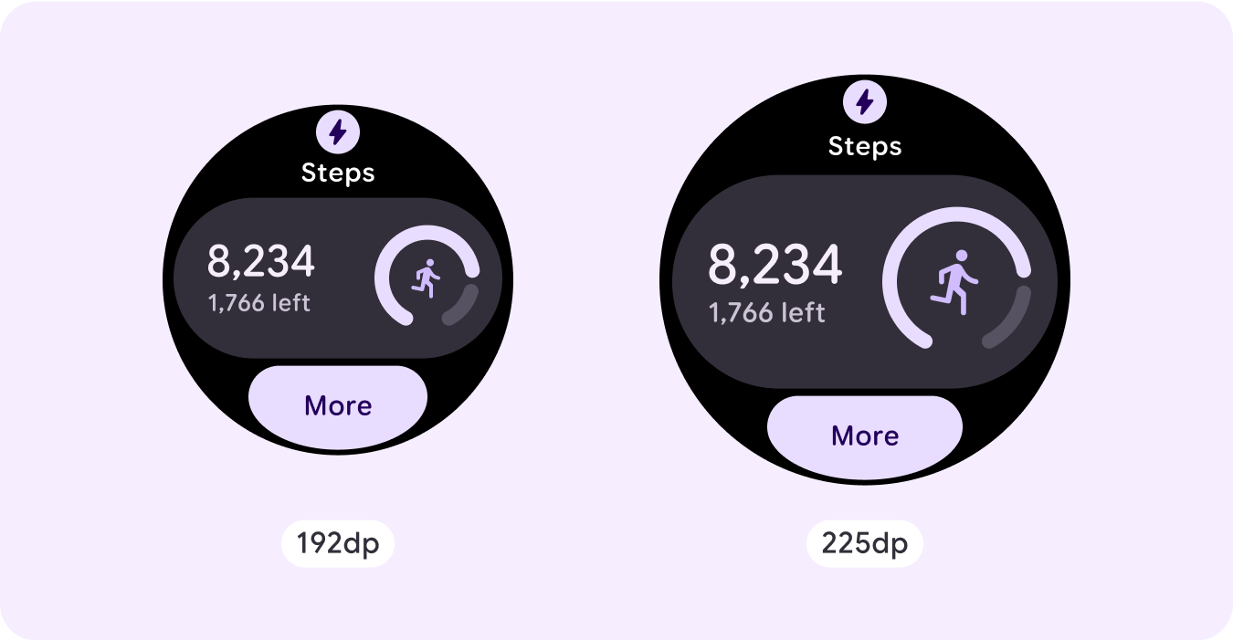
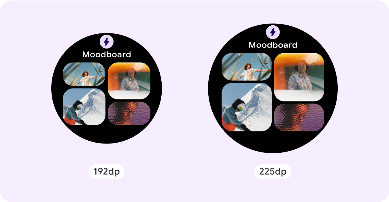
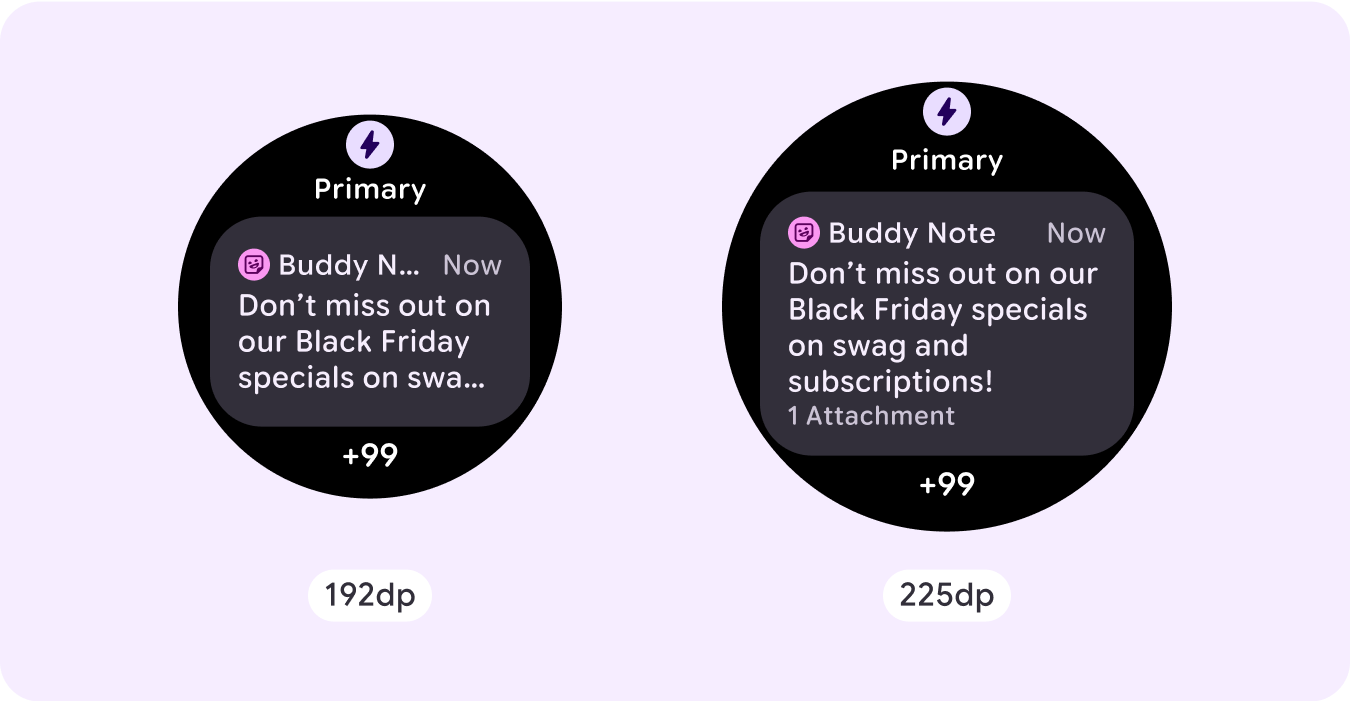
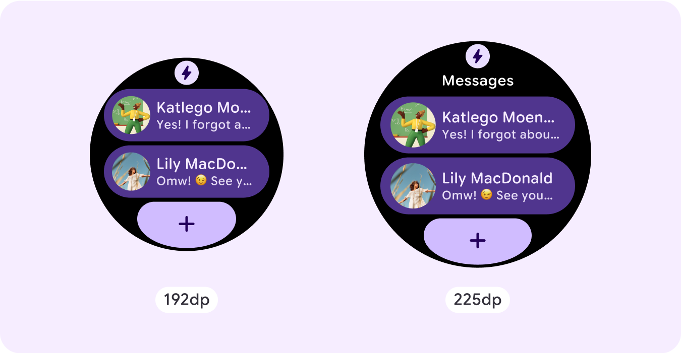
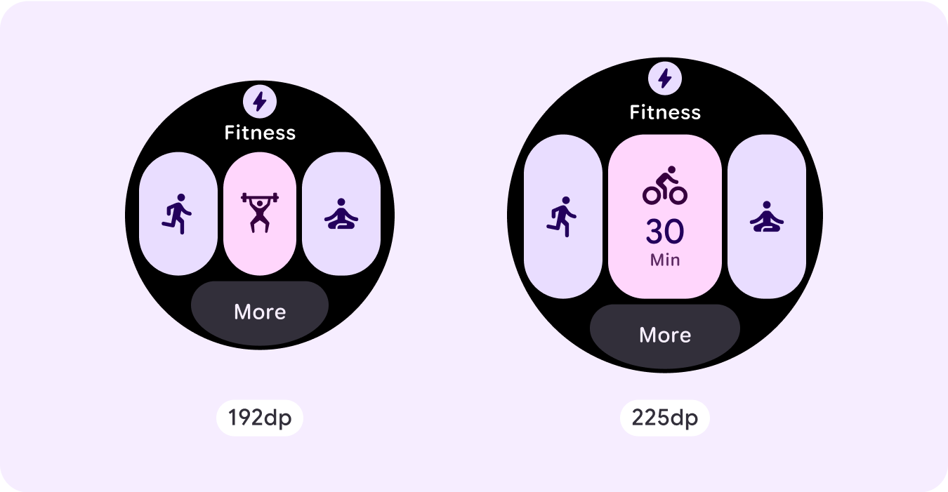
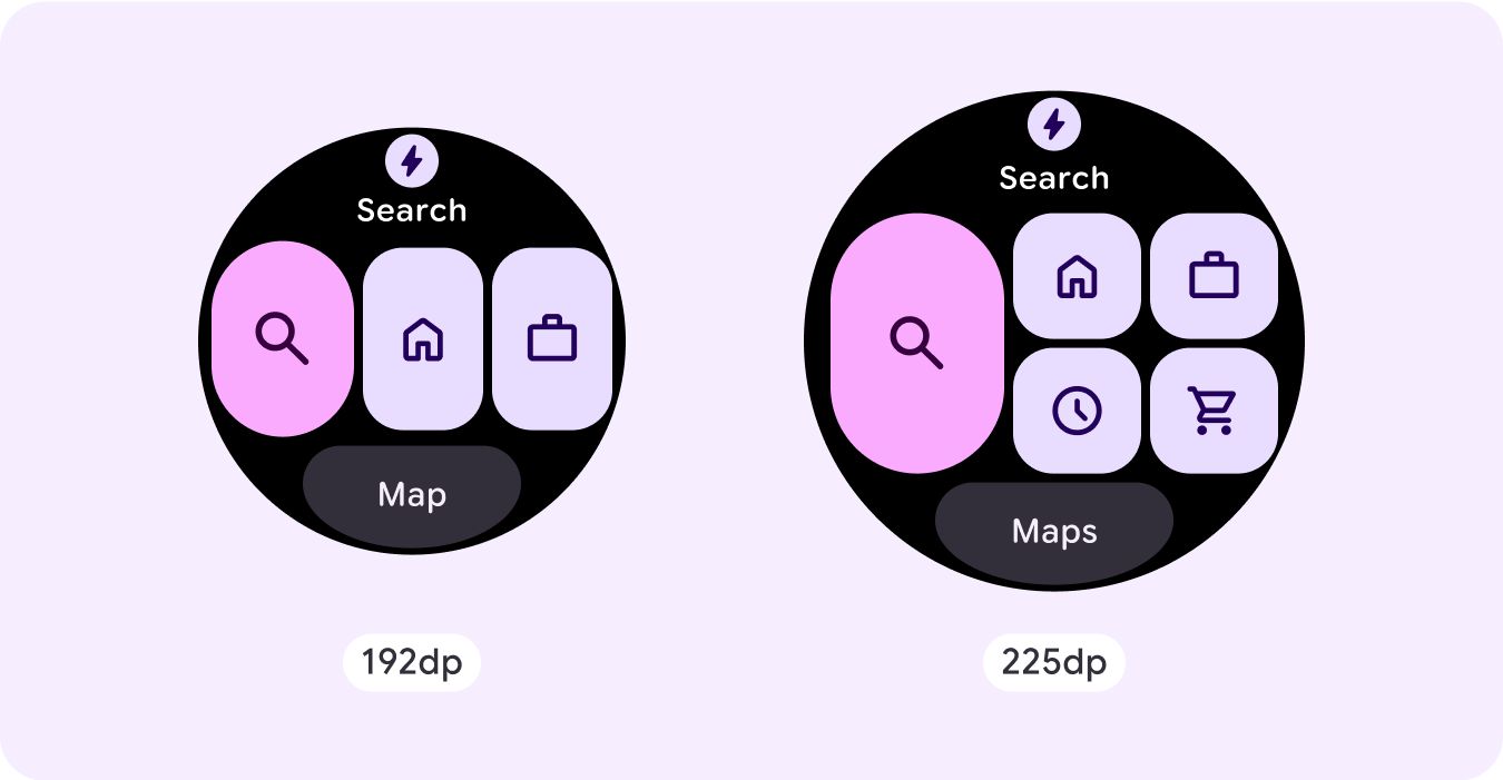
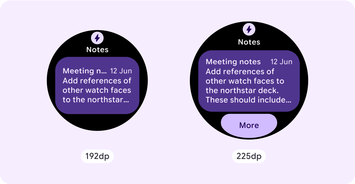
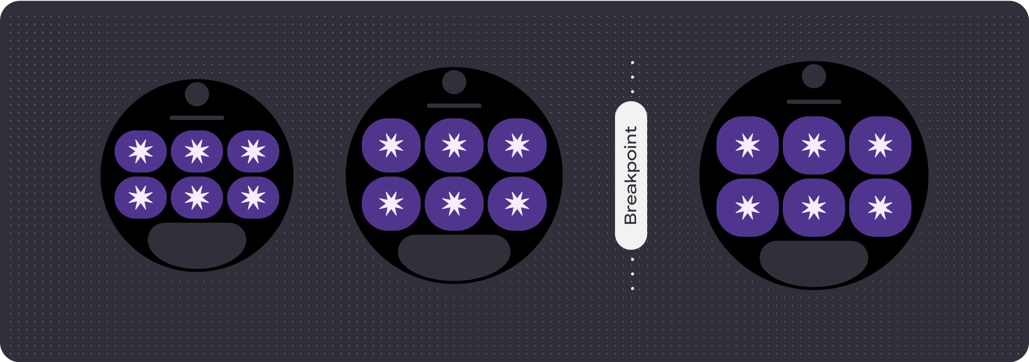
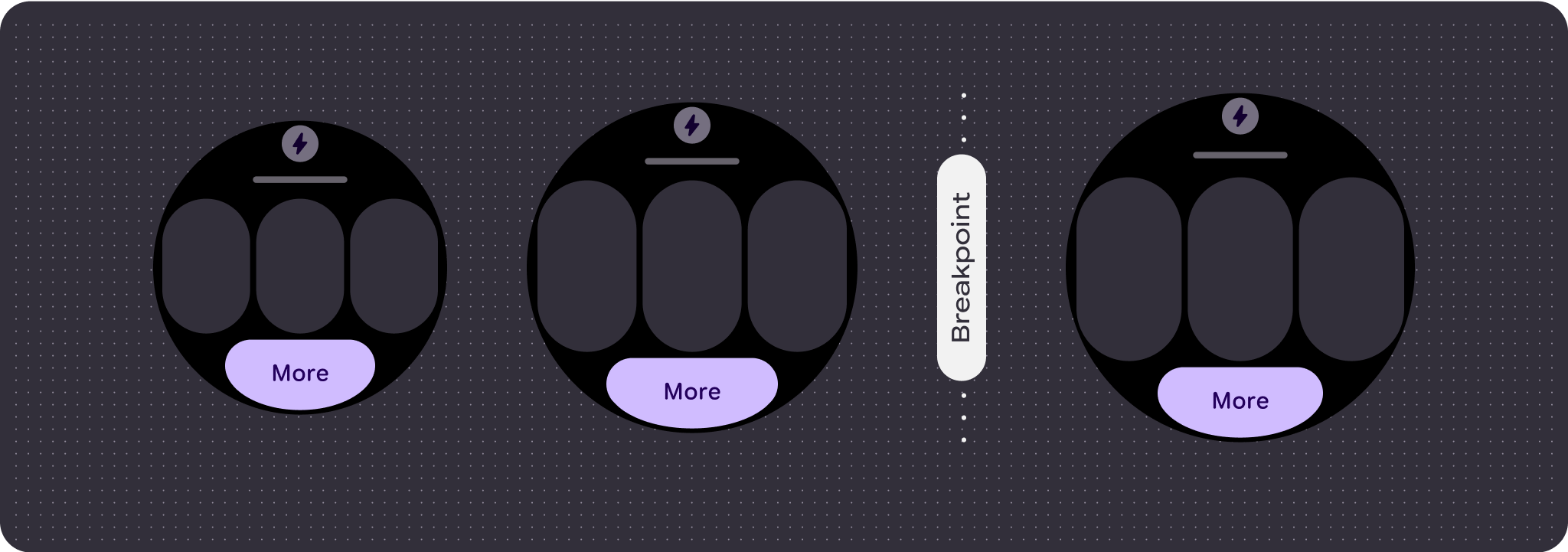
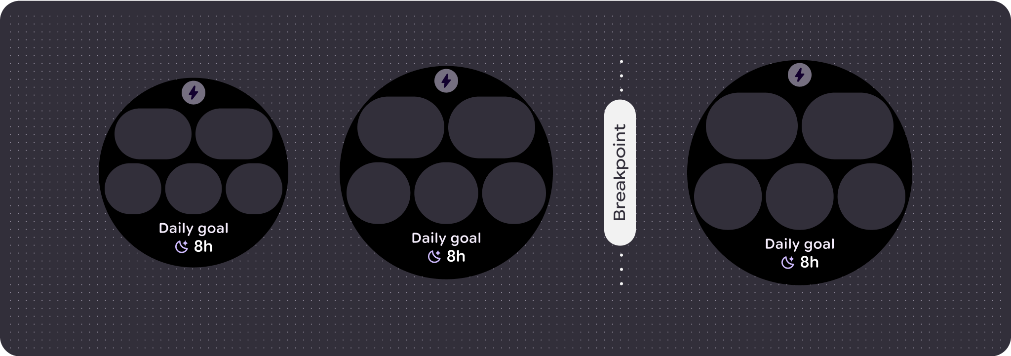
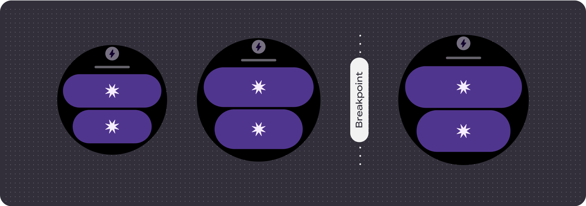
To make the most of the additional space on larger screen sizes, add a size breakpoint at 225dp. This breakpoint lets you reveal additional content, include more buttons or data, or change the layout to better suit the larger screen.
This requires a different design for each breakpoint. The larger screen design (225+ dp) could include the following additional elements:
Show the previously hidden title slot
This is advised on layouts with two rows before the breakpoint, where the title slot needs to be removed in order to ensure the min tap target of 48dp.
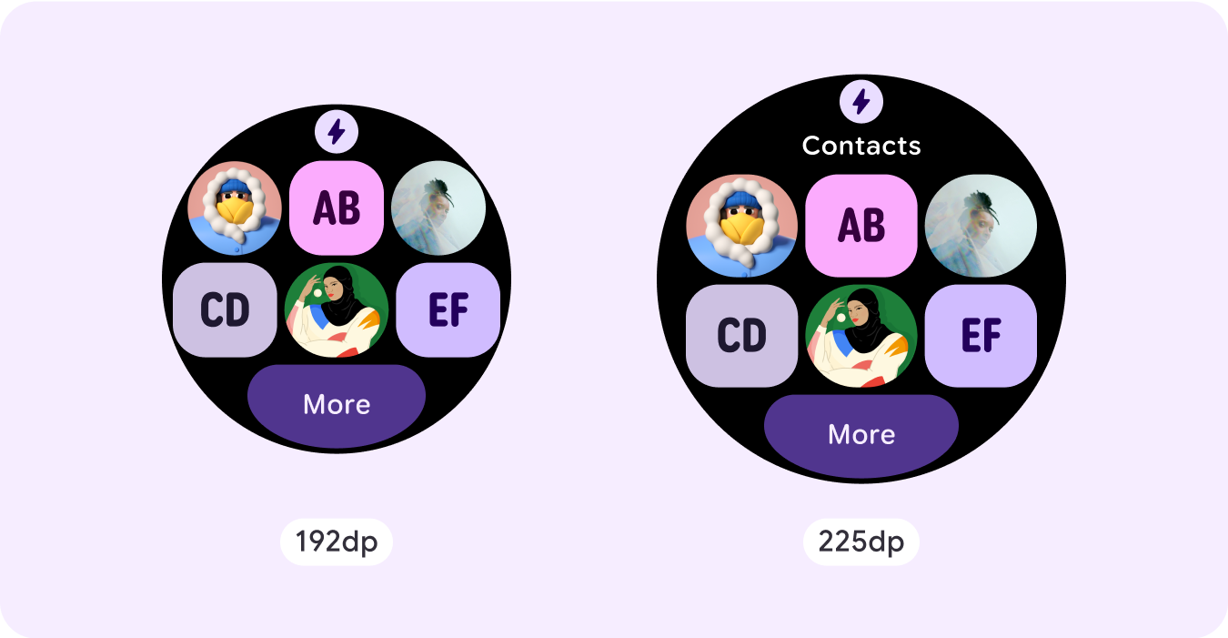
Increase the size or change the state of the existing components
This could be done in order to show more detail or make the content more glanceable.
Add component slots within the current layout
By adding components, the layout provides more options or additional details. Make sure the content remains glanceable, though.
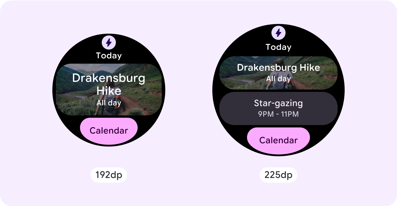

Add more content at the bottom
In some cases, it makes more sense to add action buttons or content in the bottom section, rather than adding components within the main slot.
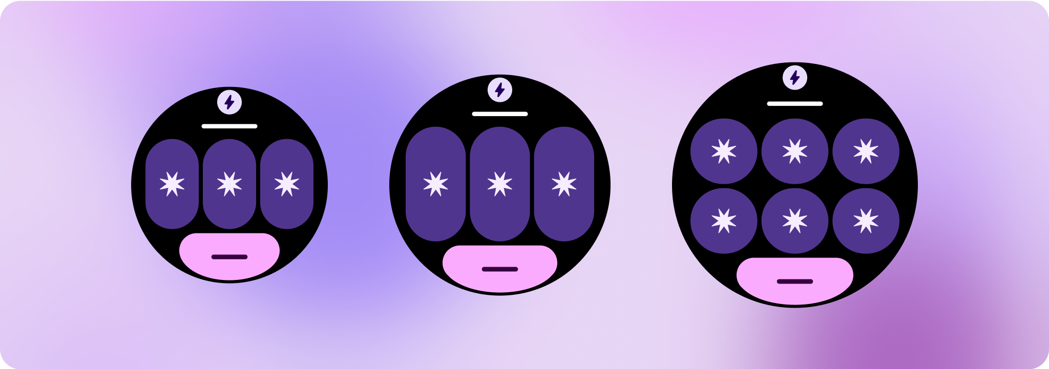
Caution: A larger display size should never display less information than ones that are smaller than it. This is especially relevant for custom behaviors added in at the breakpoint.
A common example of this is when components or text sizes are increased past the breakpoint and end up showing less are the larger screens. Screens should always show more value with increasing size.
Responsive and adaptive behavior
The responsive and adaptive behavior depends on the three slots (sections) of the layout.
App icon and title slot
There is no behavior change on the app icon that the system provides. The title slot automatically adapts to the wider screen size, displaying additional characters. There are proportional (percentage) internal margins on the top section to avoid any clipping when the screen size increases.
Main slot (components)
All components within the main slot should set their width and height to "expand" so that they automatically adapt to the wider screen size. There are proportional (percentage) internal margins on the main slot section—and each row within this slot in some instances—to avoid any clipping when the screen size increases. If you use a combination of corner radius and layout, your main slot might require larger margins.
Bottom slot
There is no behavior change in the bottom button or text, but the width of the button and text boxes automatically adapt to the wider screen size, and gain characters. There are proportional (percentage) internal margins on the bottom slot to avoid any clipping when the screen size increases. When no bottom slot is present, a default margin is added automatically.
Create differentiated experiences
One fully customizable layout, with 60 or more permutations built into it, allows for practically limitless customization. Tiles are built on a slot-based system, so you can replace a slot from the canonical layout with any content or component, and set the component to one of the many variants and color combinations. In this case, maintain responsive behavior and follow our design recommendations.
These customizations should be limited, and shouldn't deviate from the tile template. This is to maintain consistency when users scroll through the tiles carousel on their Wear OS devices.