Design on black
Designing on a black background is crucial for Wear OS for two key reasons:
- Battery efficiency: Each pixel illuminated on the screen consumes power. By using a black background, you minimize the number of active pixels, extending battery life.
- Seamless aesthetics: A black background helps to visually minimize the watch bezel, creating the illusion of a continuous surface that extends to the edge of the device. Containing UI elements within this space further enhances this effect.
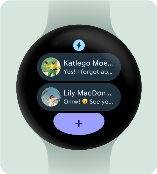
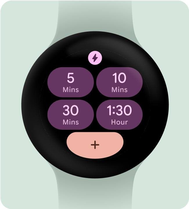
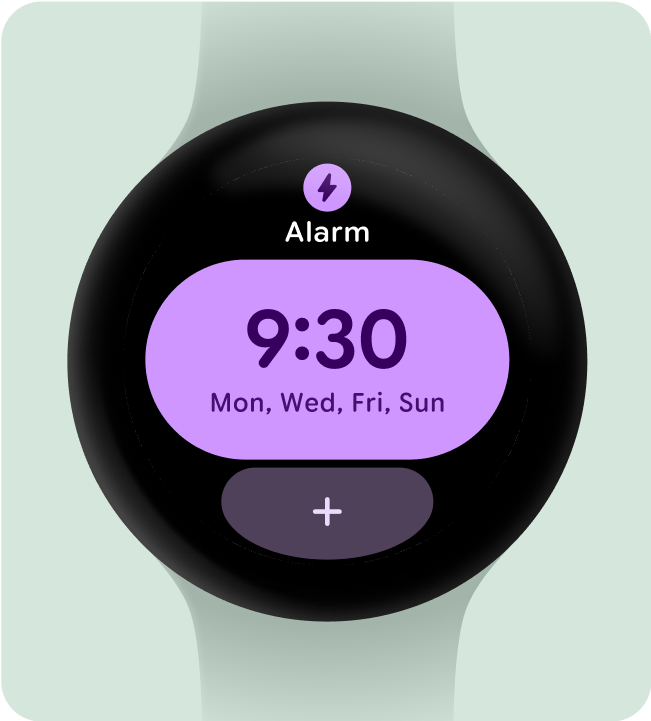
Do this
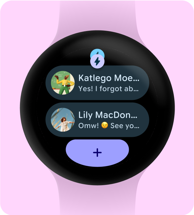
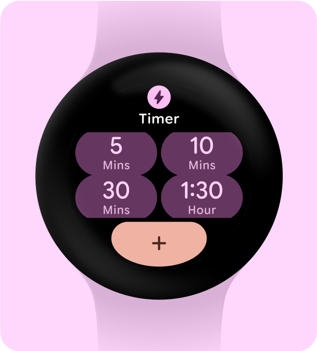
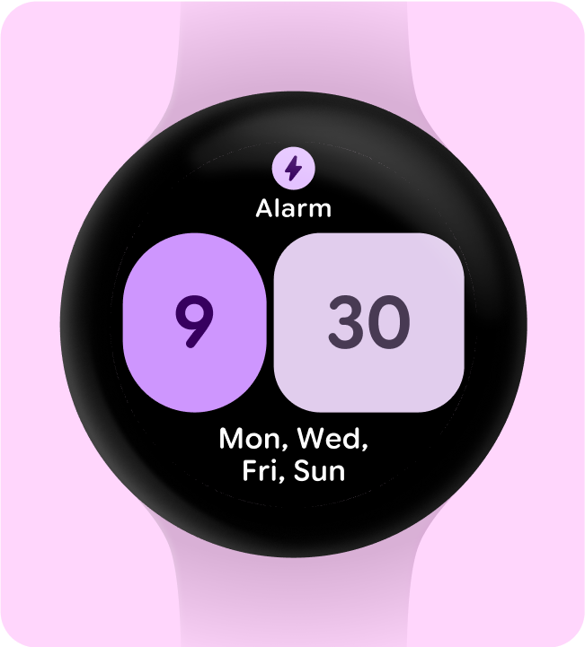
Don't do this
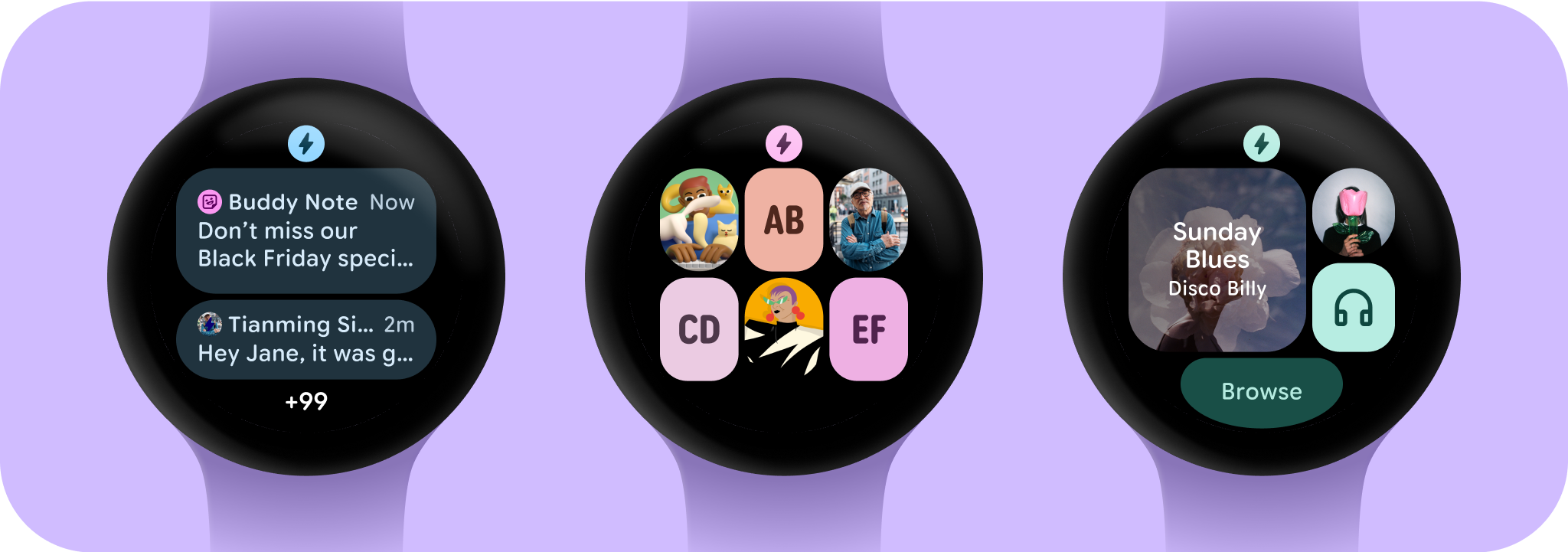
Include only necessary elements
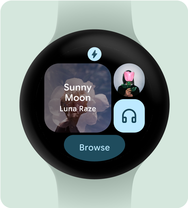
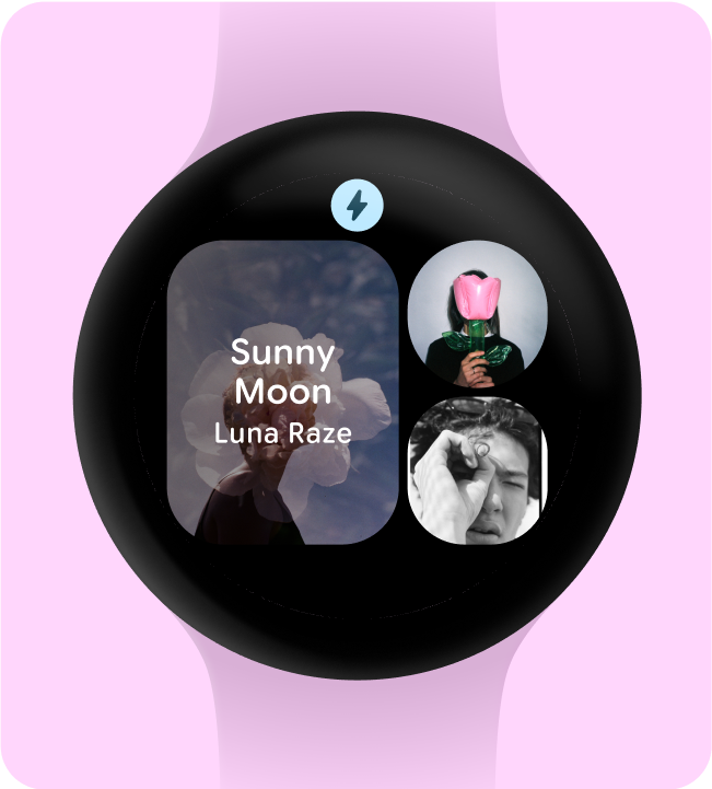
When opt-ed in (for example, using ProtoLayout Material3 PrimaryLayout), Wear OS will automatically display the permanent app icon, which will automatically display as the user scrolls through the Tile carousel. The app icon should not be designed and added as part of the Tile.
Ensure the app icon provided is monochrome if you are having dynamic theming on your tile. Check Android product icon guidelines about how to create the app icon for your brand.
Do this
Don't do this
Hide app titles to ensure minimum tap targets
To ensure enough space for interactive elements on smaller screens, the app title can be hidden when a Tile uses two rows (and a bottom section). This ensures the rows are tall enough (at least 48dp). The title can reappear on larger screens (225dp+).
Do this
Don't do this
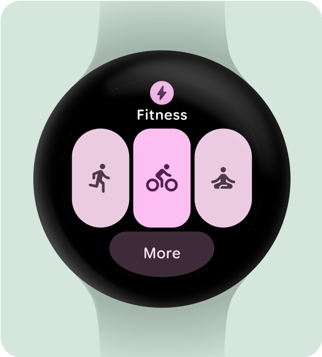
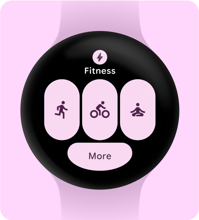
Choose a single primary use-case to highlight
To make sure users know what to do with each Tile - whether it's opening an app, starting an activity, or learning more - we need them to include at least one interactive element in their layout.
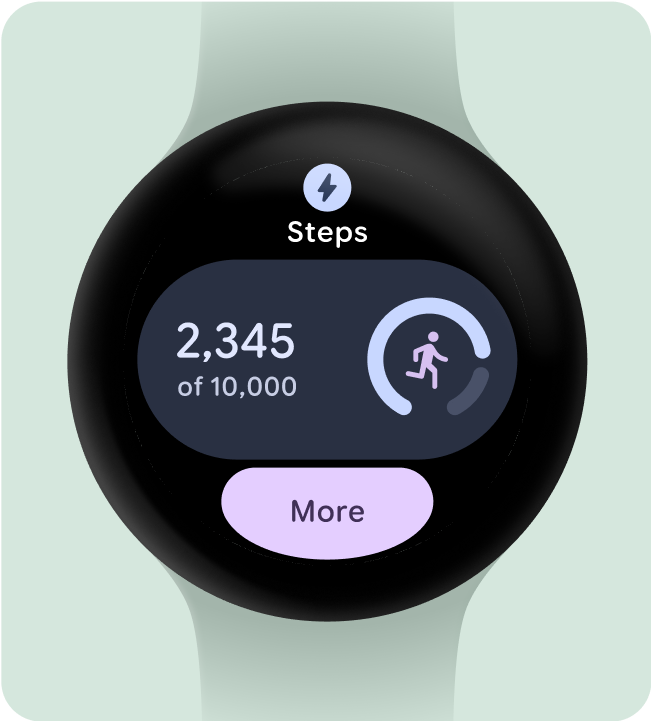
Do this
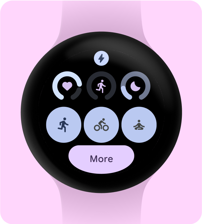
Don't do this
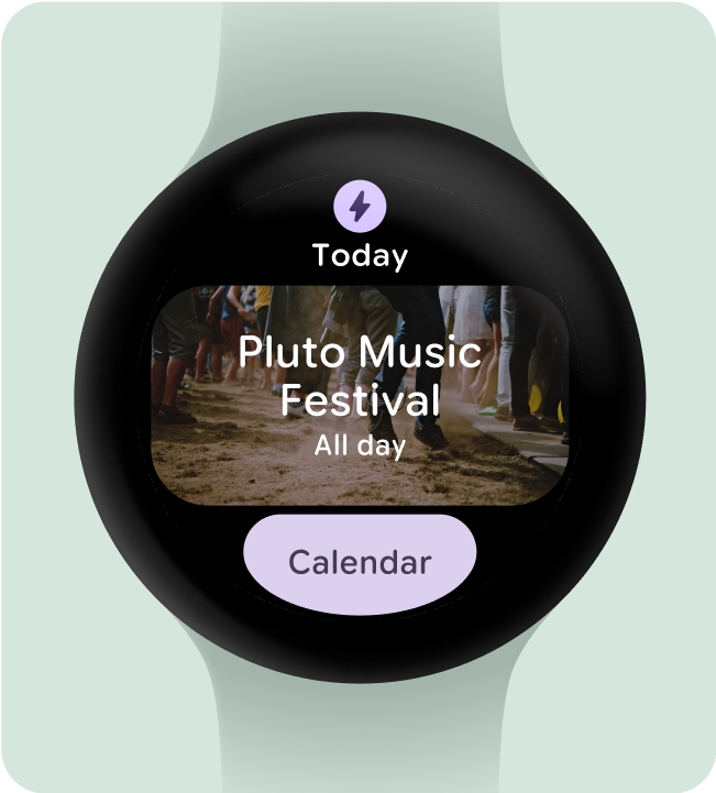
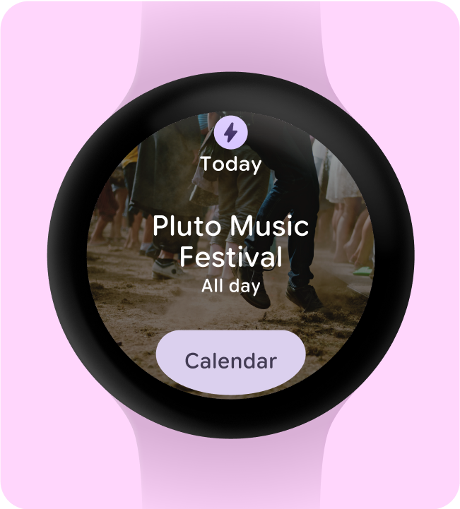
Include (at least) one container
Each tile in the app must contain at least one container element and be fully tappable, linking to a corresponding screen within the app. The Tile's information, whether contained within the container or presented separately, must clearly communicate the linked content or available action.
If buttons are used, they should adhere to standard design conventions and provide a clear indication of their function.
Do this
Don't do this
Make actions instantly understandable
Experiences on the watch don’t have the luxury of having ample space to communicate their meaning, so the most effective Tiles have easily predictable interactive components.
Do this
Don't do this
Visually prioritize actions
To help users understand the most important action on a Tile, interactive containers should be visually prioritized.
- Use primary colors on primary action buttons.
- Use secondary/tertiary colors on secondary actions
Do this
Don't do this
Simplify into fewer containers
Tiles should seek to refrain from using more than one interactive component to trigger a specific action, and instead attempt to simplify the overall layout into fewer containers.
Do this
Don't do this
Use containers for functional purposes
To ensure users can anticipate what each component within a Tile will do, we don’t recommend using containers for decorative or structural purposes to avoid taps that don't do anything.
Do this
Don't do this
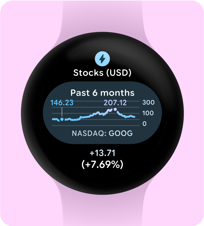
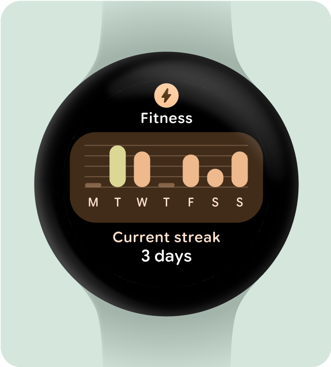
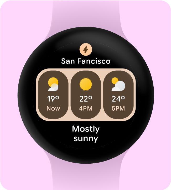
Show glanceable representations of graphs and charts
Glanceability is key for Wear OS design. With limited screen time (around 7 seconds), prioritize essential information in a clear format, that's easy to understand at a glance.
Remember, the watch complements the phone experience, providing quick access to key details.
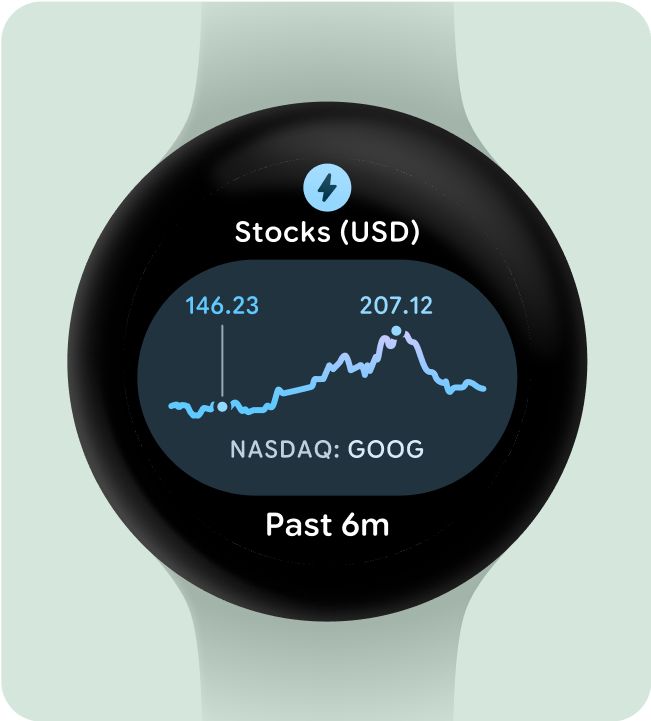
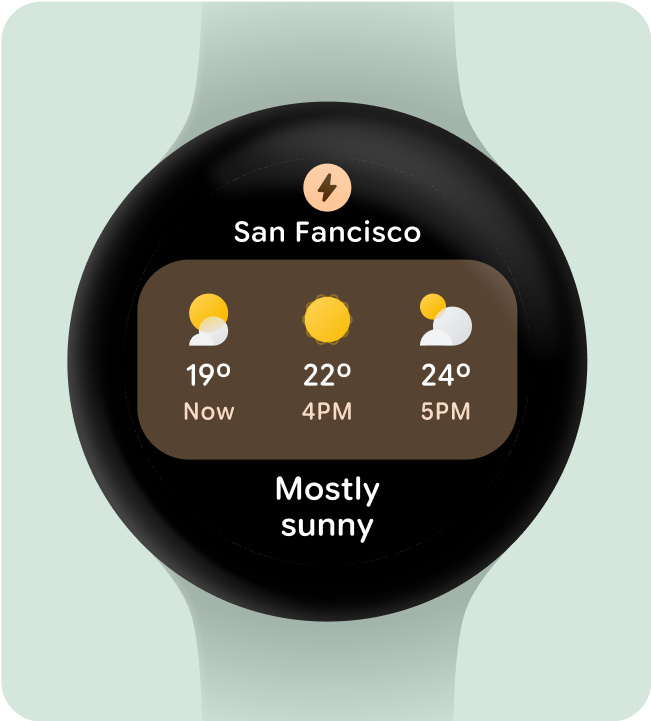
Do this