
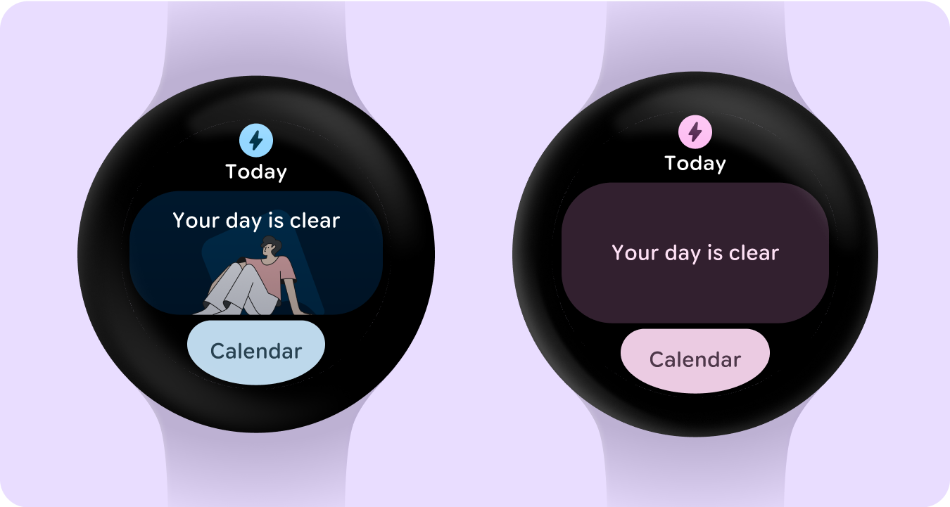
Empty states aren't always caused by an error or lack of data, but could be a logged out state, or a happy message communicating a clear diary. In some cases the empty state is the most common state, which creates an opportunity to customize the the empty state to feel more unique, positive and complete or populated.
All empty states should have a clear call-to-action to the user knows what to do to fix a potential issue, or find out more information.
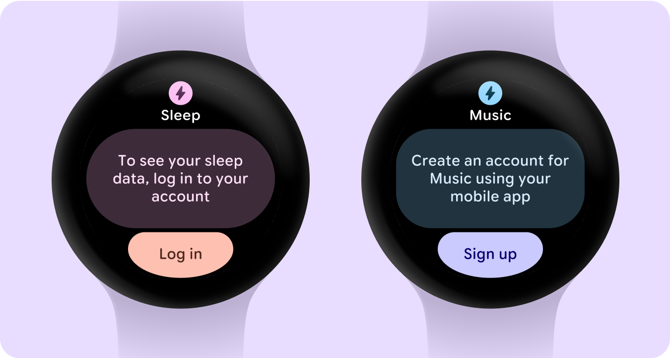
Sign-in states
Tell the user that they need to update their settings or preferences, log into their account, or create an account either from their watch or mobile app from the Tile.
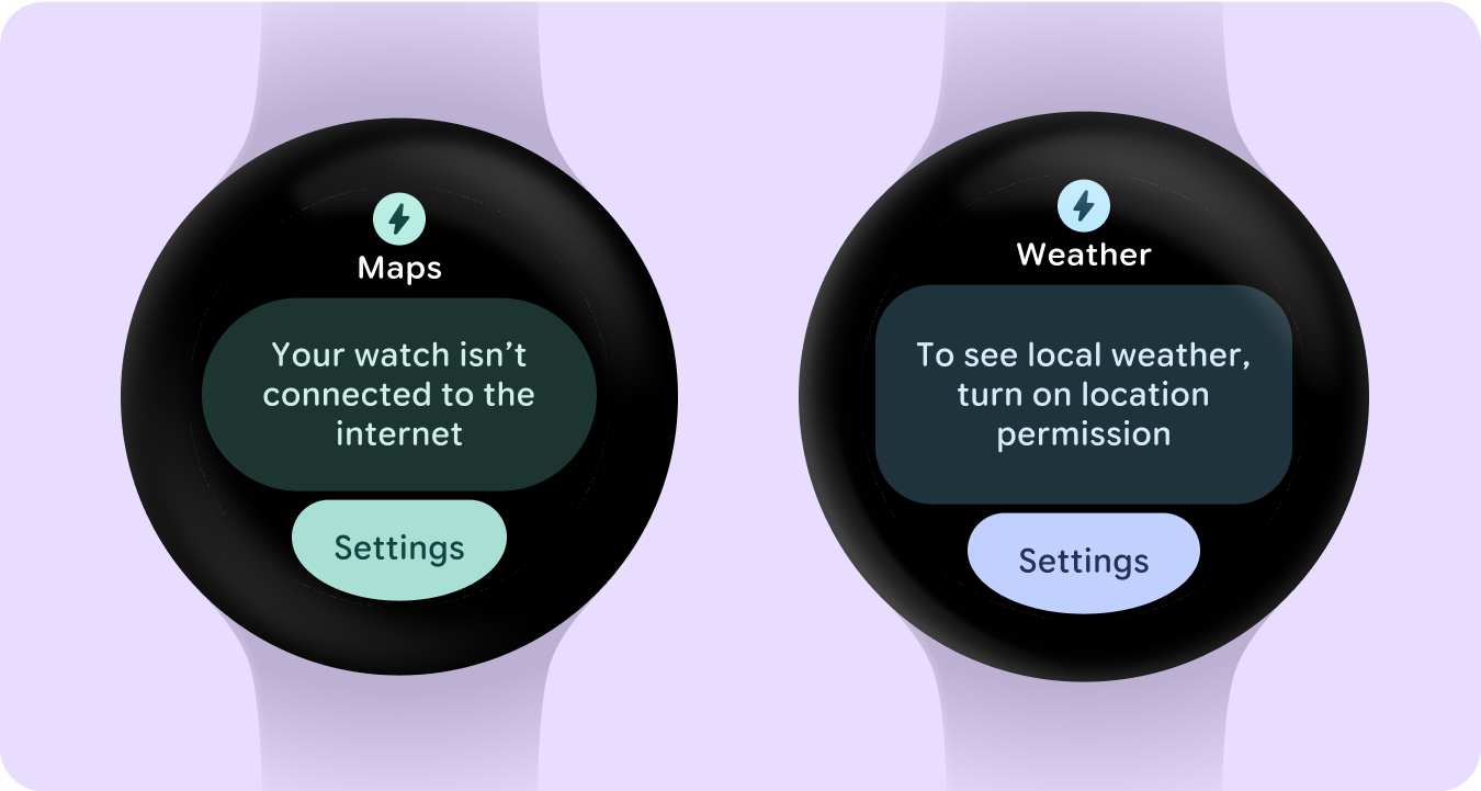
Error states
Provide a clear call-to-action to fix potential issues when viewing your Tile data.
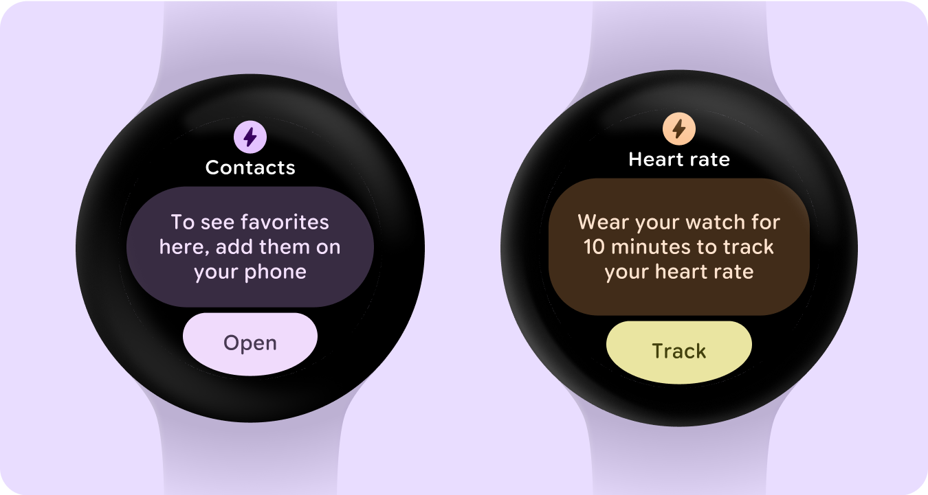
Empty states (no data)
Describe what is causing the lack of data and how a user can rectify the issue.
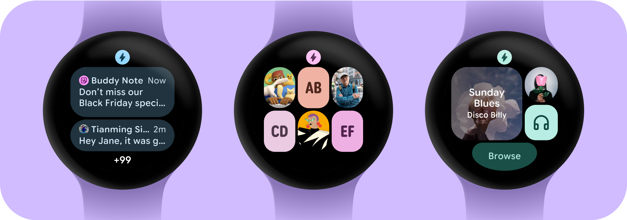
Empty states (content)
Empty states aren't always caused by an error or lack of data. In some cases the empty state is the most common state. This creates an opportunity to customize the design by adding an image to make the empty state feel complete as a populated state. Alternatively, the card will be the default text on a tonal background.
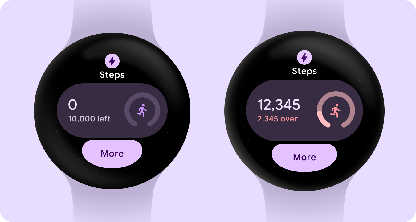
Empty states (progress)
Here is an example of how certain components cater to empty and overflow states when tracking data or progress.
Ongoing (reference) states
When an app performs a long-running activity—such as tracking a workout or playing music—it should show the progress of the ongoing activity in one of more tiles. If your app also supports Tiles that allow users to start these activities, do the following to minimize user confusion: Indicate that an ongoing activity is already in progress. If the user taps on such a Tile, launch your app and show the in-progress activity. Don't start a new instance of an ongoing activity.