Non-scrolling views focus on glanceable information and offer users value with little or no interaction. Because of that, it can be challenging to build responsive behavior into these layouts.
Preset non-scrolling layout components
Dialog
A dialog is a transient overlay that occupies the whole screen. It lets users perform a single action.
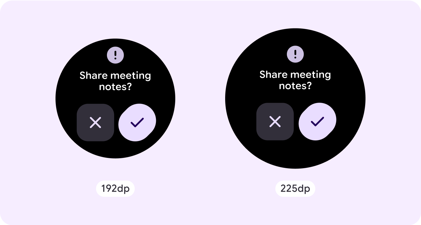
- Dialogs focus your attention to verify their content is addressed.
- Dialogs should be direct in communicating information and dedicated to completing a task.
- Dialogs should appear in response to a user task or an action, with relevant or contextual information.
Confirmation overlay
The confirmation overlay displays a confirmation message to the user for a short period. Use this component to capture the user's attention after an action has been executed.
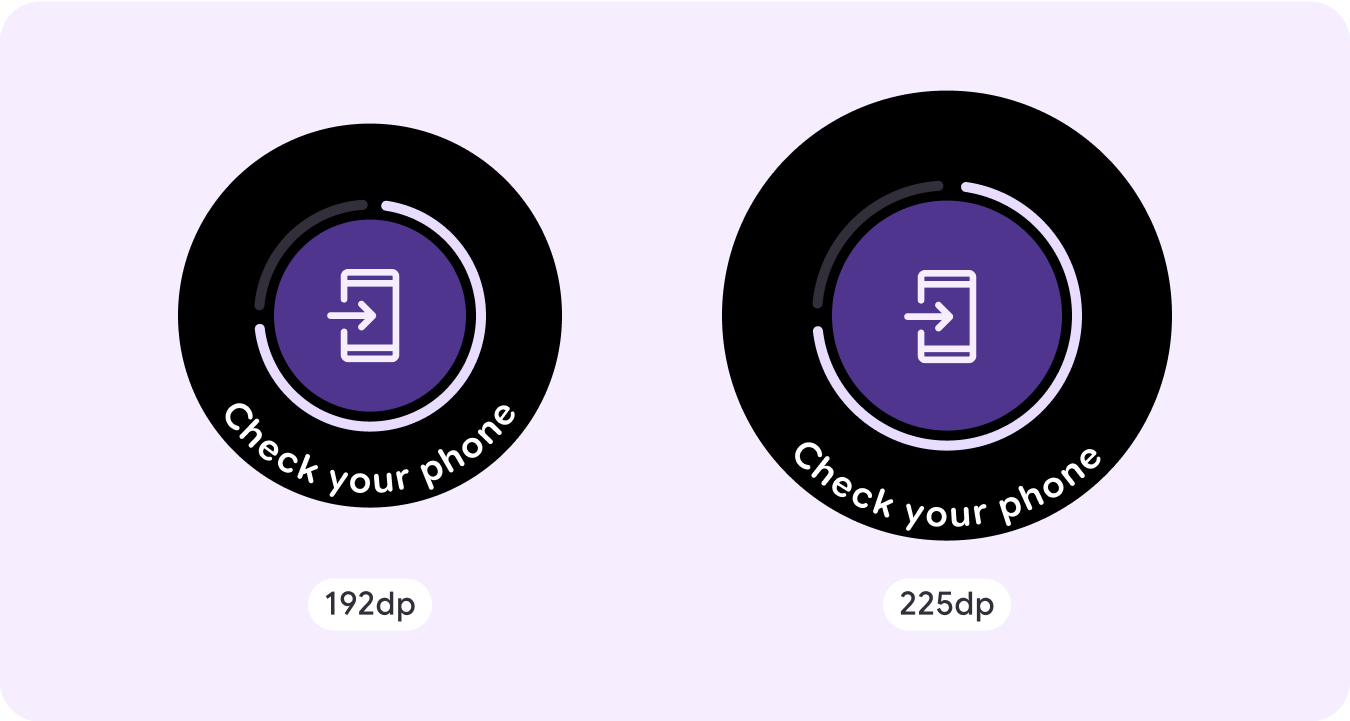
Open on phone
The open on phone overlay is triggered when the user chooses to continue their journey on a phone. The overlay has a progress indicator and tells the user when to check their phone.
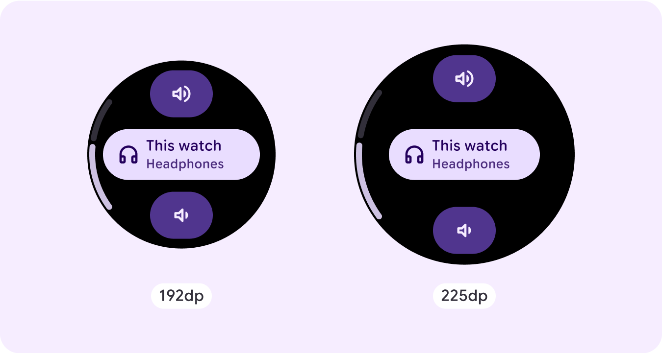
Stepper
Steppers provide a full-screen control experience that let users make a selection from a range of values. They can control the interaction using the buttons or crown, and the specific level is shown using a curved level indicator.
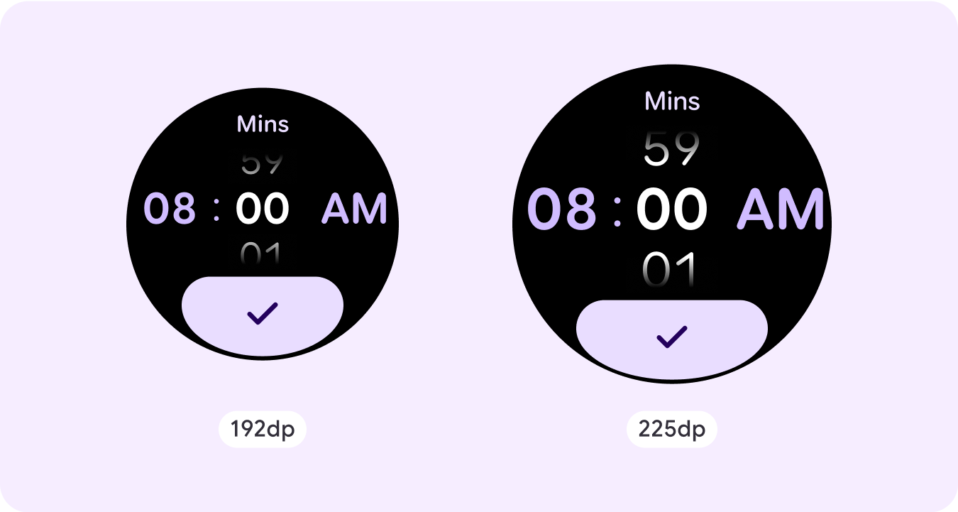
Time picker
Pickers let users choose among a finite number of items in scrollable sections. The Time Picker has up to three columns, depending on whether seconds are available or if the clock is a 12-hour or 24-hour clock. Users interact with each column at a time, making your selection by leaving the number in focus before continuing.
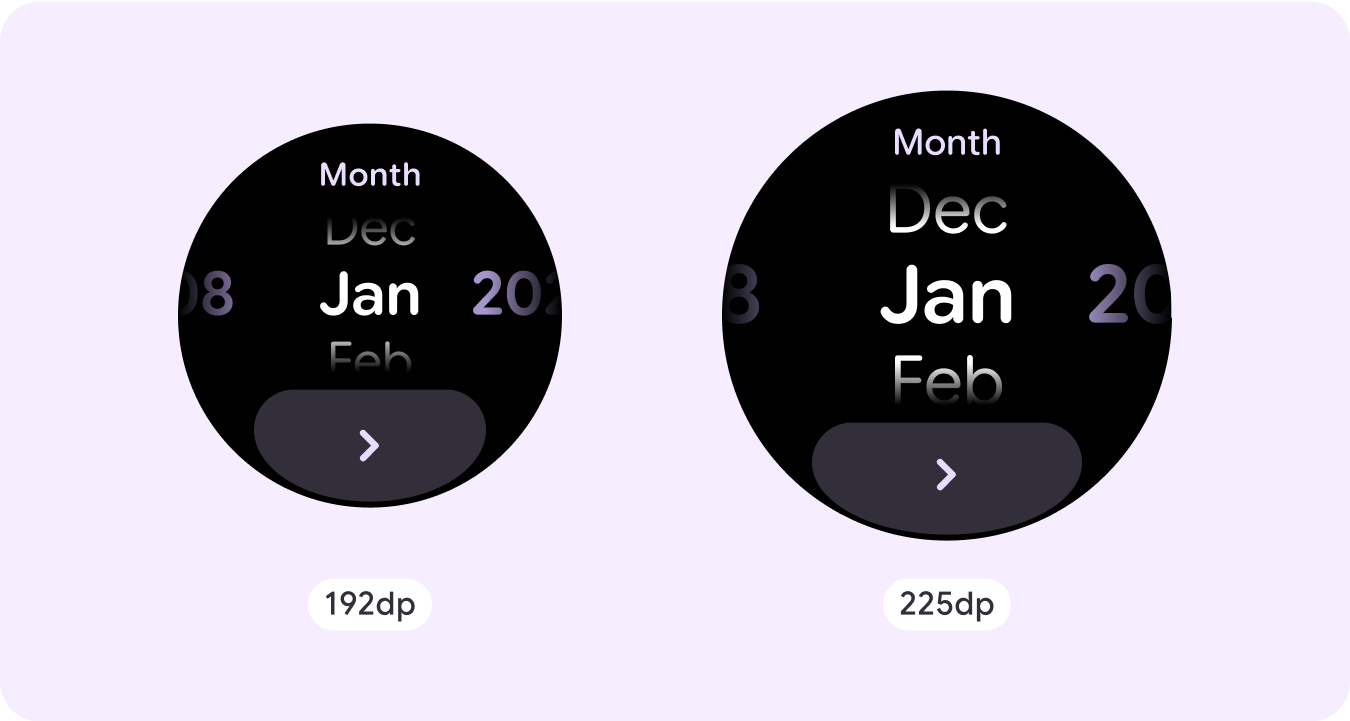
Date picker
Pickers let users choose among a finite number of items in scrollable sections. The Date Picker has up to three columns, which have an interchangeable order between date, time, and year, depending on the use case. Date Pickers require longer strings of content, so only one column is in view at a time, giving a hint of what's to the left or right. Users interact with each column at a time, making their selection by leaving the number in focus before continuing.
Custom non-scrolling layout examples
Non-scrolling app screens are not limited to the set components. You can combine a combination of elements to create the layout you want.
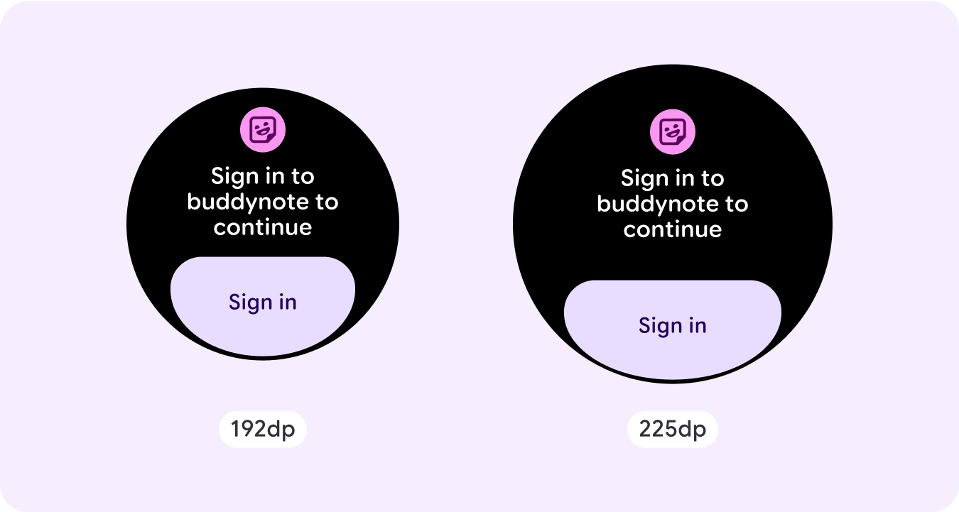
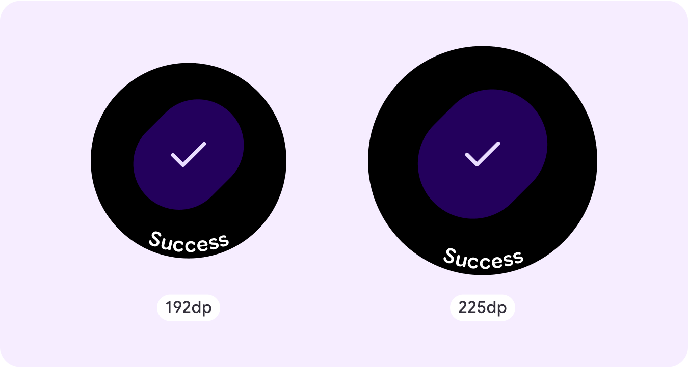
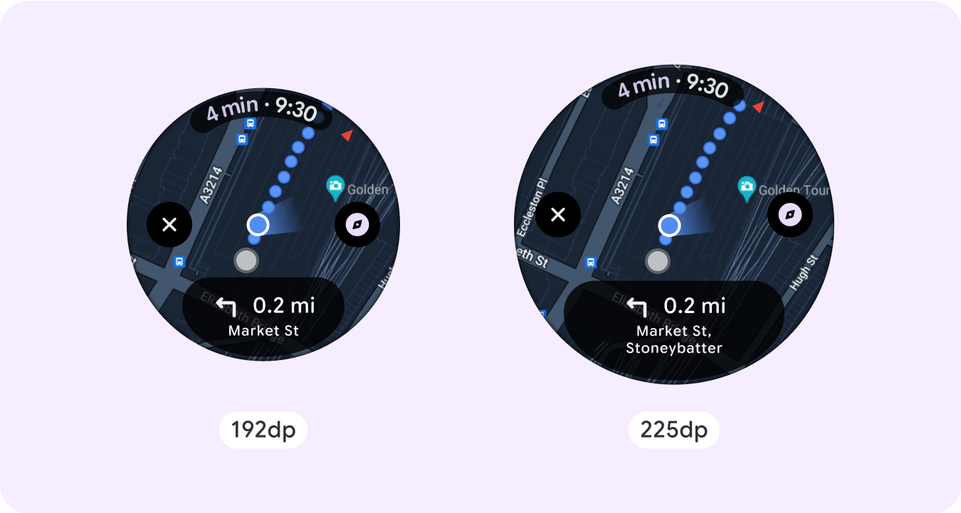
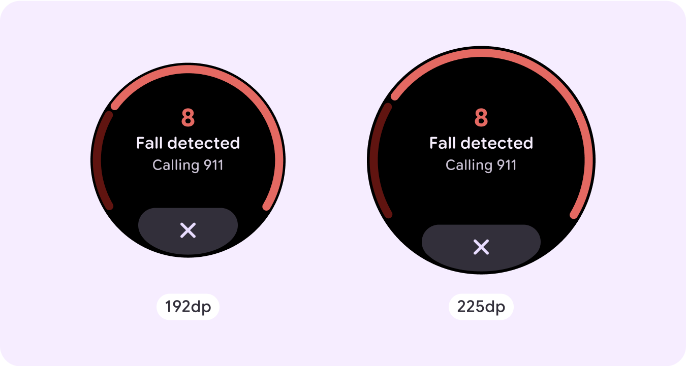
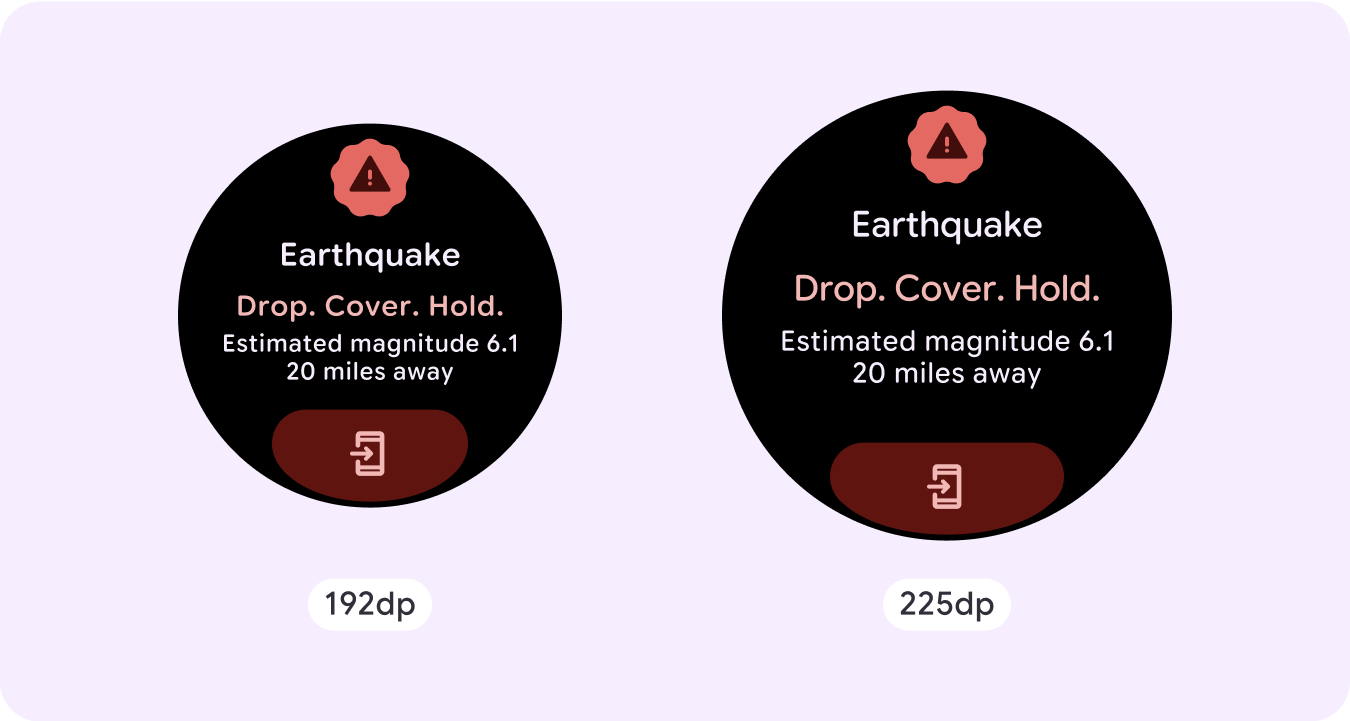
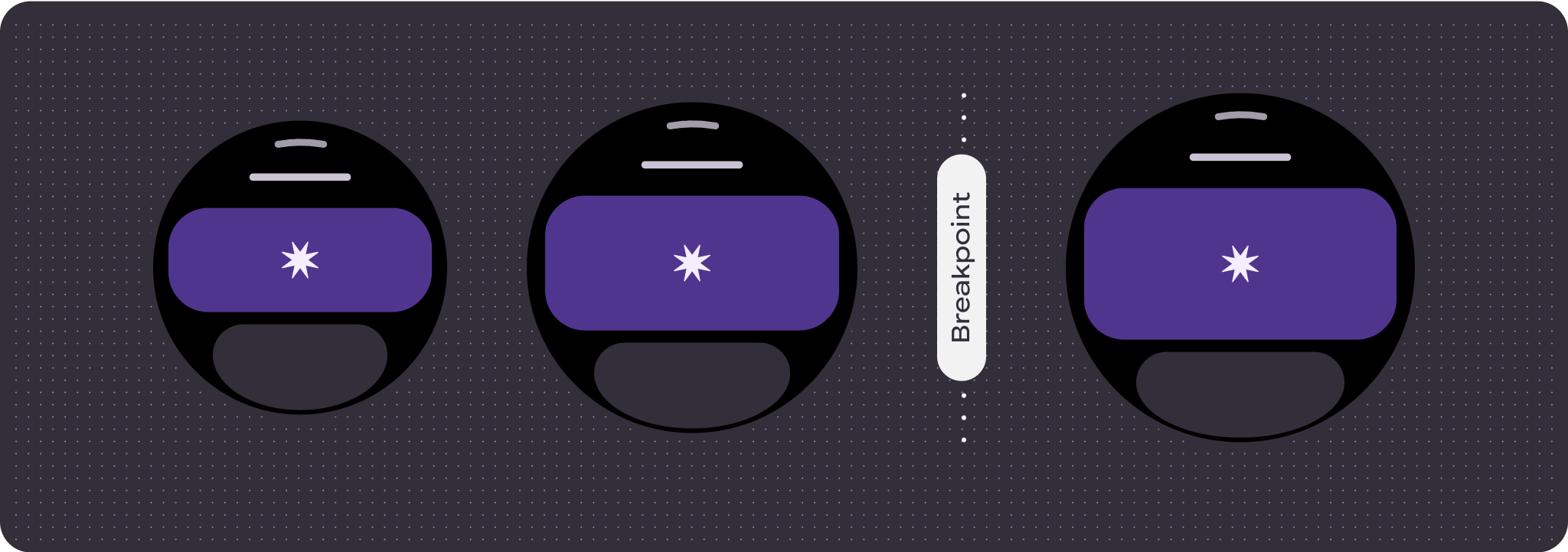
You should be mindful of the limited space on a non-scrolling screen and the use of responsive (percentage) margins and padding to use the available screen space. You can also consider applying a breakpoint at 225dp to introduce additional content or make existing content more glanceable when on bigger screen sizes.
Maps
Emergency overlay
Emergency alert
Responsive and adaptive behavior
All components in the Compose library automatically adapt to the wider screen size and gain width and height. For these views in particular, utilizing breakpoints can deliver a particularly rich and valuable experience for all users.
For many of your UI's buttons, cards, and margins, stretch and fill the space for different screen sizes to take advantage of the available space on the UI and also make for a well-balanced layout.
Use the following checklist to verify that responsive parameters are properly defined:
- Create flexible layouts that look reasonable on all screen sizes.
- Apply the recommended top, bottom, and side margins.
- Define margins in percentage values in places where content might otherwise be clipped.
- Utilize layout constraints so that elements make the best possible use of the space within the screen and maintain balance across different device sizes.
- Accommodate Time Text if used, but don't overlap the top section of the page.
- Consider using edge-hugging buttons to utilize more of the limited space.
- Consider applying a breakpoint at 225dp to introduce additional content or make existing content more glanceable when on bigger screen sizes.
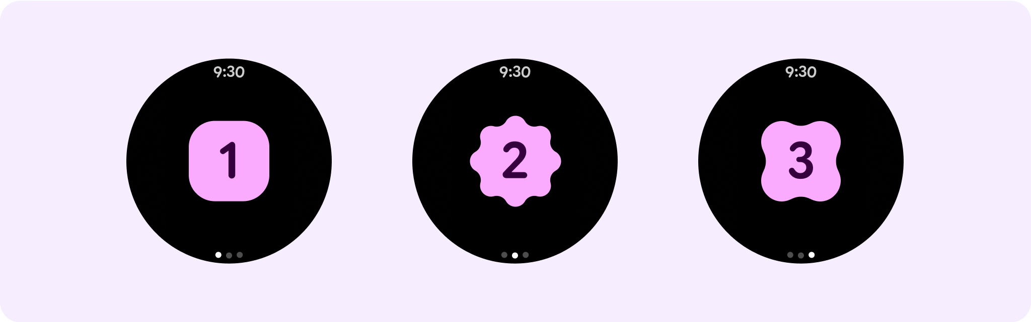
Multiple non-scrolling page journeys using pagination
In scenarios where an experience requires more content but wants to retain a non-scrolling layout, consider a multi-page layout with either vertical or horizontal pagination.