
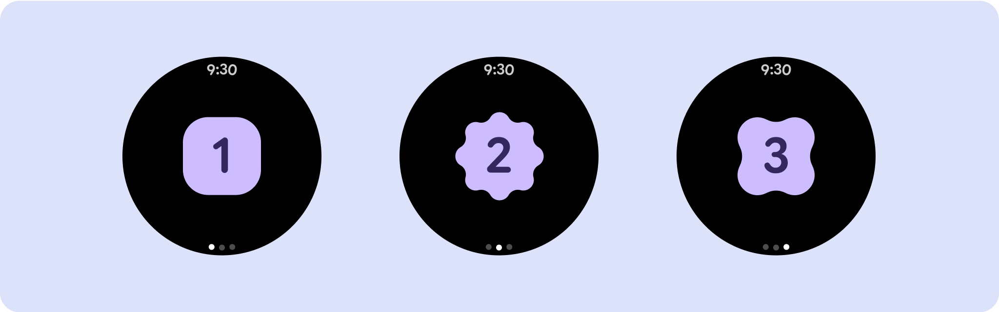
Non-scrolling app view layouts include media players, confirmation dialogs, pickers, switchers, and special fitness or tracking screens using progress indicators. You can restrict the height of any screen, which ensures the user is focused on one task or set of controls, rather than needing to browse through a list of options. To accommodate devices with smaller screen sizes, design with the limited size in mind, ensuring glanceability and embracing the circular screen where relevant.
Build responsive and optimized designs
Non-scrolling views focus on glanceable information and offer users value with minimal interaction. However, building responsive behavior into these layouts can be challenging. To address this, we have updated our Android UI library layouts and components with built-in responsive behavior, including percentage-based margins and padding. If you're utilizing our Compose components, you can automatically inherit this responsiveness.
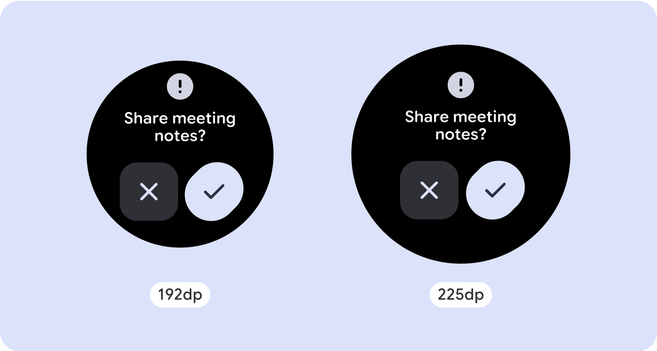
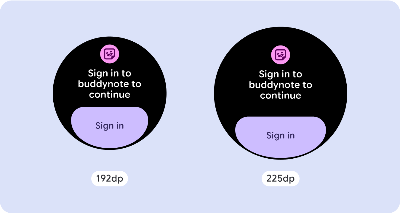
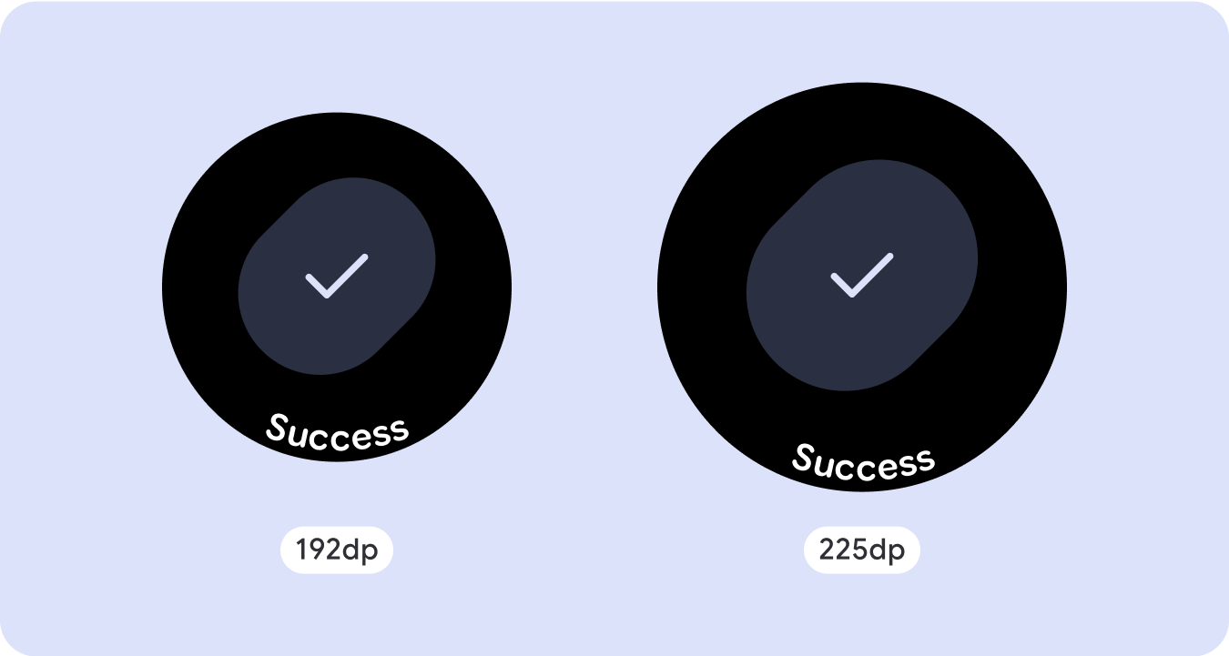
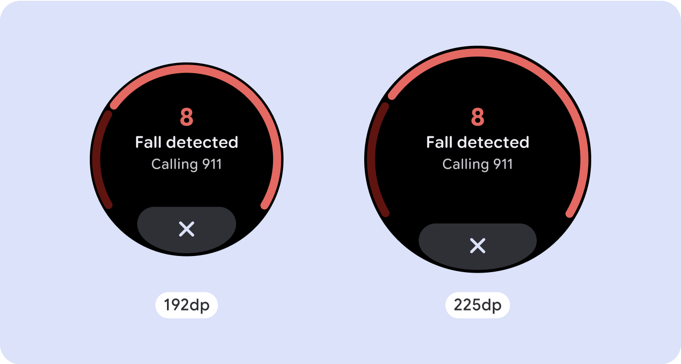
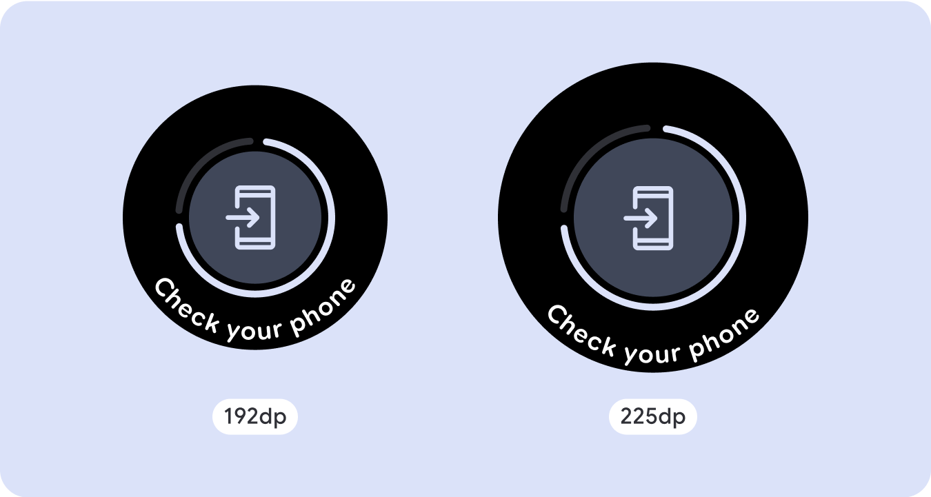
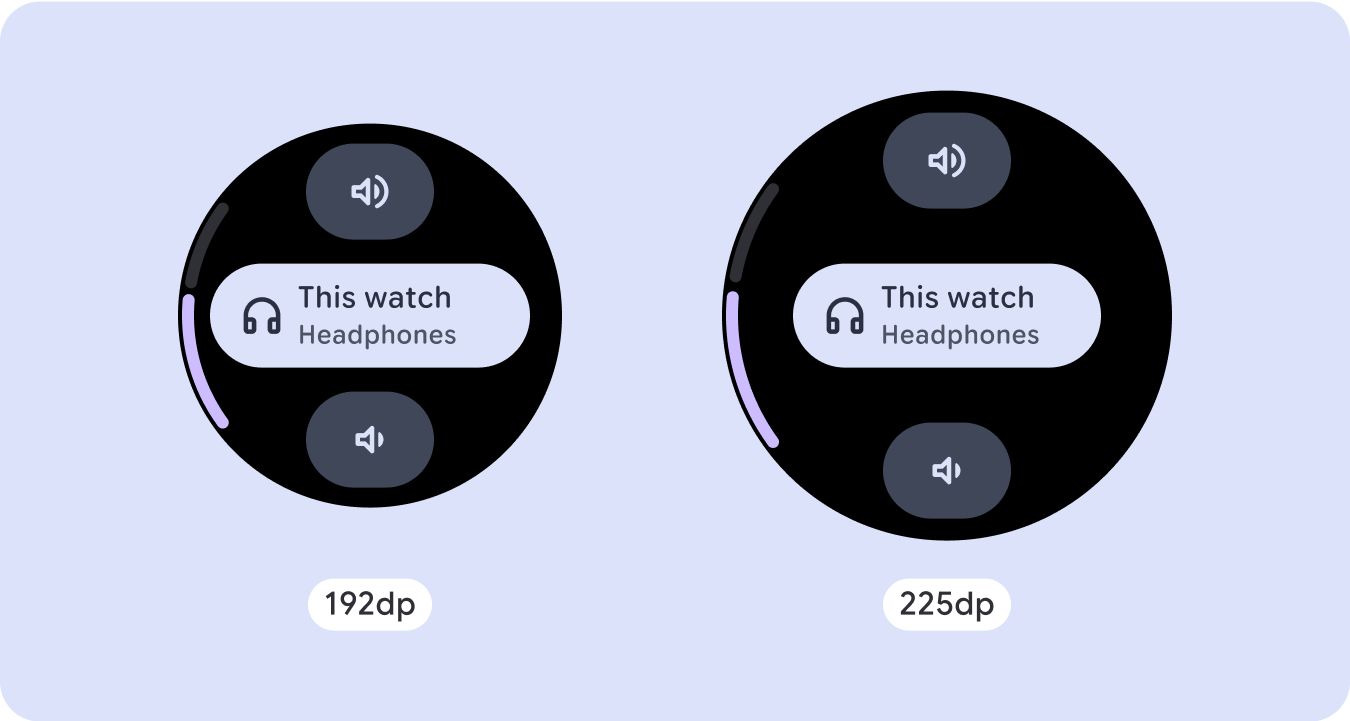
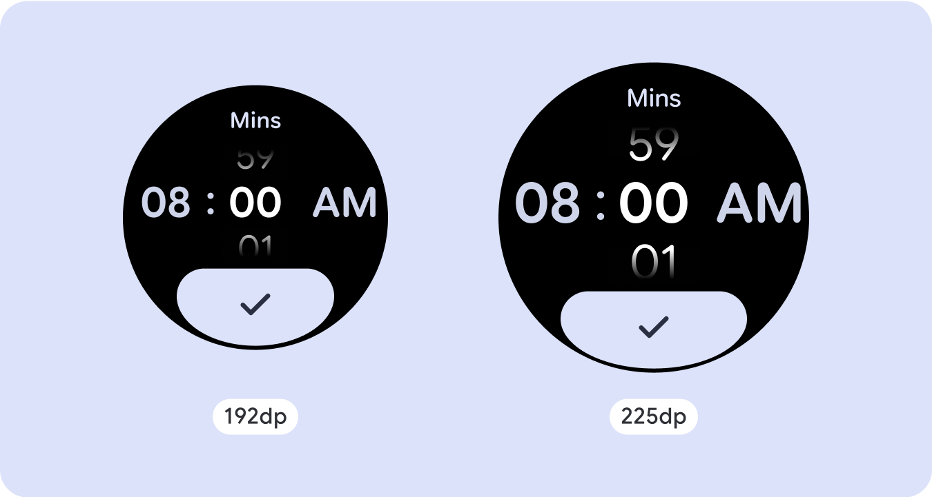
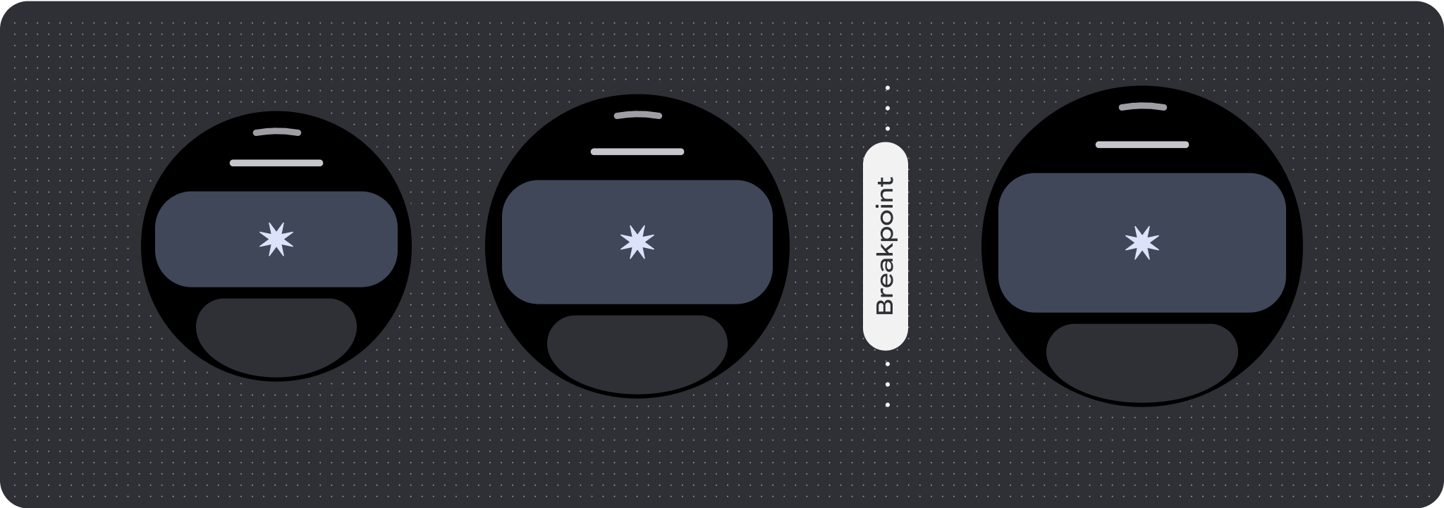
For unique screen designs, thoroughly test across a variety of screen sizes, ensuring components and elements adapt smoothly and avoid content clipping. Our percentage margins help spacers scale effectively, and we recommend using a breakpoint at 225dp to introduce additional information and enhanced functionality on larger watch screens.
Check that components adapt to the available width and height
All components are built responsively, meaning they adapting to the available width (and height when full screen). Make sure you have the necessary margins to ensure content doesn't get clipped by the rounding curve of the screen. Additionally, ensure the necessary layout behavior to ensure your non-scrolling screen content doesn't push the layout to scroll or get cut off.

Build adaptive and differentiated designs
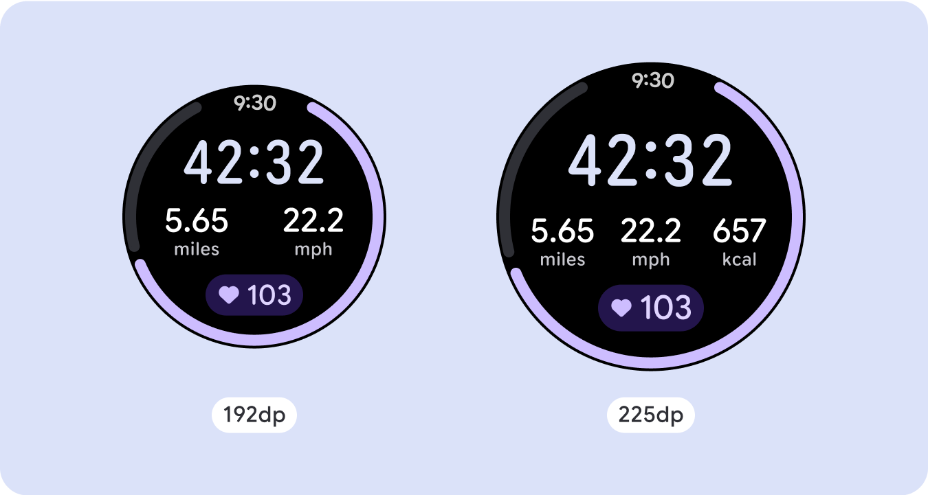
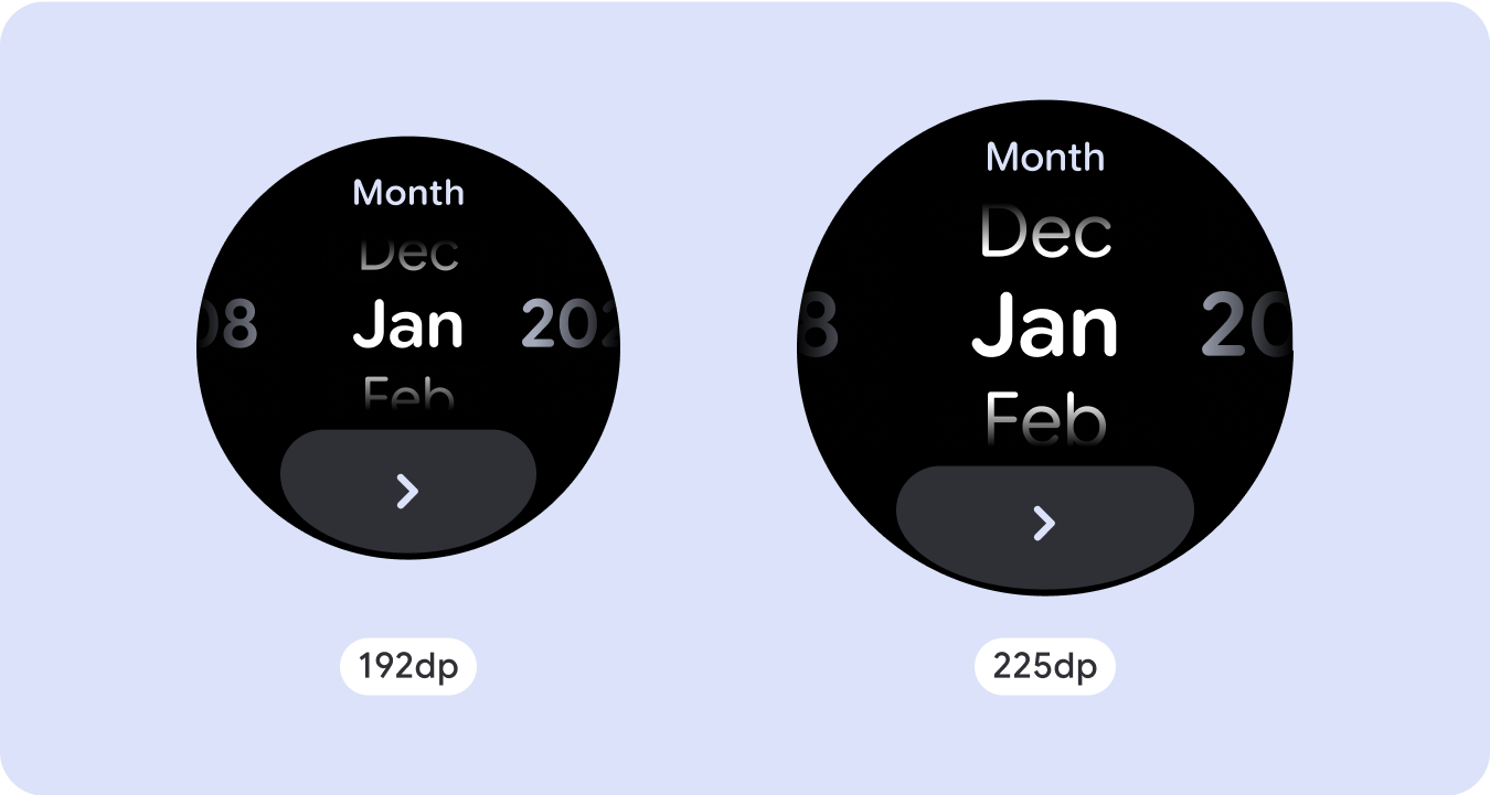
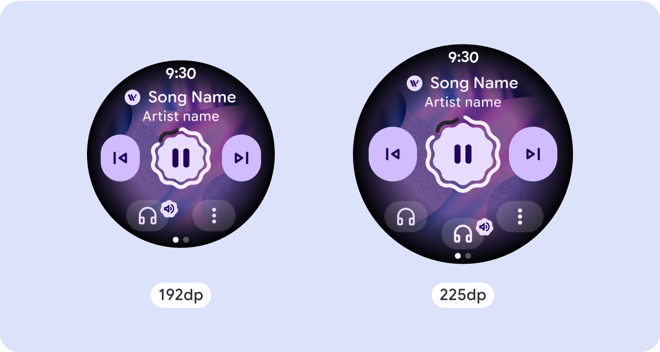
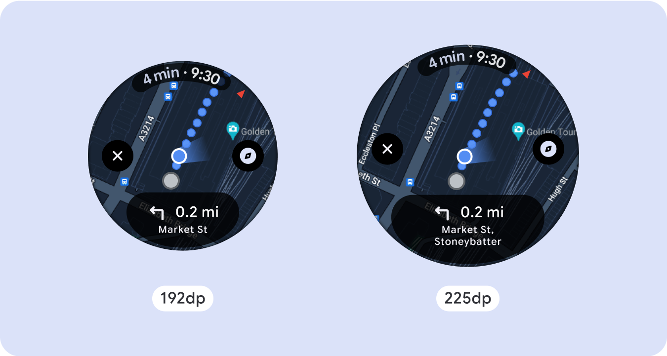
In order to best use the additional space on larger screen sizes, add a size breakpoint at 225dp. This breakpoint makes it possible to reveal additional content, include more information, options, data, or change the layout to better suit the larger screen size.
This requires a different design for each breakpoint. The larger screen design (225+) could include the following additional elements:
Increase the size or change the state of the existing components
Use the breakpoint to show more detail or make the content more glanceable. Just make sure the experience or functionality isn't broken on small screen and the large screen changes are only additional.
Add content within the current layout
By adding components or content, the layout provides additional options, detail and ultimately, value.
This should never come at the cost of the glanceability.
Use pagination
In scenarios where an experience requires more content but wants to retain a non-scrolling layout, consider a multi-page layout with either vertical or horizontal pagination.
Responsive and adaptive behavior
All components in the Compose library will automatically adapt to the wider screen size, and gain width and height. For these views in particular, utilizing breakpoints can deliver a particularly rich and valuable experience for all users. Define all margins in percentages, and define vertical constraints such that the main content in the middle can stretch to fill the available display area.
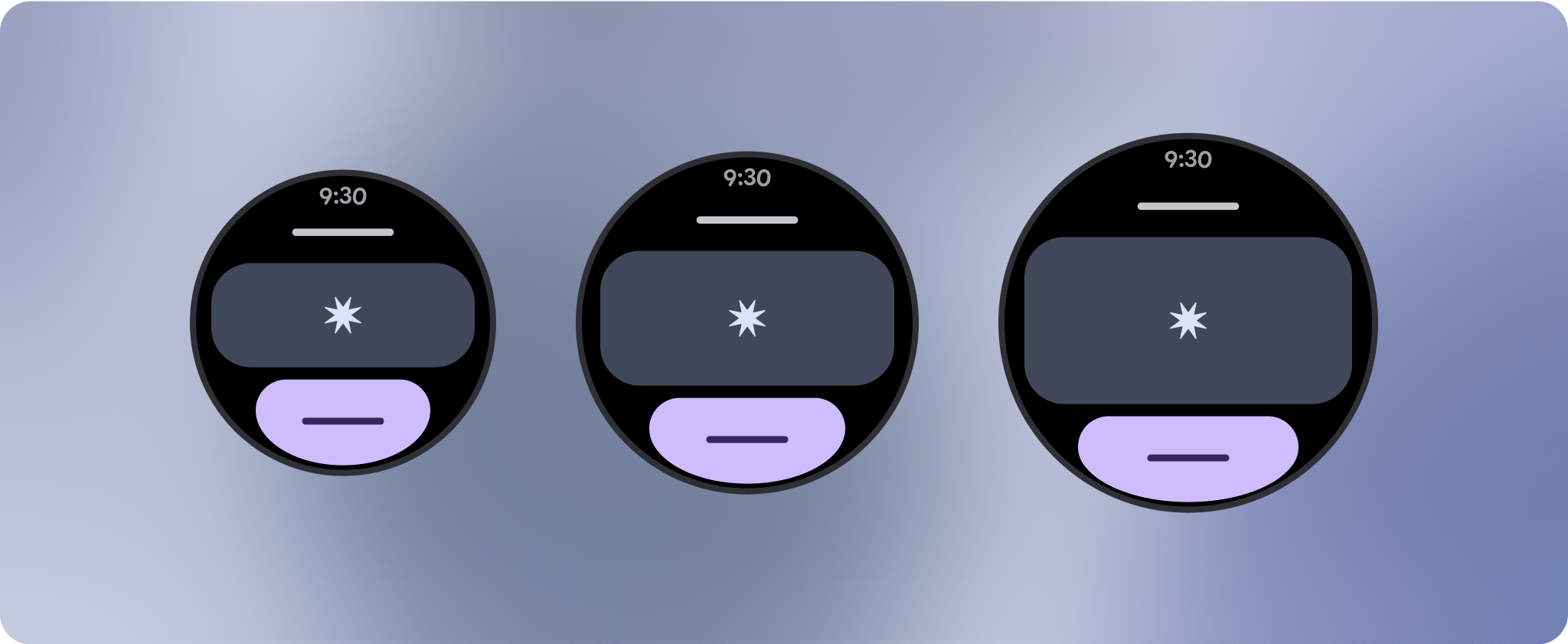
It's best to break a non-scrolling screen into a top, middle, and bottom section when designing. This way, you can add inner margins to the top and bottom section to avoid clipping, but allow your middle section to take advantage of the full width of the screen. Consider the use of the rotary scroll button to control elements of the screen when its size is limited, as tapping interactions alone may not provide the best experience.
Checklist
- Create flexible layouts that look reasonable on all screen sizes.
- Apply the recommended top, bottom, and side margins.
- Define margins in percentage values in places where content might otherwise be clipped.
- Utilize layout constraints so that elements make the best possible use of the space within the screen and maintain balance across different device sizes.
- Accommodate Time Text if used, but not overlapping the top section of the page (see progress indicators with a top gap for more)
- Consider using edge-hugging buttons to utilize more of the limited space.
- Consider applying a breakpoint at 225dp to introduce additional content or make existing content more glanceable when on bigger screen sizes.
Full screen progress indicators
There is no behavior change on the progress indicator as it automatically adapts to the screen size, however, consider applying proportional (percentage) margins and padding on the central area to best utilize space. Also consider a breakpoint to increase the size or number of components on larger screen.

Create differentiated experiences
Non-scrolling layouts are customizable, but are more limited in how much content can be added to the screen and what kind of components work best. Using Icon Buttons instead of wider pill shaped Buttons makes better use of the limited space, and visual graphics like Progress Indicators and large data points help communicate key information in a graphical way. All elements that hug the screen bezel automatically grow with the screen size, so they become even more impactful.
