
Hierarchy is communicated through differences in font weight, size, line height, and letter spacing. The updated type scale organizes styles into six roles that are named to describe their purposes: display, title, label, body, numeral and arc. The new roles are screen size-agnostic, allowing easier application across a variety of use cases.
Display styles
Display is utilized for large, short strings of text used to display highly glanceable hero information, significant metrics, confidence or expressive brand moments.
- DisplayLarge is the largest headline. Displays are the largest text on the screen, reserved for short, highly glanceable hero information, significant metrics, confidence or expressive brand moments which benefit from a prominent scale and style.
- DisplayMedium is the second largest headline. Displays are the largest text on the screen, reserved for short, highly glanceable hero information, significant metrics, confidence or expressive brand moments which benefit from a prominent scale and style.
- DisplaySmall is the smallest headline. Displays are the largest text on the screen, reserved for short, highly glanceable hero information, significant metrics, confidence or expressive brand moments which benefit from a prominent scale and style.
Title
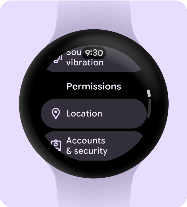
Title is hierarchical text used as a mechanism for way-finding, like a page, section title, or sub-section title (in the case of TitleSmall).
- TitleLarge is the largest title. Titles are smaller than Displays. They are typically reserved for medium-emphasis text that is shorter in length and not recommended for interactive components, rather page headings or sub headings.
- TitleMedium is the medium title. Titles are smaller than Displays. They are typically reserved for medium-emphasis text that is shorter in length and not recommended for interactive components, rather page headings or sub headings.
- TitleSmall is the smallest title. Titles are smaller than Displays. They are typically reserved for medium-emphasis text that is shorter in length and not recommended for interactive components, rather page headings or sub headings.

Label
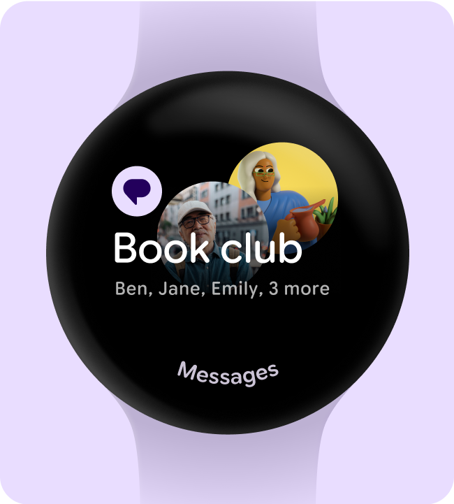
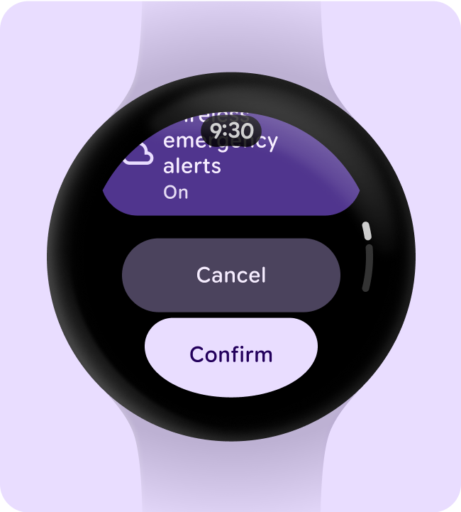
Label is used for component level text that describes an action that would happen if interacted with. The most common and widely used application for label is for text nested within a button.
- LabelLarge is the largest label. Labels are used for displaying prominent texts like label on title buttons, applied to interactive components.
- LabelMedium is the medium label, and the most commonly used. Labels are used for displaying texts like primary label on buttons, applied to interactive components.
- LabelSmall is the small label. Labels are used for displaying texts like secondary label on buttons, labels on compact buttons, applied to interactive components.
Body
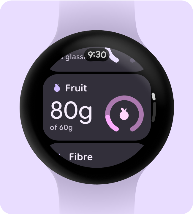
Body is reserved for content text like paragraphs of body copy, text used in complex data visualization, time stamps and metadata.
- BodyLarge is the largest body. Body texts are typically used for long-form writing as it works well for small text sizes. For longer sections of text, a serif or sans serif typeface is recommended.
- BodyMedium is second largest body. Body texts are typically used for long-form writing as it works well for small text sizes. For longer sections of text, a serif or sans serif typeface is recommended.
- BodySmall is third largest body. Body texts are typically used for long-form writing as it works well for small text sizes. For longer sections of text, a serif or sans serif typeface is recommended.
- BodyExtraSmall is the smallest body. Body texts are typically used for long-form writing as it works well for small text sizes. For longer sections of text, a serif or sans serif typeface is recommended.
Numeral
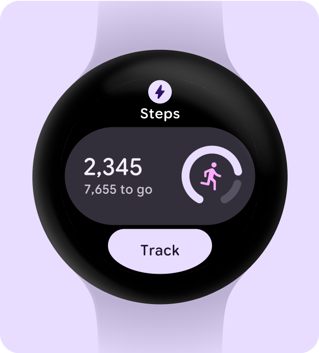
Numeral text styles are used for numerical digits, usually limited to a few characters. Can take on more expressive properties at the larger display sizes. Gives flexibility to expand width axis with minimal localization and font scaling concerns.
- NumeralsExtraLarge is the largest role for digits. Numerals use tabular spacing by default. They highlight and express glanceable numbers that are limited to a two or three characters only, where no localization is required like the charging screen or time picker.
- NumeralsLarge is the second largest role for digits. Numerals use tabular spacing by default. They are large sized number strings that are limited to big displays of time, where no localization is required like a timer countdown or time picker.
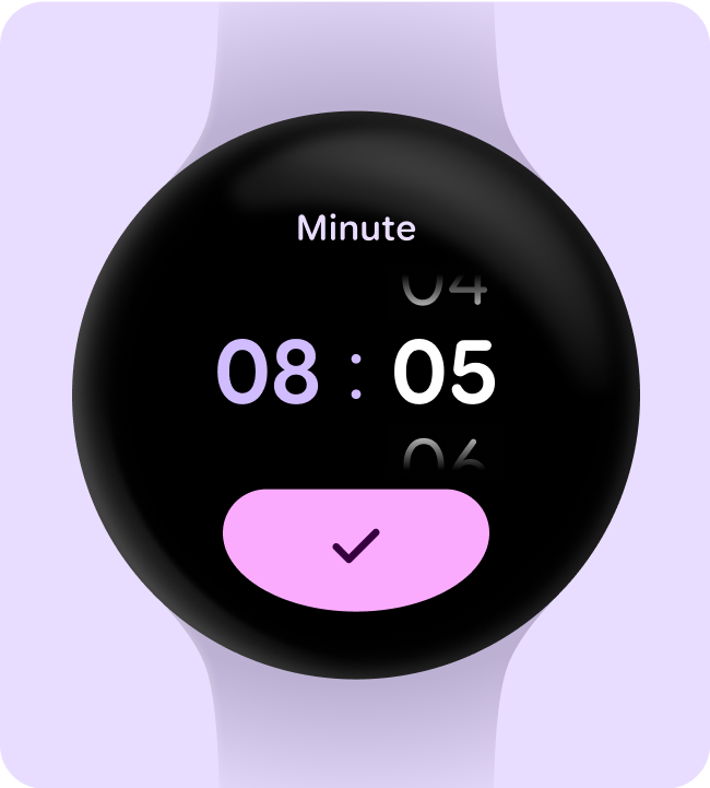
- NumeralsMedium is the third largest role for digits. Numerals use tabular spacing by default. They are medium sized numbers that are limited to short strings of digits, where no localization is required like a steps count or time picker.
- NumeralsSmall is the fourth largest role for digits. Numerals use tabular spacing by default. They are for numbers that need emphasis at a smaller scale, where no localization is required like date and time pickers.
- NumeralsExtraSmall is the smallest role for digits. Numerals use tabular spacing by default. They are for numbers that need to accommodate longer strings of digits, where no localization is required like in-workout metrics.
Arc
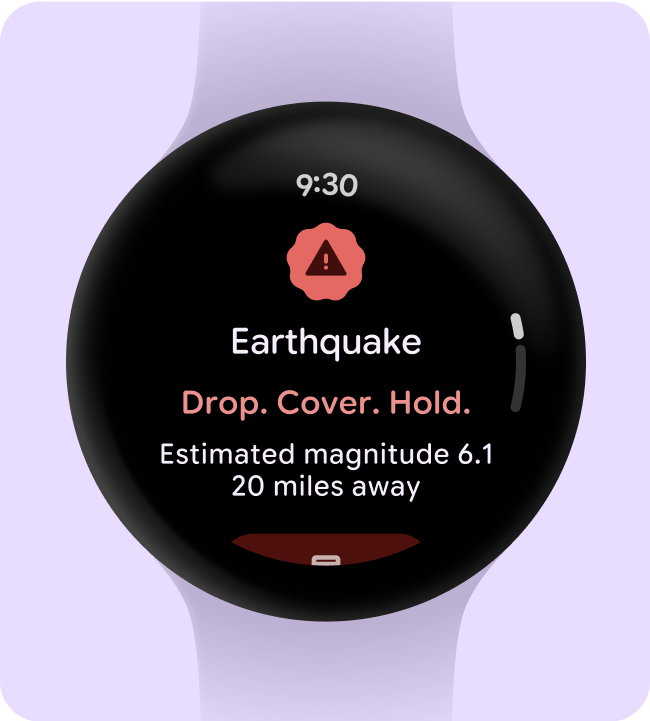
Arc header text is used for curved text making up the signposting on the UI such as time text and a curved labels. Tailored font axis that specifically optimize type along a curve and in order to accommodate the different spacing that appears between characters when they're positioned on the top, compared to the bottom, of a curved screen.
Top
- ArcLarge is for arc headers and titles. Arc is for text along a curved path on the screen, reserved for short header text strings at the very top or bottom of the screen like confirmation overlays.
- ArcMedium is for arc headers and titles. Arc is for text along a curved path on the screen, reserved for short header text strings at the very top or bottom of the screen like page titles.
- ArcSmall is for limited arc strings of text. Arc is for text along a curved path on the screen, reserved for short curved text strings at the top of the screen like time text.
Bottom
- ArcLarge is for arc headers and titles. Arc is for text along a curved path on the screen, reserved for short header text strings at the very top or bottom of the screen like confirmation overlays.
- ArcMedium is for arc headers and titles. Arc is for text along a curved path on the screen, reserved for short header text strings at the very top or bottom of the screen like page titles.
- ArcSmall is for limited arc strings of text. Arc is for text along a curved path on the screen, reserved for short curved text strings at the bottom of the screen like a call to action.

Typesetting
Vertical typesetting relies on padding, bounding boxes, and baselines to ensure text legibility at any size. Take engineering considerations and the conventions of your platform into account when making decisions for typesetting, text resizing, density, and using text in adaptive layouts.
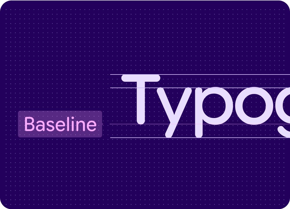
Use the baseline
The baseline is the invisible line upon which a line of text rests. In Material Design, the baseline is an important specification in measuring the vertical distance between text and an element.
Check for readability
To enhance the readability of the fonts shown in your app, complete these readability checks.
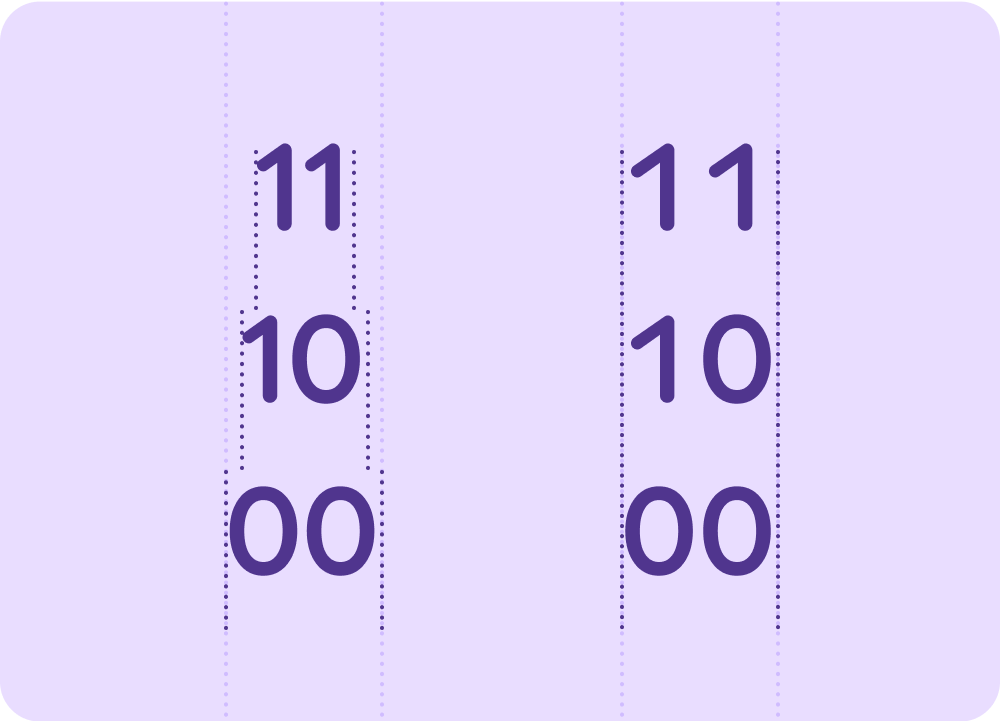
Tabular and mono numbers
Use tabular figures (also known as monospaced numbers) rather than proportional digits in places where values may change often or animate or have rapidly changing values, such as countdown timers, pickers, or ongoing fitness metrics.
Use monospaced tabular numbers to keep values optically aligned for better scanning and alignment, and to avoid the numbers or adjacent text from jumping around.
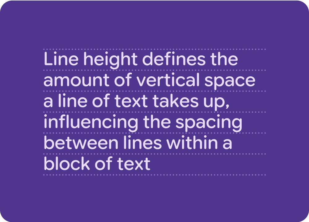
Line height
Line height is the space between each line of text and is directly connected to type size. On Watch, vertical space is limited, so the line height is optimized to ensure legibility, while maximizing on lines of text visible within the viewport.
Additional line height
In Jetpack Compose, and on Android, typography automatically gains additional line height on the last line to prevent longer characters from overlapping. This is why some screenshot tests don't align perfectly.
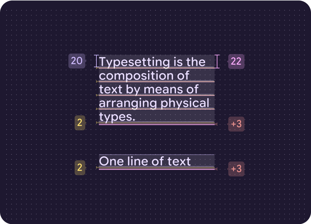
Additional line height cheatsheet
| Default style (text size / line height) | Default line height on each line | Additional line height on the bottom line only | Calculation |
|---|---|---|---|
| 60 / 60 | 0 (100%) | + 15 (125%) | 60 / 75 (15/125%) (60+15) |
| 50 / 50 | 0 (100%) | + 13 (126%) | 50 / 63 (13/126%) (50+13) |
| 40 / 44 | 4 (110%) | + 7 (127.5%) | 40 / 51 (11/127.5%) (44+7) |
| 30 / 34 | 4 (113%) | + 3 (123.3%) | 30 / 37 (7/123.3%) (34+3) |
| 24 / 26 | 2 (108%) | + 4 (125%) | 24 / 30 (6/125%) (26+4) |
| 20 / 22 | 2 (110%) | + 3 (125%) | 20 / 25 (5/125%) (22+3) |
| 18 / 20 | 2 (111%) | + 3 (125%) | 18 / 23 (5/125%) (20+3) |
| 16 / 18 | 2 (112.5%) | + 2 (125%) | 16 / 20 (4/125%) (18+2) |
| 15 / 18 | 3 (120%) | + 1 (126.6%) | 15 / 19 (4/126.6%) (18+1) |
| 14 / 16 | 2 (114%) | + 2 (128.5%) | 14 / 18 (4/128.5%) (16+2) |
| 13 / 16 | 3 (123%) | + 0 (123%) | 13 / 16 (3/123%) (16+0) |
| 12 / 14 | 2 (116.6%) | + 1 (125%) | 12 / 15 (3/125%) (14+1) |
| 10 / 12 | 2 (120%) | + 0 (120%) | 10 / 12 (2/120%) (12+0) |