
Picker を使用すると、ユーザーは特定のデータを選択して設定できます。
選択ツール
ユーザーが限られた数のアイテムから選択できるようにするには、選択ツールを使用する必要があります。
デフォルトでは、アイテムは両方向に無限にループします。リスト内の順序が重要な場合や、ユーザーがクイック スワイプで最初と最後の要素に到達できるようにするには、この動作を無効にすることを検討してください。
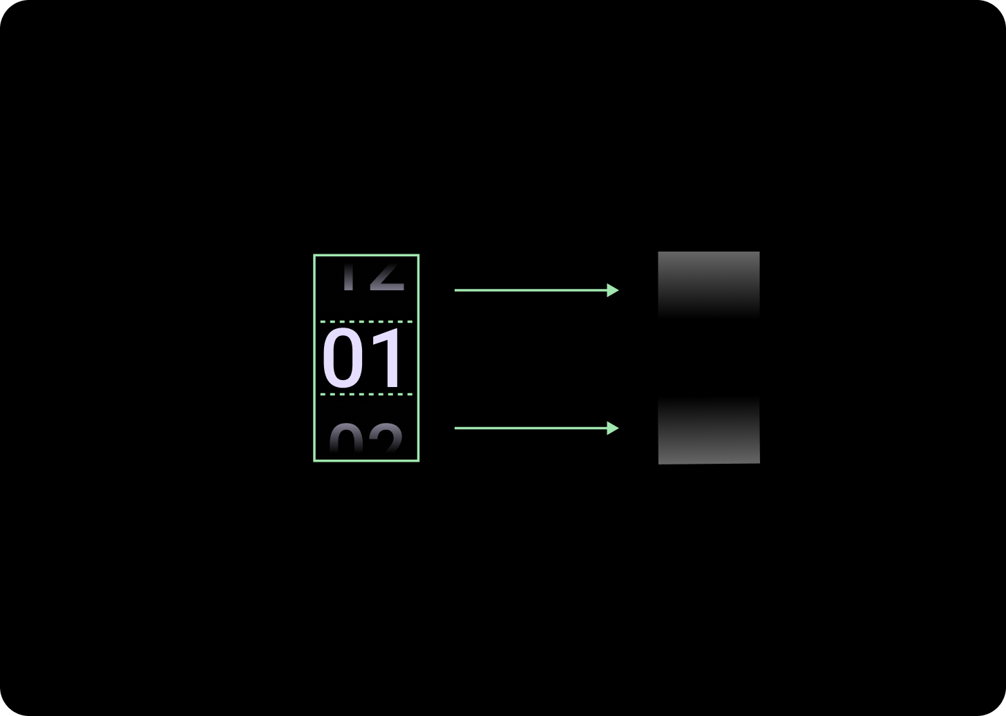
解剖学
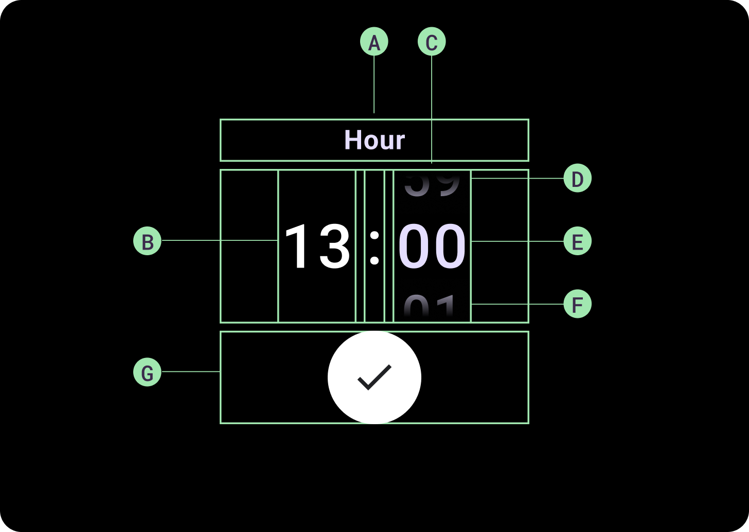
構造
A. 非アクティブな列
B. コロン ブレーカー
C. 選択ツールの列
D. 上位のコンテンツ
E. 中間コンテンツ
F. 下部コンテンツ
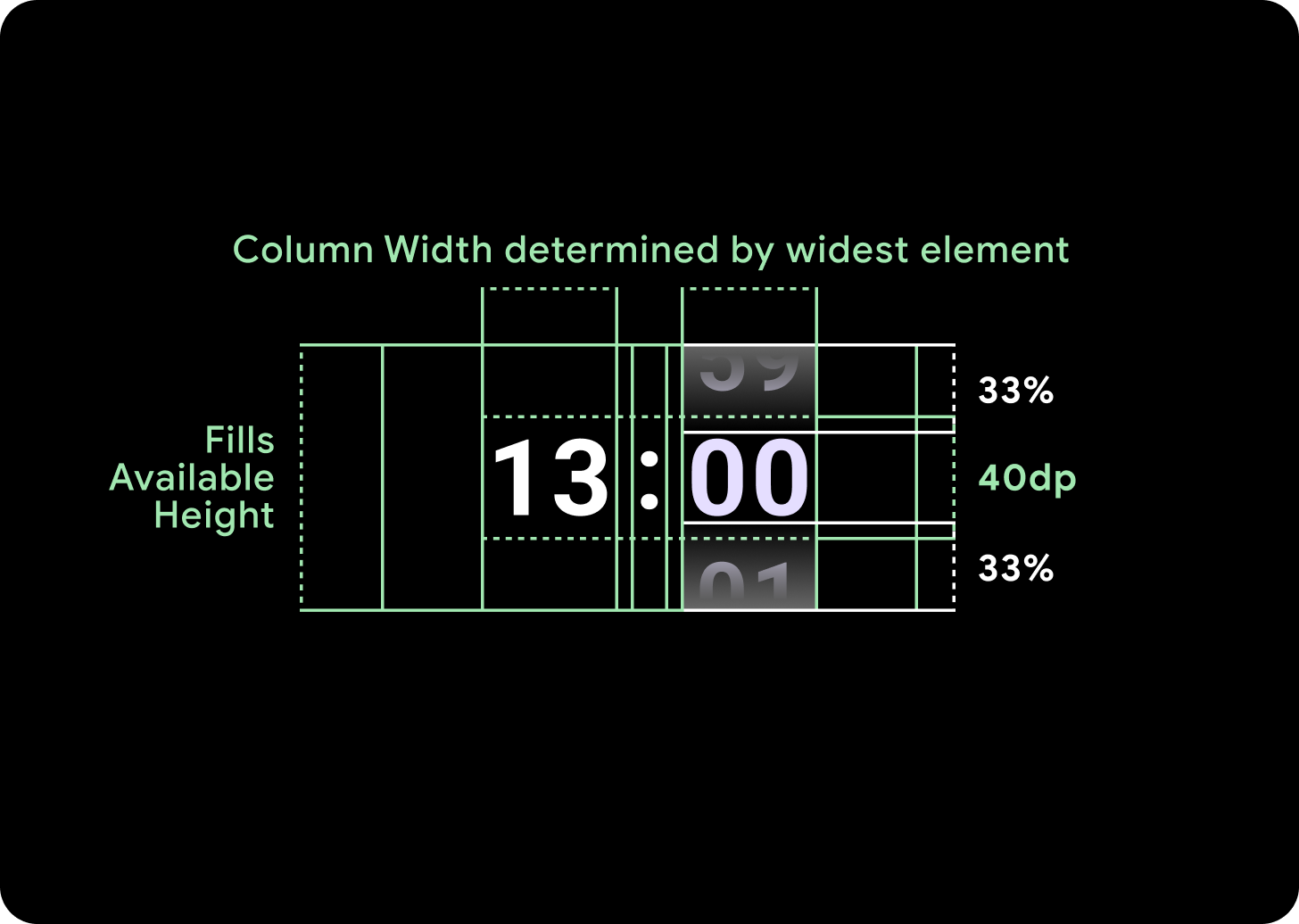
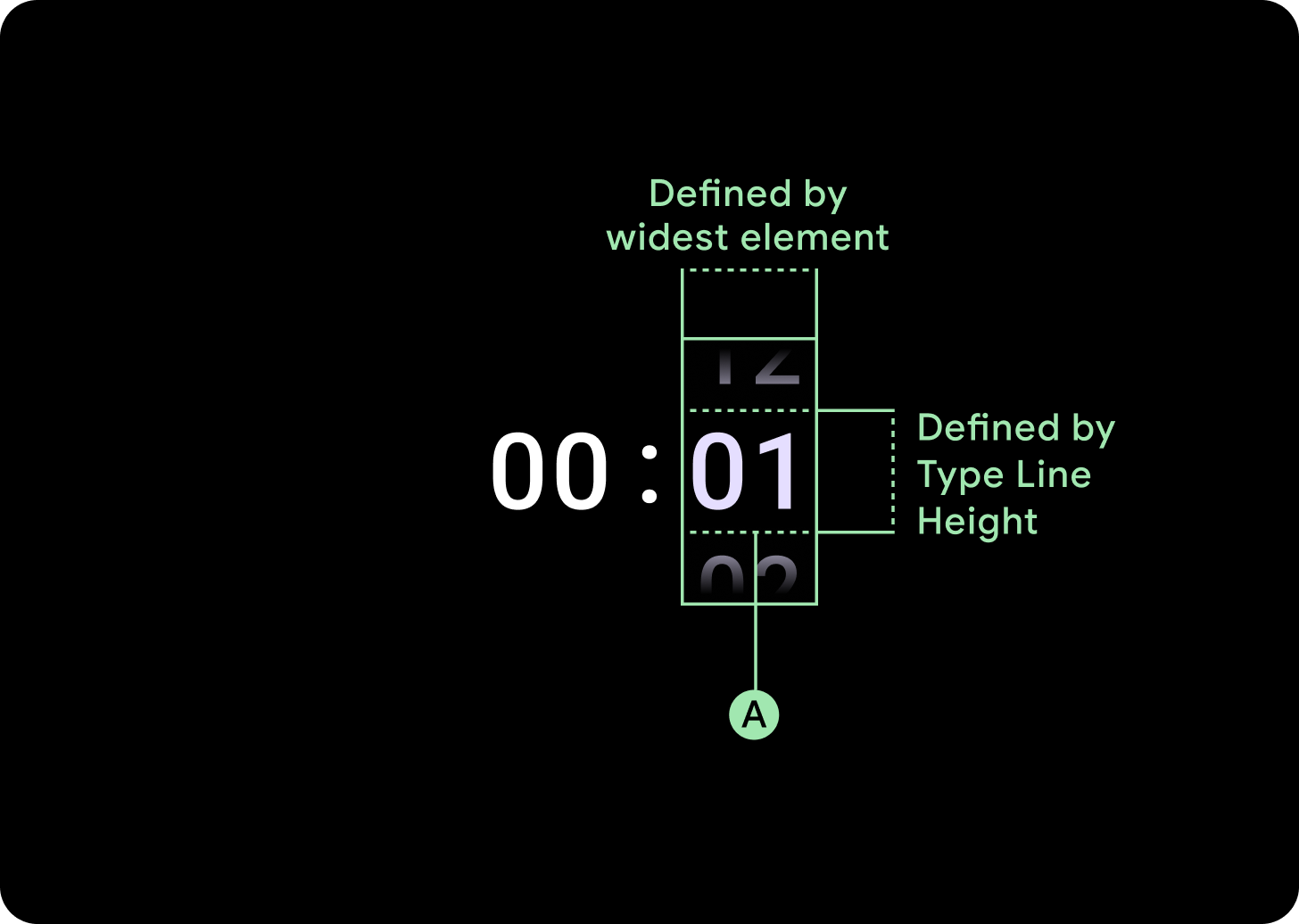
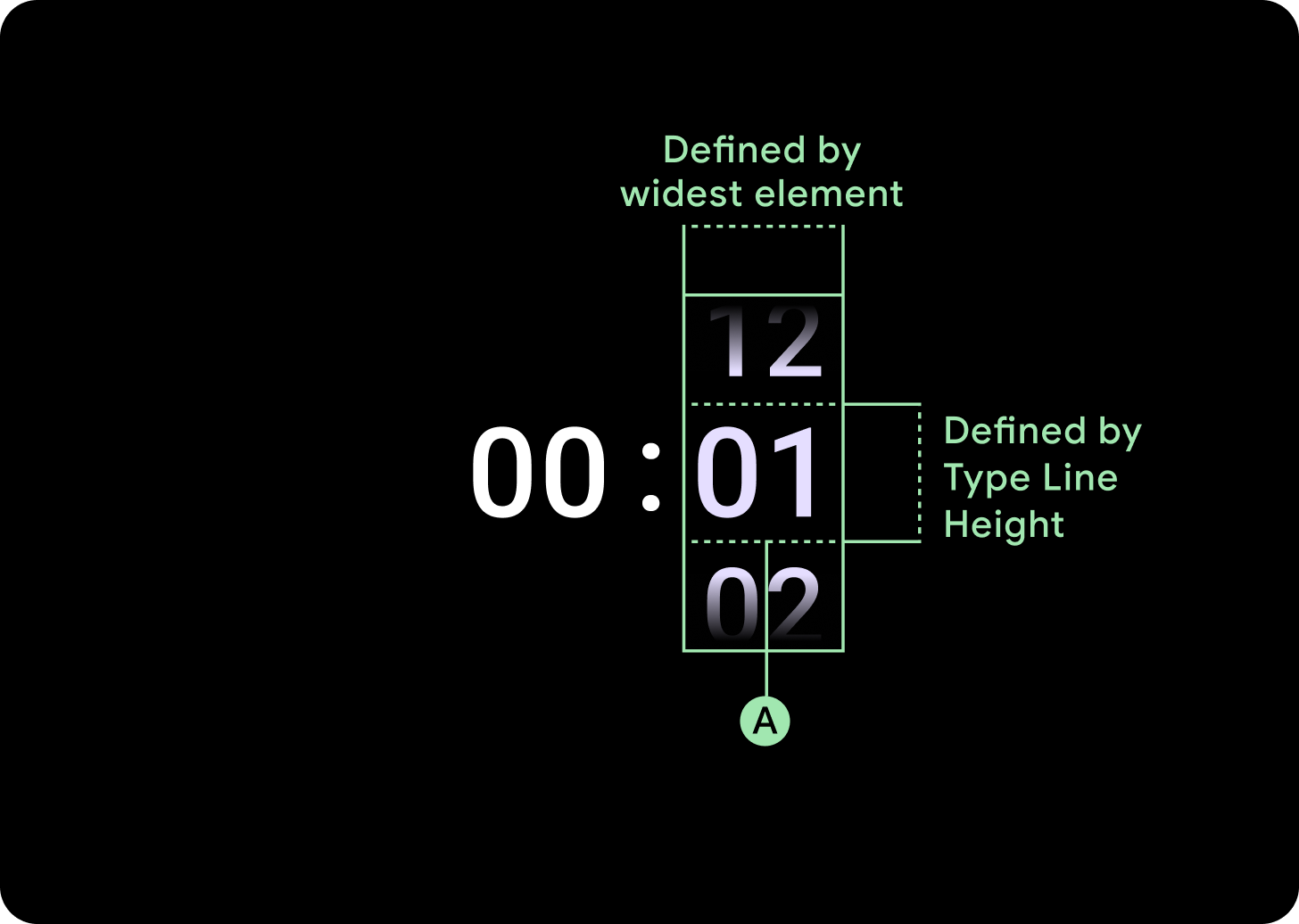
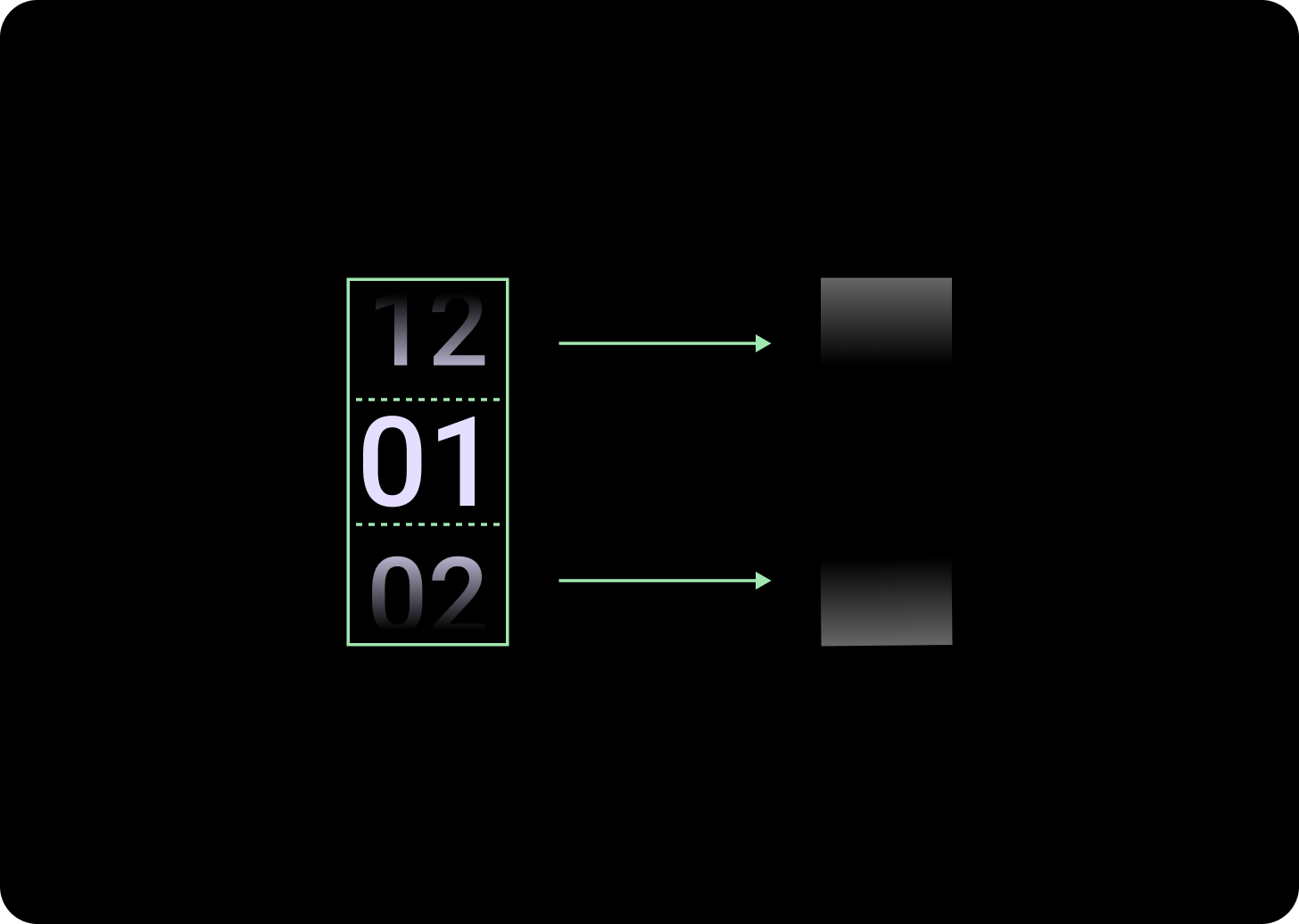
幅と高さ
選択ツール グループは、使用可能な高さと幅に収まるように配置されます。選択ツールの列には、4 つのレイアウト オプションがあります。各レイアウトは中央に配置され、使用可能な高さいっぱいに表示されます。列の幅は、フォントで必要な桁数に対応するために必要な幅で定義されます。日付選択ツールは例外で、横方向に画面全体を占有し、端からはみ出します。
たとえば、数値は「00」の幅を計算し、幅を設定します。テキスト フィールドの場合(月フィールドなど)は、「MMM」(ラテン文字で最も幅の広い文字)の幅として計算されます。そのため、幅と高さ(使用される書体の行の高さ)は、使用されるフォントの影響を受けます。
選択ツールのアイテムのサイズは、ブレークポイントによって異なります。
使用方法
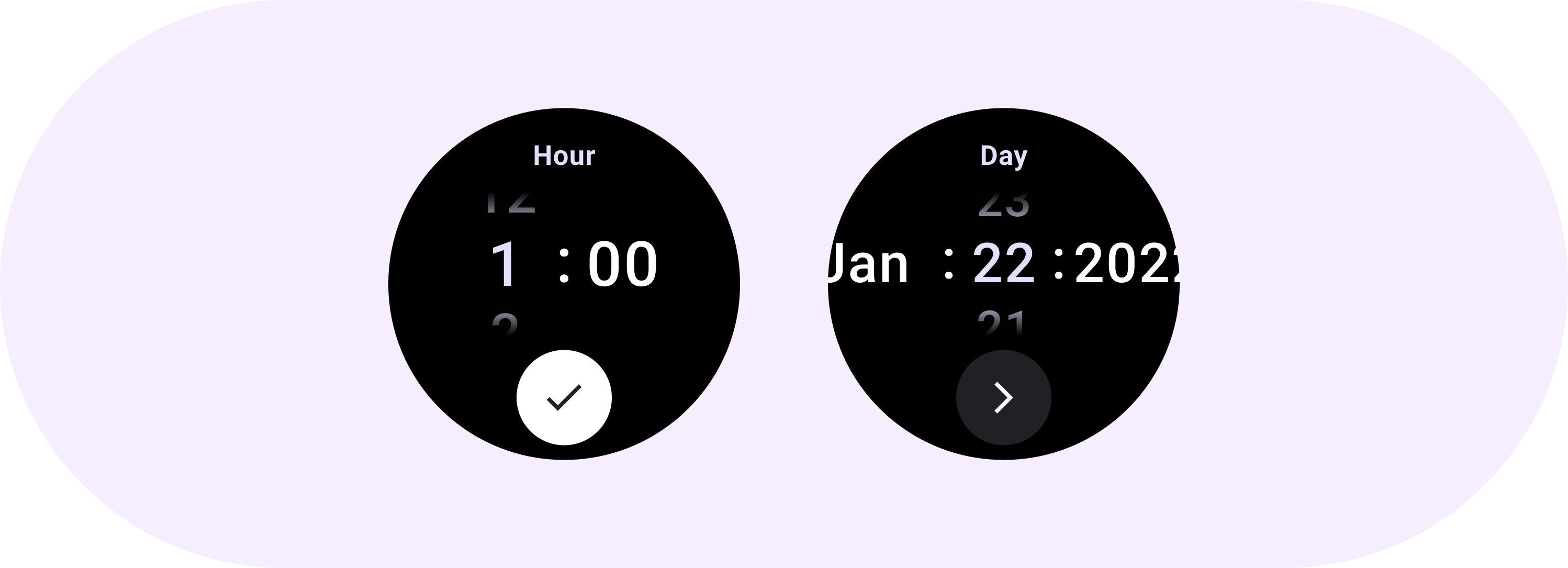
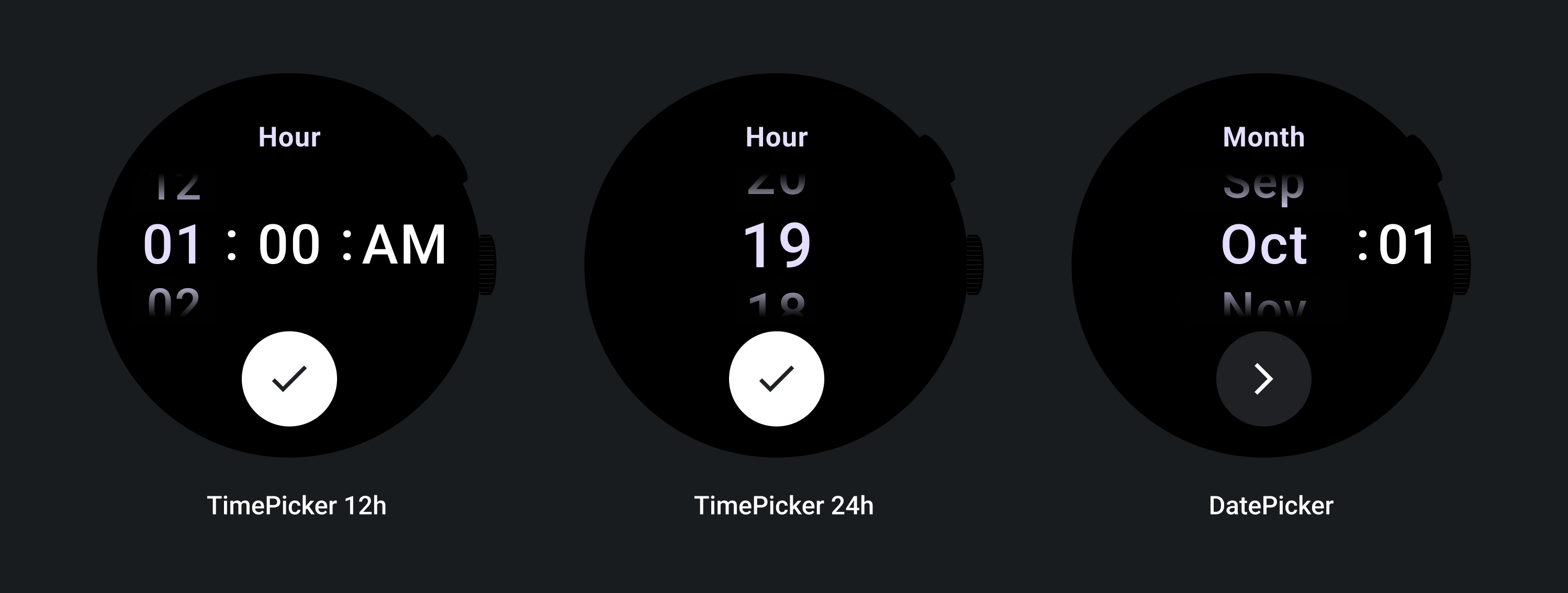
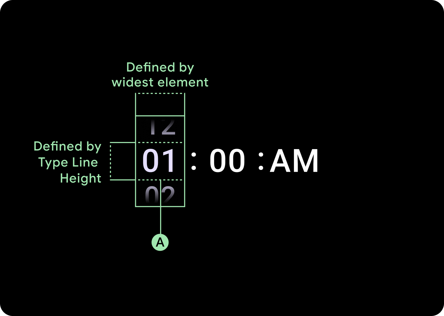
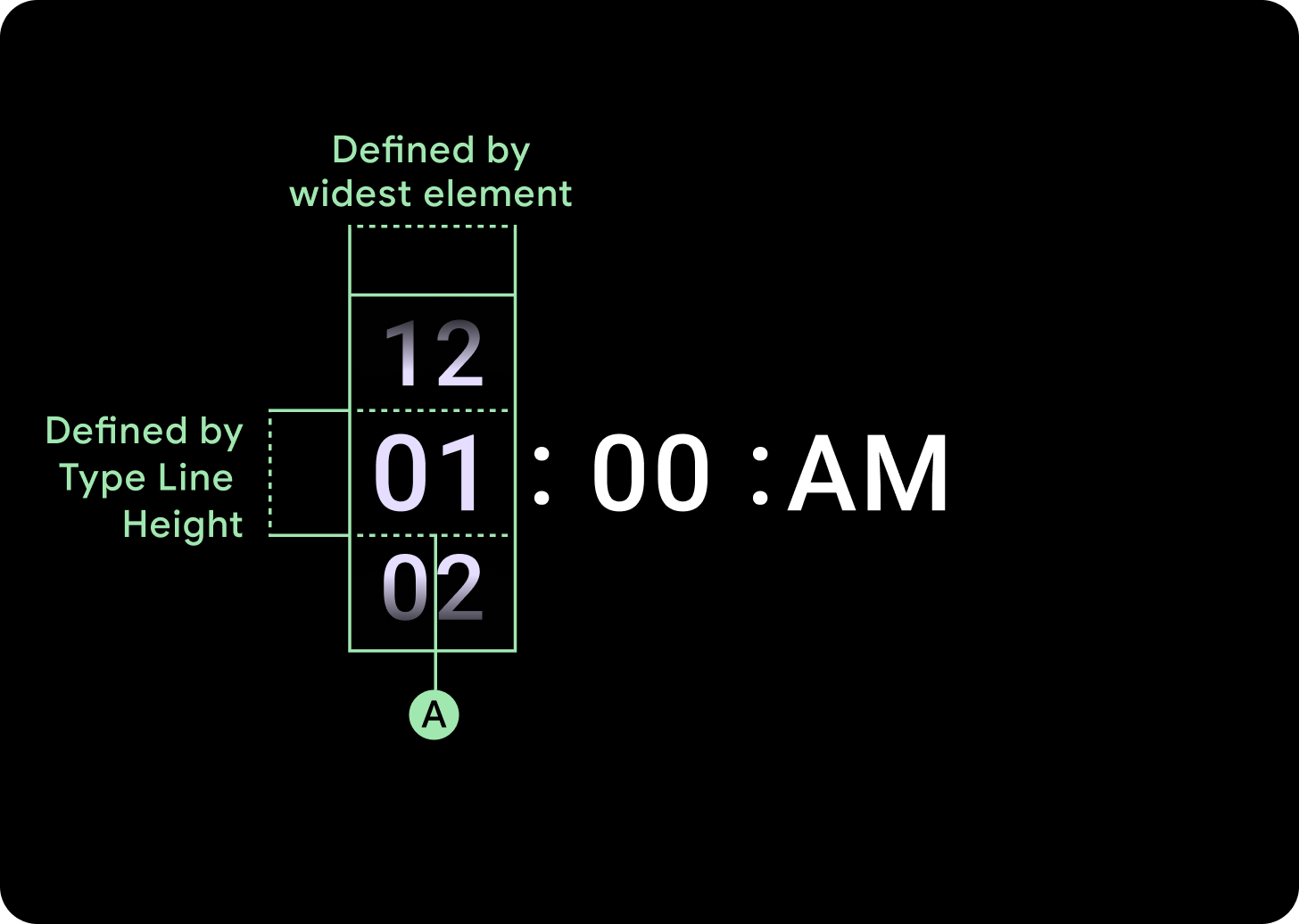
日付と時刻の選択ツールに関する次の例をご覧ください。
事前構築済みの日付と時刻の選択ツールの実装については、GitHub の Horologist ライブラリをご覧ください。
ユーザーが複数の選択ツールで複数の値を選択できる同様のエクスペリエンスを作成する場合は、組み込みの PickerGroup コンポーネントを使用します。このオブジェクトは、フォーカス コーディネーター オブジェクトを使用して、正しい Picker 要素にフォーカスを割り当てます。
アダプティブ レイアウト
TimePicker 24H
TimePicker 12H
日付選択ツール
レスポンシブな動作
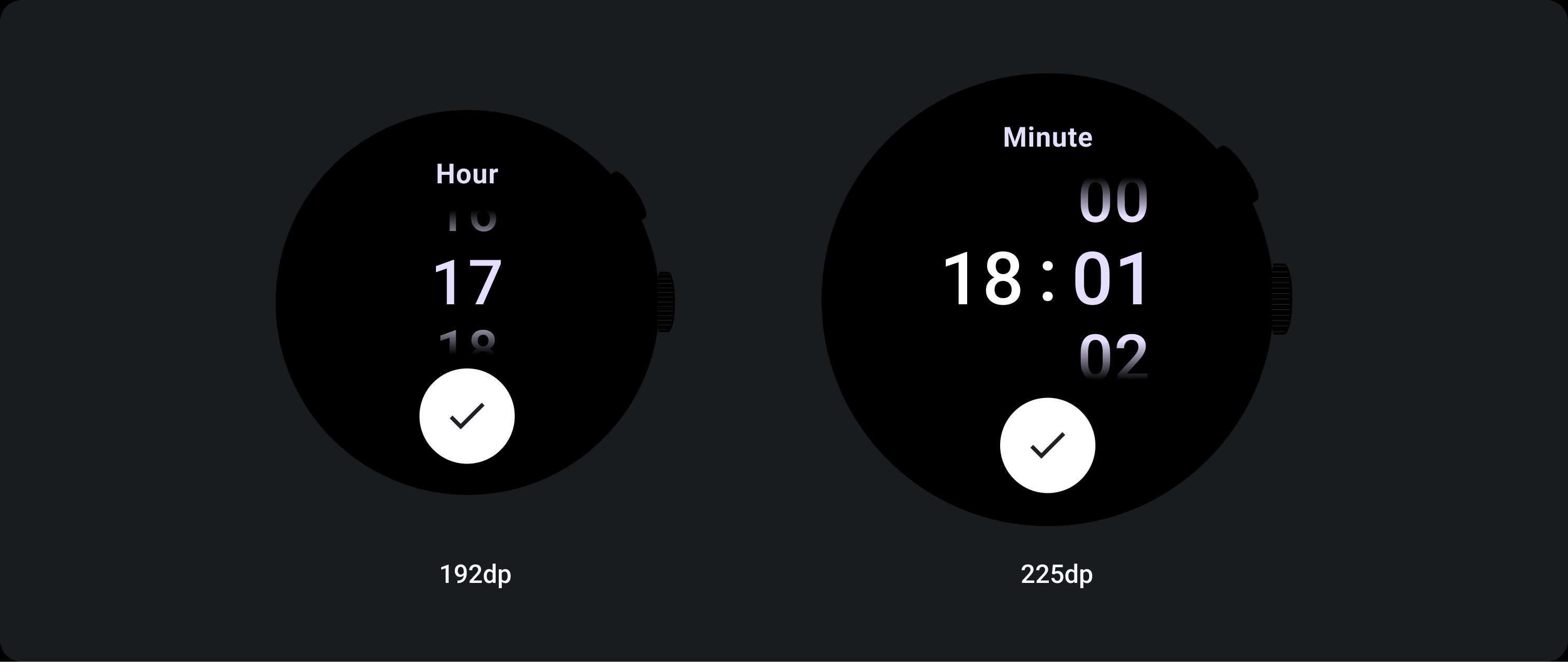
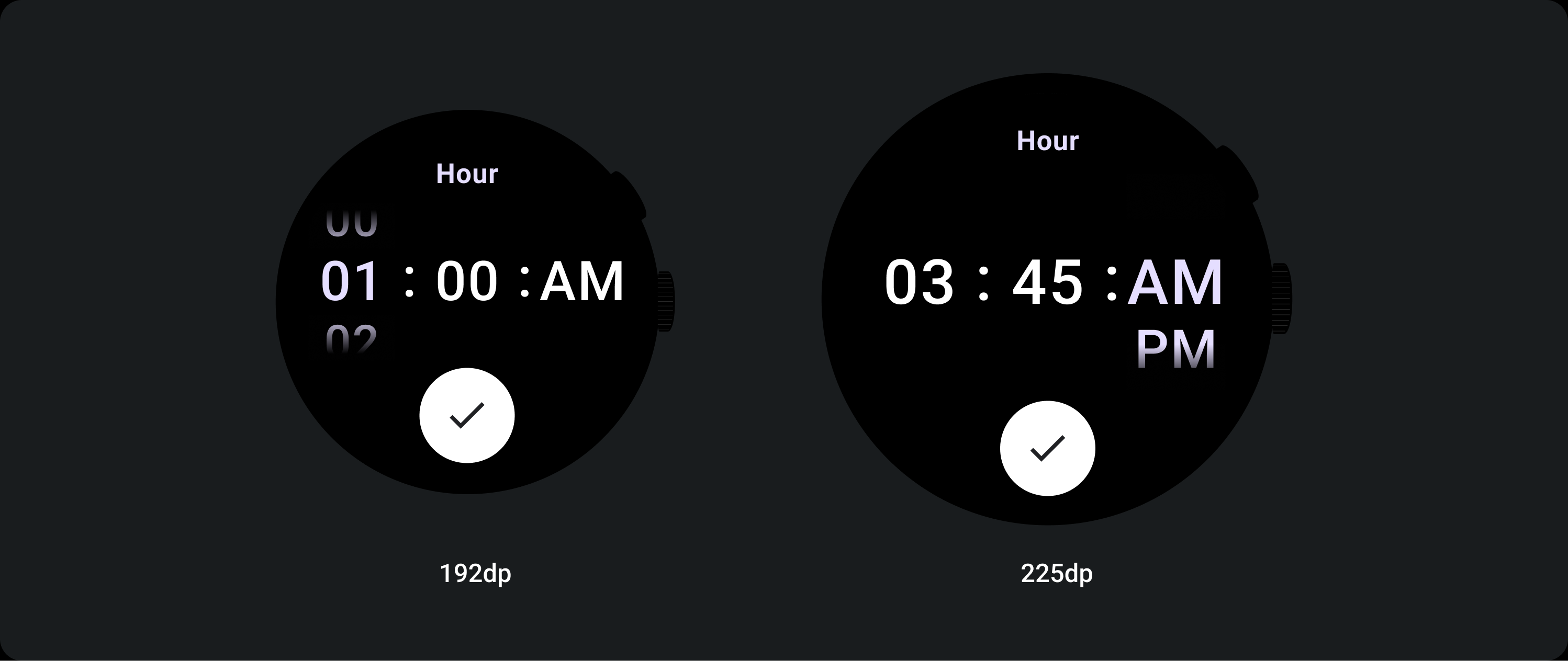
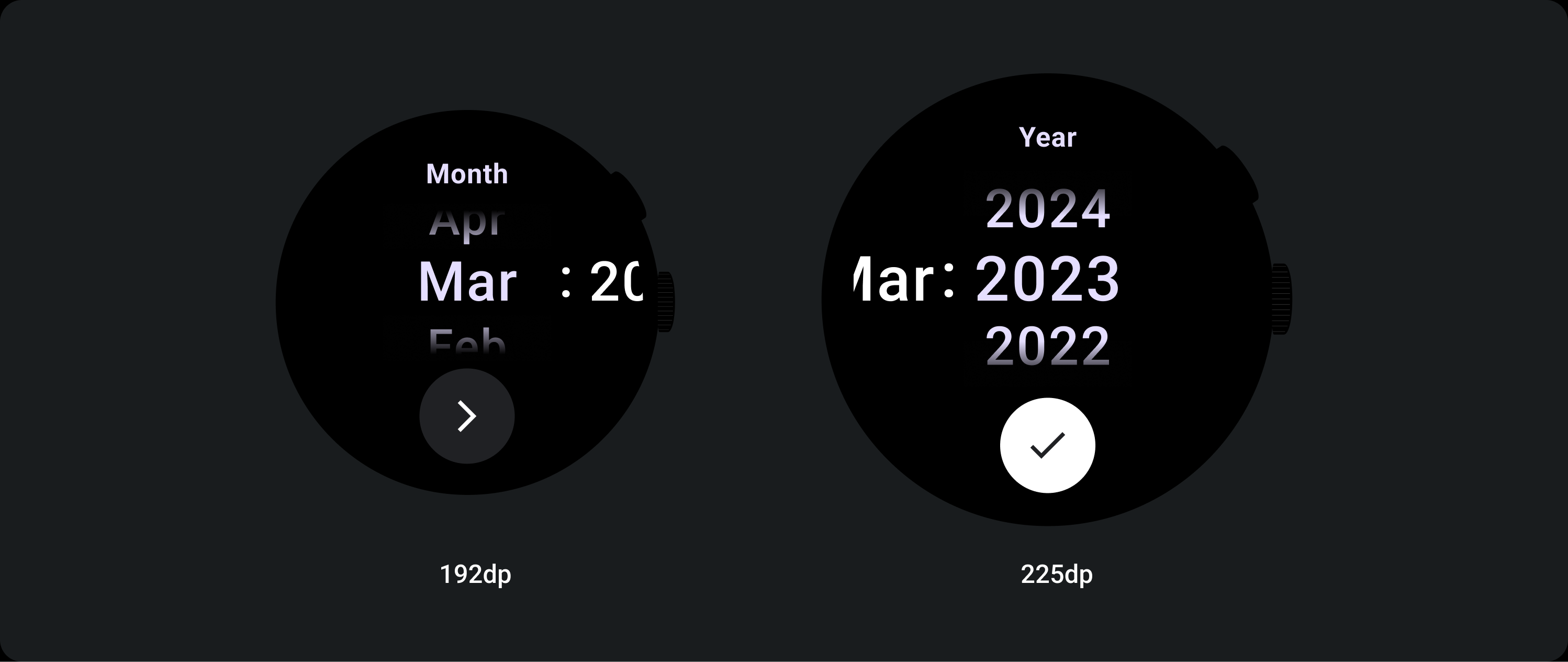
文字サイズの拡大
225 以上のブレークポイントを過ぎると、選択ツール要素のフォントサイズが変更されます。遅延スクロール列内の上部と下部のコピーは、中央のコピーと同様に調整されます(A)。以下に例を示します。
2 列のレイアウト
225 dp のブレークポイント未満
フォント: ディスプレイ 2
225 dp のブレークポイントを超える
フォント: ディスプレイ 1
3 列のレイアウト
225 dp のブレークポイント未満
フォント: ディスプレイ 3
225 dp のブレークポイントより上
フォント: ディスプレイ 2
グラデーションのサイズを大きくする
選択ツール列のグラデーションの高さは、使用可能なスペースによって定義されます。上部と下部のグラデーションの両方が、使用可能な高さの 3 分の 1(33%)に設定されています。つまり、使用可能な各画面サイズで、グラデーションは比例してスケーリングされます。列のレイアウトとは独立しています。
225 dp のブレークポイント未満
サイズ: 列の高さの 33%
225 dp のブレークポイントより上
サイズ: 列の高さの 33%
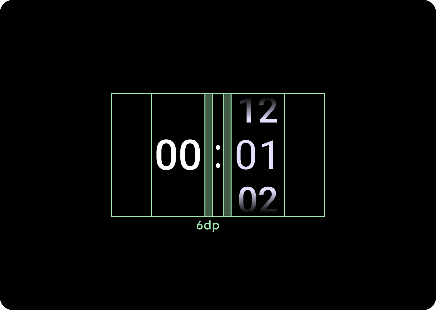
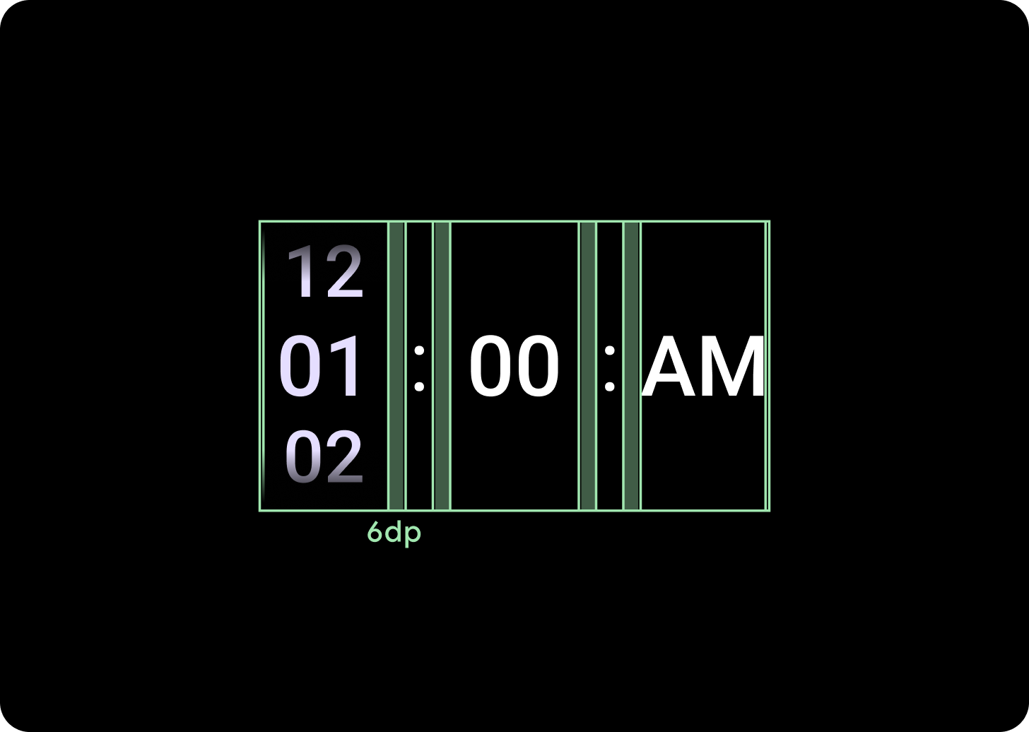
列間隔の増加
列の間隔は、225 以上のブレークポイントを超えると、2 dp または 4 dp から始まり、6 dp まで拡大します。2 列または 3 列のレイアウトのどちらを選択したかによって異なります。
2 列のレイアウト
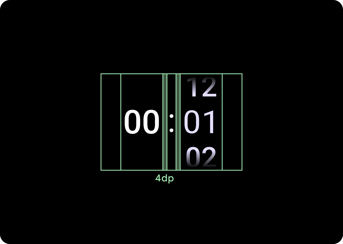
225 dp のブレークポイント未満
4 dp の列間隔
225 dp のブレークポイントより上
6 dp の列間隔
3 列のレイアウト
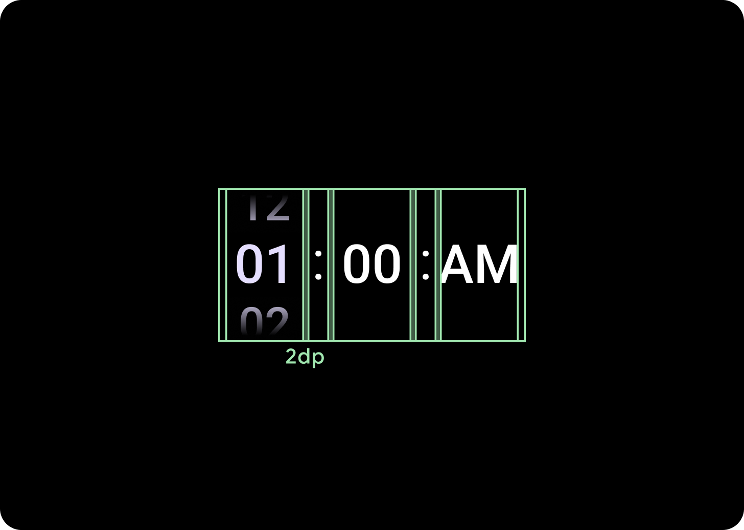
225 dp のブレークポイント未満
2 dp の列間隔
225 dp のブレークポイントより上
6 dp の列間隔