ダイアログ
コレクションでコンテンツを整理
必要に応じて、コンテンツの保存と分類を行います。
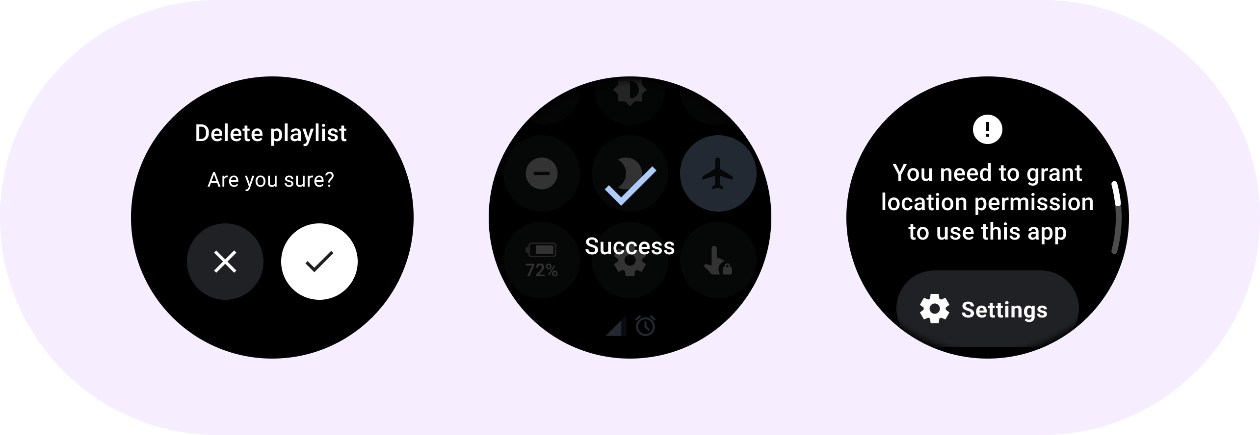
Dialog
を使用して、タイムリーなアクションや情報にユーザーの注意を向けます。

構造
ダイアログは、ユーザータスクまたはアクションに応じて、関連情報またはコンテキスト情報とともに表示される必要があります。モバイル OS のダイアログとは異なり、Wear OS のダイアログは画面全体を占有し、他のコンテンツの上に重ねて表示されます。
ダイアログは、スワイプして閉じる操作をサポートします。ユーザーがこのスワイプ操作を実行すると、システムが親コンテンツをバックグラウンドで表示します。
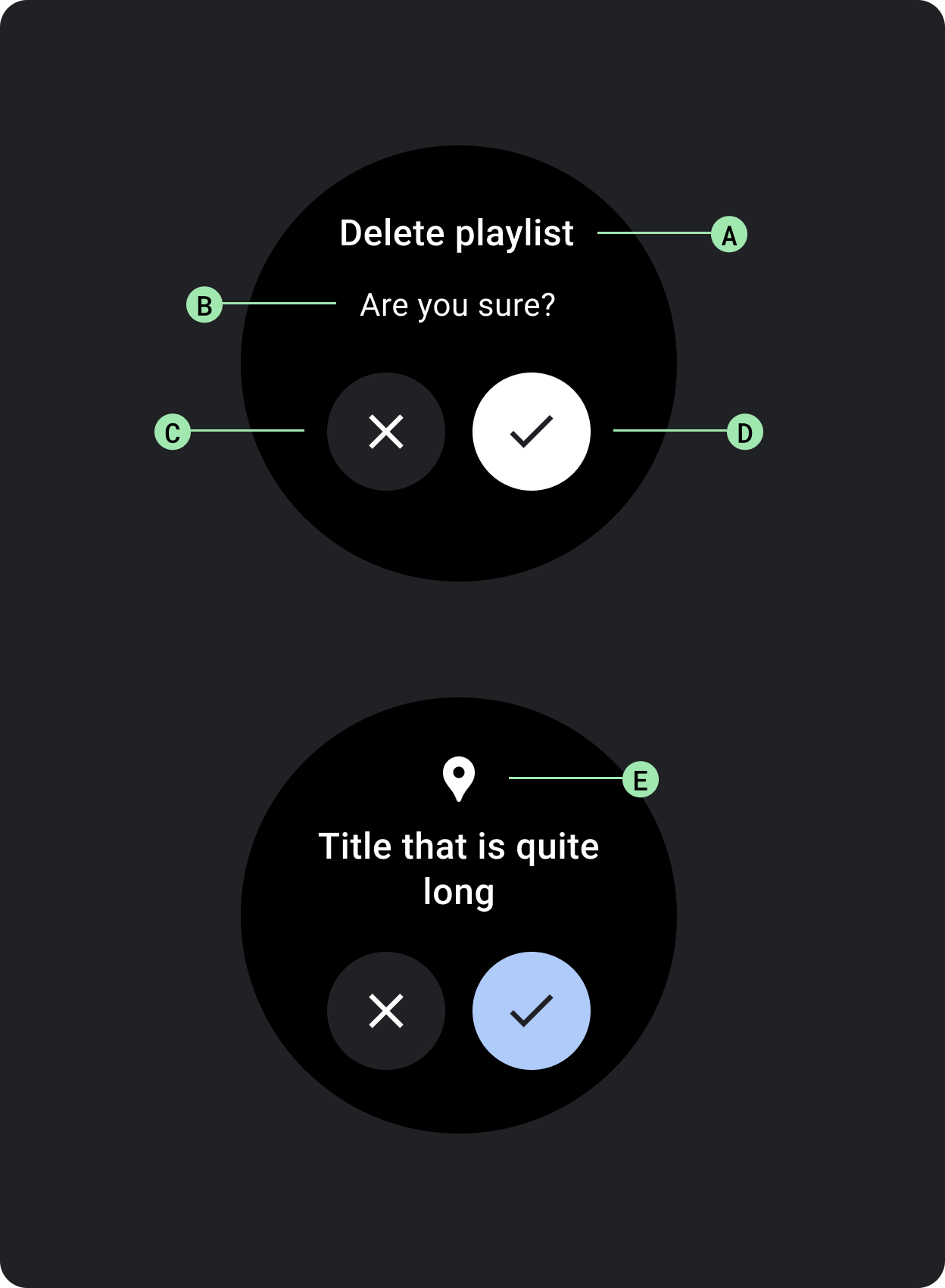
ダイアログには、アラートや確認など、独自のダイアログ コンテンツ用のスロットが 1 つあります。
アラートアラート コンポーネントを使用して、重要なタスクに対するユーザーのレスポンスを取得します。
アラートの表示中はアプリの機能がすべて無効になり、アクションが行われるまで画面に表示されます。アラートは意図的に操作を中断させるものであるため、頻繁に使用することは避けてください。
アラートのコンテンツ テキストが 3 行を超える場合は、読みやすくするためにコンテンツを左揃えすることを検討してください。それ以外の場合、テキストはデフォルトで中央揃えされます。
A. タイトル
B. コンテンツ(省略可)
C. ネガティブ ボタン
D. ポジティブ ボタン
E. アイコン(省略可)
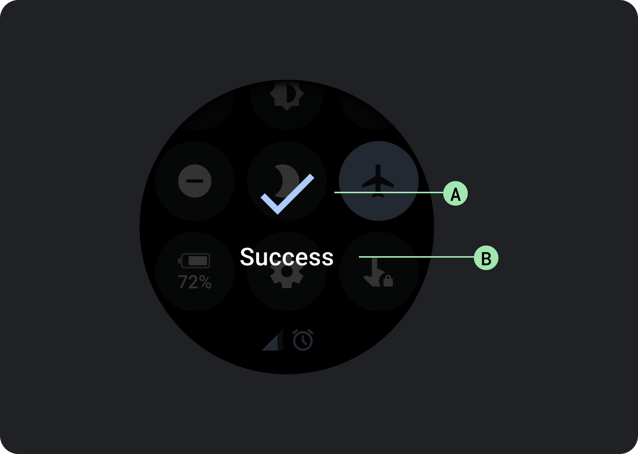
確認確認コンポーネントは、確認メッセージを短時間、ユーザーに表示します。マテリアル コンポーネントとは異なり、Wear OS の確認コンポーネントでは、ユーザーが選択内容の最終的な確定を行うことはできません。
このコンポーネントを使用して、アクションの実行後にユーザーの注意を引きます。
A. アイコン
B. ラベル
このページのコンテンツやコードサンプルは、コンテンツ ライセンスに記載のライセンスに従います。Java および OpenJDK は Oracle および関連会社の商標または登録商標です。
最終更新日 2025-07-27 UTC。
[[["わかりやすい","easyToUnderstand","thumb-up"],["問題の解決に役立った","solvedMyProblem","thumb-up"],["その他","otherUp","thumb-up"]],[["必要な情報がない","missingTheInformationINeed","thumb-down"],["複雑すぎる / 手順が多すぎる","tooComplicatedTooManySteps","thumb-down"],["最新ではない","outOfDate","thumb-down"],["翻訳に関する問題","translationIssue","thumb-down"],["サンプル / コードに問題がある","samplesCodeIssue","thumb-down"],["その他","otherDown","thumb-down"]],["最終更新日 2025-07-27 UTC。"],[],[],null,["# Dialogs\n\nUse a [`Dialog`](/reference/kotlin/androidx/wear/compose/material/dialog/package-summary) to focus users' attention on a timely action or piece of\ninformation.\n\nAnatomy\n-------\n\n\nDialogs should appear in response to a user task or an action, with\nrelevant or contextual information. Unlike their mobile counterparts,\nDialogs in Wear OS occupy the whole screen and are layered over other\ncontent.\n\n\nDialogs support a swipe-to-dismiss gesture. When the user performs\nthis swipe gesture, the system reveals the parent content in the\nbackground.\n\nDialogs have a single slot for opinionated dialog content, such as an\n[Alert](/reference/kotlin/androidx/wear/compose/material/dialog/package-summary#Alert(kotlin.Function1,kotlin.Function0,kotlin.Function0,androidx.compose.ui.Modifier,kotlin.Function1,androidx.wear.compose.material.ScalingLazyListState,androidx.compose.ui.graphics.Color,androidx.compose.ui.graphics.Color,androidx.compose.ui.graphics.Color,androidx.compose.ui.graphics.Color,androidx.compose.foundation.layout.Arrangement.Vertical,androidx.compose.foundation.layout.PaddingValues,kotlin.Function1)) or\n[Confirmation](/reference/kotlin/androidx/wear/compose/material/dialog/package-summary#Confirmation(kotlin.Function0,androidx.compose.ui.Modifier,kotlin.Function1,androidx.wear.compose.material.ScalingLazyListState,kotlin.Long,androidx.compose.ui.graphics.Color,androidx.compose.ui.graphics.Color,androidx.compose.ui.graphics.Color,androidx.compose.foundation.layout.Arrangement.Vertical,androidx.compose.foundation.layout.PaddingValues,kotlin.Function1)).\n\n\u003cbr /\u003e\n\n\n**Alert**\n\nUse an alert component to get the user's response for important\ntasks.\n\nAlerts disable all app functionality when they appear, and remain on\nscreen until an action has been taken. Alerts are purposefully interruptive,\nso use them sparingly.\n\nIf the content of the alert is longer than three lines of text, consider\nleft aligning the content to improve its readability. Otherwise the text\nis center aligned by default.\n\n\n**A. Title\nB. Content (optional)\nC. Negative button\nD. Positive button\nE. Icon (optional)**\n\n\u003cbr /\u003e\n\n**Confirmation**\n\nThe confirmation component displays a confirmation message to the user\nfor a short period of time. Unlike its Material counterpart, the\nconfirmation component in Wear OS doesn't allow users to provide final\nconfirmation of a choice.\n\nUse this component to capture a user's attention after an action has been\nexecuted.\n\n\n**A. Icon\nB. Label**"]]