スマートウォッチの画面サイズはハンドヘルド デバイスよりも小さいため、ユーザーがアクセスできるように要素を配置して表示し、利用可能な画面スペースを効率的に使用することが重要です。アイテムを画面に収めるには、マテリアル ガイドラインで指定されているとおり、適切な量のパディングとマージンを使用します。
デザインが画面に収まる場合でも、ユーザーが次のいずれかの操作を行うと、インターフェースの要素が切り詰められることがあります。
- 表示言語を変更します。
- 文字のサイズを変更します。
- [テキストを太字にする] システム設定を有効にします。
さまざまなユーザー環境にシームレスに適応できるように、これらの考慮事項を念頭に置いて設計をテストすることが重要です。
インタラクティブな要素を完全に表示されるようにする
インターフェースにインタラクティブな要素が含まれている場合は、ユーザーがこれらの要素を完全にスクロールして表示できることを確認します。特に、これらの要素がページの端に配置されている場合はなおさらです。アプリで Horologist ライブラリを使用する場合は、responsive() レイアウト ファクトリを使用します。それ以外の場合は、スペーサーを使用して ScalingLazyColumn オブジェクトの上部と下部にマージンを追加し、最初と最後のリストアイテムが常にクリップされないようにします。
高密度レイアウトにカードの代わりにチップを使用する
高密度のレイアウトが必要な場合は、カードではなく CompactChip を使用します。カードの表面領域が大きいと、テキストの切り捨てやコンテンツの切り取りを防ぐことがはるかに難しくなります。
切り捨てとクリッピングに対する画面サイズの影響を考慮する
Wear OS デバイスの画面サイズに応じて、追加のテキストやボタンを表示するスペースを狭める、または大きくすることができます。
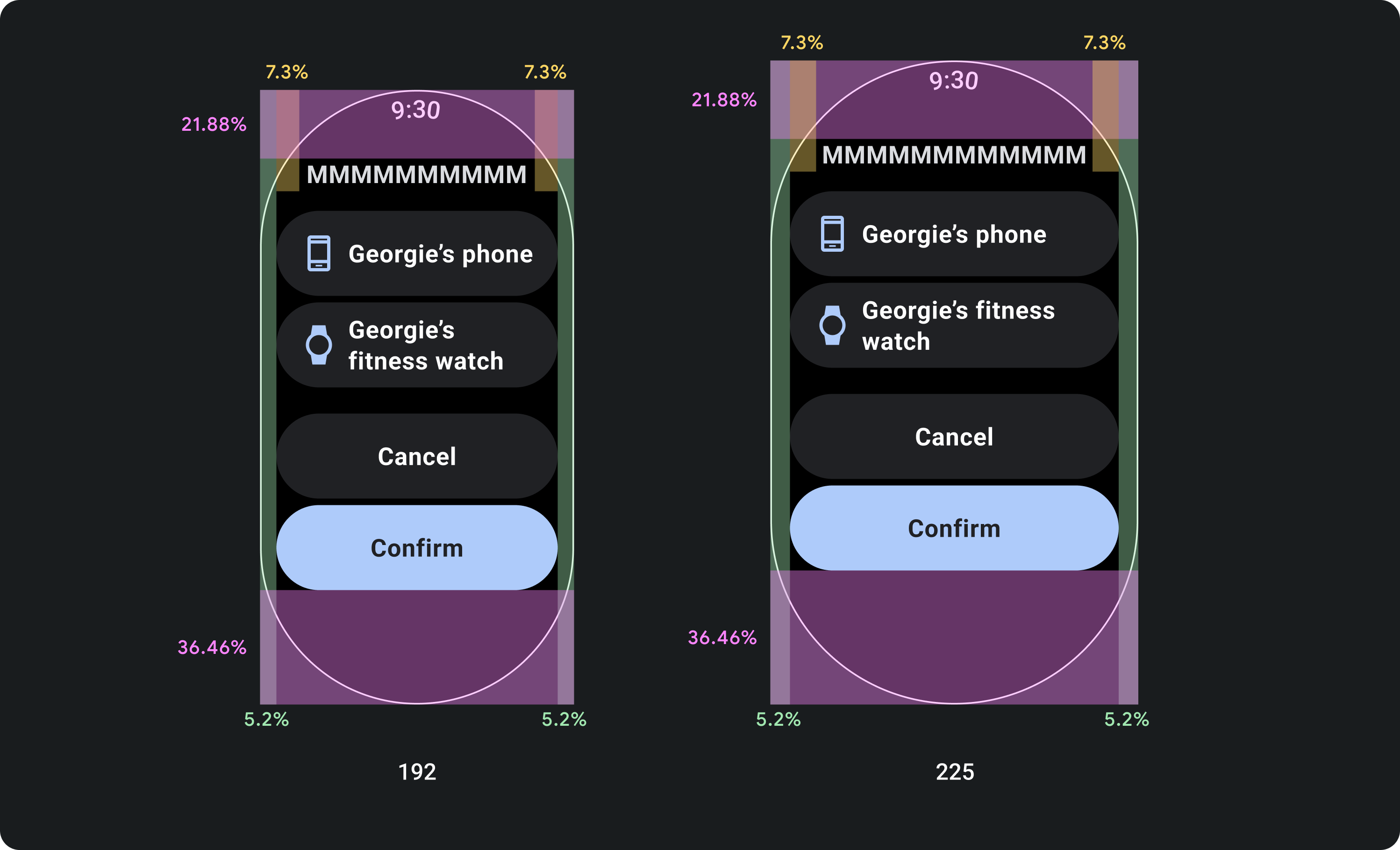
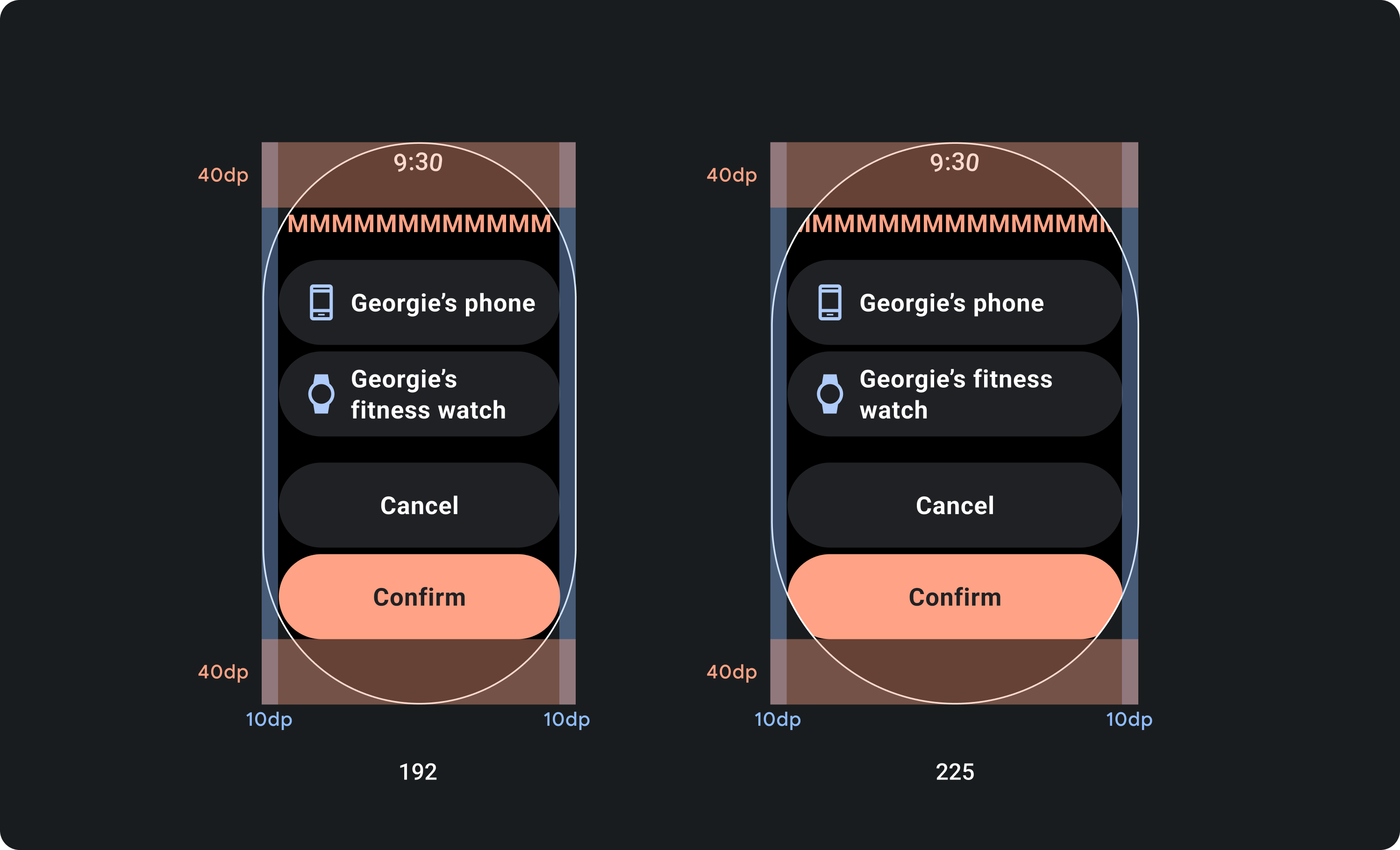
余白を固定せず、余白を考慮してデザインする
Wear OS デバイスの画面サイズにレスポンシブに適応するコンテンツを作成するには、各マージンのサイズを画面サイズに比例して、マージンの割合を適用します。アイテムが画面の上部または下部に配置されている場合は、内側のパディングを追加して、画面の湾曲した端からのコンテンツのクリッピングを最小限に抑えます。一方、コンテンツのグループが 1 つの画面に収まるほど小さい場合は、上下のスペースが増加します。
すべきこと
すべきでないこと
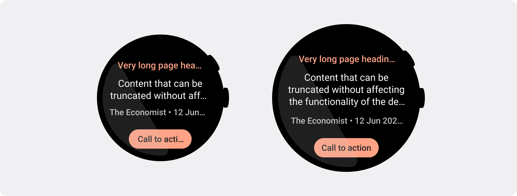
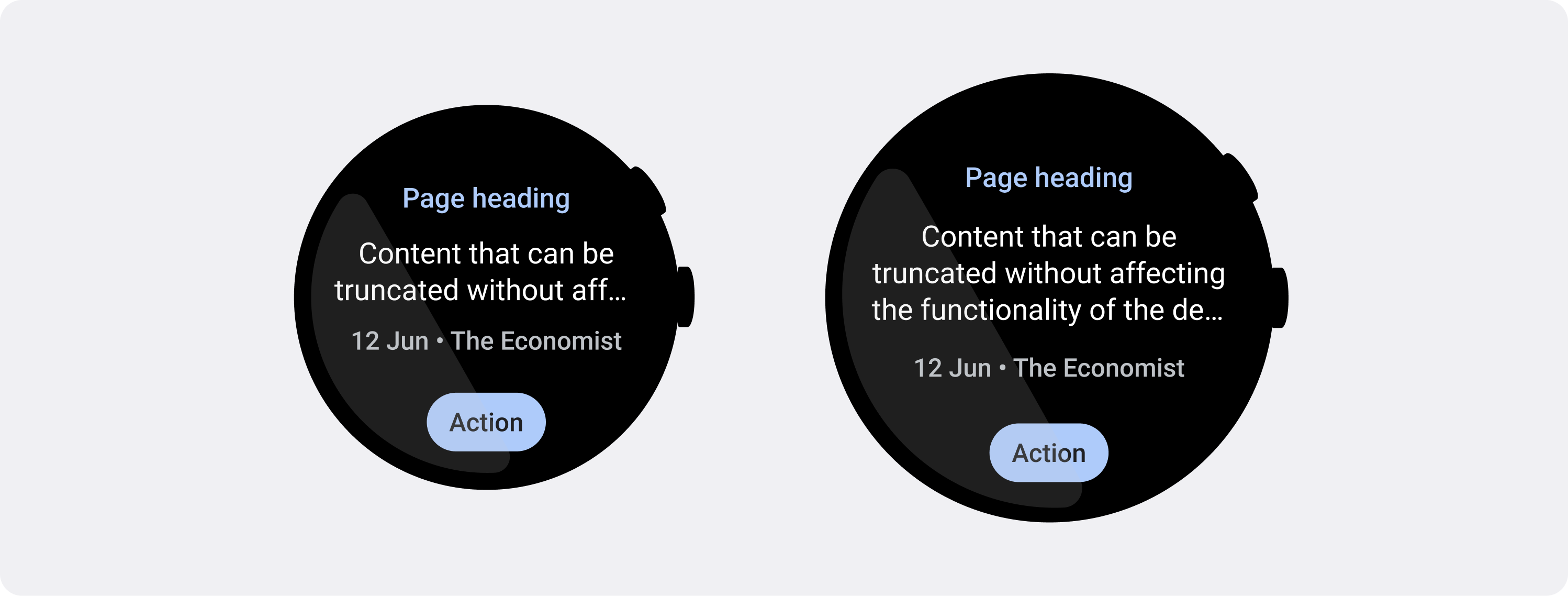
小さい画面で必要な文字数制限を使用する
ほとんどの場合、大きい画面では切り捨てられる前により多くのテキストやコンテンツが表示されます。より多くの水平方向のスペースが利用できる場合でも、デバイス間で一貫したエクスペリエンスを実現するため、常に最小の画面サイズに設計してください。
たとえば、大きな画面で文字を切り取るためのスペースがボタンに確保されていても、それがユーザー エクスペリエンスに不可欠な重要な行動喚起の場合は、小型のデバイスの画面でも文字が切り詰められずに表示されるよう、十分な長さのテキストを使用します。
タイルに可変コンテンツ(サーバーから取得したテキストなど)が表示される場合、小さな画面ではそのテキストが切り捨てられる可能性を考慮してください。
すべきこと