Tier 2: レスポンシブで最適化
コレクションでコンテンツを整理
必要に応じて、コンテンツの保存と分類を行います。
レスポンシブ レイアウトを採用し、さまざまな画面サイズに自動的に適応するアプリは、ユーザーに付加価値を提供し、より生産的で魅力的なユーザー エクスペリエンスを実現します。
レスポンシブ レイアウトは、最適なユーザー エクスペリエンスを実現するために、ボタン、テキスト フィールド、ダイアログなどの要素を動的にフォーマットして配置します。レスポンシブ デザインの手法を活用して、大画面でアプリのユーザーに自動的に追加の価値を提供します。一目で確認できるテキストの増加、画面上のアクションの増加、タップ ターゲットの拡大とアクセシビリティの向上など、レスポンシブな手法は、大画面のユーザーに優れたエクスペリエンスを提供します。
レスポンシブ デザインで価値を高める
check_circle
すべきこと
- レスポンシブでアダプティブな動作が組み込まれている M3 Compose コンポーネント ライブラリを使用します。
- レスポンシブ レイアウトを活用します。レスポンシブ レイアウトは、画面サイズ全体で利用可能なスペースを埋めるように自動的かつスムーズに調整されます。
cancel
すべきでないこと
- 余分なスペースを埋めるために UI 要素(テキスト フィールド、ボタン、ダイアログなど)を拡大します。
- 主にグラフィック目的で使用される場合を除き、フォントサイズを大きくします。
例
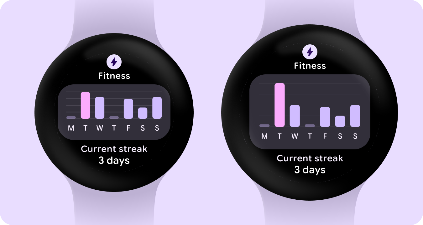
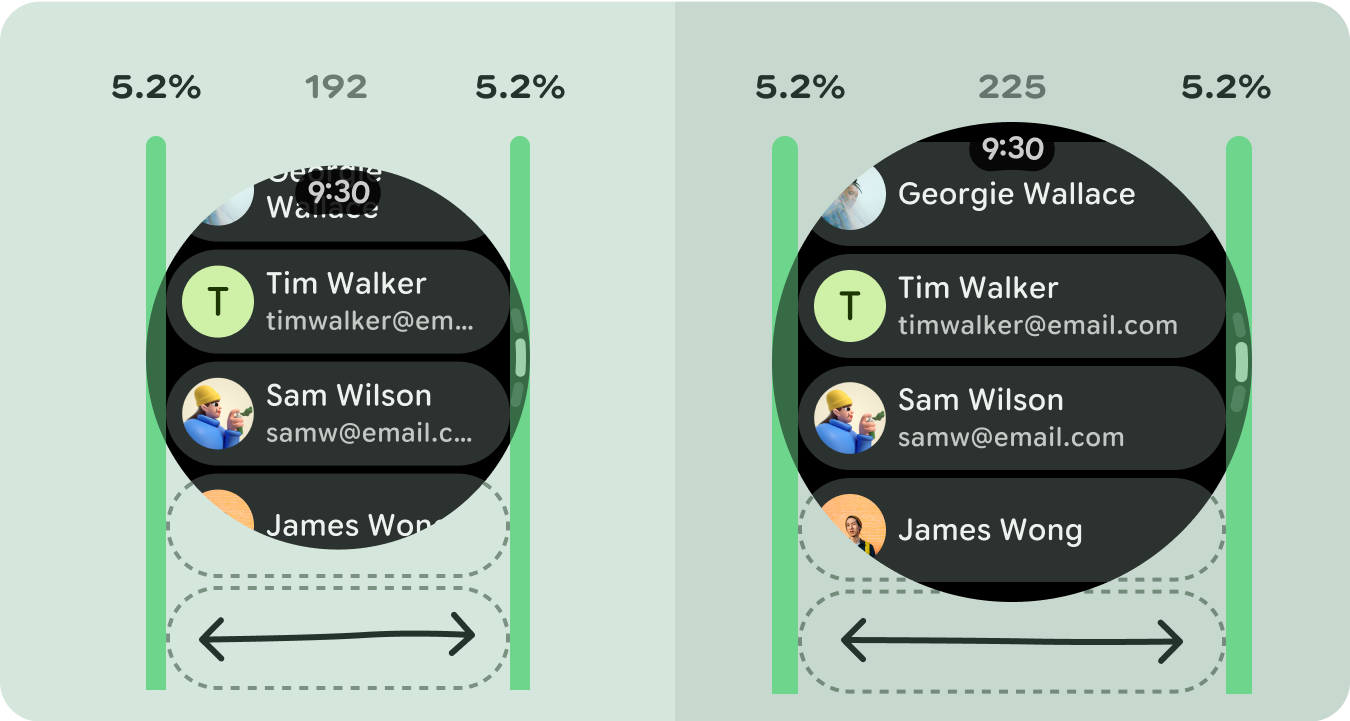
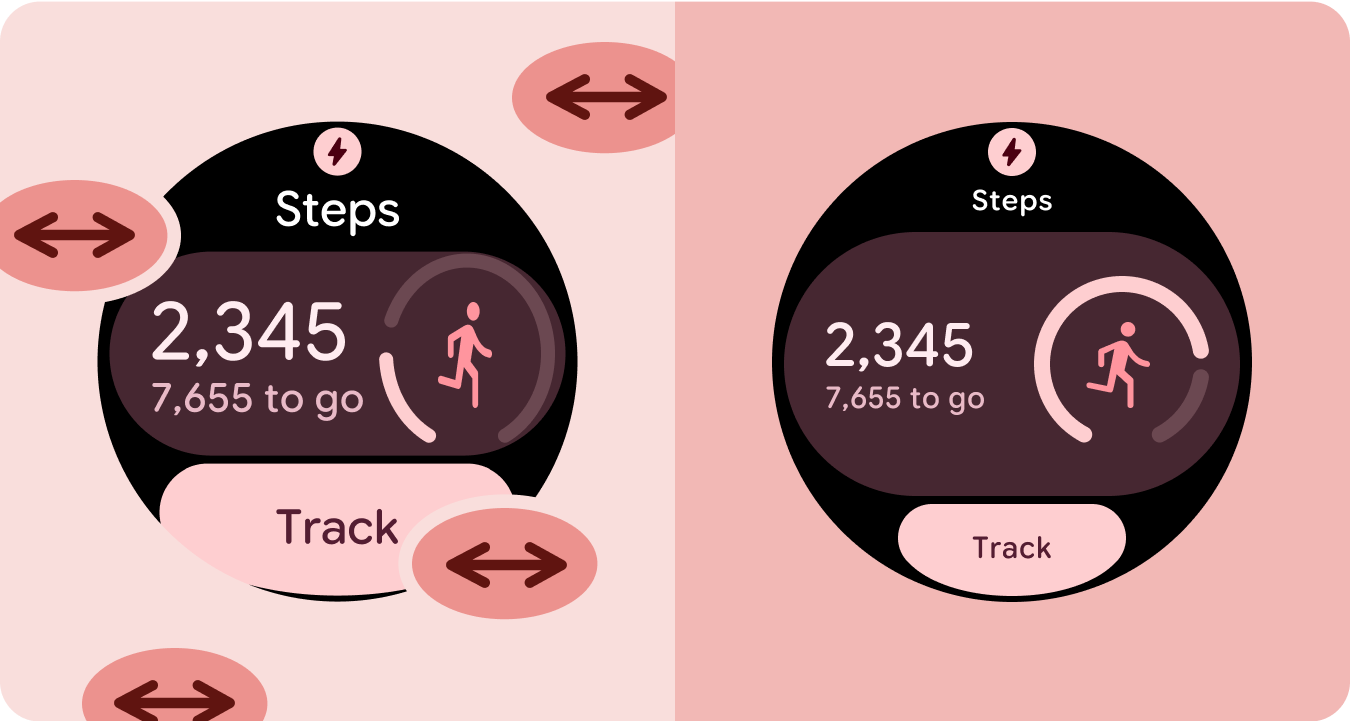
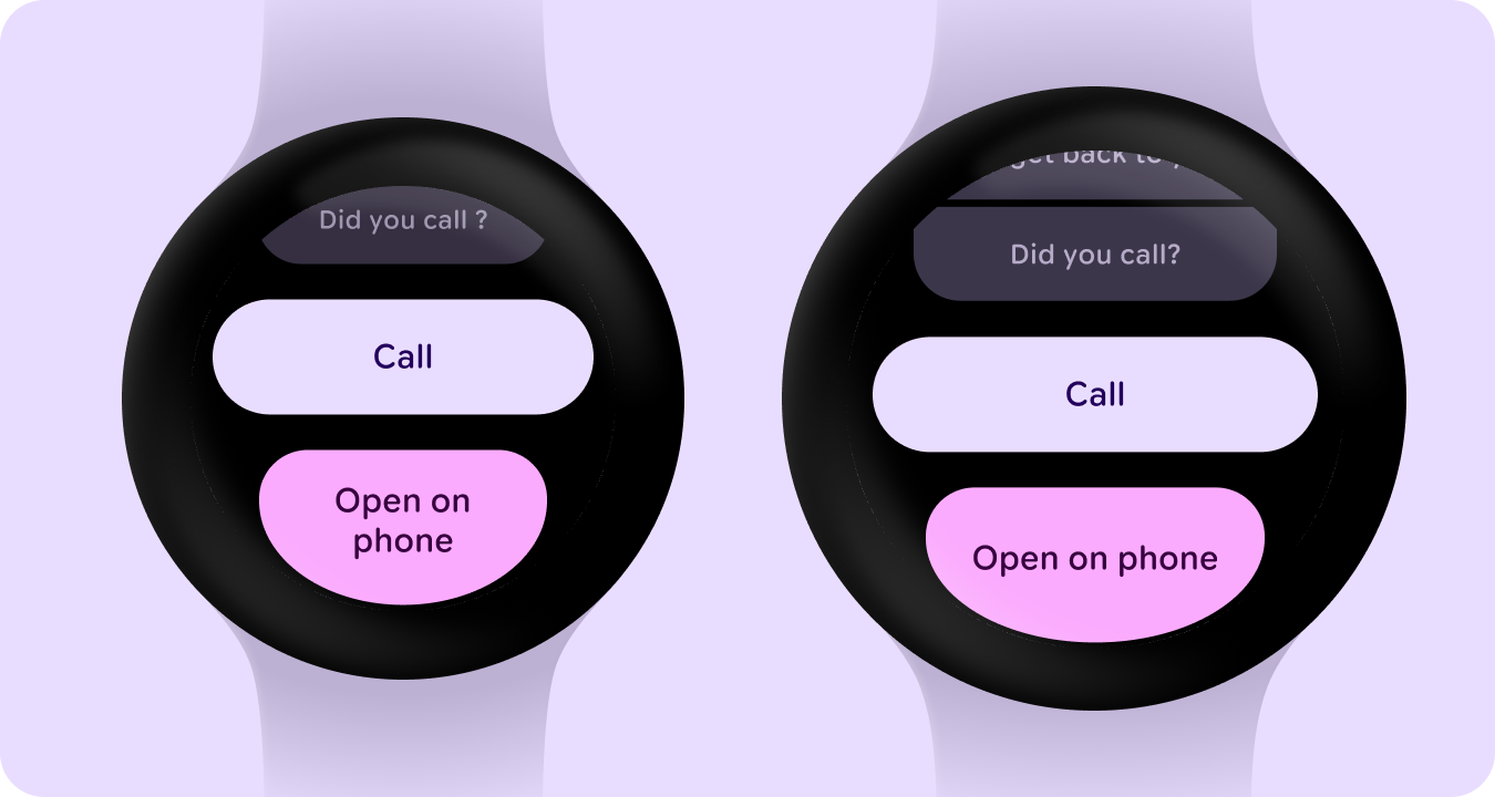
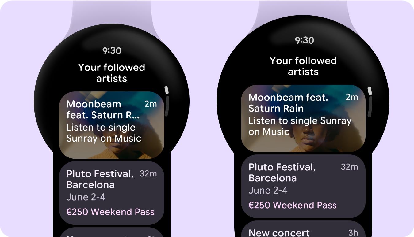
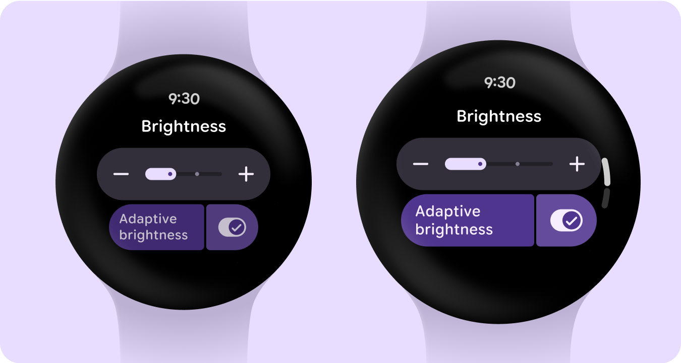
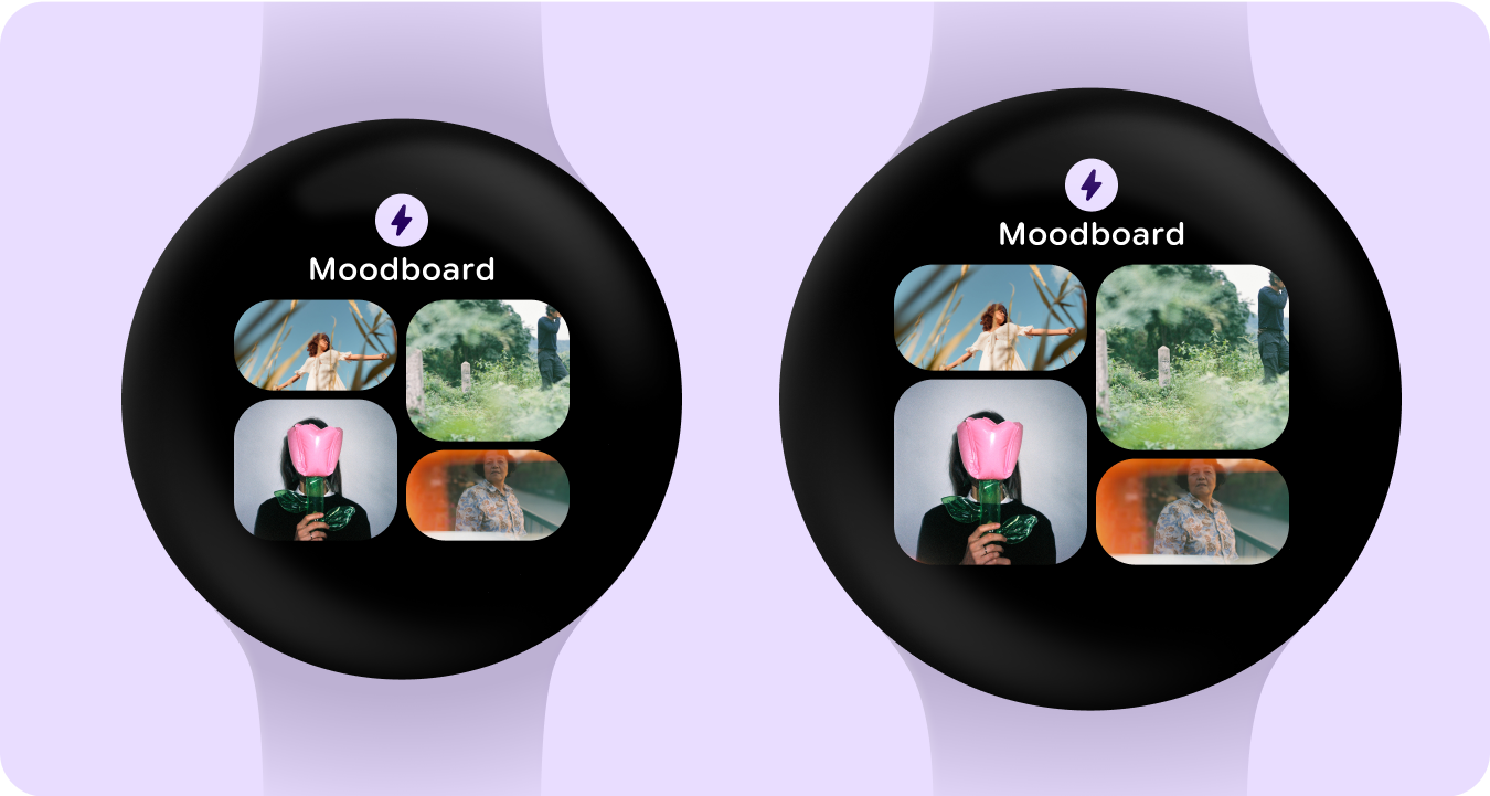
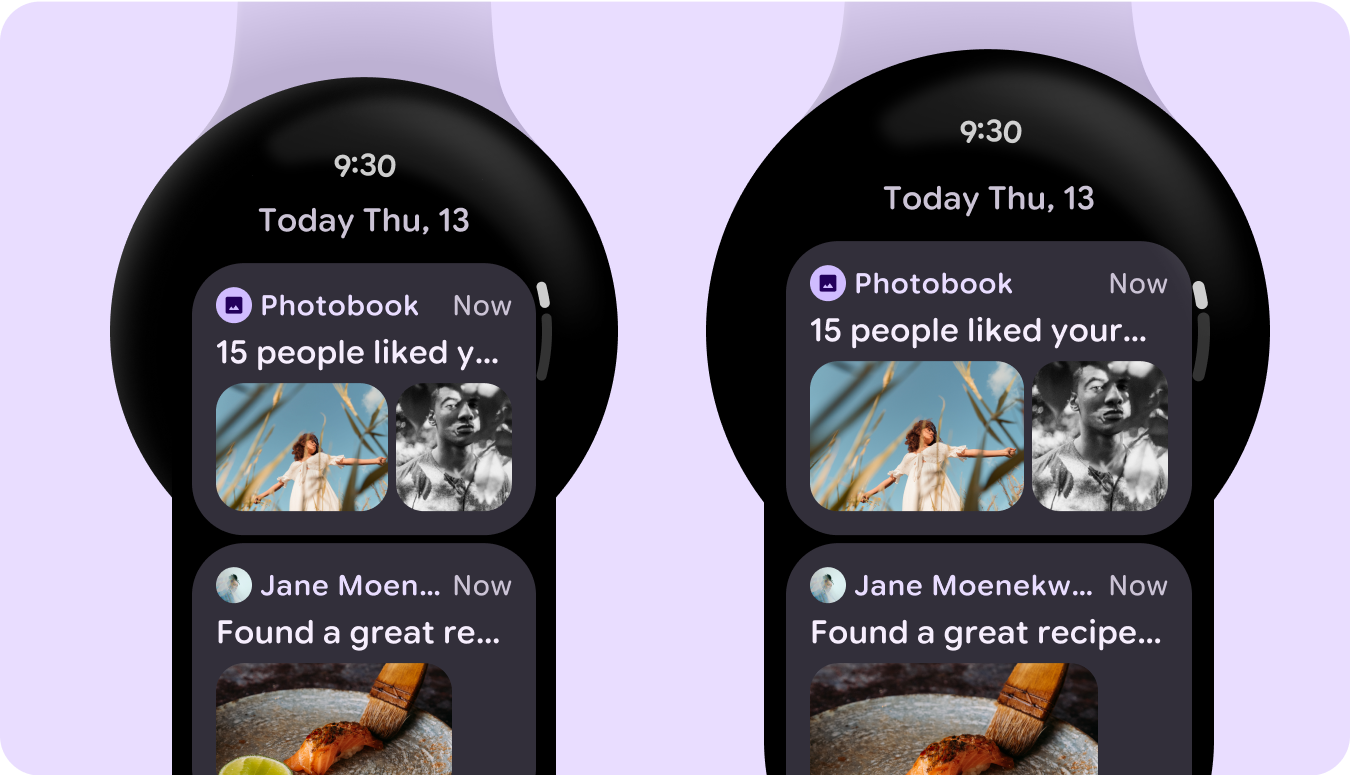
次の画像は、レスポンシブで最適化されたアプリの例を示しています。
このページのコンテンツやコードサンプルは、コンテンツ ライセンスに記載のライセンスに従います。Java および OpenJDK は Oracle および関連会社の商標または登録商標です。
最終更新日 2025-07-27 UTC。
[[["わかりやすい","easyToUnderstand","thumb-up"],["問題の解決に役立った","solvedMyProblem","thumb-up"],["その他","otherUp","thumb-up"]],[["必要な情報がない","missingTheInformationINeed","thumb-down"],["複雑すぎる / 手順が多すぎる","tooComplicatedTooManySteps","thumb-down"],["最新ではない","outOfDate","thumb-down"],["翻訳に関する問題","translationIssue","thumb-down"],["サンプル / コードに問題がある","samplesCodeIssue","thumb-down"],["その他","otherDown","thumb-down"]],["最終更新日 2025-07-27 UTC。"],[],[],null,["# Tier 2: Responsive and optimized\n\nApps that employ responsive layouts and automatically adapt to different screen\nsizes offer additional value to users and provide more productive, engaging user\nexperiences.\n\nResponsive layouts dynamically format and position elements such as buttons,\ntext fields, and dialogs for an optimal user experience. Automatically offer\nusers of your app additional value on larger screens by utilizing responsive\ndesign practices. Whether it's more text visible at a glance, more actions on\nscreen, or larger, more accessible tap targets, responsive practices provide an\nenhanced experience for users of larger screens.\n\nAdd value through responsive design\n-----------------------------------\n\ncheck_circle\n\n### Do\n\n- Use the M3 Compose component library which has built-in responsive and adaptive behavior.\n- Utilize responsive layouts, which automatically and smoothly adjust to fill the available space across screen sizes. \ncancel\n\n### Don't\n\n- Stretch UI elements---including text fields, buttons, dialogs---to fill extra space.\n- Increase the sizes of fonts, unless they're serving a primarily graphic purpose.\n\nExamples\n--------\n\nThe following images show examples of apps that are responsive and optimized.\n\n\n### Edge-hugging buttons\n\n\u003cbr /\u003e\n\n\n### List of cards\n\n\u003cbr /\u003e\n\n\n### List of switchers and buttons\n\n\u003cbr /\u003e\n\n\n### Tile with image cards\n\n\u003cbr /\u003e\n\n\n### List of cards with images\n\n\u003cbr /\u003e\n\n\n### Tile with graph\n\n\u003cbr /\u003e"]]