一般的なアダプティブ デザイン レイアウト
コレクションでコンテンツを整理
必要に応じて、コンテンツの保存と分類を行います。
共通のデザイン レイアウト(正規デザイン レイアウト)は、Wear OS で利用可能なさまざまな画面サイズで最適なユーザー エクスペリエンスを提供する、実証済みの汎用アプリ レイアウトです。
アダプティブ UI とレスポンシブ UI の原則を使用して、すべてのユーザーに最高品質のエクスペリエンスを提供します。アダプティブ UI は、レンダリングされる画面のサイズに関係なく、使用可能な画面スペースを最大限に活用するために伸縮したり変更したりします。
適応型 UI は、レイアウト ロジックに直接組み込まれたコンポーネントとメソッドを使用して、レスポンシブに変更されます。また、これらのレイアウトでは画面サイズのブレークポイントも使用します。これにより、画面サイズに応じて異なるデザインを適用し、すべてのユーザーにさらに豊かなエクスペリエンスを提供できます。
確立された一般的なレイアウトを使用する
確立された標準レイアウトを使用すると、さまざまなデバイスサイズに UI をスムーズに適応させることができます。これらの正規レイアウトは、すべての画面サイズで高品質のエクスペリエンスを提供します。
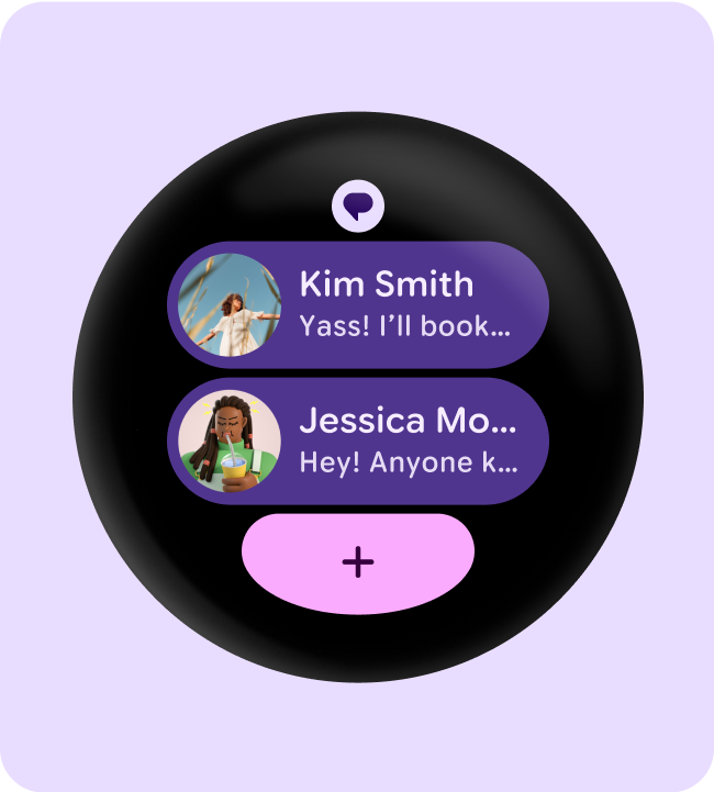
タイル(スクロールしないレイアウト)
タイルはスクロールしないビュー レイアウトで、ユーザーが作業を完了するために必要な情報やアクションにすばやくアクセスできます。ウォッチフェイスをスワイプするだけで、フィットネスの目標達成度や天気情報などを確認できます。タイルからアプリを起動したり、重要なタスクをすばやく実行したりできます。
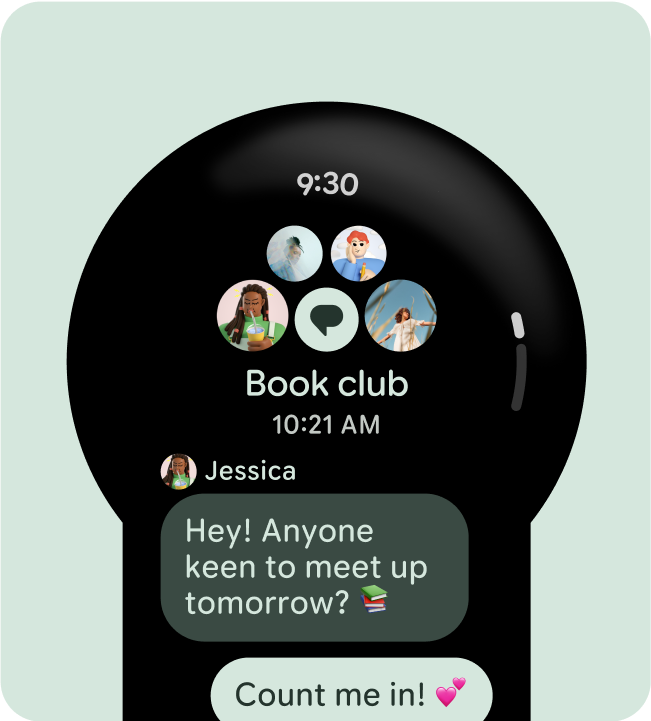
アプリ(スクロール レイアウト)
スクロールするアプリビューのレイアウトには、リスト(ScalingLazyColumn
)とダイアログがあります。これらのレイアウトはアプリ画面の大部分を占め、大画面に適応する必要があるコンポーネントのコレクションを表します。
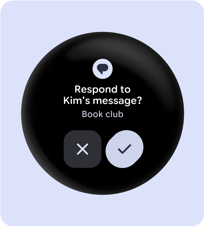
アプリ(スクロールしないレイアウト)
スクロール不可のアプリビュー レイアウトには、メディア プレーヤー、選択ツール、切り替えツール、一部のダイアログ、進行状況インジケータを使用する特別なフィットネス スクリーンやトラッキング スクリーンなどがあります。
このページのコンテンツやコードサンプルは、コンテンツ ライセンスに記載のライセンスに従います。Java および OpenJDK は Oracle および関連会社の商標または登録商標です。
最終更新日 2025-07-26 UTC。
[[["わかりやすい","easyToUnderstand","thumb-up"],["問題の解決に役立った","solvedMyProblem","thumb-up"],["その他","otherUp","thumb-up"]],[["必要な情報がない","missingTheInformationINeed","thumb-down"],["複雑すぎる / 手順が多すぎる","tooComplicatedTooManySteps","thumb-down"],["最新ではない","outOfDate","thumb-down"],["翻訳に関する問題","translationIssue","thumb-down"],["サンプル / コードに問題がある","samplesCodeIssue","thumb-down"],["その他","otherDown","thumb-down"]],["最終更新日 2025-07-26 UTC。"],[],[],null,["# Common adaptive design layouts\n\nCommon design layouts---also known as canonical design layouts---are proven,\nversatile app layouts that provide an optimal user experience on the wide\nvariety of screen sizes that are available with Wear OS.\n\nUse adaptive and responsive UI principles to deliver the highest quality\nexperience for everyone. Adaptive UIs stretch and change to make the most of\nall available screen space, no matter what size screen they're rendered on.\n\nAdaptive UIs change responsively, using components and methods built directly\ninto the layout logic. These layouts also utilize screen size\nbreakpoints---applying a different design on different screen sizes---to create an\neven richer experience for everyone.\n\nUse established common layouts\n------------------------------\n\nUse established canonical layouts to help your UIs adapt smoothly across a\nrange of device sizes. These canonical layouts offer a high quality experience\nacross all screen sizes.\n\n\n**Tiles (non-scrolling layouts)**\n\nTiles are non-scrolling view layouts which provide quick access to information\nand actions users need to get things done. With a swipe from the watch face, a\nuser can see how they are progressing towards their fitness goals, check the\nweather, and more. Launch an app or get essential tasks done quickly from tiles. \n\n**Apps (scrolling layouts)**\n\nScrolling app view layouts include lists (`ScalingLazyColumn`) and dialogs.\nThese layouts make up the majority of app screens, and they represent a\ncollection of components which need to adapt to larger screen sizes. \n\n**Apps (non-scrolling layouts)**\n\nNon-scrolling app view layouts include media players, pickers, switchers, some\ndialogs, and special fitness or tracking screens that use progress indicators.\n\n\u003cbr /\u003e"]]