スクロールしないアプリの一般的なレイアウト
コレクションでコンテンツを整理
必要に応じて、コンテンツの保存と分類を行います。
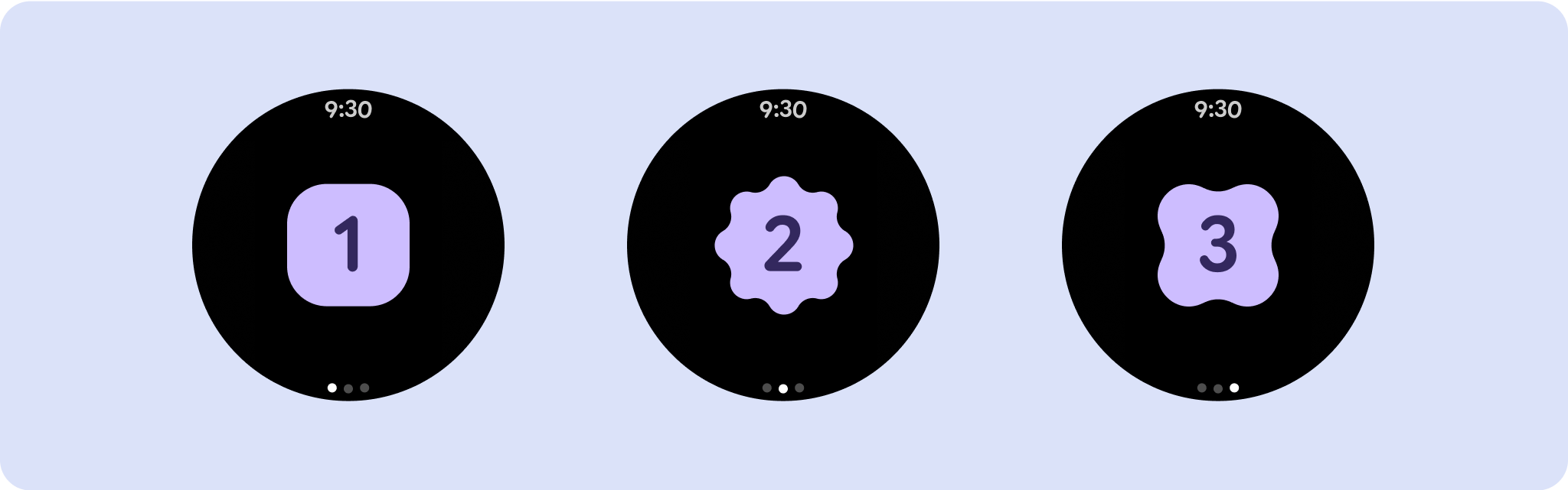
スクロールしないアプリビュー レイアウトには、メディア プレーヤー、確認ダイアログ、選択ツール、切り替えツール、進行状況インジケータを使用する特別なフィットネス スクリーンやトラッキング スクリーンなどがあります。画面の高さを制限すると、ユーザーはオプションのリストをブラウジングする必要がなく、1 つのタスクまたはコントロール セットに集中できます。画面サイズの小さいデバイスに対応するには、制限されたサイズを考慮して設計し、一目でわかるようにし、必要に応じて円形の画面を採用します。

レスポンシブで最適化されたデザインを作成する
スクロールしないビューは、ひと目でわかる情報に焦点を当て、最小限の操作でユーザーに価値を提供します。ただし、これらのレイアウトにレスポンシブ動作を組み込むのは難しい場合があります。この問題に対処するため、Android UI ライブラリのレイアウトとコンポーネントを更新し、パーセンテージベースの余白とパディングなど、レスポンシブな動作を組み込みました。Compose コンポーネントを使用している場合は、この応答性を自動的に継承できます。
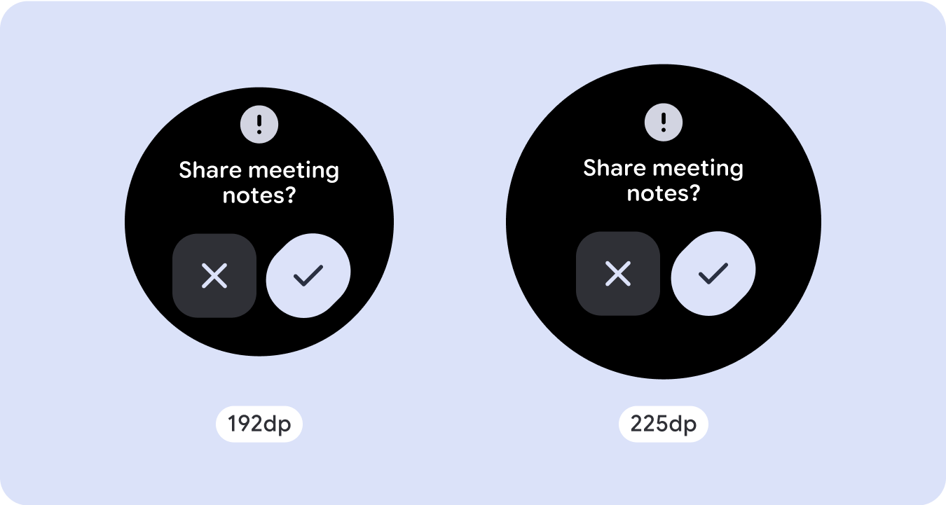
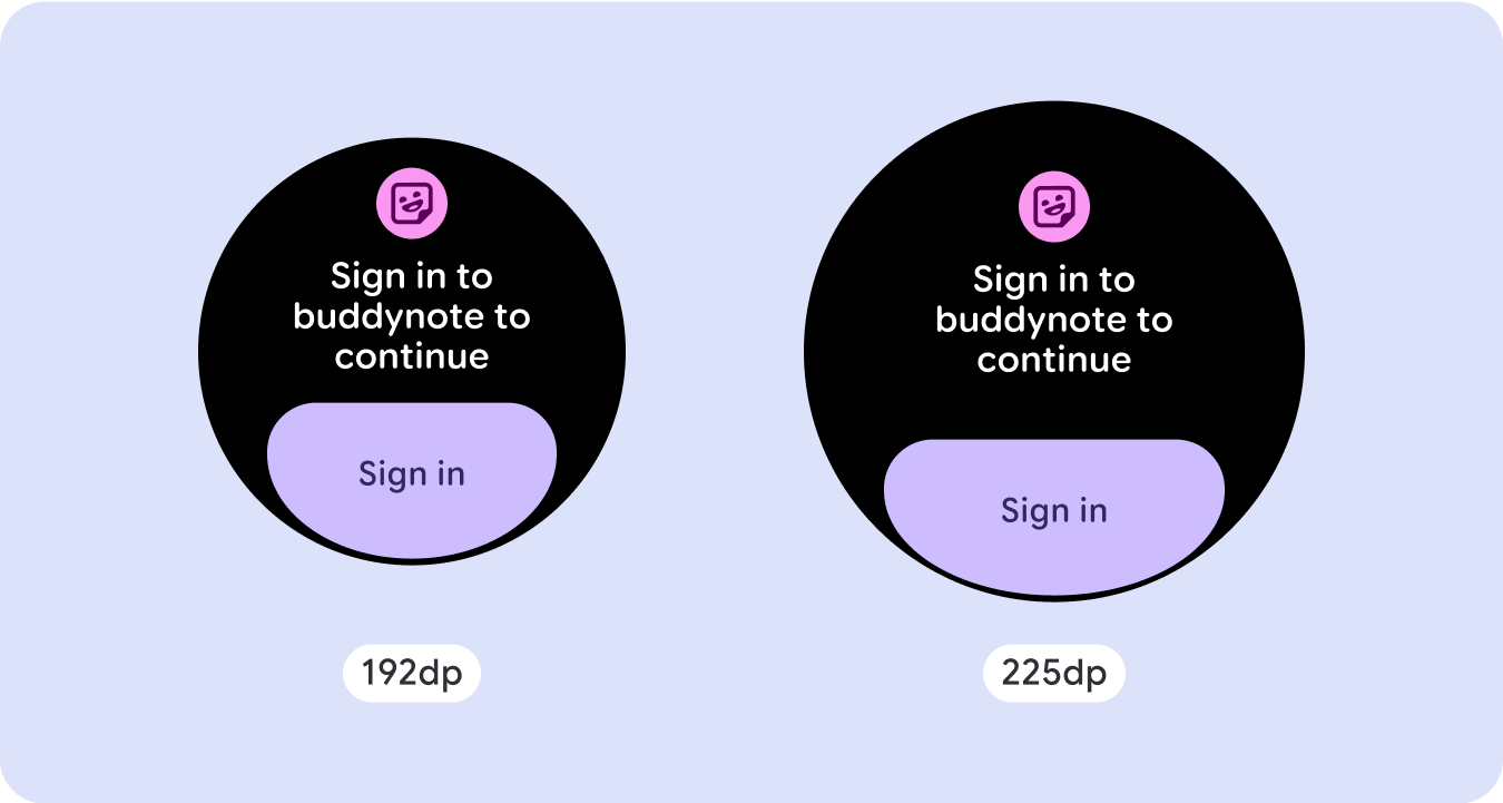
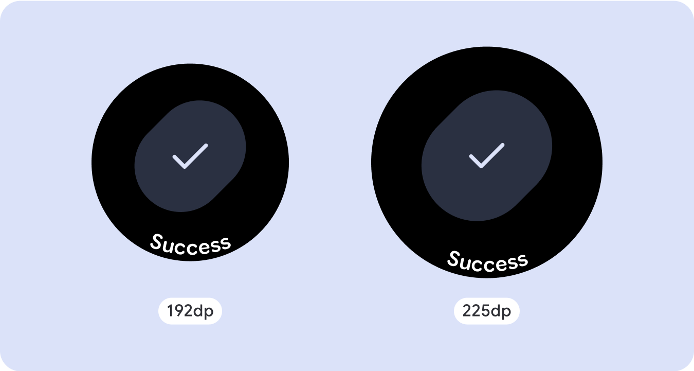
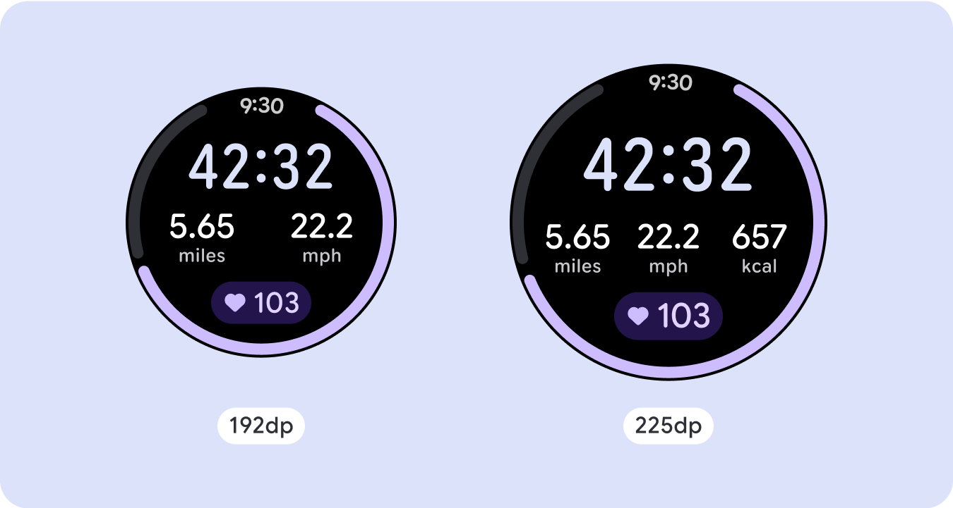
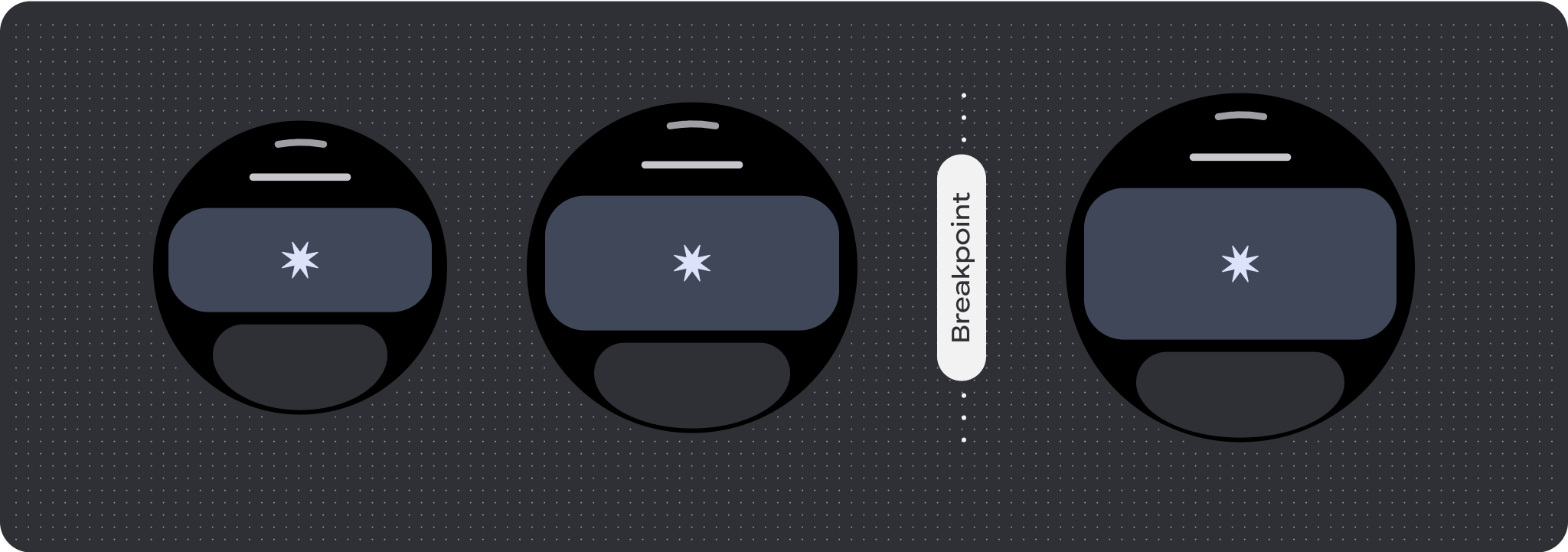
独自の画面デザインの場合は、さまざまな画面サイズで徹底的にテストし、コンポーネントと要素がスムーズに適応し、コンテンツが切り取られないようにします。パーセンテージの余白は、スペーサーを効果的にスケーリングするのに役立ちます。225dp のブレークポイントを使用して、大きなスマートウォッチの画面に追加情報や高度な機能を導入することをおすすめします。
コンポーネントが使用可能な幅と高さに適応していることを確認する
すべてのコンポーネントはレスポンシブに構築されています。つまり、利用可能な幅(全画面表示の場合は高さも)に適応します。画面の丸いカーブによってコンテンツが切り取られないように、必要な余白を確保してください。また、スクロールしない画面コンテンツがレイアウトを押し下げてスクロールしたり、切り取られたりしないように、必要なレイアウト動作を設定します。
アダプティブで差別化されたデザインを作成する
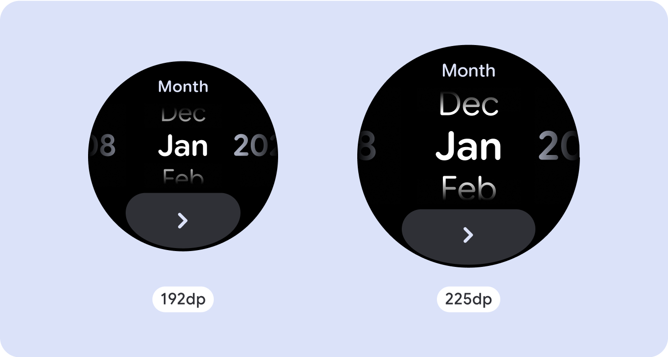
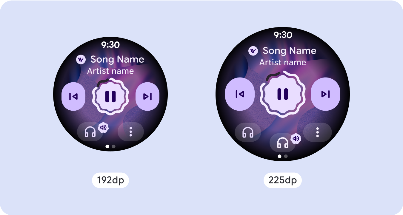
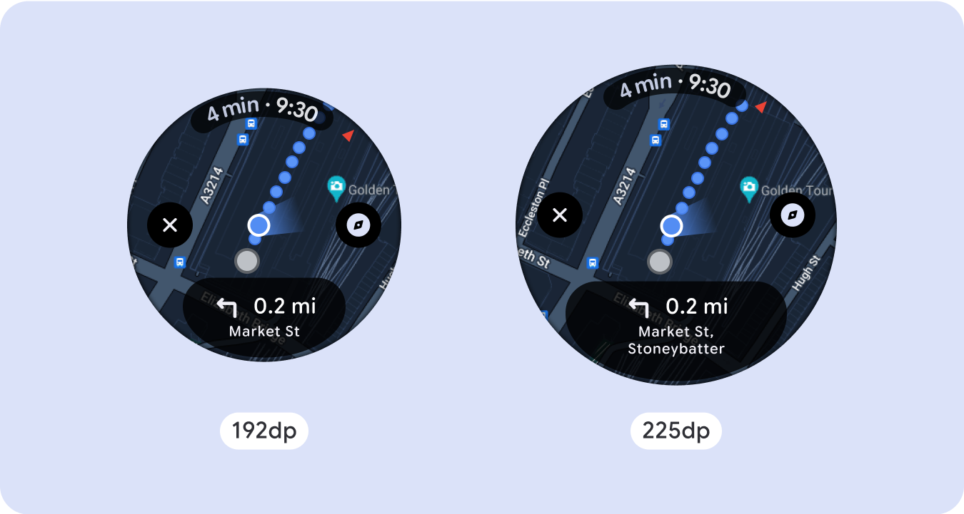
大画面サイズの追加スペースを最大限に活用するには、225 dp にサイズ ブレークポイントを追加します。このブレークポイントを使用すると、追加のコンテンツを表示したり、詳細情報、オプション、データを追加したり、大画面サイズに合わせてレイアウトを変更したりできます。
これには、ブレークポイントごとに異なる設計が必要です。大きな画面のデザイン(225 インチ以上)には、次の要素を追加できます。
既存のコンポーネントのサイズを増やす、または状態を変更する
ブレークポイントを使用して、詳細を表示したり、コンテンツをひと目で理解できるようにしたりします。小画面でエクスペリエンスや機能が損なわれないこと、大画面での変更が追加にすぎないことを確認してください。
現在のレイアウト内にコンテンツを追加する
コンポーネントやコンテンツを追加することで、レイアウトにオプションや詳細を追加し、最終的には価値を高めることができます。
ただし、その代償として、一目でわかるようにする機能が損なわれることはあってはなりません。
エクスペリエンスに多くのコンテンツが必要だが、スクロールしないレイアウトを維持したい場合は、縦方向または横方向のページネーションを使用するマルチページ レイアウトを検討してください。

レスポンシブな動作と適応性の高い動作
Compose ライブラリ内のすべてのコンポーネントは、幅と高さを広げて、より広い画面サイズに自動的に適応します。特にこのようなビューでは、ブレークポイントを利用することで、すべてのユーザーに特に豊かで価値の高いエクスペリエンスを提供できます。すべての余白をパーセンテージで定義し、中央のメイン コンテンツが使用可能なディスプレイ領域全体に広がるように垂直方向の制約を定義します。
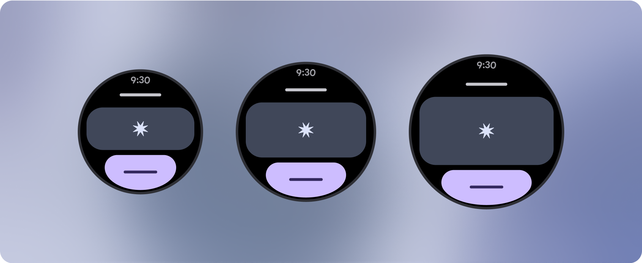
スクロールしない画面を設計する場合は、上部、中央、下部の 3 つのセクションに分割することをおすすめします。これにより、上部と下部のセクションに内側の余白を追加して切り抜きを回避し、中央のセクションでは画面の全幅を利用できます。タップ操作だけでは最適なエクスペリエンスを提供できない可能性があるため、画面のサイズが制限されている場合は、ロータリー スクロール ボタンを使用して画面の要素を操作することを検討してください。
チェックリスト
- すべての画面サイズで適切に表示されるフレキシブルなレイアウトを作成します。
- 上部、下部、両側に推奨される余白を適用します。
- コンテンツが切り捨てられる可能性がある場所に、パーセンテージ値で余白を定義します。
- レイアウト制約を使用して、要素が画面内のスペースを最大限に活用し、さまざまなデバイスサイズでバランスを維持できるようにします。
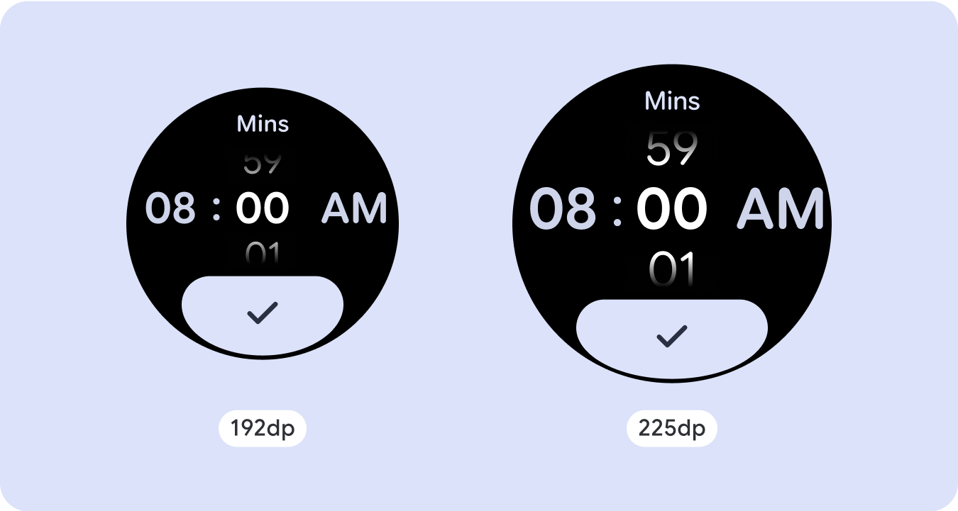
- 時刻のテキスト(使用する場合)をページの上部セクションと重ならないように配置します(詳細については、上部にギャップのある進行状況インジケーターを参照)。
- 限られたスペースをより有効に活用するために、端を覆うボタンの使用を検討してください。
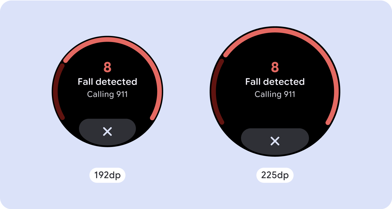
- 225dp でブレークポイントを適用して、追加のコンテンツを導入したり、大きな画面サイズで既存のコンテンツをより簡単に確認できるようにしたりすることを検討してください。
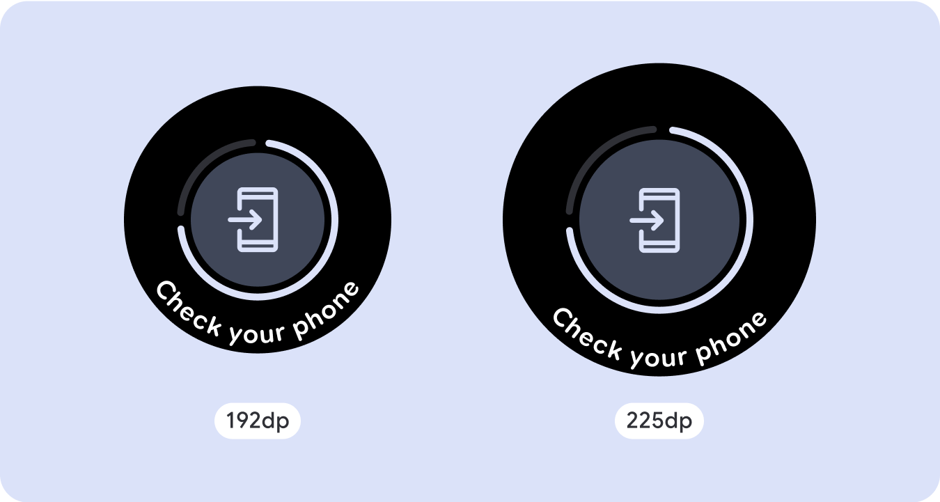
全画面の進行状況インジケーター
進行状況インジケーターは画面サイズに自動的に適応するため、動作に変更はありません。ただし、スペースを最大限に活用するには、中央の領域に比例(パーセンテージ)の余白とパディングを適用することを検討してください。また、大きな画面でコンポーネントのサイズや数を増やすためのブレークポイントも検討してください。

差別化されたエクスペリエンスを作成する
スクロールなしのレイアウトはカスタマイズ可能ですが、画面に追加できるコンテンツの量や、最適なコンポーネントの種類が制限されます。幅の広い丸いボタンではなく、アイコンボタンを使用すると、限られたスペースを有効に活用できます。進行状況インジケーターや大きなデータポイントなどの視覚的なグラフィックを使用すると、重要な情報をグラフィックで伝えることができます。画面ベゼルに沿って配置された要素はすべて、画面サイズに合わせて自動的に拡大されるため、インパクトがさらに増します。

このページのコンテンツやコードサンプルは、コンテンツ ライセンスに記載のライセンスに従います。Java および OpenJDK は Oracle および関連会社の商標または登録商標です。
最終更新日 2025-07-27 UTC。
[[["わかりやすい","easyToUnderstand","thumb-up"],["問題の解決に役立った","solvedMyProblem","thumb-up"],["その他","otherUp","thumb-up"]],[["必要な情報がない","missingTheInformationINeed","thumb-down"],["複雑すぎる / 手順が多すぎる","tooComplicatedTooManySteps","thumb-down"],["最新ではない","outOfDate","thumb-down"],["翻訳に関する問題","translationIssue","thumb-down"],["サンプル / コードに問題がある","samplesCodeIssue","thumb-down"],["その他","otherDown","thumb-down"]],["最終更新日 2025-07-27 UTC。"],[],[],null,["# Common layouts for non-scrolling apps\n\nNon-scrolling app view layouts include media players, confirmation dialogs,\npickers, switchers, and special fitness or tracking screens using progress\nindicators. You can restrict the height of any screen, which ensures the user is\nfocused on one task or set of controls, rather than needing to browse through a\nlist of options. To accommodate devices with smaller screen sizes, design with\nthe limited size in mind, ensuring glanceability and embracing the circular\nscreen where relevant.\n\nBuild responsive and optimized designs\n--------------------------------------\n\nNon-scrolling views focus on glanceable information and offer users value with\nminimal interaction. However, building responsive behavior into these layouts\ncan be challenging. To address this, we have updated our Android UI library\nlayouts and components with built-in responsive behavior, including\npercentage-based margins and padding. If you're utilizing our Compose\ncomponents, you can automatically inherit this responsiveness.\n\nFor unique screen designs, thoroughly test across a variety of screen sizes,\nensuring components and elements adapt smoothly and avoid content clipping. Our\npercentage margins help spacers scale effectively, and we recommend using a\nbreakpoint at 225dp to introduce additional information and enhanced\nfunctionality on larger watch screens.\n\nCheck that components adapt to the available width and height\n-------------------------------------------------------------\n\n\nAll components are built responsively, meaning they adapting to the available\nwidth (and height when full screen). Make sure you have the necessary margins to\nensure content doesn't get clipped by the rounding curve of the screen.\nAdditionally, ensure the necessary layout behavior to ensure your non-scrolling\nscreen content doesn't push the layout to scroll or get cut off. \n\n\n\u003cbr /\u003e\n\nBuild adaptive and differentiated designs\n-----------------------------------------\n\nIn order to best use the additional space on larger screen sizes, add a size\nbreakpoint at 225dp. This breakpoint makes it possible to reveal additional\ncontent, include more information, options, data, or change the layout to better\nsuit the larger screen size.\n\nThis requires a different design for each breakpoint. The larger screen design\n(225+) could include the following additional elements:\n\n### Increase the size or change the state of the existing components\n\n\nUse the breakpoint to show more detail or make the content more glanceable. Just\nmake sure the experience or functionality isn't broken on small screen and the\nlarge screen changes are only additional. \n\n\n\u003cbr /\u003e\n\n### Add content within the current layout\n\n\nBy adding components or content, the layout provides additional options, detail\nand ultimately, value.\n\nThis should never come at the cost of the glanceability. \n\n\u003cbr /\u003e\n\nUse pagination\n--------------\n\nIn scenarios where an experience requires more content but wants to retain a\nnon-scrolling layout, consider a multi-page layout with either vertical or\nhorizontal pagination.\n\nResponsive and adaptive behavior\n--------------------------------\n\nAll components in the Compose library will automatically adapt to the wider\nscreen size, and gain width and height. For these views in particular, utilizing\nbreakpoints can deliver a particularly rich and valuable experience for all\nusers. Define all margins in percentages, and define vertical constraints such\nthat the main content in the middle can stretch to fill the available display\narea.\n\nIt's best to break a non-scrolling screen into a top, middle, and bottom section\nwhen designing. This way, you can add inner margins to the top and bottom\nsection to avoid clipping, but allow your middle section to take advantage of\nthe full width of the screen. Consider the use of the rotary scroll button to\ncontrol elements of the screen when its size is limited, as tapping interactions\nalone may not provide the best experience.\n\n### Checklist\n\n- Create flexible layouts that look reasonable on all screen sizes.\n- Apply the recommended top, bottom, and side margins.\n- Define margins in percentage values in places where content might otherwise be clipped.\n- Utilize layout constraints so that elements make the best possible use of the space within the screen and maintain balance across different device sizes.\n- Accommodate Time Text if used, but not overlapping the top section of the page (see progress indicators with a top gap for more)\n- Consider using edge-hugging buttons to utilize more of the limited space.\n- Consider applying a breakpoint at 225dp to introduce additional content or make existing content more glanceable when on bigger screen sizes.\n\n**Full screen progress indicators**\n\nThere is no behavior change on the progress indicator as it automatically adapts\nto the screen size, however, consider applying proportional (percentage) margins\nand padding on the central area to best utilize space. Also consider a\nbreakpoint to increase the size or number of components on larger screen.\n\nCreate differentiated experiences\n---------------------------------\n\nNon-scrolling layouts are customizable, but are more limited in how much content\ncan be added to the screen and what kind of components work best. Using Icon\nButtons instead of wider pill shaped Buttons makes better use of the limited\nspace, and visual graphics like Progress Indicators and large data points help\ncommunicate key information in a graphical way. All elements that hug the screen\nbezel automatically grow with the screen size, so they become even more\nimpactful."]]