
L'éditeur de mise en page vous permet de créer rapidement des mises en page basées sur View en faisant glisser des éléments d'interface utilisateur dans un éditeur de conception visuelle au lieu d'écrire manuellement le code XML de mise en page.
L'éditeur de conception peut prévisualiser votre mise en page sur différents appareils et versions Android. Vous pouvez également la redimensionner de manière dynamique pour vous assurer qu'elle fonctionne correctement sur différentes tailles d'écran.
L'éditeur de mise en page est particulièrement performant lorsque vous créez une mise en page avec ConstraintLayout.
Cette page présente l'éditeur de mise en page. Pour en savoir plus sur les principes de base de l'éditeur de mise en page, consultez Mises en page.
Présentation de l'éditeur de mise en page
L'éditeur de mise en page s'affiche lorsque vous ouvrez un fichier de mise en page XML.
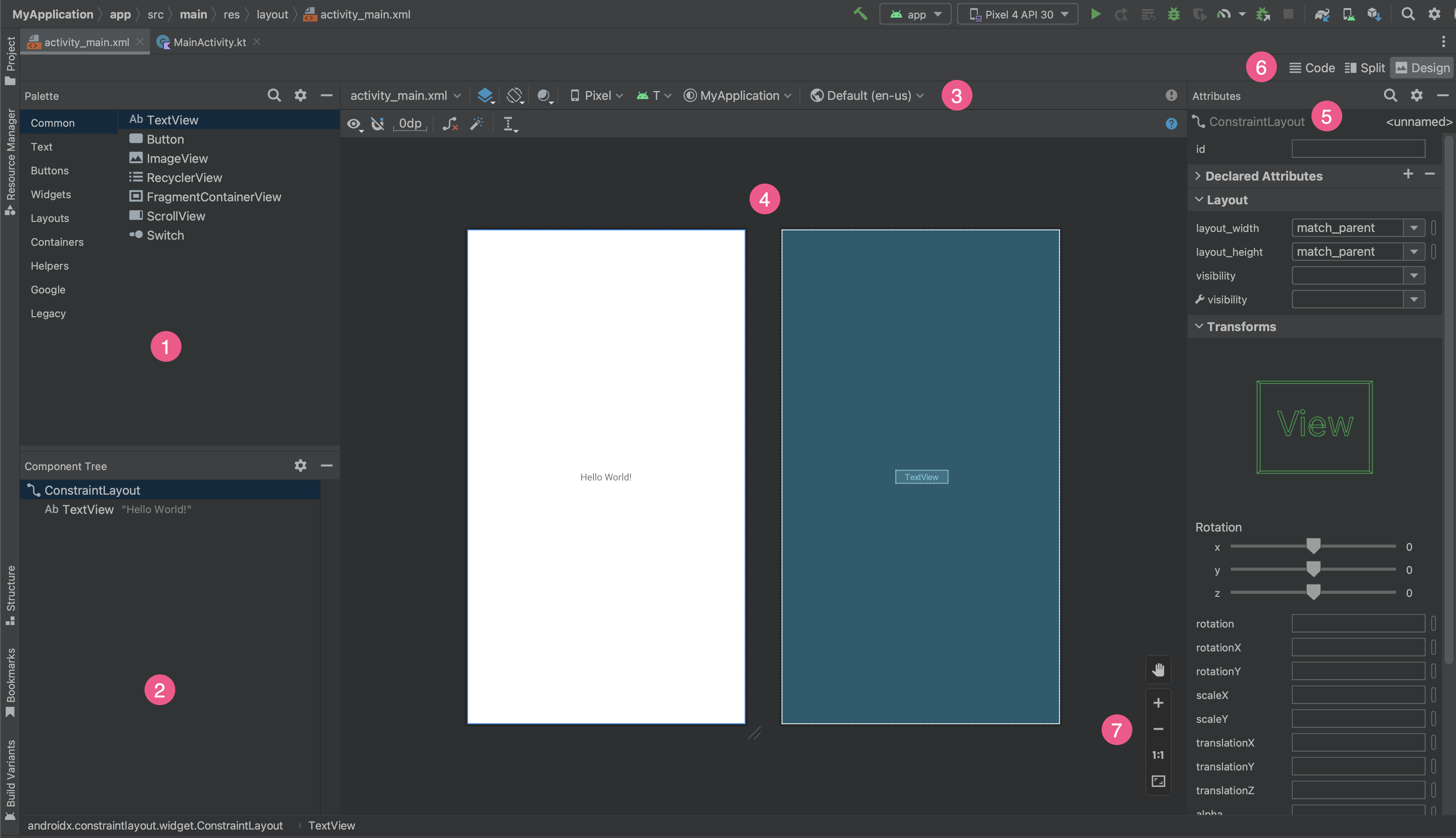
- Palette: contient différentes vues et groupes de vues que vous pouvez faire glisser dans votre mise en page.
- Component Tree (Arborescence des composants) : affiche la hiérarchie des composants dans votre mise en page.
- Toolbar (Barre d'outils) : contient des boutons qui configurent l'apparence de votre mise en page dans l'éditeur et modifient les attributs de mise en page.
- Éditeur de conception: vous permet de modifier votre mise en page dans la vue Conception, la vue Plan ou les deux.
- Attributs: contrôle des attributs de la vue sélectionnée.
- View mode (Mode d'affichage) : permet d'afficher votre mise en page en mode Code
 , Split (Partagé)
  ou Design (Conception)
  . Le mode Split (Partagé) affiche à la fois les fenêtres Code et Design (Conception).
 - Commandes de zoom et de panoramique: contrôlez la taille et la position de l'aperçu dans l'éditeur.
Lorsque vous ouvrez un fichier de mise en page XML, l'éditeur de mise en page s'ouvre par défaut, comme l'illustre la figure 1. Pour modifier le fichier XML de mise en page dans l'éditeur de texte, cliquez sur le bouton Code en haut à droite de la fenêtre. Notez que les panneaux Palette, Component Tree (Arborescence des composants) et Attributes (Attributs) ne sont pas disponibles lorsque vous modifiez votre mise en page en mode Code.
Conseil:Pour basculer entre les éditeurs de mise en page et de texte, appuyez sur Alt (Control sur macOS) plus Shift et la flèche vers la droite ou vers la gauche.
Modifier l'apparence de l'aperçu
Les boutons de la ligne supérieure de l'éditeur de mise en page vous permettent de configurer l'apparence de votre mise en page dans l'éditeur.
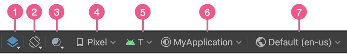
- Design and Blueprint (Conception et plan) : sélectionnez la manière dont vous souhaitez afficher votre mise en page dans l'éditeur. Vous pouvez également appuyer sur
Bpour faire défiler ces types de vues.- Sélectionnez Design (Conception) pour afficher un aperçu de votre mise en page.
- Sélectionnez Blueprint (Plan) pour afficher uniquement les contours de chaque vue.
- Sélectionnez Design + Blueprint (Conception + Plan) pour afficher les deux vues côte à côte.
- Screen orientation and layout variants (Orientation de l'écran et variantes de mise en page) : sélectionnez l'orientation paysage ou portrait de l'écran ou choisissez d'autres modes d'écran pour lesquels votre application propose d'autres mises en page, telles que le mode Nuit. Ce menu contient également des commandes permettant de créer une variante de mise en page, comme décrit dans une section de cette page.
Vous pouvez également appuyer sur la lettre
Osur le clavier pour changer d'orientation. Mode d'UI du système: si vous avez activé la couleur dynamique dans votre application, changez de fond d'écran et voyez comment vos mises en page réagissent au fond d'écran choisi par différents utilisateurs. Notez que vous devez d'abord sélectionner un thème de couleur dynamique Material, puis modifier le fond d'écran.
Device type and size (Type et taille de l'appareil) : sélectionnez le type d'appareil (téléphone/tablette, Android TV ou Wear OS) et la configuration d'écran (taille et densité). Vous pouvez choisir parmi plusieurs types d'appareils préconfigurés et vos propres définitions AVD. Vous pouvez également créer un AVD en sélectionnant Add Device Definition (Ajouter une définition d'appareil) dans la liste, comme illustré à la figure 3.
- Pour redimensionner l'appareil, faites glisser l'angle inférieur droit de la mise en page.
- Appuyez sur
Dpour parcourir la liste des appareils.
Tester votre mise en page sur les appareils de référence de ce menu permet à votre application de s'adapter bien aux états de mise en page sur des appareils réels.
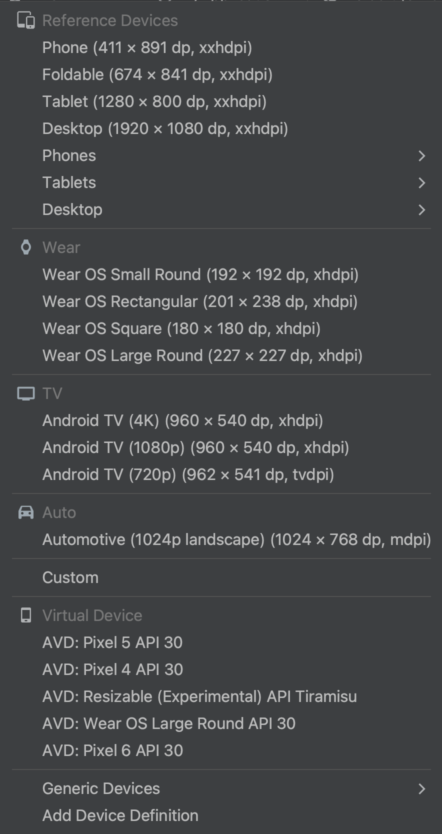
Figure 3. Liste des appareils affichant les appareils de référence. Version de l'API: sélectionnez la version d'Android sur laquelle vous souhaitez prévisualiser votre mise en page. La liste des versions Android disponibles dépend des versions de la plate-forme du SDK que vous avez installées à l'aide du SDK Manager.
App theme (Thème de l'application) : sélectionnez le thème de l'interface utilisateur à appliquer à l'aperçu. Cela ne fonctionne que pour les styles de mise en page compatibles. De nombreux thèmes de cette liste génèrent donc une erreur.
Language (Langue) : sélectionnez la langue à afficher pour vos chaînes d'interface utilisateur. Cette liste n'affiche que les langues disponibles dans vos ressources de chaîne. Si vous souhaitez modifier vos traductions, cliquez sur Edit Translations (Modifier les traductions) dans le menu. Pour en savoir plus sur l'utilisation des traductions, consultez Localiser l'interface utilisateur avec Translations Editor.
Créer une nouvelle mise en page
Lorsque vous ajoutez une nouvelle mise en page pour votre application, commencez par créer un fichier de mise en page par défaut dans le répertoire layout/ par défaut de votre projet afin de l'appliquer à toutes les configurations d'appareils. Une fois la mise en page par défaut définie, vous pouvez créer des variantes de mise en page, comme décrit dans une section de cette page, pour des configurations d'appareil spécifiques, telles que les écrans de grande taille.
Vous pouvez créer une nouvelle mise en page de l'une des manières suivantes :
À l'aide du menu principal d'Android Studio
- Dans la fenêtre Project (Projet), cliquez sur le module auquel vous souhaitez ajouter une mise en page.
- Dans le menu principal, sélectionnez File > New > XML > Layout XML File (Fichier > Nouveau > XML > Fichier XML de mise en page).
- Dans la boîte de dialogue qui s'affiche, indiquez le nom du fichier, la balise de mise en page racine et l'ensemble de sources auquel la mise en page correspond.
- Cliquez sur Finish (Terminer) pour créer la mise en page.
À l'aide de la vue Project (Projet)
- Dans la fenêtre Project (Projet), sélectionnez la vue Project (Projet).
- Effectuez un clic droit sur le répertoire de mise en page dans lequel vous souhaitez ajouter la mise en page.
- Dans le menu contextuel qui s'affiche, cliquez sur New > Layout Resource File (Nouveau > Fichier de ressources de mise en page).
À l'aide de la vue Android
- Dans la fenêtre Project (Projet), sélectionnez la vue Android.
- Faites un clic droit sur le dossier
layout. - Dans le menu contextuel qui s'affiche, sélectionnez New > Layout Resource File (Nouveau > Fichier de ressources de mise en page).
À l'aide du gestionnaire de ressources
- Dans Resource Manager (Gestionnaire de ressources), sélectionnez l'onglet Layout (Mise en page).
- Cliquez sur le bouton
+, puis sur Layout Resource File (Fichier de ressources de mise en page).
Utiliser des variantes de mise en page afin d'optimiser la mise en page pour différents écrans
Une variante de mise en page est une version alternative d'une mise en page existante, optimisée pour une certaine taille ou orientation d'écran.
Utiliser une variante de mise en page recommandée
Android Studio propose des variantes de mise en page courantes que vous pouvez utiliser dans votre projet. Pour utiliser une variante de mise en page recommandée, procédez comme suit :
- Ouvrez votre fichier de mise en page par défaut.
- Cliquez sur l'icône Design (Conception) en haut à droite de la fenêtre.
- Le nom du fichier de mise en page s'affiche dans la liste déroulante Action à effectuer pour changer et créer des qualificatifs pour les fichiers de mise en page. Sélectionnez le menu déroulant.
- Dans la liste déroulante, sélectionnez une variante, par exemple Create Landscape Qualifier (Créer un qualificatif en mode paysage) ou Create Tablet Qualifier (Créer un qualificatif pour tablette).
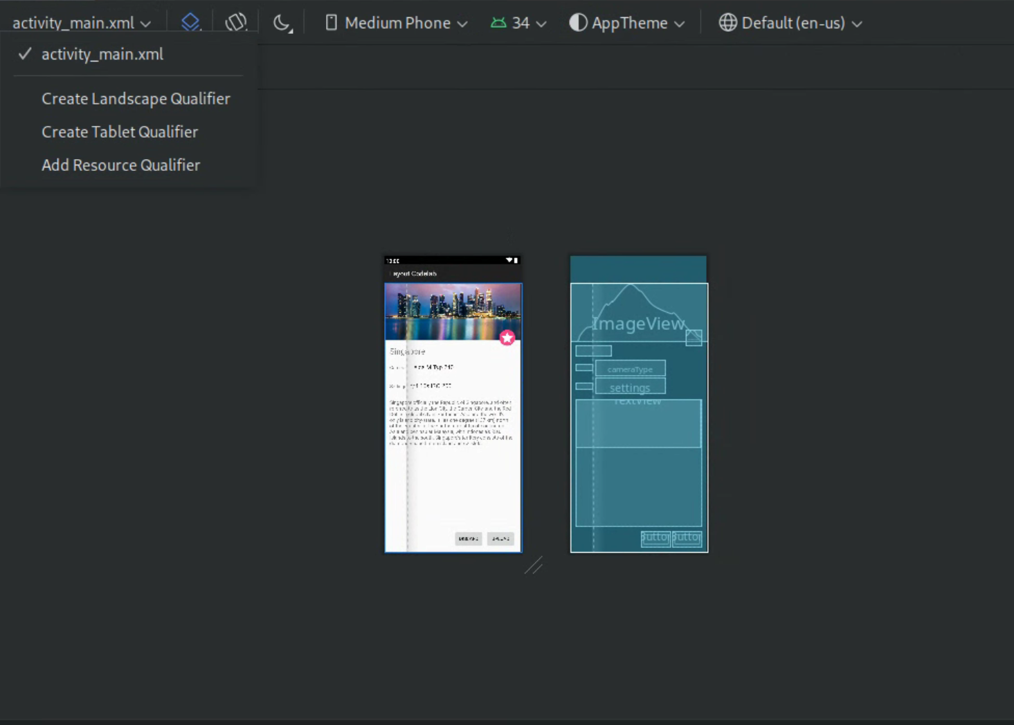
Figure 4. Liste déroulante des qualificatifs de mise en page.
Un répertoire de mise en page est créé.
Créer votre propre variante de mise en page
Si vous souhaitez créer votre propre variante de mise en page, procédez comme suit :
- Ouvrez votre fichier de mise en page par défaut.
- Cliquez sur l'icône Design (Conception) en haut à droite de la fenêtre.
- Le nom du fichier de mise en page s'affiche dans la liste déroulante Action à effectuer pour changer et créer des qualificatifs pour les fichiers de mise en page. Sélectionnez le menu déroulant.
Dans la liste déroulante, sélectionnez Ajouter un qualificatif de ressource. (Voir la figure 4 ci-dessus.)
La boîte de dialogue Select Resource Directory (Sélectionner un répertoire de ressources) s'affiche.
Dans la boîte de dialogue Select Resource Directory (Sélectionner un répertoire de ressources), définissez les qualificateurs de ressources de la variante:
- Sélectionnez un qualificateur dans la liste Available qualifiers (Qualificateurs disponibles).
- Cliquez sur le bouton Ajouter
 .
. - Saisissez les valeurs requises.
- Répétez ces étapes pour ajouter d'autres qualificateurs.
Une fois que vous avez ajouté tous les qualificateurs, cliquez sur OK.
Lorsque vous disposez de plusieurs variantes de la même mise en page, vous pouvez passer de l'une à l'autre en sélectionnant une variante dans le menu déroulant Action to switch and create qualifiers for layout files (Action à effectuer pour basculer et créer des qualificatifs pour les fichiers de mise en page).
Pour en savoir plus sur la création de mises en page pour différents écrans, consultez Compatibilité avec différentes tailles d'écran.
Convertir une vue ou une mise en page
Vous pouvez convertir une vue ou une mise en page vers un autre type de vue ou de mise en page:
- Cliquez sur le bouton Design (Conception) en haut à droite de la fenêtre de l'éditeur.
- Dans l'arborescence des composants, effectuez un clic droit sur la vue ou la mise en page, puis cliquez sur Convert view (Convertir la vue).
- Dans la boîte de dialogue qui s'affiche, choisissez le nouveau type de vue ou de mise en page, puis cliquez sur Apply (Appliquer).
Convertir une mise en page vers ConstraintLayout
Pour améliorer les performances de mise en page, convertissez les anciennes mises en page avec ConstraintLayout.
ConstraintLayout utilise un système de mise en page basé sur des contraintes qui vous permet de compiler la plupart des mises en page sans groupe de vues imbriqué.
Pour convertir une mise en page existante avec ConstraintLayout, procédez comme suit :
- Ouvrez une mise en page existante dans Android Studio.
- Cliquez sur l'icône Design (Conception) en haut à droite de la fenêtre de l'éditeur.
- Dans l'arborescence des composants, effectuez un clic droit sur la mise en page, puis cliquez sur Convert
your-layout-typeto ConstraintLayout (Convertir en ConstraintLayout).
Pour en savoir plus sur ConstraintLayout, consultez Créer une interface utilisateur responsive avec ConstraintLayout.
Rechercher des éléments dans la palette
Pour rechercher une vue ou un groupe de vues par nom dans la palette, cliquez sur le bouton Search (Rechercher)  en haut de la palette. Vous pouvez également saisir le nom de l'élément chaque fois que la fenêtre Palette est active.
Dans la palette, vous pouvez trouver des éléments fréquemment utilisés dans la catégorie Common (Courant). Pour ajouter un élément à cette catégorie, effectuez un clic droit sur une vue ou un groupe de vues dans la palette, puis cliquez sur Favorite (Favori) dans le menu contextuel.
Ouvrir des documents depuis la palette
Pour ouvrir les documents de référence d'Android Developers pour une vue ou un groupe de vues, sélectionnez l'élément d'interface utilisateur dans la palette, puis appuyez sur Shift+F1.
Pour afficher les instructions de Material Design pour une vue ou un groupe de vues, effectuez un clic droit sur l'élément d'interface utilisateur dans la palette, puis sélectionnez Material Guidelines (Instructions de Material Design) dans le menu contextuel. S'il n'existe aucune entrée spécifique pour cet élément, la commande ouvre la page d'accueil de la documentation Material Design.
Ajouter des vues à votre mise en page
Pour commencer à créer votre mise en page, faites glisser les vues et les groupes de vues de la palette vers l'éditeur de mise en page. Lorsque vous placez une vue dans la mise en page, l'éditeur affiche des informations sur son lien avec le reste de la mise en page.
Avec ConstraintLayout, vous pouvez créer automatiquement des contraintes à l'aide des fonctionnalités "Contrainte d'inférence" et "Connexion automatique".
Modifier les attributs de la vue
Vous pouvez modifier les attributs de la vue à partir du panneau Attributes (Attributs) de l'éditeur de mise en page. Cette fenêtre n'est disponible que lorsque l'éditeur de mise en page est ouvert. Pour l'utiliser, affichez votre mise en page en mode Design (Conception) ou Split (Divisé).
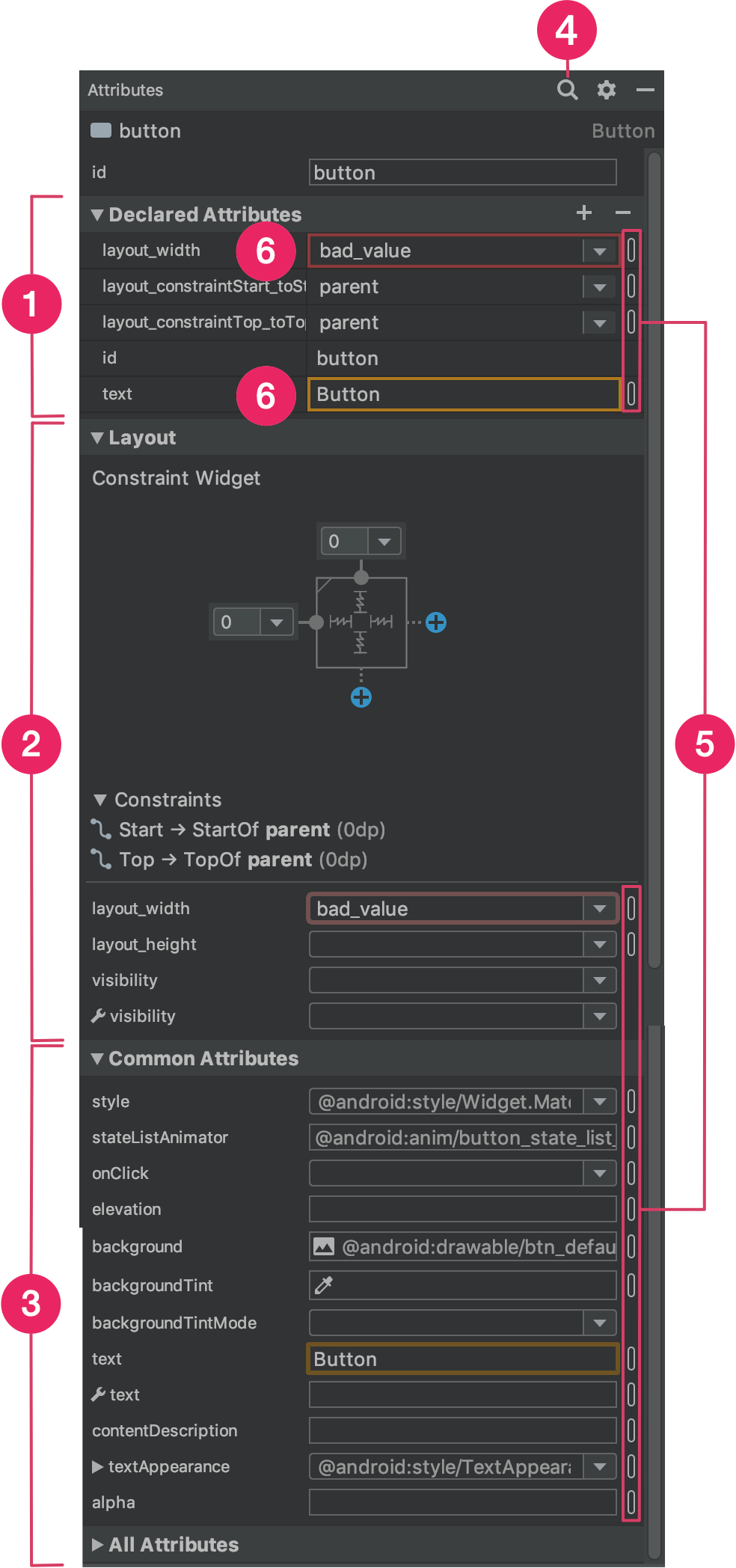
Lorsque vous sélectionnez une vue, en cliquant dessus soit depuis l'arborescence des composants, soit depuis l'éditeur de mise en page, le panneau Attributes affiche les éléments suivants, comme illustré en figure 5:
- Declared Attributes (Attributs déclarés) : liste les attributs spécifiés dans le fichier de mise en page. Pour ajouter un attribut, cliquez sur le bouton Add (Ajouter)
 en haut de la section.
 - Mise en page: contient des commandes permettant de définir la largeur et la hauteur de la vue. Si la vue se trouve dans un
ConstraintLayout, cette section affiche également les préférences de contrainte ainsi que les contraintes qu'elle utilise. Pour en savoir plus sur le contrôle de la taille des vues avecConstraintLayout, consultez la section Ajuster la taille de la vue. - Common Attributes (Attributs courants) : liste les attributs courants de la vue sélectionnée. Pour afficher tous les attributs disponibles, développez la section All Attributes (Tous les attributs) en bas de la fenêtre.
- Rechercher: permet de rechercher un attribut de vue spécifique.
Les icônes à droite de chaque valeur d'attribut indiquent si les valeurs d'attribut sont des références de ressources. Ces indicateurs sont pleins
 lorsque la valeur est une référence de ressource et vides
  lorsque la valeur est codée en dur pour vous aider à reconnaître en un clin d'œil les valeurs codées en dur.
Cliquez sur les indicateurs dans l'un ou l'autre des états pour ouvrir la boîte de dialogue Resources (Ressources), dans laquelle vous pouvez sélectionner une référence de ressource pour l'attribut correspondant.
Une valeur d'attribut en surbrillance rouge indique une erreur de valeur. Par exemple, une erreur peut indiquer une entrée non valide pour un attribut de mise en page.
Une valeur en surbrillance orange indique un avertissement. Par exemple, un avertissement peut s'afficher lorsque vous utilisez une valeur codée en dur plutôt que la référence de ressource attendue.
Ajouter des échantillons de données à votre vue
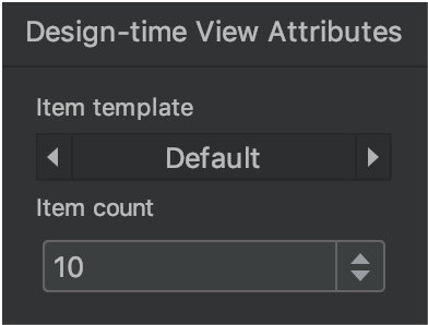
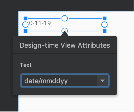
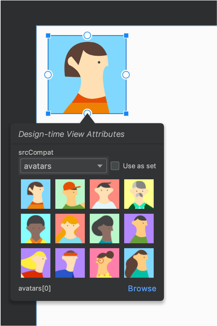
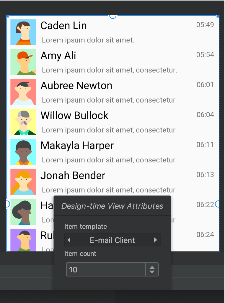
Étant donné que de nombreuses mises en page Android reposent sur des données d'exécution, il peut être difficile de visualiser l'apparence d'une mise en page en concevant votre application. Vous pouvez ajouter des échantillons de données d'aperçu à une vue TextView, ImageView ou RecyclerView à partir de l'éditeur de mise en page.
Pour afficher la fenêtre Design-time View Attributes (Attributs de la vue au moment de la mise en page), effectuez un clic droit sur l'un de ces types de vue et sélectionnez Set Sample Data (Définir un échantillon de données), comme illustré à la figure 6.
Pour TextView, vous pouvez choisir entre différentes catégories d'échantillons de texte. Lorsque vous utilisez un échantillon de texte, Android Studio remplit l'attribut text de TextView avec les échantillons de données de votre choix. Notez que vous ne pouvez choisir un échantillon de texte via la fenêtre des attributs de la vue au moment de la mise en page que si l'attribut text est vide.
TextView avec des exemples de donnéesPour une ImageView, vous pouvez choisir parmi différents échantillons d'images. Lorsque vous choisissez un échantillon d'image, Android Studio insère l'attribut tools:src d'ImageView (ou tools:srcCompat si vous utilisez AndroidX).
ImageView avec des exemples de donnéesPour une RecyclerView, vous pouvez choisir parmi un ensemble de modèles contenant des exemples d'images et de textes. Lorsque vous utilisez ces modèles, Android Studio ajoute un fichier à votre répertoire res/layout, recycler_view_item.xml, qui contient la mise en page des échantillons de données. Android Studio ajoute également des métadonnées à la vue RecyclerView pour afficher correctement les échantillons de données.
RecyclerView avec des exemples de donnéesAfficher les avertissements et les erreurs de mise en page
L'éditeur de mise en page vous signale tout problème de mise en page à côté de la vue correspondante dans l'arborescence des composants en utilisant une icône de cercle rouge avec point d'exclamation  pour les erreurs ou une icône de triangle orange avec point d'exclamation
  pour les avertissements. Cliquez sur l'icône pour en savoir plus.
Pour afficher tous les problèmes connus dans une fenêtre sous l'éditeur, cliquez sur Afficher les avertissements et les erreurs ( ou ). dans la barre d'outils.
Télécharger des polices et les appliquer au texte
Si vous utilisez Android 8.0 (niveau d'API 26) ou la bibliothèque Jetpack Core, vous pouvez choisir parmi des centaines de polices en procédant comme suit:
- Dans l'éditeur de mise en page, cliquez sur l'icône Design (Concevoir) pour afficher votre mise en page dans l'éditeur de mise en page.
- Sélectionnez une vue Texte.
- Dans le panneau Attributes (Attributs), développez textAppearance, puis développez la case fontFamily.
- Faites défiler la liste jusqu'en bas, puis cliquez sur More Fonts (Autres polices) pour ouvrir la boîte de dialogue Resources.
- Dans la boîte de dialogue Resources (Ressources), pour sélectionner une police, parcourez la liste ou saisissez le nom dans la barre de recherche en haut. Si vous sélectionnez une police sous Downloadable (Téléchargeable), vous pouvez cliquer sur Créer une police téléchargeable pour la charger lors de l'exécution en tant que police téléchargeable ou cliquez sur Ajouter une police au projet (Ajouter une police au projet) pour empaqueter le fichier de police TTF dans votre APK. Les polices listées sous Android sont fournies par le système Android. Vous n'avez donc pas besoin de les télécharger ni de les regrouper dans votre APK.
- Cliquez sur OK pour terminer.
Validation de mise en page
La validation de mise en page est un outil visuel qui permet de prévisualiser simultanément des mises en page pour différents appareils et configurations d'affichage. Vous pouvez ainsi détecter les problèmes liés à vos mises en page plus tôt dans le processus. Pour accéder à cette fonctionnalité, cliquez sur l'onglet Validation de la mise en page en haut à droite de la fenêtre IDE:
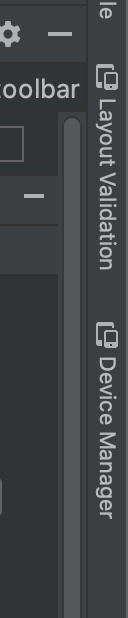
Figure 10 : Onglet "Layout Validation" (Validation de la mise en page).
Pour basculer entre les ensembles de configuration disponibles, sélectionnez l'une des options suivantes dans la liste déroulante Reference Devices (Appareils de référence) en haut de la fenêtre de validation de mise en page:
- Appareils de référence
- Personnaliser
- Daltonien
- Tailles de police
Figure 11 : Menu déroulant "Reference Devices" (Appareils de référence).
Appareils de référence
Les appareils de référence correspondent à un ensemble d'appareils que nous vous recommandons de tester. Elles incluent les interfaces pour téléphone, appareil pliable, pour tablette et pour ordinateur. Vous devriez prévisualiser votre mise en page sur cet ensemble d'appareils de référence :
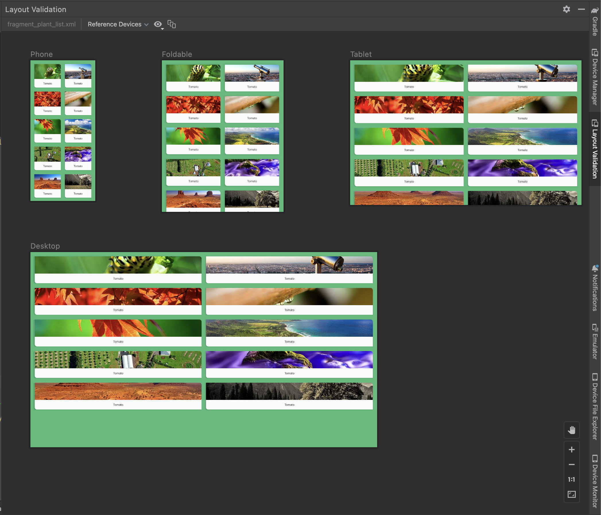
Figure 12. Aperçus des appareils de référence dans l'outil de validation de mise en page.
Personnaliser
Pour personnaliser la configuration d'affichage à prévisualiser, faites votre choix parmi divers paramètres, avec par exemple la langue, l'appareil ou l'orientation de l'écran :
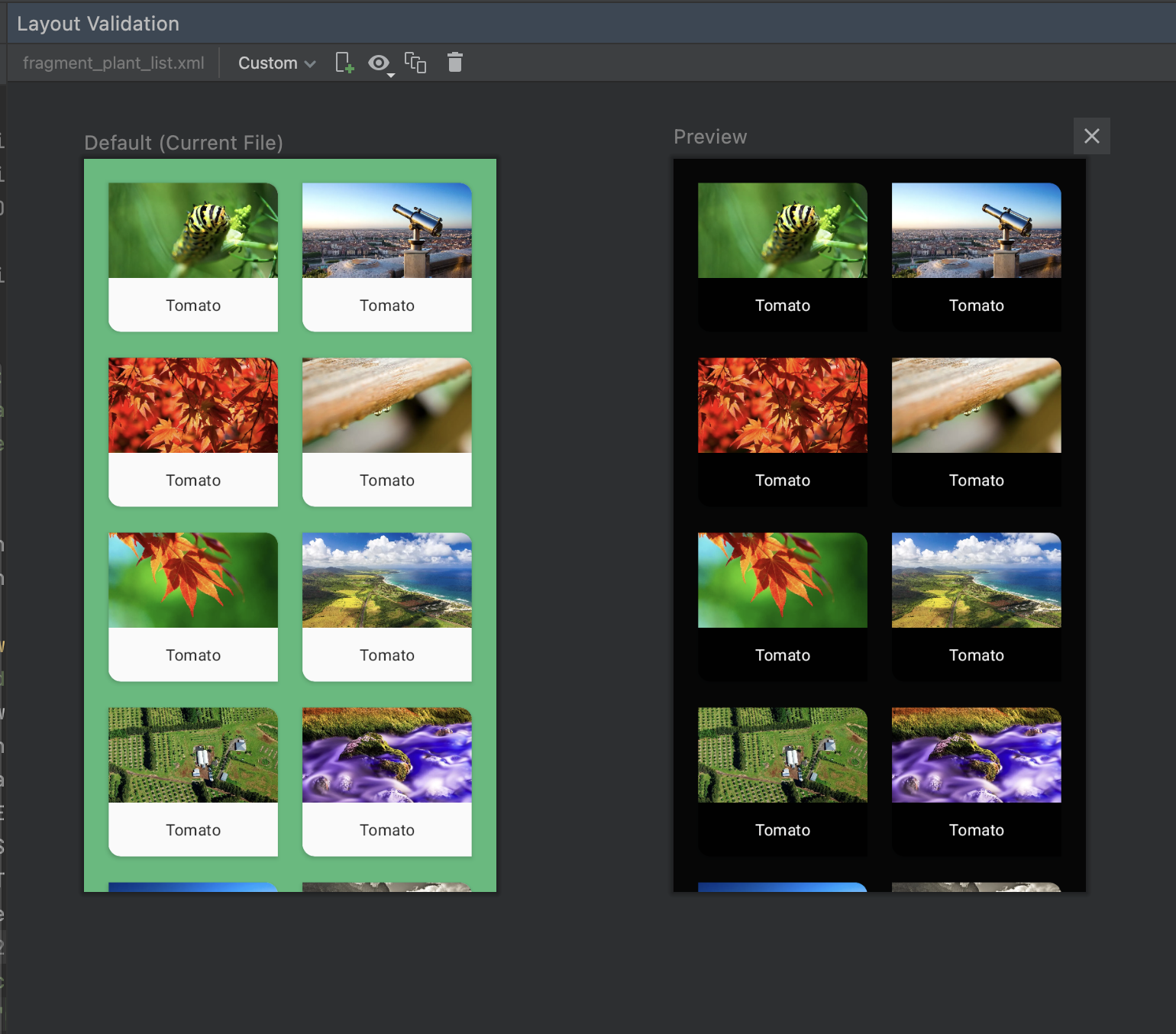
Figure 16 : Configuration d'un affichage personnalisé dans l'outil de validation de mise en page.
Daltonien
Pour rendre votre application plus accessible aux utilisateurs daltoniens, validez votre mise en page à l'aide de simulations de daltonisme courants :
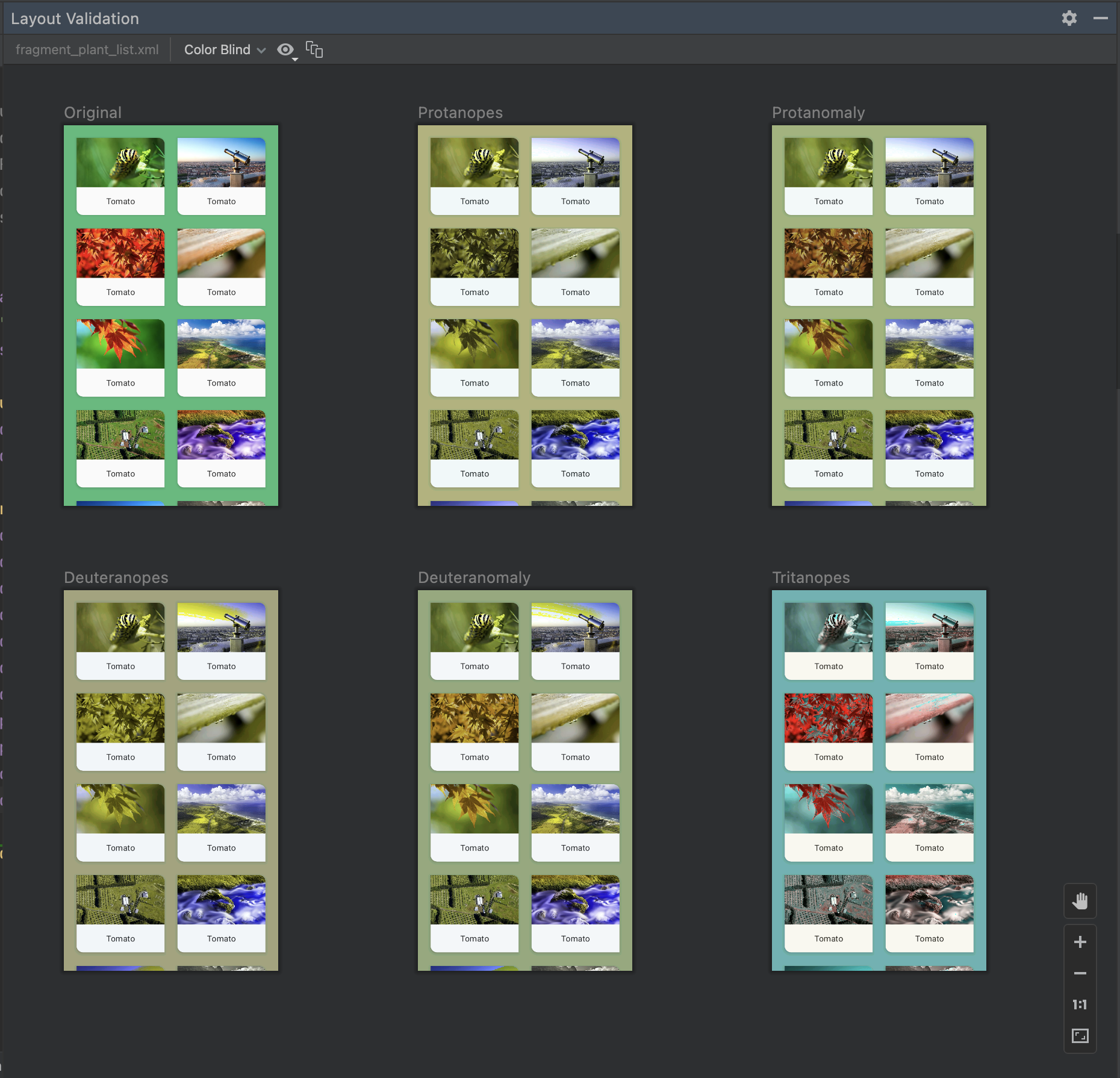
Figure 13. Aperçus de simulations de daltonisme sont proposées dans l'outil de validation de mise en page.
Tailles de police
Validez vos mises en page sur différentes tailles de police et améliorez l'accessibilité de votre application pour les utilisateurs malvoyants en testant des mises en page avec des polices plus grandes :
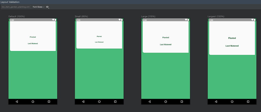
Figure 14. Aperçus de taille de police variable dans l'outil de validation de mise en page