Flame chart
Stay organized with collections
Save and categorize content based on your preferences.
The Flame Chart tab provides an inverted call chart that aggregates
identical call stacks. That is, identical methods or functions that share the
same sequence of callers are collected and represented as one longer bar in a
flame chart (rather than displaying them as multiple shorter bars, as shown in a
call chart). This makes it easier to see which methods or functions consume the
most time. However, this also means that the horizontal axis doesn't represent a
timeline; instead, it indicates the relative amount of time each method or
function takes to execute.
To help illustrate this concept, consider the call chart in Figure 1. Note
that method D makes multiple calls to B (B1, B2, and
B3), and some of those calls to B make a call to C (C1 and
C3).
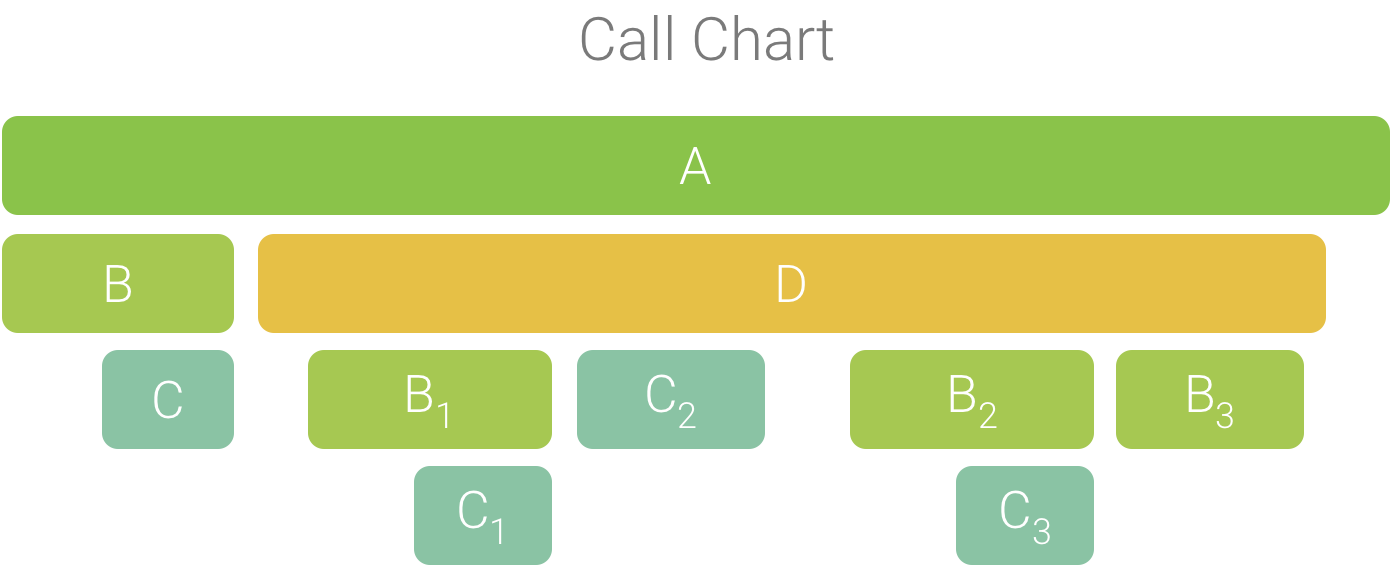
Figure 1. A call chart with multiple method calls
that share a common sequence of callers.
Because B1, B2, and B3 share the same sequence
of callers (A → D → B) they are aggregated, as shown in Figure 2. Similarly,
C1 and C3 are aggregated because they share the same
sequence of callers (A → D → B → C); note that C2 is not included
because it has a different sequence of callers (A → D → C).
Figure 2. Aggregating identical methods that share
the same call stack.
The aggregated calls are used to create the flame chart, as shown in Figure 3.
Note that, for any given call in a flame chart, the callees that consume the
most CPU time appear first.
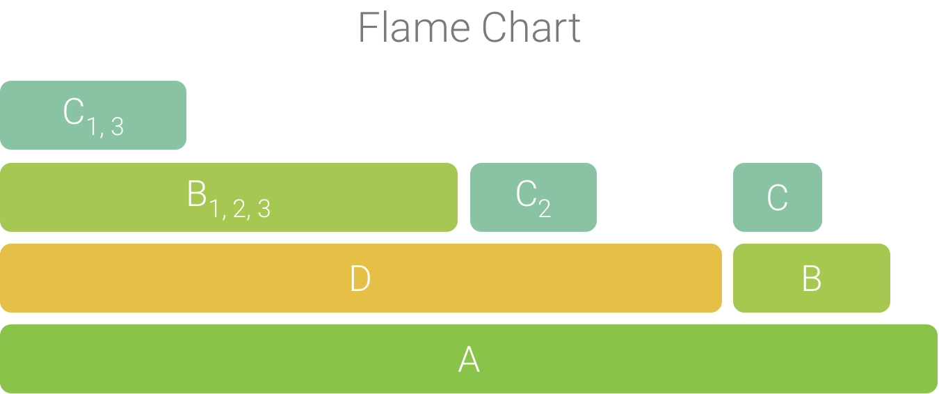
Figure 3. A flame chart representation of the call
chart shown in figure 5.
Content and code samples on this page are subject to the licenses described in the Content License. Java and OpenJDK are trademarks or registered trademarks of Oracle and/or its affiliates.
Last updated 2024-08-29 UTC.
[[["Easy to understand","easyToUnderstand","thumb-up"],["Solved my problem","solvedMyProblem","thumb-up"],["Other","otherUp","thumb-up"]],[["Missing the information I need","missingTheInformationINeed","thumb-down"],["Too complicated / too many steps","tooComplicatedTooManySteps","thumb-down"],["Out of date","outOfDate","thumb-down"],["Samples / code issue","samplesCodeIssue","thumb-down"],["Other","otherDown","thumb-down"]],["Last updated 2024-08-29 UTC."],[],[],null,["# Flame chart\n\nThe **Flame Chart** tab provides an inverted call chart that aggregates\nidentical call stacks. That is, identical methods or functions that share the\nsame sequence of callers are collected and represented as one longer bar in a\nflame chart (rather than displaying them as multiple shorter bars, as shown in a\ncall chart). This makes it easier to see which methods or functions consume the\nmost time. However, this also means that the horizontal axis doesn't represent a\ntimeline; instead, it indicates the relative amount of time each method or\nfunction takes to execute.\n\nTo help illustrate this concept, consider the call chart in Figure 1. Note\nthat method D makes multiple calls to B (B~1~, B~2~, and\nB~3~), and some of those calls to B make a call to C (C~1~ and\nC~3~).\n\n\n**Figure 1.** A call chart with multiple method calls\nthat share a common sequence of callers.\n\n\u003cbr /\u003e\n\nBecause B~1~, B~2~, and B~3~ share the same sequence\nof callers (A → D → B) they are aggregated, as shown in Figure 2. Similarly,\nC~1~ and C~3~ are aggregated because they share the same\nsequence of callers (A → D → B → C); note that C~2~ is not included\nbecause it has a different sequence of callers (A → D → C).\n\n\n**Figure 2.** Aggregating identical methods that share\nthe same call stack.\n\n\u003cbr /\u003e\n\nThe aggregated calls are used to create the flame chart, as shown in Figure 3.\nNote that, for any given call in a flame chart, the callees that consume the\nmost CPU time appear first.\n\n\n**Figure 3.** A flame chart representation of the call\nchart shown in figure 5.\n\n\u003cbr /\u003e"]]