
W sekcjach poniżej dowiesz się, jak utworzyć podstawowy widżet aplikacji za pomocą Glance.
Zadeklaruj AppWidget w pliku manifestu
Po wykonaniu kroków konfiguracji zadeklaruj w aplikacji AppWidget i jego metadane.
Przedłużenie odbiornika
AppWidgetodGlanceAppWidgetReceiver:class MyAppWidgetReceiver : GlanceAppWidgetReceiver() { override val glanceAppWidget: GlanceAppWidget = TODO("Create GlanceAppWidget") }
Zarejestruj dostawcę widżetu aplikacji w
AndroidManifest.xmli powiązanym pliku metadanych:<receiver android:name=".glance.MyReceiver" android:exported="true"> <intent-filter> <action android:name="android.appwidget.action.APPWIDGET_UPDATE" /> </intent-filter> <meta-data android:name="android.appwidget.provider" android:resource="@xml/my_app_widget_info" /> </receiver>
Dodaj metadane AppWidgetProviderInfo
Następnie postępuj zgodnie z instrukcjami w przewodniku Tworzenie widżetu, aby utworzyć i zdefiniować informacje o widżecie aplikacji w pliku @xml/my_app_widget_info.
Jedyna różnica w przypadku Glance polega na tym, że nie ma initialLayoutpliku XML, ale musisz go zdefiniować. Możesz użyć wstępnie zdefiniowanego układu wczytywania dostępnego w bibliotece:
<appwidget-provider xmlns:android="http://schemas.android.com/apk/res/android"
android:initialLayout="@layout/glance_default_loading_layout">
</appwidget-provider>
Zadeklaruj plik XML AppWidgetProviderInfo
Obiekt AppWidgetProviderInfo określa podstawowe cechy widżetu. Zdefiniuj element AppWidgetProviderInfo w pliku zasobu metadanych XML (res/xml/my_app_widget_info.xml) w elemencie <appwidget-provider>:
<appwidget-provider xmlns:android="http://schemas.android.com/apk/res/android"
    android:minWidth="40dp"
    android:minHeight="40dp"
    android:targetCellWidth="1"
    android:targetCellHeight="1"
    android:maxResizeWidth="250dp"
    android:maxResizeHeight="120dp"
    android:updatePeriodMillis="86400000"
    android:description="@string/example_appwidget_description"
    android:previewLayout="@layout/example_appwidget_preview"
    android:initialLayout="@layout/glance_default_loading_layout"
    android:configure="com.example.android.ExampleAppWidgetConfigurationActivity"
    android:resizeMode="horizontal|vertical"
    android:widgetCategory="home_screen"
    android:widgetFeatures="reconfigurable|configuration_optional">
</appwidget-provider>
Atrybuty rozmiaru widżetu
Domyślny ekran główny umieszcza widżety w swoim oknie na podstawie siatki komórek o określonej wysokości i szerokości. Większość ekranów głównych pozwala widżetom zajmować rozmiary będące wielokrotnościami komórek siatki, np. 2 komórki w poziomie i 3 w pionie.
Atrybuty rozmiaru widżetu umożliwiają określenie domyślnego rozmiaru widżetu oraz podanie dolnej i górnej granicy jego rozmiaru. W tym kontekście domyślny rozmiar widżetu to rozmiar, jaki widżet przyjmuje po pierwszym dodaniu do ekranu głównego.
W tej tabeli opisujemy atrybuty <appwidget-provider> dotyczące rozmiaru widżetu:
| Atrybuty i opis | |
|---|---|
targetCellWidth i targetCellHeight (Android 12),minWidth i minHeight |
targetCellWidth i targetCellHeight oraz minWidth i minHeight. Dzięki temu aplikacja będzie mogła używać atrybutów minWidth i minHeight, jeśli urządzenie użytkownika nie obsługuje atrybutów targetCellWidth i targetCellHeight. Jeśli są obsługiwane, atrybuty targetCellWidth i targetCellHeight mają pierwszeństwo przed atrybutami minWidth i minHeight.
|
minResizeWidth i minResizeHeight |
Określ minimalny rozmiar bezwzględny widżetu. Te wartości określają rozmiar, poniżej którego widżet jest nieczytelny lub w inny sposób nieużyteczny. Użycie tych atrybutów pozwala użytkownikowi zmienić rozmiar widżetu na mniejszy niż domyślny. Atrybut minResizeWidth jest ignorowany, jeśli jest większy niż minWidth lub jeśli nie jest włączona zmiana rozmiaru w poziomie. Zobacz resizeMode. Podobnie atrybut minResizeHeight jest ignorowany, jeśli jest większy niż minHeight lub jeśli nie jest włączona zmiana rozmiaru w pionie. |
maxResizeWidth i
maxResizeHeight |
Określ zalecany maksymalny rozmiar widżetu. Jeśli wartości nie są wielokrotnością wymiarów komórki siatki, są zaokrąglane w górę do najbliższego rozmiaru komórki. Atrybut maxResizeWidth jest ignorowany, jeśli jest mniejszy niż minWidth lub jeśli nie jest włączona zmiana rozmiaru w poziomie. Zobacz resizeMode. Podobnie atrybut maxResizeHeight jest ignorowany, jeśli jest mniejszy niż minHeight lub jeśli nie jest włączona zmiana rozmiaru w pionie.
Wprowadzono w Androidzie 12. |
resizeMode |
Określa reguły, według których można zmieniać rozmiar widżetu. Możesz użyć tego atrybutu, aby umożliwić zmianę rozmiaru widżetów na ekranie głównym w poziomie, pionie lub w obu tych kierunkach. Użytkownicy naciskają i przytrzymują widżet, aby wyświetlić uchwyty zmiany rozmiaru, a następnie przeciągają uchwyty poziome lub pionowe, aby zmienić rozmiar widżetu w siatce układu. Wartości atrybutu resizeMode to horizontal, vertical i none. Aby zadeklarować, że rozmiar widżetu można zmieniać w pionie i poziomie, użyj horizontal|vertical. |
Przykład
Aby pokazać, jak atrybuty z tabeli powyżej wpływają na rozmiar widżetu, przyjmijmy te specyfikacje:
- Komórka siatki ma 30 dp szerokości i 50 dp wysokości.
- Podano tę specyfikację atrybutu:
<appwidget-provider xmlns:android="http://schemas.android.com/apk/res/android"
    android:minWidth="80dp"
    android:minHeight="80dp"
    android:targetCellWidth="2"
    android:targetCellHeight="2"
    android:minResizeWidth="40dp"
    android:minResizeHeight="40dp"
    android:maxResizeWidth="120dp"
    android:maxResizeHeight="120dp"
    android:resizeMode="horizontal|vertical" />
Od Androida 12:
Użyj atrybutów targetCellWidth i targetCellHeight jako domyślnego rozmiaru widżetu.
Domyślny rozmiar widżetu to 2x2. Rozmiar widżetu można zmniejszyć do 2x1 lub zwiększyć do 4x3.
Android 11 i starsze:
Do obliczania domyślnego rozmiaru widżetu używaj atrybutów minWidth i minHeight.
Domyślna szerokość = Math.ceil(80 / 30) = 3
Wysokość domyślna = Math.ceil(80 / 50) = 2
Domyślny rozmiar widżetu to 3x2. Rozmiar widżetu można zmniejszyć do 2x1 lub zwiększyć do pełnego ekranu.
Dodatkowe atrybuty widżetu
W tej tabeli opisujemy atrybuty <appwidget-provider> dotyczące cech innych niż rozmiar widżetu.
| Atrybuty i opis | |
|---|---|
updatePeriodMillis |
Określa, jak często platforma widżetów wysyła żądanie aktualizacji do GlanceAppWidgetReceiver, wywołując metodę wywołania zwrotnego onUpdate(). Aby oszczędzać baterię, zalecamy aktualizowanie tak rzadko, jak to możliwe – nie częściej niż raz na godzinę. Więcej informacji znajdziesz w sekcji Kiedy aktualizować widżety w artykule Zarządzanie stanem widżetu. |
initialLayout |
Wskazuje zasób układu, który definiuje układ wczytywania widżetu, zanim zostaną wyrenderowane kompozycje interfejsu Glance. Możesz użyć wstępnie zdefiniowanego układu wczytywania dostępnego w bibliotece: @layout/glance_default_loading_layout. |
configure |
Określa działanie konfiguracji, które jest uruchamiane, gdy użytkownik dodaje widżet. Zapoznaj się z sekcją Implement a widget configuration Activity (Wdrażanie aktywności konfiguracji widżetu) na tej stronie. |
description |
Określa opis, który ma się wyświetlać w selektorze widżetów w przypadku Twojego widżetu. Wprowadzono w Androidzie 12. |
previewLayout (Android 12) i previewImage (Android 11 i starsze) |
|
autoAdvanceViewId |
Określa identyfikator widoku podrzędnego widżetu, który jest automatycznie przewijany przez hosta widżetu. |
widgetCategory |
Określa, czy widżet może być wyświetlany na ekranie głównym (home_screen), ekranie blokady (keyguard) czy na obu tych ekranach. W przypadku Androida 5.0 i nowszych wersji obowiązuje tylko home_screen. |
widgetFeatures |
Deklaruje funkcje obsługiwane przez widżet. Jeśli na przykład konfiguracja widżetu jest opcjonalna, określ zarówno configuration_optional, jak i reconfigurable. |
Definicja GlanceAppWidget
Utwórz nową klasę, która rozszerza klasę
GlanceAppWidgeti zastępuje metodęprovideGlance. Jest to metoda, w której możesz wczytywać dane potrzebne do renderowania widżetu:class MyAppWidget : GlanceAppWidget() { override suspend fun provideGlance(context: Context, id: GlanceId) { // In this method, load data needed to render the AppWidget. // Use `withContext` to switch to another thread for long running // operations. provideContent { // create your AppWidget here Text("Hello World") } } }
Utwórz instancję w
glanceAppWidgetna urządzeniuGlanceAppWidgetReceiver:class MyAppWidgetReceiver : GlanceAppWidgetReceiver() { // Let MyAppWidgetReceiver know which GlanceAppWidget to use override val glanceAppWidget: GlanceAppWidget = MyAppWidget() }
AppWidget został skonfigurowany za pomocą Glance.
Używanie klasy GlanceAppWidgetReceiver do obsługi transmisji widżetów
Widżet współrzędnych GlanceAppWidgetReceiver transmituje aktualizacje stanu platformy i rozgłoszeniowe, rozszerzając bazowy element AppWidgetProvider. Otrzymuje zdarzenia platformy, gdy widżet jest aktualizowany, usuwany, włączany lub wyłączany, i przekształca je w żądania cyklu życia Compose.
Deklarowanie widżetu w pliku manifestu
Zadeklaruj podklasę klasy GlanceAppWidgetReceiver jako odbiornik transmisji w pliku AndroidManifest.xml:
<receiver android:name="ExampleAppWidgetReceiver"
          android:exported="false">
    <intent-filter>
        <action android:name="android.appwidget.action.APPWIDGET_UPDATE" />
    </intent-filter>
    <meta-data android:name="android.appwidget.provider"
               android:resource="@xml/my_app_widget_info" />
</receiver>
Element <receiver> wymaga atrybutu android:name, który określa klasę odbiornika. Odbiornik musi zaakceptować działanie ACTION_APPWIDGET_UPDATE
broadcast w obrębie elementu <intent-filter>.
Element <meta-data> musi określać swoją nazwę jako android.appwidget.provider, a atrybut android:resource musi wskazywać zasób metadanych XML AppWidgetProviderInfo (@xml/my_app_widget_info).
Implementowanie klasy GlanceAppWidgetReceiver
W przypadku Glance rozszerzasz GlanceAppWidgetReceiver zamiast AppWidgetProvider bezpośrednio. Aby to zrobić, połącz odbiornik z instancją GlanceAppWidget. Główne wywołania zwrotne dostępne w GlanceAppWidgetReceiver działają w ten sposób:
onUpdate(): automatycznie zastępowane przez Glance w celu wykonywania aktualizacji kompozycji. Jeśli ręcznie zastąpisz wartośćonUpdate, musisz wywołaćsuper.onUpdate, aby umożliwić Glance uruchomienie wątków kompozycji.onAppWidgetOptionsChanged(): wywoływana, gdy widżet jest umieszczany po raz pierwszy lub zmieniany jest jego rozmiar. Opcje szybkiego odczytu grupują elementy w tle, dzięki czemu układ dostosowuje się bezproblemowo do wymiarów w czasie działania.onDeleted(Context, IntArray): wywoływane za każdym razem, gdy użytkownik usunie konkretne wystąpienie widżetu.onEnabled(Context): wywoływane, gdy pierwsza instancja widżetu zostanie utworzona. Doskonała do przeprowadzania migracji globalnych.onDisabled(Context): wywoływana, gdy zostanie usunięta ostatnia aktywna instancja dostawcy.onReceive(Context, Intent): przechwytuje każdą transmisję platformy przed określonymi metodami wywołania zwrotnego. Musisz zadbać o to, aby napisana przez Ciebie niestandardowa logika odbiornika wywoływała funkcjesuper.onReceive(context, intent)i , a nigdy nie wywoływała funkcjigoAsync, ponieważ Glance automatycznie kieruje pracę asynchronicznie.
Otrzymywanie intencji transmisji widżetu
GlanceAppWidgetReceiver filtruje i obsługuje te podstawowe intencje transmisji widżetów platformy:
ACTION_APPWIDGET_UPDATEACTION_APPWIDGET_DELETEDACTION_APPWIDGET_ENABLEDACTION_APPWIDGET_DISABLEDACTION_APPWIDGET_OPTIONS_CHANGED
Tworzenie interfejsu
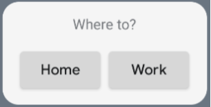
Poniższy fragment kodu pokazuje, jak utworzyć interfejs:
/* Import Glance Composables In the event there is a name clash with the Compose classes of the same name, you may rename the imports per https://kotlinlang.org/docs/packages.html#imports using the `as` keyword. import androidx.glance.Button import androidx.glance.layout.Column import androidx.glance.layout.Row import androidx.glance.text.Text */ class MyAppWidget : GlanceAppWidget() { override suspend fun provideGlance(context: Context, id: GlanceId) { // Load data needed to render the AppWidget. // Use `withContext` to switch to another thread for long running // operations. provideContent { // create your AppWidget here MyContent() } } @Composable private fun MyContent() { Column( modifier = GlanceModifier.fillMaxSize(), verticalAlignment = Alignment.Top, horizontalAlignment = Alignment.CenterHorizontally ) { Text(text = "Where to?", modifier = GlanceModifier.padding(12.dp)) Row(horizontalAlignment = Alignment.CenterHorizontally) { Button( text = "Home", onClick = actionStartActivity<MyActivity>() ) Button( text = "Work", onClick = actionStartActivity<MyActivity>() ) } } } }
Powyższy przykładowy kod wykonuje te czynności:
- Na najwyższym poziomie
Columnelementy są umieszczane pionowo jeden za drugim. - Element
Columnrozszerza się, aby dopasować się do dostępnego miejsca (za pomocą właściwościGlanceModifier), a jego zawartość jest wyrównana do góry (verticalAlignment) i wyśrodkowana w poziomie (horizontalAlignment). - Zawartość elementu
Columnjest definiowana za pomocą funkcji lambda. Kolejność ma znaczenie.- Pierwszy element w
Columnto komponentTextz12.dppikselami dopełnienia. - Drugi element to
Row, w którym elementy są umieszczane poziomo jeden za drugim, z dwomaButtonswyśrodkowanymi poziomo (horizontalAlignment). Ostateczny wygląd zależy od dostępnego miejsca. Poniżej znajdziesz przykładowy zrzut ekranu:
- Pierwszy element w
Możesz zmienić wartości wyrównania lub zastosować inne wartości modyfikatorów (np. dopełnienie), aby zmienić położenie i rozmiar komponentów. Pełną listę komponentów, parametrów i dostępnych modyfikatorów dla każdej klasy znajdziesz w dokumentacji.
Implementowanie zaokrąglonych narożników
Android 12 wprowadza parametry systemowe, które umożliwiają dynamiczne dostosowywanie promieni zaokrąglenia rogów widżetów aplikacji:
system_app_widget_background_radius: określa promień zaokrąglenia kontenera tła widżetu (nigdy nie większy niż 28 dp).- Promień wewnętrzny: aby zapobiec przycinaniu treści, oblicz proporcjonalny promień dla treści wewnętrznych na podstawie konturu tła systemu:
systemRadiusValue - widgetPadding
W Glance możesz dynamicznie stosować właściwości rozmiaru zaokrąglenia narożników w kompozycji za pomocą GlanceModifier.cornerRadius(android.R.dimen.system_app_widget_background_radius).
Aby zapewnić zgodność wsteczną na urządzeniach z Androidem 11 (poziom interfejsu API 30) lub starszym, zaimplementuj atrybuty niestandardowe i niestandardowe zasoby motywu:
/values/attrs.xml<resources> <attr name="backgroundRadius" format="dimension" /> </resources>/values/styles.xml<resources> <style name="MyWidgetTheme"> <item name="backgroundRadius">@dimen/my_background_radius_dimen</item> </style> </resources>/values-31/styles.xml<resources> <style name="MyWidgetTheme" parent="@android:style/Theme.DeviceDefault.DayNight"> <item name="backgroundRadius">@android:dimen/system_app_widget_background_radius</item> </style> </resources>/drawable/my_widget_background.xml<shape xmlns:android="http://schemas.android.com/apk/res/android" android:shape="rectangle"> <corners android:radius="?attr/backgroundRadius" /> </shape>