Stay organized with collections
Save and categorize content based on your preferences.
A radio button lets a user select an option from a set of
options. You use a radio button when only one item can be selected from a
list. If users need to select more than one item, use a switch
instead.
Figure 1. A pair of radio buttons with one option selected.
API surface
Use the RadioButton composable to list the available options. Wrap each
RadioButton option and its label inside a Row component to group them
together.
RadioButton includes the following key parameters:
selected: Indicates whether the radio button is selected.
onClick: A lambda function that your app executes when the user clicks the radio
button. If this is null, the user can't interact directly with the radio
button.
enabled: Controls whether the radio button is enabled or disabled. Users
can't interact with disabled radio buttons.
interactionSource: Lets you observe the interaction state of the
button, for example, whether it's pressed, hovered, or focused.
Create a basic radio button
The following code snippet renders a list of radio buttons within a Column:
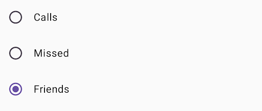
@ComposablefunRadioButtonSingleSelection(modifier:Modifier=Modifier){valradioOptions=listOf("Calls","Missed","Friends")val(selectedOption,onOptionSelected)=remember{mutableStateOf(radioOptions[0])}// Note that Modifier.selectableGroup() is essential to ensure correct accessibility behaviorColumn(modifier.selectableGroup()){radioOptions.forEach{text->
Row(Modifier.fillMaxWidth().height(56.dp).selectable(selected=(text==selectedOption),onClick={onOptionSelected(text)},role=Role.RadioButton).padding(horizontal=16.dp),verticalAlignment=Alignment.CenterVertically){RadioButton(selected=(text==selectedOption),onClick=null// null recommended for accessibility with screen readers)Text(text=text,style=MaterialTheme.typography.bodyLarge,modifier=Modifier.padding(start=16.dp))}}}}
radioOptions represents the labels for the radio buttons.
The remember composable function creates a state variable selectedOption
and a function to update that state called onOptionSelected. This state holds
the selected radio button option.
mutableStateOf(radioOptions[0]) initializes the state to the first item
in the list. "Calls" is the first item, so it's the radio button selected by
default.
Modifier.selectableGroup() ensures proper accessibility behavior for
screen readers. It informs the system that the elements within this Column
are part of a selectable group, which enables proper screen reader support.
selected indicates whether the current Row is selected based on the
selectedOption state.
The onClick lambda function updates the selectedOption state to the
clicked option when the Row is clicked.
role = Role.RadioButton informs accessibility services that the Row
functions as a radio button.
RadioButton(...) creates the RadioButton composable.
onClick = null on the RadioButton improves accessibility. This prevents
the radio button from handling the click event directly, and allows the
Row's selectable modifier to manage the selection state and accessibility
behavior.
Result
Figure 2. Three radio buttons with the "Friends" option selected.
Content and code samples on this page are subject to the licenses described in the Content License. Java and OpenJDK are trademarks or registered trademarks of Oracle and/or its affiliates.
Last updated 2025-08-26 UTC.
[[["Easy to understand","easyToUnderstand","thumb-up"],["Solved my problem","solvedMyProblem","thumb-up"],["Other","otherUp","thumb-up"]],[["Missing the information I need","missingTheInformationINeed","thumb-down"],["Too complicated / too many steps","tooComplicatedTooManySteps","thumb-down"],["Out of date","outOfDate","thumb-down"],["Samples / code issue","samplesCodeIssue","thumb-down"],["Other","otherDown","thumb-down"]],["Last updated 2025-08-26 UTC."],[],[],null,["A [radio button](https://m3.material.io/components/radio-button/overview) lets a user select an option from a set of\noptions. You use a radio button when only one item can be selected from a\nlist. If users need to select more than one item, use a [switch](https://m3.material.io/components/switch/overview)\ninstead.\n**Figure 1.** A pair of radio buttons with one option selected.\n\nAPI surface\n\nUse the [`RadioButton`](/reference/kotlin/androidx/compose/material3/package-summary#RadioButton(kotlin.Boolean,kotlin.Function0,androidx.compose.ui.Modifier,kotlin.Boolean,androidx.compose.material3.RadioButtonColors,androidx.compose.foundation.interaction.MutableInteractionSource)) composable to list the available options. Wrap each\n`RadioButton` option and its label inside a `Row` component to group them\ntogether.\n\n`RadioButton` includes the following key parameters:\n\n- `selected`: Indicates whether the radio button is selected.\n- `onClick`: A lambda function that your app executes when the user clicks the radio button. If this is `null`, the user can't interact directly with the radio button.\n- `enabled`: Controls whether the radio button is enabled or disabled. Users can't interact with disabled radio buttons.\n- `interactionSource`: Lets you observe the interaction state of the button, for example, whether it's pressed, hovered, or focused.\n\nCreate a basic radio button\n\nThe following code snippet renders a list of radio buttons within a `Column`:\n\n\n```kotlin\n@Composable\nfun RadioButtonSingleSelection(modifier: Modifier = Modifier) {\n val radioOptions = listOf(\"Calls\", \"Missed\", \"Friends\")\n val (selectedOption, onOptionSelected) = remember { mutableStateOf(radioOptions[0]) }\n // Note that Modifier.selectableGroup() is essential to ensure correct accessibility behavior\n Column(modifier.selectableGroup()) {\n radioOptions.forEach { text -\u003e\n Row(\n Modifier\n .fillMaxWidth()\n .height(56.dp)\n .selectable(\n selected = (text == selectedOption),\n onClick = { onOptionSelected(text) },\n role = Role.RadioButton\n )\n .padding(horizontal = 16.dp),\n verticalAlignment = Alignment.CenterVertically\n ) {\n RadioButton(\n selected = (text == selectedOption),\n onClick = null // null recommended for accessibility with screen readers\n )\n Text(\n text = text,\n style = MaterialTheme.typography.bodyLarge,\n modifier = Modifier.padding(start = 16.dp)\n )\n }\n }\n }\n}https://github.com/android/snippets/blob/5673ffc60b614daf028ee936227128eb8c4f9781/compose/snippets/src/main/java/com/example/compose/snippets/components/RadioButton.kt#L39-L70\n```\n\n\u003cbr /\u003e\n\nKey points about the code\n\n- `radioOptions` represents the labels for the radio buttons.\n- The `remember` composable function creates a state variable `selectedOption` and a function to update that state called `onOptionSelected`. This state holds the selected radio button option.\n - `mutableStateOf(radioOptions[0])` initializes the state to the first item in the list. \"Calls\" is the first item, so it's the radio button selected by default.\n- [`Modifier.selectableGroup()`](/reference/kotlin/androidx/compose/ui/Modifier#(androidx.compose.ui.Modifier).selectableGroup()) ensures proper accessibility behavior for screen readers. It informs the system that the elements within this `Column` are part of a selectable group, which enables proper screen reader support.\n- [`Modifier.selectable()`](/reference/kotlin/androidx/compose/ui/Modifier#(androidx.compose.ui.Modifier).selectable(kotlin.Boolean,kotlin.Boolean,androidx.compose.ui.semantics.Role,kotlin.Function0)) makes the entire `Row` act as a single selectable item.\n - `selected` indicates whether the current `Row` is selected based on the `selectedOption` state.\n - The `onClick` lambda function updates the `selectedOption` state to the clicked option when the `Row` is clicked.\n - `role = Role.RadioButton` informs accessibility services that the `Row` functions as a radio button.\n- `RadioButton(...)` creates the `RadioButton` composable.\n - `onClick = null` on the `RadioButton` improves accessibility. This prevents the radio button from handling the click event directly, and allows the `Row`'s `selectable` modifier to manage the selection state and accessibility behavior.\n\nResult **Figure 2.** Three radio buttons with the \"Friends\" option selected.\n\nAdditional resources\n\n- Material Design: [Buttons](https://m3.material.io/components/buttons/overview)"]]