

Widgets on Android
Add widgets to level up your user experience. Widgets are customizable home screen elements that display a clear and actionable view of an app's content or actions.
Getting started

Guides
Layouts
Layouts dictate how information and interactive elements are organized within your widget. Learn more about the pre-built layouts for text, list & grid-type widgets.

Guides
Sizing
Learn more about designing widgets that scale seamlessly to multiple sizes. See the default widget sizes and learn how to make full use of the available grid space.

Guides
Style
Learn how to style your widget to enhance your widget’s visual impact and to fit with the user's device theme.

Guides
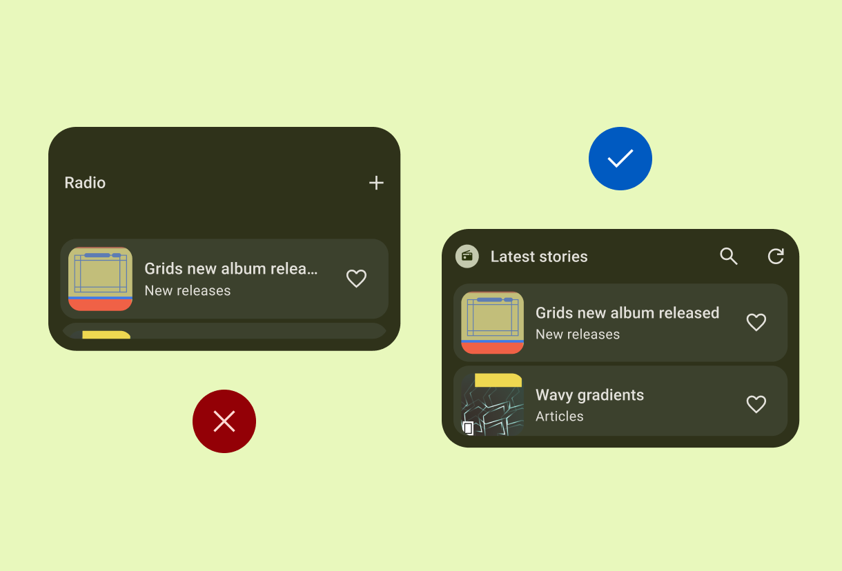
Discovery & promotion
Learn to promote your widget on the widget picker by using appropriate sizing and displaying appropriate preview content.
Adapt

Widgets across form factors
Design your widget once to transition seamlessly across a variety of form factors, from mobile to auto and wear. Use responsive layout techniques and size-specific definitions to ensure your content automatically adapts for a high-quality experience on every screen.
Layouts

Content
Before deciding on a layout, think about the content you want to display in your widget. Do you want your widget to be image-rich or text-heavy? Find layout examples for a variety of content types.

Canonical widget layouts
Get up and running with our ready-made, responsive layouts that cater to the most common widget types.
Sizing

Responsive layouts
Make sure your widget is flexible and consider how your widget could be resized. How might it look in portrait, square, or landscape layout?

Filling the bounds
Home screen space is precious so it's important to make sure your widget is built to make best use of the space it's been allocated.
Style

Anatomy and specs
Understand the core components and detailed design specs to ensure your widget meets our quality bar.

Color tokens
To better fit in with a user's home screen, allow your widget to adapt to system device theming so your widget can use features like light and dark themes and contrast settings.
Discovery & promotion

Widget picker requirements
From recommended widget sizes to high quality previews, review our guidance to help your widget get noticed and stand out from the crowd.
Widget quality tiers
Widget quality affects how users interact with or find your widget. Check out the quality tiers to help your widget stand out and get noticed.
Download the kit
Figma
Android Figma file
Use our design components to create beautiful & functional widgets. These components and patterns ensure an optimal user experience with widgets, while maintaining consistency & showing your brand.