
Design for mobile
Create your app design using Android themes and components. Leverage Android’s unique design patterns and offerings to create a beautiful, usable, modern app.
Get started


Guides
Styles
How to create beautiful visual design with color, type, motion, and theming for your app.

Guides
Layout & content
How content should be structured within an app—from basics of adaptive layouts and grids to displaying graphics, and modern Android features, like edge-to-edge content.

Guides
Behaviors & patterns
Interaction patterns that help your users understand, interact with, and control their experience in your app. Common behavior patterns include navigation, sharing, predictive back, and settings.

Guides
Components
Leverage small, reusable, interactive, UI building blocks. Learn more about using Material Design components.

Guides
Home screen
Extend your app to create unique experiences across the device by using system UI features like app widgets and notifications.


Guides
Accessibility
Benefit everyone by designing in accessibility support to help 15% of the world’s population communicate, learn, and work.
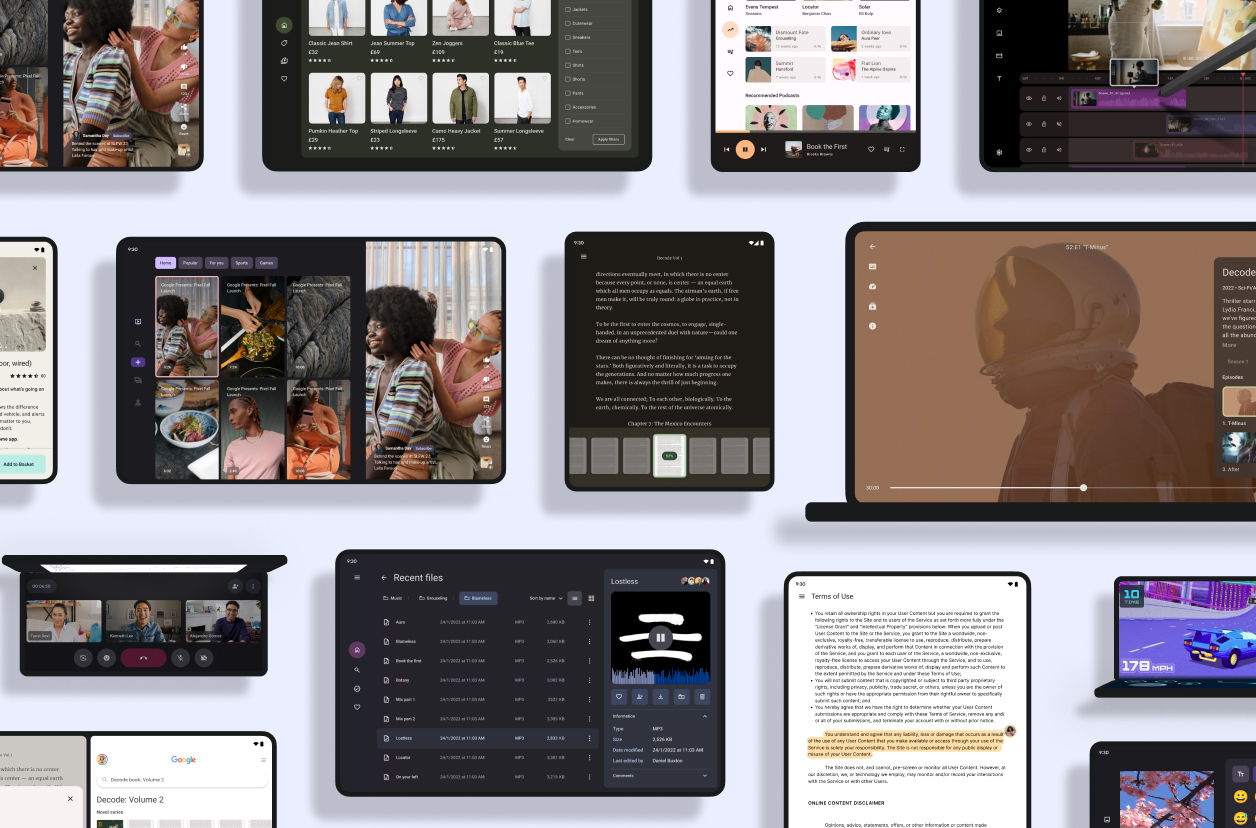
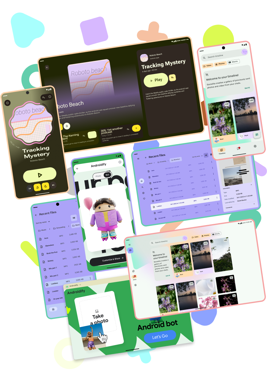
Gallery
Tour the Android design gallery
Explore inspiring, optimized designs for all screen sizes and devices. Browse UI/UX templates for popular app categories, including media, creativity, games, and more.
Explore our kits
Explore our other Figma-based library kits, plugins, and the Material theme builder. Start building your Android app with modern themes, tools and user-generated dynamic color, or check out our Wear OS kits and TV kits to build for other devices.
Android UI kit
Get started designing for Android faster and easier with an introductory guide, styles, components, and system templates.

Android Design community
Explore the Android Design Figma community page with the latest templates, labs, and kits.
Theme builder
Use the web-based Material theme builder to design your next Android app.
Use window size classes
Use compact, medium, and expanded window size classes to support different form
factors for an optimal user experience.
Use a proven design system

Try Material Design 3
Material Design 3 is an open source, adaptable system of guidelines, components, and tools that support the best practices of user interface design.
Develop for mobile
Developer guides
Use our developer guides and reference to build your app design.

Quality guides
Lay out your designs by following Android best practices.