Zadbaj o dobrą organizację dzięki kolekcji
Zapisuj i kategoryzuj treści zgodnie ze swoimi preferencjami.
Użyj plakietki, aby wyświetlić mały element wizualny oznaczający stan lub wartość liczbową na innym komponencie. Oto kilka typowych sytuacji, w których możesz użyć plakietki:
Powiadomienia: wyświetlaj liczbę nieprzeczytanych powiadomień na ikonie aplikacji lub dzwonku powiadomień.
Wiadomości: wskazuje nowe lub nieprzeczytane wiadomości w aplikacji do czatowania.
Aktualizacje stanu: pokazują stan zadania, np. „ukończone”, „w toku” lub „nieudane”.
Liczba produktów w koszyku: wyświetla liczbę produktów w koszyku użytkownika.
Nowe treści: wyróżnij nowe treści lub funkcje dostępne dla użytkownika.
Rysunek 1. Przykłady plakietek
Powierzchnia interfejsu API
Aby zaimplementować plakietki w aplikacji, użyj komponentu BadgedBox. Jest to w końcu kontener. Wygląd możesz kontrolować za pomocą tych 2 głównych parametrów:
content: komponenty, które zawiera BadgedBox. Zwykle Icon.
badge: komponent kompozycyjny, który pojawia się jako plakietka nad treścią.
Zwykle jest to specjalny komponent Badge.
Podstawowy przykład
Ten fragment kodu pokazuje podstawową implementację BadgedBox:
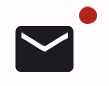
Argument parametru badge funkcji BadgedBox to Badge.
Ponieważ funkcja Badge nie ma własnych argumentów, aplikacja wyświetla domyślny
znaczek, czyli małe czerwone kółko.
Icon jest argumentem parametru content funkcji BadgedBox. Jest to ikona, nad którą wyświetla się plakietka. W tym przypadku jest to ikona poczty.
Wygląda to tak:
Rysunek 2. Minimalna implementacja logo.
Szczegółowy przykład
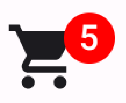
Poniższy fragment kodu pokazuje, jak wyświetlać w plakietce wartości, które reagują na działania użytkownika.
Treść strony i umieszczone na niej fragmenty kodu podlegają licencjom opisanym w Licencji na treści. Java i OpenJDK są znakami towarowymi lub zastrzeżonymi znakami towarowymi należącymi do firmy Oracle lub jej podmiotów stowarzyszonych.
Ostatnia aktualizacja: 2025-08-25 UTC.
[[["Łatwo zrozumieć","easyToUnderstand","thumb-up"],["Rozwiązało to mój problem","solvedMyProblem","thumb-up"],["Inne","otherUp","thumb-up"]],[["Brak potrzebnych mi informacji","missingTheInformationINeed","thumb-down"],["Zbyt skomplikowane / zbyt wiele czynności do wykonania","tooComplicatedTooManySteps","thumb-down"],["Nieaktualne treści","outOfDate","thumb-down"],["Problem z tłumaczeniem","translationIssue","thumb-down"],["Problem z przykładami/kodem","samplesCodeIssue","thumb-down"],["Inne","otherDown","thumb-down"]],["Ostatnia aktualizacja: 2025-08-25 UTC."],[],[],null,["Use a [badge](https://m3.material.io/components/badges/overview) to display a small visual element to denote status\nor a numeric value on another composable. Here are a few common scenarios where\nyou might use a badge:\n\n- **Notifications**: Display the number of unread notifications on an app icon or notification bell.\n- **Messages**: Indicate new or unread messages within a chat application.\n- **Status updates**: Show the status of a task, such as \"complete,\" \"in progress,\" or \"failed.\"\n- **Cart quantity**: Display the number of items in a user's shopping cart.\n- **New content**: Highlight new content or features available to the user.\n\n**Figure 1.** Badge examples\n\nAPI surface\n\nUse the [`BadgedBox`](/reference/kotlin/androidx/compose/material3/package-summary#BadgedBox(kotlin.Function1,androidx.compose.ui.Modifier,kotlin.Function1)) composable to implement badges in your application. It\nis ultimately a container. You control its appearance with these two main\nparameters:\n\n- `content`: The composable content that the `BadgedBox` contains. Typically `Icon`.\n- `badge`: The composable that appears as the badge over the content. Typically the dedicated [`Badge`](/reference/kotlin/androidx/compose/material3/package-summary#Badge(androidx.compose.ui.Modifier,androidx.compose.ui.graphics.Color,androidx.compose.ui.graphics.Color,kotlin.Function1)) composable.\n\nBasic example\n\nThis code snippet shows a basic implementation of `BadgedBox`:\n\n\n```kotlin\n@Composable\nfun BadgeExample() {\n BadgedBox(\n badge = {\n Badge()\n }\n ) {\n Icon(\n imageVector = Icons.Filled.Mail,\n contentDescription = \"Email\"\n )\n }\n}https://github.com/android/snippets/blob/5673ffc60b614daf028ee936227128eb8c4f9781/compose/snippets/src/main/java/com/example/compose/snippets/components/Badges.kt#L62-L74\n```\n\n\u003cbr /\u003e\n\nThis example displays a badge that overlaps the provided `Icon` composable. Note\nthe following in the code:\n\n- [`BadgedBox`](/reference/kotlin/androidx/compose/material3/package-summary#BadgedBox(kotlin.Function1,androidx.compose.ui.Modifier,kotlin.Function1)) serves as the overall container.\n- The argument for the `badge` parameter of `BadgedBox` is [`Badge`](/reference/kotlin/androidx/compose/material3/package-summary#Badge(androidx.compose.ui.Modifier,androidx.compose.ui.graphics.Color,androidx.compose.ui.graphics.Color,kotlin.Function1)). Because `Badge` has no arguments of its own, the app displays the default badge, which is a small red circle.\n- `Icon` serves as the argument for the `content` parameter of `BadgedBox`. It is the icon over which the badge appears. In this case, it is a mail icon.\n\nThis is how it appears:\n**Figure 2.** A minimal badge implementation. **Important:** You can pass any composable to the `BadgedBox` composable's content slot. You could therefore create a badge that displays on a `Button`, an `Image`, or any other composable.\n\nDetailed example\n\nThe following snippet demonstrates how you can display values in the badge that\nrespond to user actions.\n\n\n```kotlin\n@Composable\nfun BadgeInteractiveExample() {\n var itemCount by remember { mutableStateOf(0) }\n\n Column(\n verticalArrangement = Arrangement.spacedBy(16.dp)\n ) {\n BadgedBox(\n badge = {\n if (itemCount \u003e 0) {\n Badge(\n containerColor = Color.Red,\n contentColor = Color.White\n ) {\n Text(\"$itemCount\")\n }\n }\n }\n ) {\n Icon(\n imageVector = Icons.Filled.ShoppingCart,\n contentDescription = \"Shopping cart\",\n )\n }\n Button(onClick = { itemCount++ }) {\n Text(\"Add item\")\n }\n }\n}https://github.com/android/snippets/blob/5673ffc60b614daf028ee936227128eb8c4f9781/compose/snippets/src/main/java/com/example/compose/snippets/components/Badges.kt#L79-L107\n```\n\n\u003cbr /\u003e\n\nThis example implements a shopping cart icon with a badge that displays the\nnumber of items in the user's cart.\n\n- The [`BadgedBox`](/reference/kotlin/androidx/compose/material3/package-summary#BadgedBox(kotlin.Function1,androidx.compose.ui.Modifier,kotlin.Function1)) displays only when the item count is over 0.\n- The arguments for `containerColor` and `contentColor` control the appearance of the badge.\n- The `Text` composable for the content slot of [`Badge`](/reference/kotlin/androidx/compose/material3/package-summary#Badge(androidx.compose.ui.Modifier,androidx.compose.ui.graphics.Color,androidx.compose.ui.graphics.Color,kotlin.Function1)) appears within the badge. In this case, it displays the number of items in the cart.\n\nThis implementation appears as follows:\n**Figure 3.** A badge that displays the number of items in a shopping cart.\n\nAdditional resources\n\n- [Material 3 - Badges](https://m3.material.io/components/badges/overview)\n- [`BadgedBox`](/reference/kotlin/androidx/compose/material3/package-summary#BadgedBox(kotlin.Function1,androidx.compose.ui.Modifier,kotlin.Function1))\n- [`Badge`](/reference/kotlin/androidx/compose/material3/package-summary#Badge(androidx.compose.ui.Modifier,androidx.compose.ui.graphics.Color,androidx.compose.ui.graphics.Color,kotlin.Function1))"]]