
This page describes how you can style text for your
paragraph. To set paragraph-level styling, you can configure parameters like
textAlign and lineHeight or define your own ParagraphStyle.
Set text alignment
The textAlign parameter lets you set the horizontal
alignment of the
text within a Text composable surface area.
By default, Text will select the natural text alignment depending on its
content value:
- Left edge of the
Textcontainer for left-to-right alphabets such as Latin, Cyrillic, or Hangul - Right edge of the
Textcontainer for right-to-left alphabets such as Arabic or Hebrew
@Composable fun CenterText() { Text( "Hello World", textAlign = TextAlign.Center, modifier = Modifier.width(150.dp) ) }

If you want to manually set the text alignment of a Text composable, prefer
using TextAlign.Start and TextAlign.End instead of TextAlign.Left and
TextAlign.Right respectively, as they resolve to the right edge of the Text
composable depending on the preferred language text orientation. For example,
TextAlign.End aligns to the right side for French text and to the left side
for Arabic text, but TextAlign.Right aligns to the right side no matter what
alphabet is used.
Add multiple styles in a paragraph
To add multiple styles in a paragraph, you can use ParagraphStyle in an
AnnotatedString, which can be annotated with styles of arbitrary annotations.
Once a portion of your text is marked with a ParagraphStyle, that portion is
separated from the remaining text as if it had line feeds at the beginning and
end.
For more information about adding multiple styles in a text, see Add multiple styles in text.
AnnotatedString has a type-safe
builder
to make it easier to create: buildAnnotatedString. The following snippet uses
buildAnnotatedString to set ParagraphStyle:
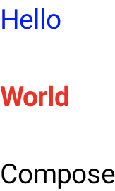
@Composable fun ParagraphStyle() { Text( buildAnnotatedString { withStyle(style = ParagraphStyle(lineHeight = 30.sp)) { withStyle(style = SpanStyle(color = Color.Blue)) { append("Hello\n") } withStyle( style = SpanStyle( fontWeight = FontWeight.Bold, color = Color.Red ) ) { append("World\n") } append("Compose") } } ) }
Adjust line height and padding
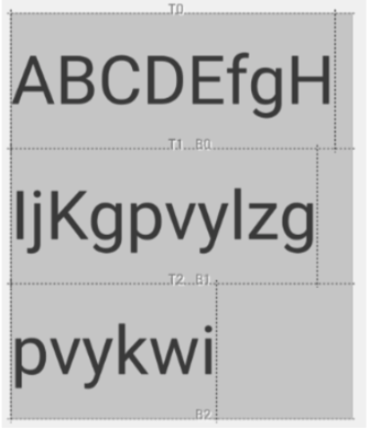
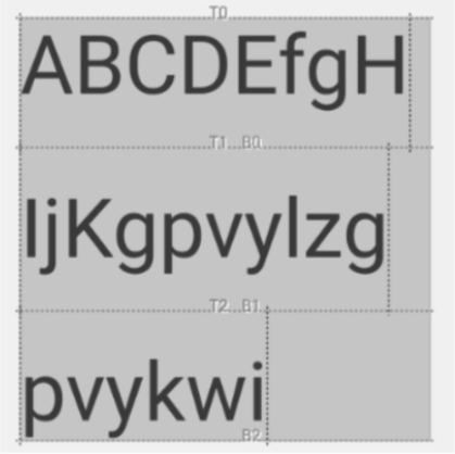
includeFontPadding is a legacy property that adds extra padding based on
font metrics at the top of the first line and bottom of the last line of a text.
Starting from Compose BOM version 2024.01.01, includeFontPadding is set
to false by default, which brings the default text layout more in line with
common design tools.
The ability to configure lineHeight is not new– it has been available
since Android Q. You can configure lineHeight for Text using the
lineHeight parameter, which distributes the line height in each line of
text. You can then use the new LineHeightStyle API to further configure
how this text is aligned within the space, and remove whitespace.
You may want to adjust lineHeight using the text unit "em" (relative font
size) instead of "sp" (scaled pixels) for improved precision. For more information about
selecting an appropriate text unit, see TextUnit.
lineHeight, and trim extra space if needed.
Text( text = text, style = LocalTextStyle.current.merge( TextStyle( lineHeight = 2.5.em, platformStyle = PlatformTextStyle( includeFontPadding = false ), lineHeightStyle = LineHeightStyle( alignment = LineHeightStyle.Alignment.Center, trim = LineHeightStyle.Trim.None ) ) ) )
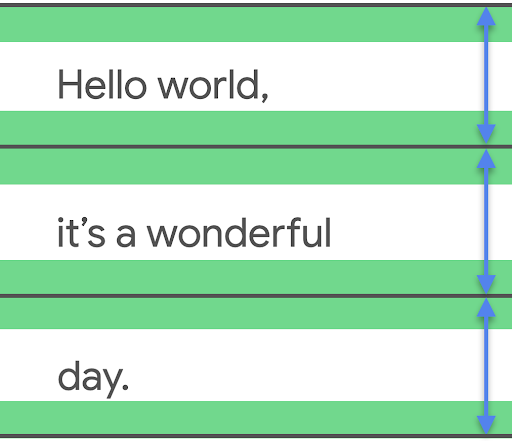
In addition to adjusting lineHeight, you can now further center and style text
using configurations with the LineHeightStyle API: LineHeightStyle.Alignment
and LineHeightStyle.Trim (includeFontPadding must be set to false for
Trim to work). Alignment and Trim use the measured space in between lines of
text to more appropriately distribute it to all lines– including a single line
of text and the top line of a block of text.
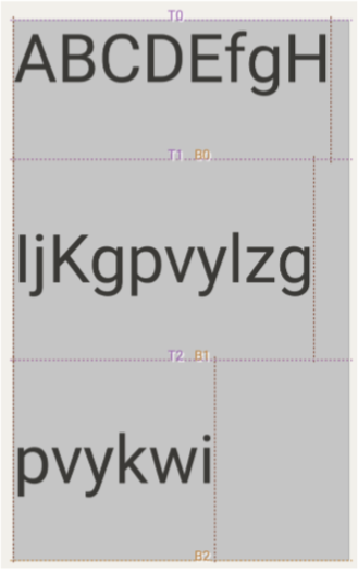
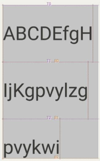
LineHeightStyle.Alignment defines how to align the line in the space
provided by the line height. Within each line, you can align the text to the
top, bottom, center, or proportionally. LineHeightStyle.Trim then allows you
to leave or remove the extra space to the top of the first line and bottom of
the last line of your text, generated from any lineHeight and Alignment
adjustments. The following samples show how multi-line text looks with
various LineHeightStyle.Trim configurations when alignment is centered
(LineHeightStyle.Alignment.Center).
 |
 |
LineHeightStyle.Trim.None |
LineHeightStyle.Trim.Both |
 |
 |
LineHeightStyle.Trim.FirstLineTop |
LineHeightStyle.Trim.LastLineBottom |
See the Fixing Font Padding in Compose Text blog post to learn
more about the context of this change, how includeFontPadding worked in the View
system, and the changes made for Compose and the new LineHeightStyle
APIs.
Insert line breaks
The LineBreak API defines the criteria by which text is split across
multiple lines. You can specify the type of line breaking you want in the
TextStyle block of your Text composable. The preset line breaking types
include the following:
Simple— Fast, basic line breaking. Recommended for text input fields.Heading— Line breaking with looser breaking rules. Recommended for short text, such as titles.Paragraph— Slower, higher-quality line breaking for improved readability. Recommended for larger amounts of text, such as paragraphs.
The following snippet uses both Simple and Paragraph to specify
line-breaking behavior on a long block of text:
TextSample( samples = mapOf( "Simple" to { Text( text = SAMPLE_LONG_TEXT, modifier = Modifier .width(130.dp) .border(BorderStroke(1.dp, Color.Gray)), fontSize = 14.sp, style = TextStyle.Default.copy( lineBreak = LineBreak.Simple ) ) }, "Paragraph" to { Text( text = SAMPLE_LONG_TEXT, modifier = Modifier .width(130.dp) .border(BorderStroke(1.dp, Color.Gray)), fontSize = 14.sp, style = TextStyle.Default.copy( lineBreak = LineBreak.Paragraph ) ) } ) )
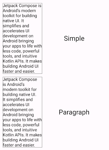
In the above output, notice that the Paragraph line breaking behavior produces
a more visually balanced result than the Simple line breaking.
Customize line breaks
You can also construct your own LineBreak configuration with the Strategy
parameter. The Strategy can be any of the following:
Balanced— Attempts to balance the line lengths of the text, also applying automatic hyphenation if enabled. Recommended for small screens, like watches, to maximize the amount of text displayed.HighQuality— Optimizes a paragraph for more readable text, including hyphenation if enabled. (Should be a default for everything that's notBalancedorSimple.)Simple— basic, fast strategy. If enabled, hyphenation is done only for words that don't fit on an entire line by themselves. Useful for editing text to avoid changing positions while typing.
The following snippet shows the difference between a paragraph with default settings
and a paragraph optimized for small screens with the Balanced line-breaking
strategy:
TextSample( samples = mapOf( "Balanced" to { val smallScreenAdaptedParagraph = LineBreak.Paragraph.copy(strategy = LineBreak.Strategy.Balanced) Text( text = SAMPLE_LONG_TEXT, modifier = Modifier .width(200.dp) .border(BorderStroke(1.dp, Color.Gray)), fontSize = 14.sp, style = TextStyle.Default.copy( lineBreak = smallScreenAdaptedParagraph ) ) }, "Default" to { Text( text = SAMPLE_LONG_TEXT, modifier = Modifier .width(200.dp) .border(BorderStroke(1.dp, Color.Gray)), fontSize = 14.sp, style = TextStyle.Default ) } ) )
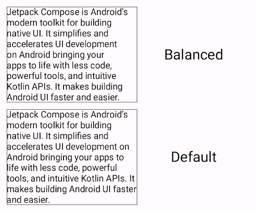
Balanced line-breaking strategy
(top) versus a paragraph formatted without a line-breaking strategy.CJK considerations
You can also customize LineBreak with the Strictness and
WordBreak APIs, which were designed specifically for CJK languages.
You may not always see the effects of these APIs in non-CJK languages. Overall,
line-breaking rules are defined based on locale.
Strictness describes the strictness of the line breaking with the following
properties:
Default— Default breaking rules for the locale. May correspond toNormalorStrict.Loose— The least restrictive rules. Suitable for short lines.Normal— The most common rules for line breaking.Strict— The most stringent rules for line breaking.
WordBreak defines how line breaks should be inserted within words with the
following properties:
Default— Default breaking rules for the locale.Phrase— Line breaking is based on phrases.
The following snippet uses a Strict strictness and a Phrase word breaking
setting for a Japanese text:
val customTitleLineBreak = LineBreak( strategy = LineBreak.Strategy.HighQuality, strictness = LineBreak.Strictness.Strict, wordBreak = LineBreak.WordBreak.Phrase ) Text( text = "あなたに寄り添う最先端のテクノロジー。", modifier = Modifier.width(250.dp), fontSize = 14.sp, style = TextStyle.Default.copy( lineBreak = customTitleLineBreak ) )
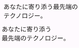
Strictness and WordBreak settings (top)
versus text formatted only with LineBreak.Heading (bottom).Hyphenate text split across lines
The Hyphens API lets you add hyphenation support to your app.
Hyphenation refers to inserting a dash-like punctuation mark to indicate that a
word is divided across lines of text. When enabled, hyphenation is added between
the syllables of a word at appropriate hyphenation points.
By default, hyphenation is not enabled. To enable hyphenation, add
Hyphens.Auto as a parameter in a TextStyle block:
TextSample( samples = mapOf( "Hyphens - None" to { Text( text = SAMPLE_LONG_TEXT, modifier = Modifier .width(130.dp) .border(BorderStroke(1.dp, Color.Gray)), fontSize = 14.sp, style = TextStyle.Default.copy( lineBreak = LineBreak.Paragraph, hyphens = Hyphens.None ) ) }, "Hyphens - Auto" to { Text( text = SAMPLE_LONG_TEXT, modifier = Modifier .width(130.dp) .border(BorderStroke(1.dp, Color.Gray)), fontSize = 14.sp, style = TextStyle.Default.copy( lineBreak = LineBreak.Paragraph, hyphens = Hyphens.Auto ) ) } ) )
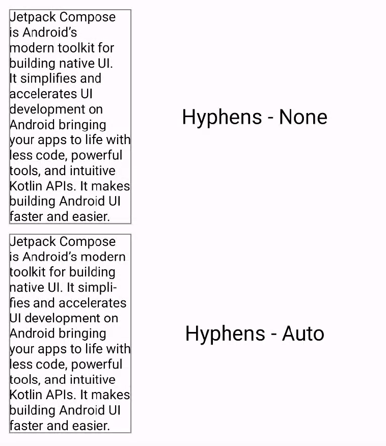
When enabled, hyphenation only occurs under the following conditions:
- A word does not fit onto a line. If you use a
Simpleline breaking strategy, the hyphenation of a word occurs only if a line is shorter than the single word. - The appropriate locale is set on your device, as appropriate hyphenation is determined using dictionaries present on the system.
Recommended for you
- Note: link text is displayed when JavaScript is off
- Style text
- Compose layout basics
- Intrinsic measurements in Compose layouts