
Kanonische Layouts sind bewährte, vielseitige Layouts, die auf einer Vielzahl von Formfaktoren eine optimale Nutzererfahrung bieten.
Die kanonischen Layouts unterstützen Smartphones mit kleinen Bildschirmen sowie Tablets, faltbare Geräte und ChromeOS-Geräte. Sie basieren auf den Richtlinien für Material Design und sind sowohl ästhetisch als auch funktional.
Das Android-Framework enthält spezielle Komponenten, die die Implementierung der Layouts einfach und zuverlässig machen.
Die kanonischen Layouts ermöglichen ansprechende, produktivitätssteigernde Benutzeroberflächen, die die Grundlage für großartige Apps bilden.
Listen-Detailansicht

Mit dem Layout „Listen-Detailansicht“ können Nutzer Listen mit Elementen durchsuchen, die beschreibende, erklärende oder andere zusätzliche Informationen enthalten – die Elementdetails.
Das Layout teilt das App-Fenster in zwei nebeneinander liegende Bereiche auf: einen für die Liste und einen für die Details. Nutzer wählen Elemente aus der Liste aus, um die Elementdetails anzuzeigen. Über Deeplinks in den Details können zusätzliche Inhalte im Detailbereich aufgerufen werden.
Auf Displays mit erweiterter Breite (siehe Fenstergrößenklassen verwenden) können sowohl die Liste als auch die Details gleichzeitig angezeigt werden. Wenn ein Listenelement ausgewählt wird, wird der Detailbereich aktualisiert und die zugehörigen Inhalte für das ausgewählte Element werden angezeigt.
Auf Displays mit mittlerer und kompakter Breite wird je nach Nutzerinteraktion mit der App entweder die Liste oder die Details angezeigt. Wenn nur die Liste sichtbar ist, wird durch Auswahl eines Listenelements anstelle der Liste die Detailansicht angezeigt. Wenn nur die Detailansicht sichtbar ist, wird durch Drücken der Zurück-Taste wieder die Liste angezeigt.
Konfigurationsänderungen wie Änderungen der Geräteausrichtung oder der App-Fenstergröße können die Fenstergrößenklasse des Displays ändern. Ein Layout mit Listen-Detailansicht reagiert entsprechend und behält den App-Status bei:
- Wenn ein Display mit erweiterter Breite, auf dem sowohl die Liste als auch der Detailbereich angezeigt werden, auf eine mittlere oder kompakte Breite verkleinert wird, bleibt der Detailbereich sichtbar und der Listenbereich wird ausgeblendet.
- Wenn auf einem Display mit mittlerer oder kompakter Breite nur der Detailbereich sichtbar ist und die Fenstergrößenklasse auf „Erweitert“ vergrößert wird, werden die Liste und die Details zusammen angezeigt. In der Liste wird angegeben, dass das Element ausgewählt ist, das dem Inhalt im Detailbereich entspricht.
- Wenn auf einem Display mit mittlerer oder kompakter Breite nur der Listenbereich sichtbar ist und die Breite auf „Erweitert“ vergrößert wird, werden die Liste und ein Platzhalter-Detailbereich zusammen angezeigt.
Das Layout „Listen-Detailansicht“ eignet sich ideal für Messaging-Apps, Kontaktmanager, interaktive Medienbrowser oder jede App, in der die Inhalte als Liste von Elementen organisiert werden können, die zusätzliche Informationen enthalten.
Implementierung
Das deklarative Paradigma von Compose unterstützt die Logik der Fenstergrößenklasse, mit der festgelegt wird, ob die Listen- und Detailbereiche gleichzeitig angezeigt werden sollen (wenn die Fenstergrößenklasse „Breite“ erweitert ist) oder nur der Listen- oder Detailbereich (wenn die Fenstergrößenklasse „Breite“ mittel oder kompakt ist).
Um einen unidirektionalen Datenfluss zu gewährleisten, müssen Sie alle Statusinformationen nach oben verschieben, einschließlich der aktuellen Fenstergrößenklasse und der Details des ausgewählten Listenelements (falls vorhanden), damit alle zusammensetzbaren Elemente auf die Daten zugreifen und sie korrekt rendern können.
Wenn auf kleinen Fenstergrößen nur der Detailbereich angezeigt wird, fügen Sie einen BackHandler
hinzu, um den Detailbereich zu entfernen und nur den Listenbereich anzuzeigen. Der BackHandler ist nicht Teil der allgemeinen App-Navigation, da er von der Fenstergrößenklasse und dem ausgewählten Detailstatus abhängt.
ListDetailPaneScaffold ist ein zusammensetzbares Element auf hoher Ebene, das die Implementierung von Layouts mit Liste und Details vereinfacht. Es verarbeitet die Bereichslogik automatisch basierend auf Fenstergrößenklassen und unterstützt die Navigation zwischen Bereichen.
Hier ist eine minimale Implementierung mit ListDetailPaneScaffold:
@OptIn(ExperimentalMaterial3AdaptiveApi::class) @Composable fun MyListDetailPaneScaffold() { val navigator = rememberListDetailPaneScaffoldNavigator() ListDetailPaneScaffold( directive = navigator.scaffoldDirective, value = navigator.scaffoldValue, listPane = { // Listing Pane }, detailPane = { // Details Pane } ) }
Das sind die wichtigsten Komponenten in diesem Beispiel:
rememberListDetailPaneScaffoldNavigator: Erstellt einen Navigator, um die Navigation zwischen den Listen- und Detailbereichen zu verwalten.listPane: Zeigt die Liste der Elemente an.detailPane: Zeigt den Inhalt eines ausgewählten Elements an.
Ausführliche Implementierungsbeispiele finden Sie unter:
- Entwicklerleitfaden zum Erstellen eines Layouts mit Liste und Details
- Beispiel für „list-detail-compose“
Feed
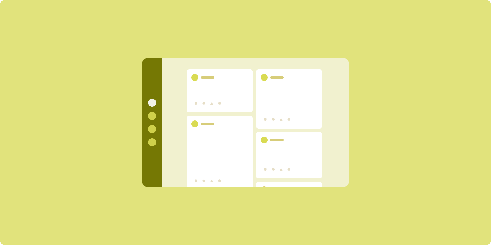
Bei einem Feed-Layout werden gleichwertige Inhaltselemente in einem konfigurierbaren Raster angeordnet, damit eine große Menge an Inhalten schnell und bequem angezeigt werden kann.
Größe und Position bestimmen die Beziehungen zwischen den Inhaltselementen.
Inhaltsgruppen werden erstellt, indem Elemente die gleiche Größe erhalten und zusammen positioniert werden. Elemente werden hervorgehoben, indem sie größer als die umliegenden Elemente gemacht werden.
Karten und Listen sind gängige Komponenten von Feed-Layouts.
Ein Feed-Layout unterstützt Displays fast jeder Größe, da sich das Raster von einer einzelnen scrollbaren Spalte zu einem scrollbaren Feed mit mehreren Spalten anpassen kann.
Feeds eignen sich besonders gut für Nachrichten- und Social-Media-Apps.
Implementierung
Ein Feed besteht aus einer großen Anzahl von Inhaltselementen in einem vertikal scrollenden Container, die in einem Raster angeordnet sind. Mit Lazy Lists lassen sich eine große Anzahl von Elementen in Spalten oder Zeilen effizient rendern. Mit Lazy Grids werden Elemente in Rastern gerendert. Dabei wird die Konfiguration der Elementgrößen und Spannen unterstützt.
Konfigurieren Sie die Spalten des Rasterlayouts basierend auf dem verfügbaren Anzeigebereich, um die zulässige Mindestbreite für Rasterelemente festzulegen. Beim Definieren von Rasterelementen können Sie die Spaltenüberspannung anpassen, um einige Elemente hervorzuheben.
Verwenden Sie für Abschnittsüberschriften, Trennzeichen oder andere Elemente, die die volle Breite des Feeds einnehmen sollen, maxLineSpan, um die volle Breite des Layouts zu nutzen.
Auf Displays mit kompakter Breite, auf denen nicht genügend Platz für mehr als eine Spalte ist, verhält sich LazyVerticalGrid wie ein LazyColumn.
Hier ist eine minimale Implementierung mit LazyVerticalGrid:
@Composable fun MyFeed(names: List<String>) { LazyVerticalGrid( // GridCells.Adaptive automatically adapts column count based on available width columns = GridCells.Adaptive(minSize = 180.dp), ) { items(names) { name -> Text(name) } } }
Der Schlüssel zu einem adaptiven Feed ist die columns-Konfiguration.
Mit GridCells.Adaptive(minSize = 180.dp) wird ein Raster erstellt, in dem jede Spalte mindestens 180.dp breit ist. Im Raster werden dann so viele Spalten angezeigt, wie in den verfügbaren Platz passen.
Eine Beispielimplementierung finden Sie im Feed with Compose-Beispiel.
Unterstützender Bereich

Beim Layout „Unterstützender Bereich“ werden App-Inhalte in primäre und sekundäre Anzeigebereiche unterteilt.
Der primäre Anzeigebereich nimmt den Großteil des App-Fensters ein (in der Regel etwa zwei Drittel) und enthält den Hauptinhalt. Der sekundäre Anzeigebereich ist ein Bereich, der den Rest des App-Fensters einnimmt und Inhalte präsentiert, die den Hauptinhalt unterstützen.
Layouts mit unterstützendem Bereich eignen sich gut für Displays mit erweiterter Breite (siehe Fenstergrößenklassen verwenden) im Querformat. Auf Displays mit mittlerer oder kompakter Breite können sowohl der primäre als auch der sekundäre Anzeigebereich angezeigt werden, wenn die Inhalte an schmalere Anzeigebereiche angepasst werden können oder wenn die zusätzlichen Inhalte zunächst in einem Blatt am unteren Rand oder an der Seite ausgeblendet werden können, auf das über ein Steuerelement wie ein Menü oder eine Schaltfläche zugegriffen werden kann.
Ein Layout mit unterstützendem Bereich unterscheidet sich von einem Layout mit Listen-Detailansicht in der Beziehung zwischen primären und sekundären Inhalten. Inhalte im sekundären Bereich sind nur in Bezug auf die primären Inhalte sinnvoll. Ein Toolfenster im unterstützenden Bereich ist beispielsweise für sich genommen irrelevant. Die zusätzlichen Inhalte im Detailbereich eines Layouts mit Listen-Detailansicht sind jedoch auch ohne die primären Inhalte sinnvoll, z. B. die Beschreibung eines Produkts aus einer Produktliste.
Anwendungsfälle für den unterstützenden Bereich:
- Produktivitäts-Apps: Ein Dokument oder eine Tabelle mit Kommentaren von Prüfern Kommentare in einem unterstützenden Bereich
- Media-Apps: Ein Streamingvideo und eine Liste ähnlicher Videos in einem unterstützenden Bereich oder die Darstellung eines Musikalbums mit einer Playlist
- Tools und Einstellungen: Ein Tool zur Medienbearbeitung mit Paletten, Effekten und anderen Einstellungen in einem unterstützenden Bereich
Implementierung
Compose unterstützt die Logik für Fenstergrößenklassen. Damit können Sie festlegen, ob Haupt- und unterstützende Inhalte gleichzeitig angezeigt werden sollen oder ob die unterstützenden Inhalte an einem alternativen Ort platziert werden sollen.
Stellen Sie alle Statusinformationen bereit, einschließlich der aktuellen Fenstergrößenklasse und Informationen zu den Daten im Hauptinhalt und im unterstützenden Inhalt.
Bei Displays mit kompakter Breite sollte der unterstützende Inhalt unter dem Hauptinhalt oder in einem Blatt am unteren Rand platziert werden. Bei mittleren und erweiterten Breiten sollte der unterstützende Inhalt neben dem Hauptinhalt platziert werden. Die Größe sollte dabei an den Inhalt und den verfügbaren Platz angepasst werden. Bei mittlerer Breite wird der Anzeigebereich gleichmäßig zwischen Haupt- und unterstützenden Inhalten aufgeteilt. Bei erweiterter Breite sollten Sie dem Hauptinhalt 70% und dem unterstützenden Inhalt 30% des Platzes zuweisen.
SupportingPaneScaffold ist eine allgemeine zusammensetzbare Funktion, die die Implementierung von unterstützten Bereichslayouts vereinfacht. Das Composable verarbeitet die Bereichslogik automatisch basierend auf den Fenstergrößenklassen. Auf großen Bildschirmen werden die Bereiche nebeneinander angezeigt, auf kleinen Bildschirmen wird der unterstützende Bereich ausgeblendet. SupportingPaneScaffold unterstützt auch die Navigation zwischen Bereichen.
Hier ein Beispiel für eine minimale Implementierung:
@OptIn(ExperimentalMaterial3AdaptiveApi::class) @Composable fun MySupportingPaneScaffold() { // Creates and remembers a navigator to control pane visibility and navigation val navigator = rememberSupportingPaneScaffoldNavigator() SupportingPaneScaffold( // Directive and value help control pane visibility based on screen size and state directive = navigator.scaffoldDirective, value = navigator.scaffoldValue, mainPane = { // Main Pane for the primary content }, supportingPane = { //Supporting Pane for supplementary content } ) }
rememberSupportingPaneScaffoldNavigator: Composable, mit dem ein Navigator erstellt wird, um die Sichtbarkeit von Bereichen zu verwalten, z. B. um den unterstützenden Bereich auf kompakten Bildschirmen auszublenden oder einzublenden.mainPane: Composable, das den primären Inhalt anzeigtsupportingPane: Composable, in der der zusätzliche Inhalt angezeigt wird
Ausführliche Implementierungsbeispiele finden Sie hier:
- Entwicklerleitfaden zum Erstellen eines Layouts für den unterstützenden Bereich
- supporting-pane-compose-Beispiel
Zusätzliche Ressourcen
- Material Design – Kanonische Layouts