
標準版面配置是經過實證、功能多元的版面配置,可為各種板型規格提供最佳使用者體驗。

標準版面配置支援小螢幕手機、平板電腦、摺疊式裝置和 ChromeOS 裝置。這些版面配置是根據 Material Design 指南所設計,美觀又實用。
Android 架構包含特殊的元件,可直觀可靠地實作版面配置。
標準化版面配置可建立引人入勝、提升工作效率的 UI,奠定卓越應用程式的基礎。
If you're already familiar with the adaptive app canonical layouts but aren't sure which Android APIs to use, jump to the Applicability section for help determining which layout is right for your app's use cases.
清單詳細資料
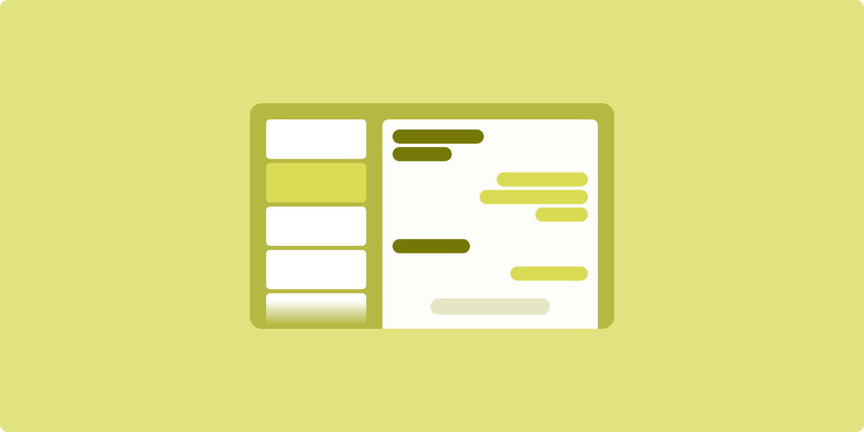
藉助清單詳細資料版面配置,使用者可探索具有描述性、解釋性或其他補充資訊的項目清單,例如作品詳細資料。
此版面配置將應用程式視窗分為兩個並排的窗格:一個用於清單,另一個用於詳細資料。使用者從清單中選取項目,即可顯示作品詳細資料。 詳細資料中的深層連結會顯示詳細資料窗格中的其他內容。
展開寬度螢幕 (請參閱「使用視窗大小類別」) 可同時顯示清單和詳細資料。選取清單項目,即可更新詳細資料窗格,顯示所選項目的相關內容。
寬度中等和較窄的螢幕會依照使用者與應用程式的互動情況,顯示清單或詳細資料。僅顯示清單時,選取某個清單項目會使畫面改為顯示詳細資料,不再顯示清單。僅顯示詳細資訊時,按下返回按鈕即可重新顯示清單。
設定變更 (例如裝置螢幕方向變更或應用程式視窗大小變更) 則會改變螢幕的視窗大小類別。清單詳細資料版面配置會據此回應,保留應用程式狀態:
- 展開寬度螢幕同時顯示清單和詳細資料窗格時,若其縮小為中等或密集,詳細資料窗格仍會繼續顯示,而清單窗格則會隱藏起來
- 如果寬度為中等或較窄小的螢幕僅顯示詳細資料窗格,且視窗大小類別擴大為展開狀態,清單和詳細資料則會同時顯示,而清單則會指出已選取與詳細資料窗格中內容對應的項目
- 如果寬度為中等或較窄小的螢幕僅顯示清單窗格,並擴大為展開狀態,清單和預留位置詳細資料窗格會同時顯示
清單/詳細資料很適合用於訊息應用程式、聯絡人管理工具、互動式媒體瀏覽器,或是任何可將內容整理成項目清單的形式來顯示額外資訊的應用程式。
實作
您可以運用多種技術建立清單詳細資料版面配置,包括 Compose、檢視區塊和活動嵌入 (適用於舊版應用程式)。請參閱「適用性」一節,以協助判斷哪種技術最適用於您的應用程式。
SlidingPaneLayout 程式庫可根據檢視區塊或片段,實作清單詳細資料版面配置。
首先,宣告 SlidingPaneLayout 做為 XML 版面配置的根元素。接著,新增兩個代表清單和詳細資料內容的子項元素 (檢視畫面或片段)。
實作通訊方法,在清單/詳細資料檢視畫面或片段之間傳遞資料。建議使用 ViewModel,因為該程式碼能夠儲存商業邏輯,並在設定變更後繼續有效。
SlidingPaneLayout 會自動判斷是否要個別或同時顯示清單與詳細資料。在水平空間足以容納兩者的視窗中,清單和詳細資料會並列顯示。在缺少足夠空間的視窗中,系統會根據使用者與應用程式的互動顯示清單或詳細資料。
如需實作範例,請參閱「使用滑動窗格建立清單詳細資料」範例。
Activity embedding
Use activity embedding to enable legacy, multiple-activity apps to display two activities side by side on the same screen or stacked (one overlaying the other). If your app implements the list and detail of a list‑detail layout in separate activities, activity embedding enables you to create a list‑detail layout with minimal or no code refactoring.
Implement activity embedding by specifying a task window split using an XML configuration file. The split defines the primary activity, which initiates the split, and a secondary activity. Specify a minimum display width for the split using the window size class breakpoints. When the display width falls below the minimum breakpoint, the activities are displayed one overlaying the other. For example, if the minimum display width is 600dp, the activities are displayed one overlaying the other on compact displays, but side by side on medium and expanded displays.
Activity embedding is supported on Android 12L (API level 32) and higher, but may also be available on lower API levels if implemented by device manufacturers. When activity embedding is not available on a device, the fallback behavior results in the list activity or the detail activity occupying the entire app window based on user interaction with the app.
For more information, see Activity embedding.
For an example implementation, see the List-detail with activity embedding sample.
動態消息
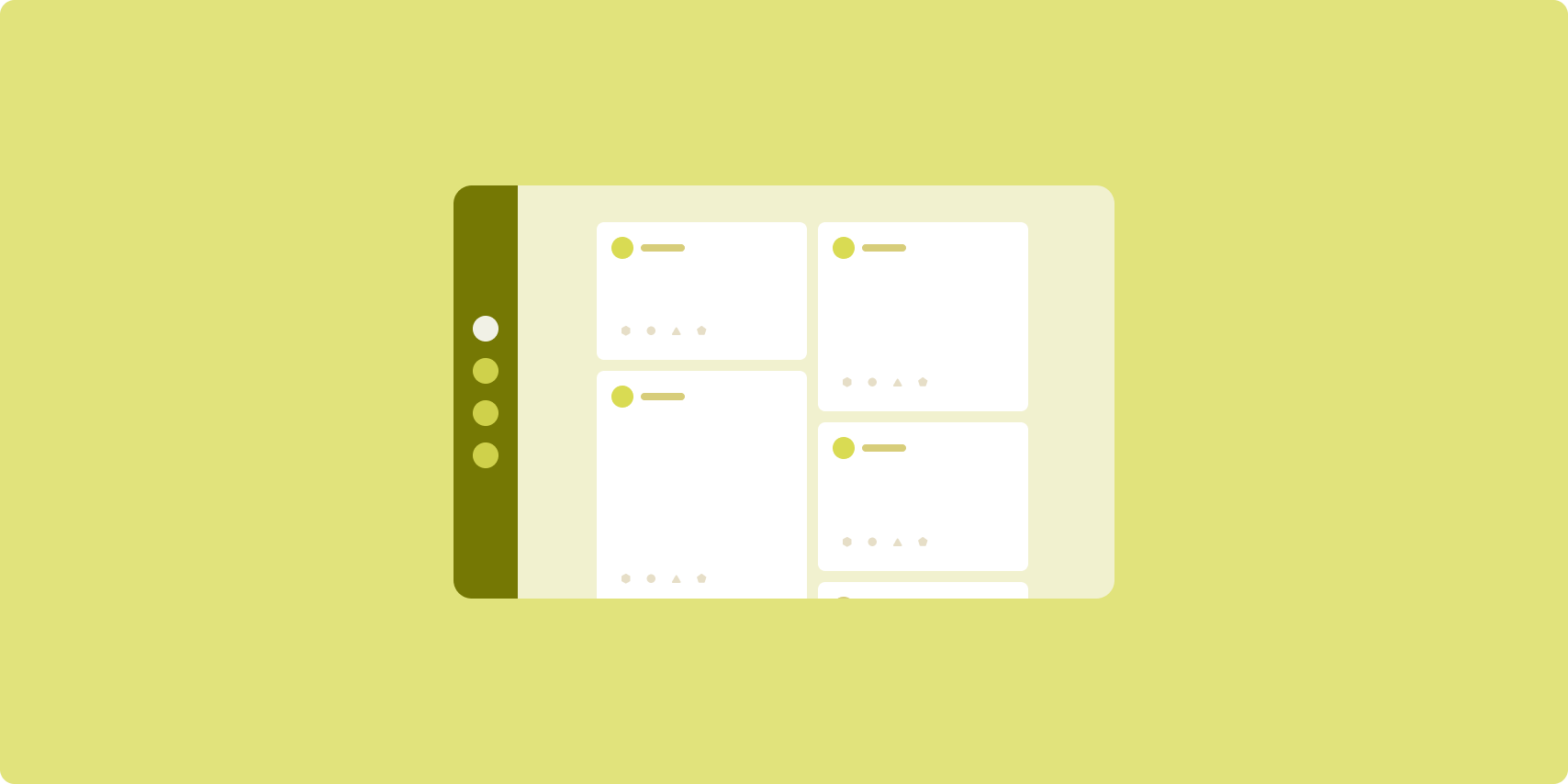
動態消息版面配置會在可設定格線中,排列對等的內容元素,以便快速檢視大量內容。
大小和位置建立內容元素之間的關係。
內容群組的建立方式是建立相同大小的元素並放在一起。讓這些元素比鄰近元素還要大,藉此吸引對於元素的注意。
資訊卡和清單是動態提醒版面配置的常見元件。
動態消息版面配置幾乎可支援所有螢幕尺寸,因為這種配置方式可調整內容顯示格框,單欄或多欄捲動都沒問題。
動態消息特別適合新聞和社群媒體應用程式。
實作
A RecyclerView efficiently renders a large number of items in a single
column. A GridLayoutManager lays out items in a grid, allowing
configuration of the item sizes and spans.
Configure the grid columns based on the size of the available display area to set the minimum allowable width for items.
The GridLayoutManager default spanning strategy, which is one span per item,
can be overridden by creating a custom SpanSizeLookup. Adjust the span to
emphasize some items over others.
On compact-width displays that have enough space for only one column, use
LinearLayoutManager instead of GridLayoutManager.
For an example implementation, see the Feed with views sample.
輔助窗格

輔助窗格版面配置會將應用程式內容整理成主要和次要顯示區域。
主要顯示區域會占用應用程式視窗的大部分空間 (通常約三分之二),用於呈現主要內容。次要顯示區域是窗格,會占用應用程式視窗的其餘部分,並呈現主要內容的輔助內容。
輔助窗格版面配置非常適合橫向的展開寬度螢幕 (請參閱「使用視窗大小類別」)。中等或精簡寬度螢幕支援顯示主要和次要顯示區域,前提是內容可根據更窄的顯示空間調整,或其他內容最初可隱藏在底部或側邊工作表中 (以選單或按鈕等控制項存取)。
就主要和次要內容的關係而言,輔助窗格版面配置不同於清單詳細資料版面配置。在輔助窗格版面配置中,次要窗格內容只因與主要內容相關而有意義。舉例來說,輔助窗格工具視窗本身並不重要。不過,即使沒有主要內容 (例如產品資訊中的產品說明),在清單詳細資料版面配置的詳細資料窗格中的補充內容也仍然有意義。
輔助窗格的用途如下:
- 效率提升應用程式:在文件或試算表中以輔助窗格呈現評論者留言
- 媒體應用程式:在串流影片中以輔助窗格中呈現相關影片清單,或在音樂專輯說明旁顯示播放清單
- 工具和設定:輔助窗格中的媒體編輯工具,包含調色盤、效果和其他設定
實作
A supporting pane layout is implemented using a helper layout such as
LinearLayout or ConstraintLayout. Establish the window size classes
that divide the amount of horizontal display space available for your app into
three categories: compact (< 600dp), medium (>= 600dp), and expanded
(>= 840dp).
For each window size class, define layouts as follows:
- Compact: In the app resources
layoutfolder, place content that renders the supporting pane below the main content or inside a bottom sheet - Medium: In the
layout-w600dpfolder, provide supporting pane content that results in the main content and supporting pane rendering side by side, splitting the horizontal display space equally - Expanded: In the
layout-w840dpfolder, include supporting pane content that results in the main content and supporting pane rendering side by side; however, the supporting pane takes up only 30% of the horizontal space, leaving the remaining 70% for the main content
Use a ViewModel for communication between the main content and the
supporting pane whether using views, fragments, or a combination.
For implementation examples, see the following samples:
Applicability
The canonical layouts create multifaceted presentations of content for easy access and deep exploration. Use the following flowchart to determine which layout and implementation strategy is best for your app's use cases.
For examples of the canonical layouts implemented in different types of apps, see the large screen gallery.

其他資源
- Material Design:標準化版面配置