It is sometimes necessary to override the default focus behavior of the elements on your screen. For example, you might want to group composables, prevent focus on a certain composable, explicitly request focus on one, capture or release focus, or redirect focus on entry or exit. This section describes how to change focus behavior when the defaults aren't what you need.
Provide coherent navigation with focus groups
Sometimes, Jetpack Compose doesn't immediately guess the correct next item for
tabbed navigation, especially when complex parent Composables like tabs and
lists come into play.
While focus search usually follows the declaration order of the Composables,
this is impossible in some cases, like when one of the Composables in the
hierarchy is a horizontal scrollable that is not fully visible. This is shown in
the example below.
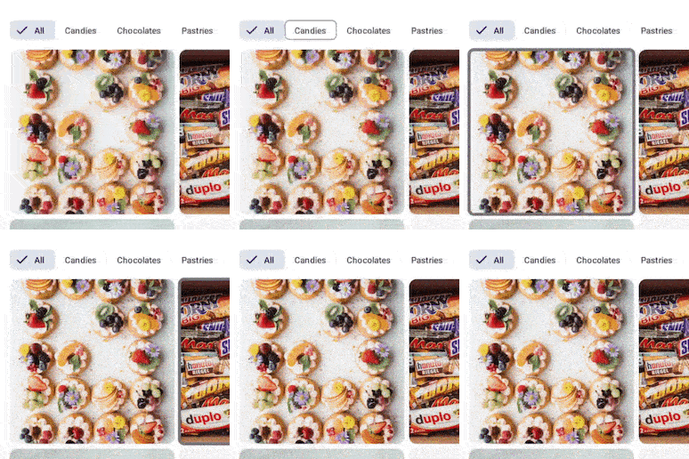
Jetpack Compose may decide to focus the next item closest to the start of the screen, as shown below, rather than continuing on the path you expect for one-directional navigation:

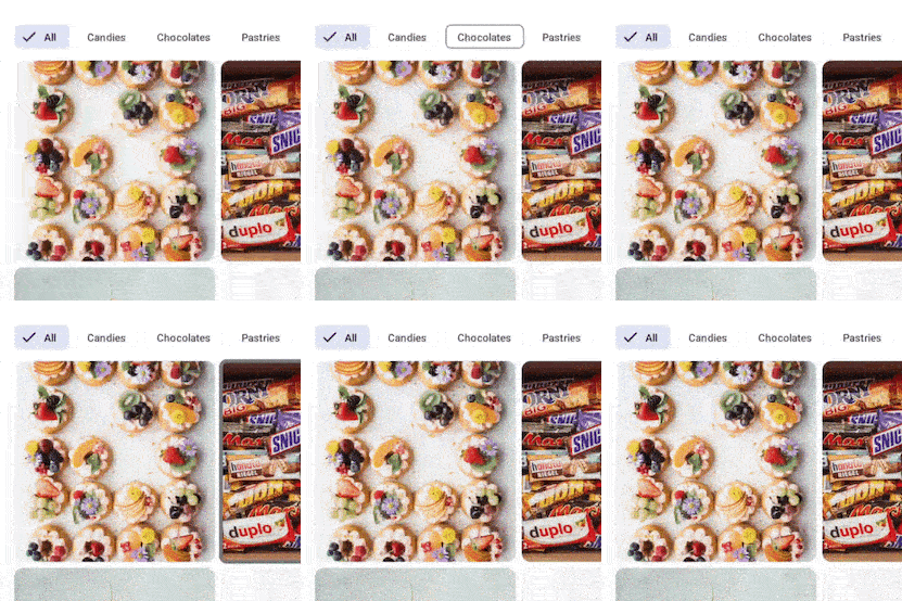
In this example, it is clear that the developers did not intend for the focus to jump from the Chocolates tab to the first image below, and then back up to the Pastries tab. Instead, they wanted the focus to continue on the tabs until the last tab, and then focus on the inner content:

In situations where it's important that a group of composables gains focus
sequentially, like in the Tab row from the previous example, you need to wrap
the Composable in a parent that has the focusGroup() modifier:
LazyVerticalGrid(columns = GridCells.Fixed(4)) { item(span = { GridItemSpan(maxLineSpan) }) { Row(modifier = Modifier.focusGroup()) { FilterChipA() FilterChipB() FilterChipC() } } items(chocolates) { SweetsCard(sweets = it) } }
Bi-directional navigation looks for the closest composable for the given
direction— if an element from another group is closer than a non-fully visible
item in the current group, navigation picks the closest one. To avoid this
behavior, you can apply the focusGroup() modifier.
FocusGroup makes a whole group appear like a single entity in terms of focus,
but the group itself will not get the focus— instead, the closest child will
gain focus instead. In this way, navigation knows to go to the non-fully visible
item before leaving the group.
In this case, the three instances of FilterChip will be focused before the
SweetsCard items, even when the SweetsCards are completely visible to the
user and some FilterChip might be hidden. This happens because the
focusGroup modifier tells the focus manager to adjust the order in which items
are focused so that navigation is easier and more coherent with the UI.
Without the focusGroup modifier, if the FilterChipC was not visible, focus
navigation would pick it up last. However, adding such a modifier makes it not
only discoverable, but it will also acquire focus right after FilterChipB, as
users would expect.
Making a composable focusable
Some composables are focusable by design, such as a Button or a composable with
the clickable modifier attached to it. If you want to specifically add
focusable behavior to a composable, you use the focusable modifier:
var color by remember { mutableStateOf(Green) } Box( Modifier .background(color) .onFocusChanged { color = if (it.isFocused) Blue else Green } .focusable() ) { Text("Focusable 1") }
Making a composable unfocusable
There might be situations in which some of your elements should not participate
in the focus. In these rare occasions, you can leverage the canFocus property
to exclude a Composable from being focusable.
var checked by remember { mutableStateOf(false) } Switch( checked = checked, onCheckedChange = { checked = it }, // Prevent component from being focused modifier = Modifier .focusProperties { canFocus = false } )
Request keyboard focus with FocusRequester
In some cases, you might want to explicitly request focus as a response to a user interaction. For example, you might ask a user if they want to restart filling in a form, and if they press "yes" you want to refocus the first field of that form.
The first thing to do is associate a FocusRequester object with the
composable you want to move the keyboard focus to. In the following code
snippet, a FocusRequester object is associated with a TextField by setting a
modifier called Modifier.focusRequester:
val focusRequester = remember { FocusRequester() } var text by remember { mutableStateOf("") } TextField( value = text, onValueChange = { text = it }, modifier = Modifier.focusRequester(focusRequester) )
You can call FocusRequester's requestFocus method to send actual focus requests. You should invoke this method outside of a Composable context
(otherwise, it is re-executed at every recomposition). The following snippet
shows how to request the system to move the keyboard focus when the button is
clicked:
val focusRequester = remember { FocusRequester() } var text by remember { mutableStateOf("") } TextField( value = text, onValueChange = { text = it }, modifier = Modifier.focusRequester(focusRequester) ) Button(onClick = { focusRequester.requestFocus() }) { Text("Request focus on TextField") }
Capture and release focus
You can leverage focus to guide your users to provide the right data your app needs to perform its task— for instance, getting a valid email address or phone number. Although error states inform your users about what is going on, you might need the field with erroneous information to stay focused until it gets fixed.
In order to capture the focus, you can invoke the captureFocus() method, and
release it afterwards with the freeFocus() method instead, as in the following
example:
val textField = remember { FocusRequester() } TextField( value = text, onValueChange = { text = it if (it.length > 3) { textField.captureFocus() } else { textField.freeFocus() } }, modifier = Modifier.focusRequester(textField) )
Precedence of focus modifiers
Modifiers can be seen as elements that only have one child, so when you queue
them, each Modifier on the left (or top) wraps the Modifier that follows on
the right (or below). This means that the second Modifier is contained inside
the first one, so that when declaring two focusProperties, only the topmost
one works, as the following ones are contained in the topmost.
To clarify the concept more, see the following code:
Modifier .focusProperties { right = item1 } .focusProperties { right = item2 } .focusable()
In this case, the focusProperties indicating item2 as the right focus will
not be used, as it is contained in the preceding one; thus, item1 will be the
one used.
Leveraging this approach, a parent can also reset the behavior to default by
using FocusRequester.Default:
Modifier .focusProperties { right = Default } .focusProperties { right = item1 } .focusProperties { right = item2 } .focusable()
The parent does not have to be part of the same modifier chain. A parent
composable can overwrite a focus property of a child composable. For example,
consider this FancyButton that makes the button not focusable:
@Composable fun FancyButton(modifier: Modifier = Modifier) { Row(modifier.focusProperties { canFocus = false }) { Text("Click me") Button(onClick = { }) { Text("OK") } } }
A user can make this button focusable again by setting canFocus to true:
FancyButton(Modifier.focusProperties { canFocus = true })
Like every Modifier, focus-related ones behave differently based on the order
you declare them. For instance, code like the following makes the Box
focusable, but the FocusRequester isn't associated with this focusable since it
is declared after the focusable.
Box( Modifier .focusable() .focusRequester(Default) .onFocusChanged {} )
It's important to remember that a focusRequester is associated with the first
focusable below it in the hierarchy, so this focusRequester points to the
first focusable child. In case none is available, it won't point to anything.
However, since the Box is focusable (thanks to the focusable() modifier),
you can navigate to it using two-directional navigation.
As another example, either of the following would work, as the onFocusChanged()
modifier refers to the first focusable element that appears after the
focusable() or focusTarget() modifiers.
Box( Modifier .onFocusChanged {} .focusRequester(Default) .focusable() ) |
Box( Modifier .focusRequester(Default) .onFocusChanged {} .focusable() ) |
Redirect focus upon entry or exit
Sometimes, you need to provide a very specific kind of navigation, like the one shown in the animation below:

Before we dive into how to create this, it's important to understand the default
behavior of the focus search. Without any modification, once the focus search
reaches the Clickable 3 item, pressing DOWN on the D-Pad (or the equivalent
arrow key) would move the focus to whatever is displayed below the Column,
exiting the group and ignoring the one on the right. If there are no
focusable items available, the focus doesn't move anywhere, but stays on
Clickable 3.
To alter this behavior and provide the intended navigation, you can leverage the
focusProperties modifier, which helps you manage what happens when the focus
search enters or exits the Composable:
val otherComposable = remember { FocusRequester() } Modifier.focusProperties { exit = { focusDirection -> when (focusDirection) { Right -> Cancel Down -> otherComposable else -> Default } } }
It is possible to direct the focus to a specific Composable whenever it enters
or exits a certain portion of the hierarchy— for example, when your UI has two
columns and you want to make sure that whenever the first one is processed,
focus switches to the second:

In this gif, once the focus reaches the Clickable 3 Composable in Column 1,
the next item being focused is Clickable 4 in another Column. This behavior
can be achieved by combining the focusDirection with the enter and exit
values inside the focusProperties modifier. They both need a lambda that takes
as a parameter the direction from which the focus is coming from and returns a
FocusRequester. This lambda can behave in three different ways: returning
FocusRequester.Cancel stops the focus from continuing, while
FocusRequester.Default does not alter its behavior. Providing instead the
FocusRequester attached to another Composable makes the focus jump to that
specific Composable.
Change focus advancing direction
To advance the focus to the next item or towards a precise direction, you can
leverage the onPreviewKey modifier and imply the LocalFocusManager to
advance the focus with the moveFocus Modifier.
The following example shows the default behavior of the focus mechanism: when a
tab keypress is detected, the focus advances to the next element in the focus
list. While this is not something you usually need to configure, it's important
to know the inner workings of the system to be able to change the default
behavior.
val focusManager = LocalFocusManager.current var text by remember { mutableStateOf("") } TextField( value = text, onValueChange = { text = it }, modifier = Modifier.onPreviewKeyEvent { when { KeyEventType.KeyUp == it.type && Key.Tab == it.key -> { focusManager.moveFocus(FocusDirection.Next) true } else -> false } } )
In this sample, the focusManager.moveFocus() function advances the focus to
the item specified, or to the direction implied in the function parameter.
Recommended for you
- Note: link text is displayed when JavaScript is off
- React to focus
- Focus in Compose
- Change focus traversal order
