
Android Studio has features inside the editor area to improve your productivity with Jetpack Compose.
Live templates
Android Studio comes with these Compose-related live templates, which allow you to enter code snippets for fast insertion by typing the corresponding template abbreviation:
compto set up a@Composablefunctionprevto create a@Previewcomposable functionpaddpto add apaddingModifier in dpweightto add aweightModifierW,WR,WCto surround the current composable with aBox,Row, orColumncontainer
Gutter icons
Gutter icons are contextual actions visible on the sidebar, next to the line numbers. Android Studio introduces several gutter icons specific to Jetpack Compose to ease your developer experience.
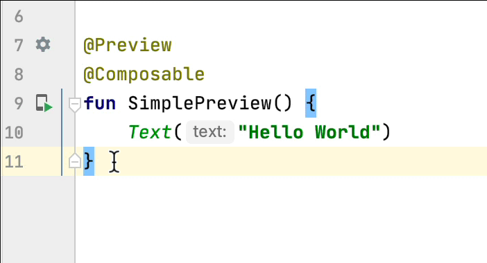
Deploy preview
You can deploy a @Preview to the emulator or physical device directly from the
gutter icon:
Color picker
Whenever a color is defined inside or outside a composable, its preview is shown on the gutter. You can change the color via the color picker by clicking on it like this:
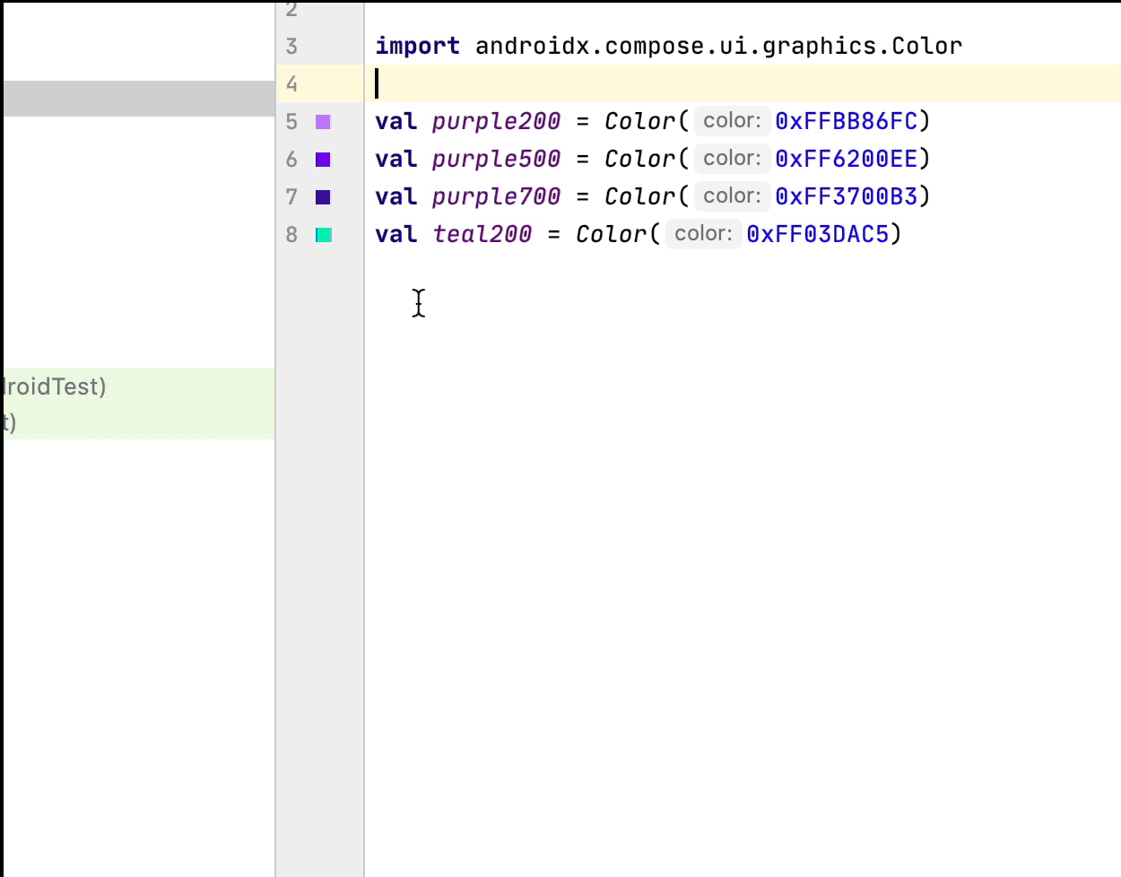
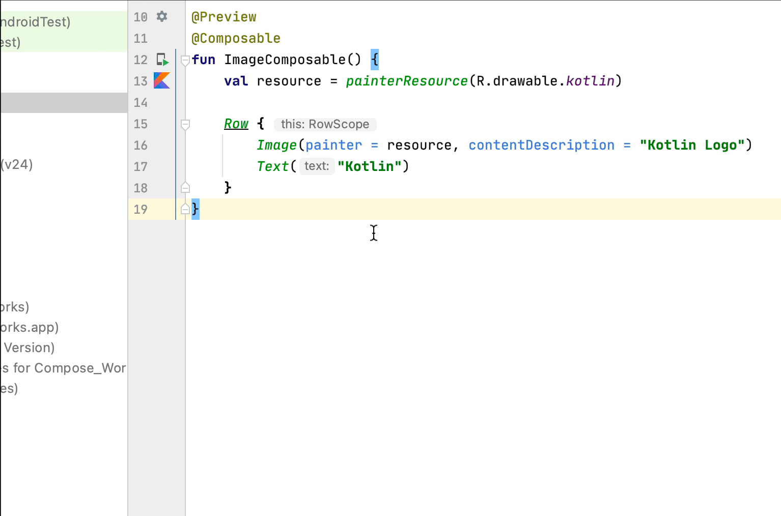
Image resource picker
Whenever a drawable, vector, or image is defined inside or outside a composable, its preview is shown on the gutter. You can change it via the image resource picker by clicking on it like this:
Recommended for you
- Note: link text is displayed when JavaScript is off
- Compose layout basics
- Compose modifiers
- Lists and grids