Jetpack Compose makes it much easier to design and build your app's UI. Compose transforms state into UI elements, via:
- Composition of elements
- Layout of elements
- Drawing of elements
This document focuses on the layout of elements, explaining some of the building blocks Compose provides to help you lay out your UI elements.
Goals of layouts in Compose
The Jetpack Compose implementation of the layout system has two main goals:
- High performance
- Ability to easily write custom layouts
Basics of composable functions
Composable functions are the basic building block of Compose. A composable
function is a function emitting Unit that describes some part of your UI. The
function takes some input and generates what's shown on the screen. For more
information about composables, take a look at the Compose mental
model documentation.
A composable function might emit several UI elements. However, if you don't provide guidance on how they should be arranged, Compose might arrange the elements in a way you don't like. For example, this code generates two text elements:
@Composable fun ArtistCard() { Text("Alfred Sisley") Text("3 minutes ago") }
Without guidance on how you want them arranged, Compose stacks the text elements on top of each other, making them unreadable:

Compose provides a collection of ready-to-use layouts to help you arrange your UI elements, and makes it easy to define your own, more-specialized layouts.
Standard layout components
In many cases, you can just use Compose's standard layout elements.
Use
Column
to place items vertically on the screen.
@Composable fun ArtistCardColumn() { Column { Text("Alfred Sisley") Text("3 minutes ago") } }

Similarly, use
Row
to place items horizontally on the screen. Both Column and Row support
configuring the alignment of the elements they contain.
@Composable fun ArtistCardRow(artist: Artist) { Row(verticalAlignment = Alignment.CenterVertically) { Image(bitmap = artist.image, contentDescription = "Artist image") Column { Text(artist.name) Text(artist.lastSeenOnline) } } }

Use Box to put elements on top of another. Box also supports configuring specific alignment of the elements it contains.
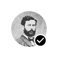
@Composable fun ArtistAvatar(artist: Artist) { Box { Image(bitmap = artist.image, contentDescription = "Artist image") Icon(Icons.Filled.Check, contentDescription = "Check mark") } }

Often these building blocks are all you need. You can write your own composable function to combine these layouts into a more elaborate layout that suits your app.

To set children's position within a Row, set the horizontalArrangement and
verticalAlignment arguments. For a Column, set the verticalArrangement and
horizontalAlignment arguments:
@Composable fun ArtistCardArrangement(artist: Artist) { Row( verticalAlignment = Alignment.CenterVertically, horizontalArrangement = Arrangement.End ) { Image(bitmap = artist.image, contentDescription = "Artist image") Column { /*...*/ } } }

The layout model
In the layout model, the UI tree is laid out in a single pass. Each node is first asked to measure itself, then measure any children recursively, passing size constraints down the tree to children. Then, leaf nodes are sized and placed, with the resolved sizes and placement instructions passed back up the tree.
Briefly, parents measure before their children, but are sized and placed after their children.
Consider the following SearchResult function.
@Composable fun SearchResult() { Row { Image( // ... ) Column { Text( // ... ) Text( // ... ) } } }
This function yields the following UI tree.
SearchResult
  Row
    Image
    Column
      Text
      Text
In the SearchResult example, the UI tree layout follows this order:
- The root node
Rowis asked to measure. - The root node
Rowasks its first child,Image, to measure. Imageis a leaf node (that is, it has no children), so it reports a size and returns placement instructions.- The root node
Rowasks its second child,Column, to measure. - The
Columnnode asks its firstTextchild to measure. - The first
Textnode is a leaf node, so it reports a size and returns placement instructions. - The
Columnnode asks its secondTextchild to measure. - The second
Textnode is a leaf node, so it reports a size and returns placement instructions. - Now that the
Columnnode has measured, sized, and, placed its children, it can determine its own size and placement. - Now that the root node
Rowhas measured, sized, and placed its children, it can determine its own size and placement.
Performance
Compose achieves high performance by measuring children only once. Single-pass measurement is good for performance, allowing Compose to efficiently handle deep UI trees. If an element measured its child twice and that child measured each of its children twice and so on, a single attempt to lay out a whole UI would have to do a lot of work, making it hard to keep your app performant.
If your layout needs multiple measurements for some reason, Compose offers a special system, intrinsic measurements. You can read more about this feature in Intrinsic measurements in Compose layouts.
Since measurement and placement are distinct sub-phases of the layout pass, any changes that only affects placement of items, not measurement, can be executed separately.
Using modifiers in your layouts
As discussed in Compose modifiers, you can use
modifiers to decorate or augment your composables. Modifiers are essential
for customizing your layout. For example, here we chain several modifiers
to customize the ArtistCard:
@Composable fun ArtistCardModifiers( artist: Artist, onClick: () -> Unit ) { val padding = 16.dp Column( Modifier .clickable(onClick = onClick) .padding(padding) .fillMaxWidth() ) { Row(verticalAlignment = Alignment.CenterVertically) { /*...*/ } Spacer(Modifier.size(padding)) Card( elevation = CardDefaults.cardElevation(defaultElevation = 4.dp), ) { /*...*/ } } }

In the code above, notice different modifier functions used together.
clickablemakes a composable react to user input and shows a ripple.paddingputs space around an element.fillMaxWidthmakes the composable fill the maximum width given to it from its parent.size()specifies an element's preferred width and height.
Scrollable layouts
Learn more about scrollable layouts in the Compose gestures documentation.
For lists and lazy lists, check out the Compose lists documentation.
Responsive layouts
A layout should be designed with consideration of different screen orientations and form factor sizes. Compose offers out of the box a few mechanisms to facilitate adapting your composable layouts to various screen configurations.
Constraints
In order to know the constraints coming from the parent and design the layout
accordingly, you can use a BoxWithConstraints. The measurement
constraints
can be found in the scope of the content lambda. You can use these measurement
constraints to compose different layouts for different screen configurations:
@Composable fun WithConstraintsComposable() { BoxWithConstraints { Text("My minHeight is $minHeight while my maxWidth is $maxWidth") } }
Slot-based layouts
Compose provides a large variety of composables based on Material
Design with the
androidx.compose.material:material dependency (included when creating a
Compose project in Android Studio) to make UI building easy. Elements like
Drawer,
FloatingActionButton,
and TopAppBar are all provided.
Material components make heavy use of slot APIs, a pattern Compose introduces
to bring in a layer of customization on top of composables. This approach makes
components more flexible, as they accept a child element which can configure
itself rather than having to expose every configuration parameter of the child.
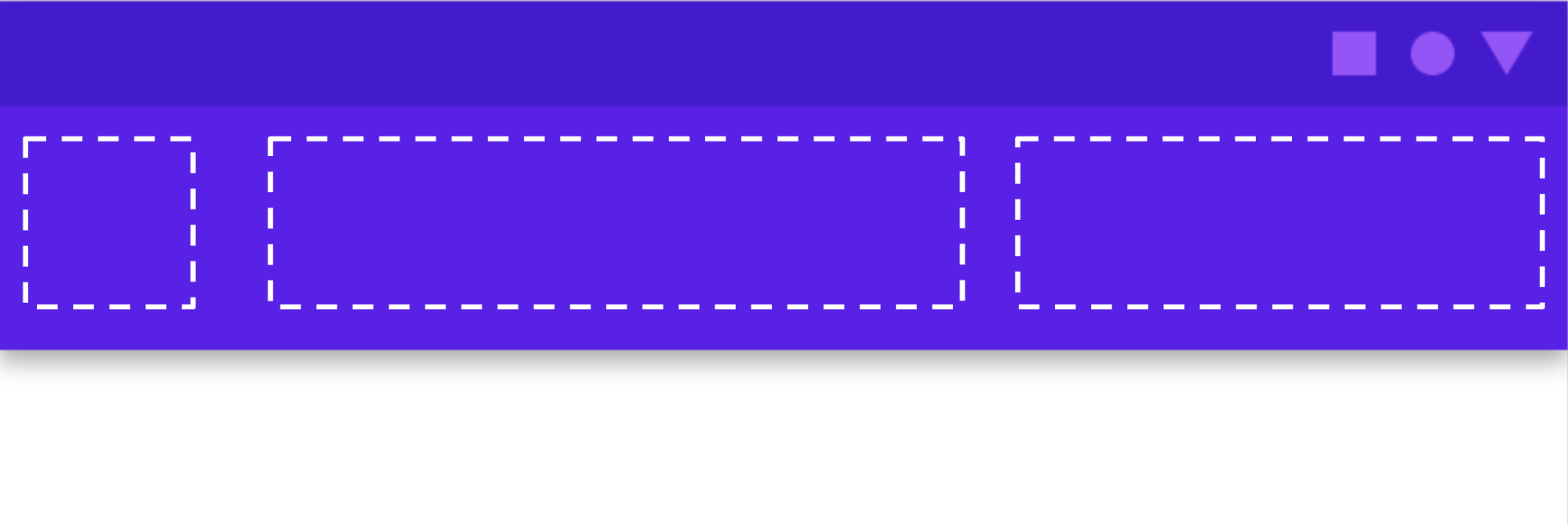
Slots leave an empty space in the UI for the developer to fill as they wish. For
example, these are the slots that you can customize in a
TopAppBar:

Composables usually take a content composable lambda ( content: @Composable
() -> Unit). Slot APIs expose multiple content parameters for specific uses.
For example, TopAppBar allows you to provide the content for title,
navigationIcon, and actions.
For example,
Scaffold
allows you to implement a UI with the basic Material Design layout structure.
Scaffoldprovides slots for the most common top-level Material components,
such as TopAppBar,
BottomAppBar,
FloatingActionButton,
and Drawer. By using
Scaffold, it's easy to make sure these components are properly positioned and
work together correctly.

@Composable fun HomeScreen(/*...*/) { ModalNavigationDrawer(drawerContent = { /* ... */ }) { Scaffold( topBar = { /*...*/ } ) { contentPadding -> // ... } } }
Recommended for you
- Note: link text is displayed when JavaScript is off
- Compose modifiers
- Kotlin for Jetpack Compose
- Material Components and layouts


