Scaffold
In Material Design, a scaffold is a fundamental structure that provides a standardized platform for complex user interfaces. It holds together different parts of the UI, such as app bars and floating action buttons, giving apps a coherent look and feel.
Example
The Scaffold composable provides a straightforward API you can use to
quickly assemble your app's structure according to Material Design guidelines.
Scaffold accepts several composables as parameters. Among these are the
following:
topBar: The app bar across the top of the screen.bottomBar: The app bar across the bottom of the screen.floatingActionButton: A button that hovers over the bottom-right corner of the screen that you can use to expose key actions.
You can also pass Scaffold content as you would to other containers. It passes
PaddingValues to the content lambda that you should apply to your
content's root composable to constrain its size.
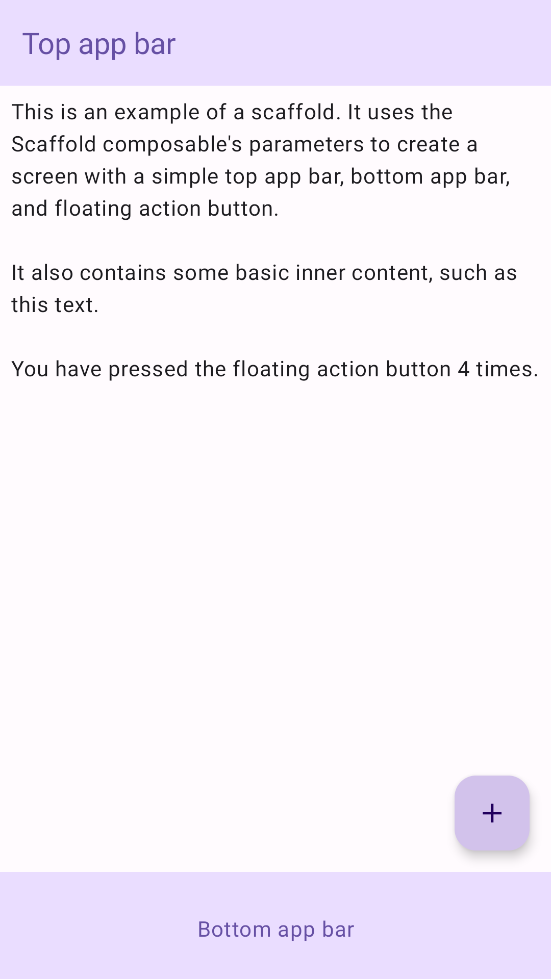
The following example shows a complete Scaffold implementation. It contains a
top app bar, a bottom app bar, and a floating action button.
@Composable fun ScaffoldExample() { var presses by remember { mutableIntStateOf(0) } Scaffold( topBar = { TopAppBar( colors = topAppBarColors( containerColor = MaterialTheme.colorScheme.primaryContainer, titleContentColor = MaterialTheme.colorScheme.primary, ), title = { Text("Top app bar") } ) }, bottomBar = { BottomAppBar( containerColor = MaterialTheme.colorScheme.primaryContainer, contentColor = MaterialTheme.colorScheme.primary, ) { Text( modifier = Modifier .fillMaxWidth(), textAlign = TextAlign.Center, text = "Bottom app bar", ) } }, floatingActionButton = { FloatingActionButton(onClick = { presses++ }) { Icon(Icons.Default.Add, contentDescription = "Add") } } ) { innerPadding -> Column( modifier = Modifier .padding(innerPadding), verticalArrangement = Arrangement.spacedBy(16.dp), ) { Text( modifier = Modifier.padding(8.dp), text = """ This is an example of a scaffold. It uses the Scaffold composable's parameters to create a screen with a simple top app bar, bottom app bar, and floating action button. It also contains some basic inner content, such as this text. You have pressed the floating action button $presses times. """.trimIndent(), ) } } }
This implementation appears as follows:

