Mit Sammlungen den Überblick behalten
Sie können Inhalte basierend auf Ihren Einstellungen speichern und kategorisieren.
Über Drop-down-Menüs können Nutzer auf ein Symbol, ein Textfeld oder eine andere Komponente klicken und dann aus einer Liste mit Optionen auf einer temporären Oberfläche auswählen. In diesem Leitfaden wird beschrieben, wie Sie sowohl einfache als auch komplexere Menüs mit Trennzeichen und Symbolen erstellen.
Abbildung 1: Ein einfaches Drop-down-Menü mit zwei Einträgen.
API-Oberfläche
Verwenden Sie die Komponenten DropdownMenu, DropdownMenuItem und IconButton, um ein benutzerdefiniertes Drop-down-Menü zu implementieren. Die Komponenten DropdownMenu und DropdownMenuItem werden verwendet, um die Menüpunkte anzuzeigen, während IconButton der Trigger zum Ein- oder Ausblenden des Drop-down-Menüs ist.
Die wichtigsten Parameter für die Komponente DropdownMenu sind:
expanded: Gibt an, ob das Menü sichtbar ist.
onDismissRequest: Wird verwendet, um das Schließen des Menüs zu verarbeiten.
content: Der zusammensetzbare Inhalt des Menüs, der in der Regel DropdownMenuItem-Composables enthält.
Zu den wichtigsten Parametern für DropdownMenuItem gehören:
text: Definiert den Inhalt, der im Menüelement angezeigt wird.
onClick: Callback zur Verarbeitung der Interaktion mit dem Element im Menü.
Einfaches Drop-down-Menü erstellen
Das folgende Snippet zeigt eine minimale DropdownMenu-Implementierung:
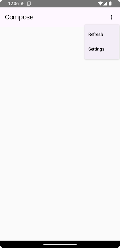
@ComposablefunMinimalDropdownMenu(){varexpandedbyremember{mutableStateOf(false)}Box(modifier=Modifier.padding(16.dp)){IconButton(onClick={expanded=!expanded}){Icon(Icons.Default.MoreVert,contentDescription="More options")}DropdownMenu(expanded=expanded,onDismissRequest={expanded=false}){DropdownMenuItem(text={Text("Option 1")},onClick={/* Do something... */})DropdownMenuItem(text={Text("Option 2")},onClick={/* Do something... */})}}}
Definiert ein einfaches DropdownMenu mit zwei Menüpunkten.
Mit dem Parameter expanded wird die Sichtbarkeit des Menüs als maximiert oder minimiert gesteuert.
Der Parameter onDismissRequest definiert einen Callback, der ausgeführt wird, wenn der Nutzer das Menü schließt.
Die zusammensetzbare Funktion DropdownMenuItem stellt auswählbare Elemente im Drop-down-Menü dar.
Ein IconButton löst das Maximieren und Minimieren des Menüs aus.
Ergebnis
Abbildung 2. Ein kleines Drop-down-Menü mit nur zwei Optionen.
Längeres Drop-down-Menü erstellen
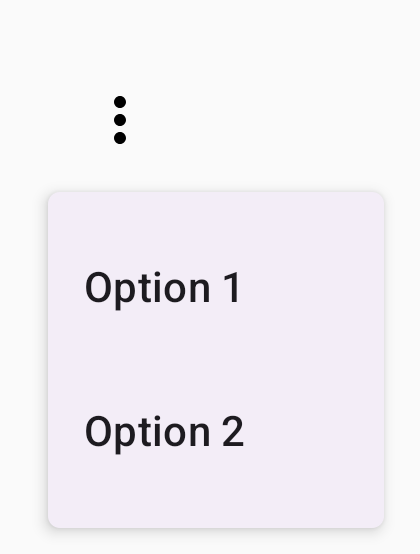
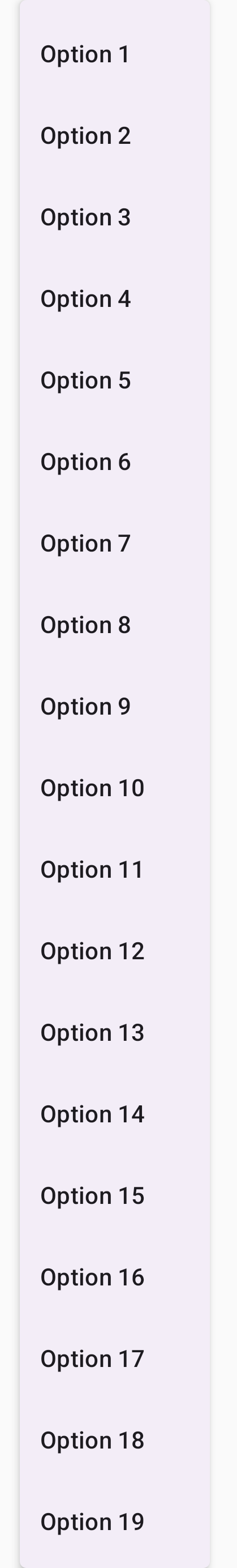
DropdownMenu ist standardmäßig scrollbar, wenn nicht alle Menüelemente gleichzeitig angezeigt werden können. Mit dem folgenden Snippet wird ein längeres Drop-down-Menü mit Scrollfunktion erstellt:
@ComposablefunLongBasicDropdownMenu(){varexpandedbyremember{mutableStateOf(false)}// Placeholder list of 100 strings for demonstrationvalmenuItemData=List(100){"Option ${it+1}"}Box(modifier=Modifier.padding(16.dp)){IconButton(onClick={expanded=!expanded}){Icon(Icons.Default.MoreVert,contentDescription="More options")}DropdownMenu(expanded=expanded,onDismissRequest={expanded=false}){menuItemData.forEach{option->
DropdownMenuItem(text={Text(option)},onClick={/* Do something... */})}}}}
DropdownMenu ist scrollbar, wenn die Gesamthöhe des Inhalts den verfügbaren Platz überschreitet. Mit diesem Code wird ein scrollbarer DropdownMenu erstellt, in dem 100 Platzhalterelemente angezeigt werden.
In der forEach-Schleife werden DropdownMenuItem-Composables dynamisch generiert. Die Elemente werden nicht verzögert erstellt. Das bedeutet, dass alle 100 Dropdown-Elemente erstellt werden und in der Komposition vorhanden sind.
Das IconButton löst das Ein- und Ausblenden des DropdownMenu aus, wenn darauf geklickt wird.
Mit der onClick-Lambda-Funktion in jedem DropdownMenuItem können Sie die Aktion definieren, die ausgeführt wird, wenn der Nutzer ein Menüelement auswählt.
Ergebnis
Das obige Code-Snippet erzeugt das folgende scrollbare Menü:
Abbildung 3. Ein langes, scrollbares Drop-down-Menü.
Längeres Drop-down-Menü mit Trennzeichen erstellen
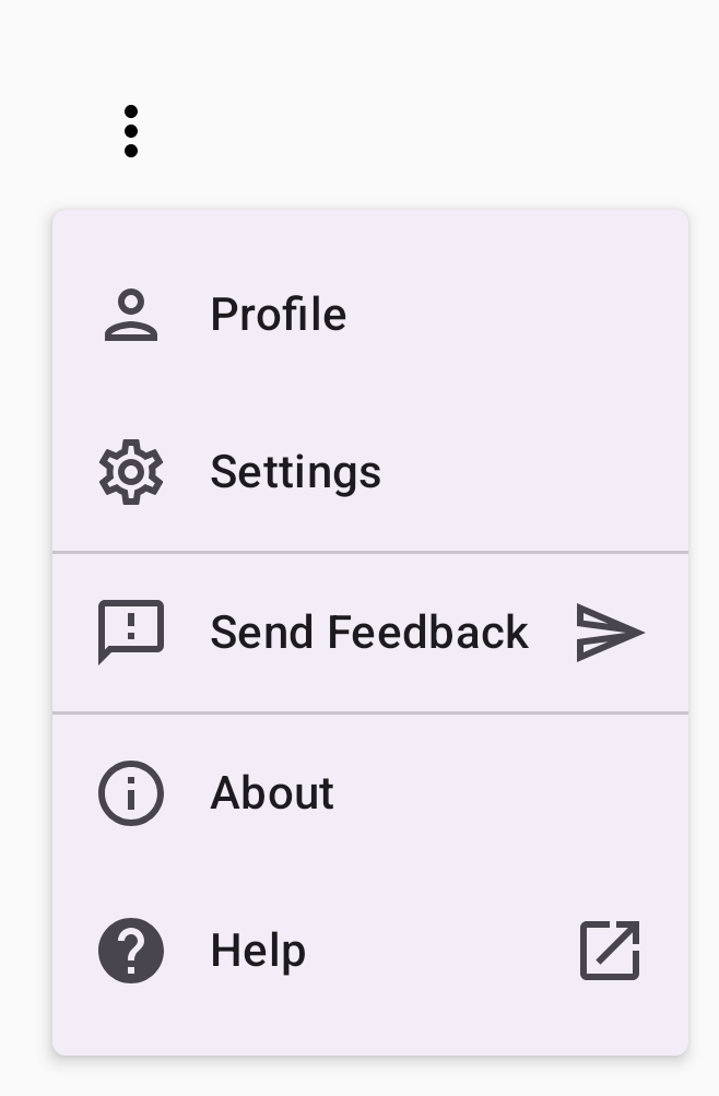
Das folgende Snippet zeigt eine erweiterte Implementierung eines Drop-down-Menüs.
In diesem Snippet werden Menüelementen führende und nachfolgende Symbole hinzugefügt und Gruppen von Menüelementen durch Trennzeichen getrennt.
@ComposablefunDropdownMenuWithDetails(){varexpandedbyremember{mutableStateOf(false)}Box(modifier=Modifier.fillMaxWidth().padding(16.dp)){IconButton(onClick={expanded=!expanded}){Icon(Icons.Default.MoreVert,contentDescription="More options")}DropdownMenu(expanded=expanded,onDismissRequest={expanded=false}){// First sectionDropdownMenuItem(text={Text("Profile")},leadingIcon={Icon(Icons.Outlined.Person,contentDescription=null)},onClick={/* Do something... */})DropdownMenuItem(text={Text("Settings")},leadingIcon={Icon(Icons.Outlined.Settings,contentDescription=null)},onClick={/* Do something... */})HorizontalDivider()// Second sectionDropdownMenuItem(text={Text("Send Feedback")},leadingIcon={Icon(Icons.Outlined.Feedback,contentDescription=null)},trailingIcon={Icon(Icons.AutoMirrored.Outlined.Send,contentDescription=null)},onClick={/* Do something... */})HorizontalDivider()// Third sectionDropdownMenuItem(text={Text("About")},leadingIcon={Icon(Icons.Outlined.Info,contentDescription=null)},onClick={/* Do something... */})DropdownMenuItem(text={Text("Help")},leadingIcon={Icon(Icons.AutoMirrored.Outlined.Help,contentDescription=null)},trailingIcon={Icon(Icons.AutoMirrored.Outlined.OpenInNew,contentDescription=null)},onClick={/* Do something... */})}}}
Alle Inhalte und Codebeispiele auf dieser Seite unterliegen den Lizenzen wie im Abschnitt Inhaltslizenz beschrieben. Java und OpenJDK sind Marken oder eingetragene Marken von Oracle und/oder seinen Tochtergesellschaften.
Zuletzt aktualisiert: 2025-08-27 (UTC).
[[["Leicht verständlich","easyToUnderstand","thumb-up"],["Mein Problem wurde gelöst","solvedMyProblem","thumb-up"],["Sonstiges","otherUp","thumb-up"]],[["Benötigte Informationen nicht gefunden","missingTheInformationINeed","thumb-down"],["Zu umständlich/zu viele Schritte","tooComplicatedTooManySteps","thumb-down"],["Nicht mehr aktuell","outOfDate","thumb-down"],["Problem mit der Übersetzung","translationIssue","thumb-down"],["Problem mit Beispielen/Code","samplesCodeIssue","thumb-down"],["Sonstiges","otherDown","thumb-down"]],["Zuletzt aktualisiert: 2025-08-27 (UTC)."],[],[],null,["Drop-down menus let users click an icon, text field, or other component, and\nthen select from a list of options on a temporary surface. This guide describes\nhow to create both basic menus and more complex menus with dividers and icons.\n**Figure 1.** A basic drop-down menu with two items listed.\n\nAPI surface\n\nUse [`DropdownMenu`](/reference/kotlin/androidx/compose/material3/package-summary#DropdownMenu(kotlin.Boolean,kotlin.Function0,androidx.compose.ui.Modifier,androidx.compose.ui.unit.DpOffset,androidx.compose.foundation.ScrollState,androidx.compose.ui.window.PopupProperties,androidx.compose.ui.graphics.Shape,androidx.compose.ui.graphics.Color,androidx.compose.ui.unit.Dp,androidx.compose.ui.unit.Dp,androidx.compose.foundation.BorderStroke,kotlin.Function1)), [`DropdownMenuItem`](/reference/kotlin/androidx/compose/material3/package-summary#DropdownMenuItem(kotlin.Function0,kotlin.Function0,androidx.compose.ui.Modifier,kotlin.Function0,kotlin.Function0,kotlin.Boolean,androidx.compose.material3.MenuItemColors,androidx.compose.foundation.layout.PaddingValues,androidx.compose.foundation.interaction.MutableInteractionSource)), and the [`IconButton`](/reference/kotlin/androidx/compose/material3/package-summary#IconButton(kotlin.Function0,androidx.compose.ui.Modifier,kotlin.Boolean,androidx.compose.material3.IconButtonColors,androidx.compose.foundation.interaction.MutableInteractionSource,androidx.compose.ui.graphics.Shape,kotlin.Function0))\ncomponents to implement a custom drop-down menu. The `DropdownMenu` and\n`DropdownMenuItem` components are used to display the menu items, while the\n`IconButton` is the trigger to display or hide the drop-down menu.\n\nThe key parameters for the `DropdownMenu` component include the following:\n\n- `expanded`: Indicates whether the menu is visible.\n- `onDismissRequest`: Used to handle menu dismissal.\n- `content`: The composable content of the menu, typically containing `DropdownMenuItem` composables.\n\nThe key parameters for `DropdownMenuItem` include the following:\n\n- `text`: Defines the content displayed in the menu item.\n- `onClick`: Callback to handle interaction with the item in the menu.\n\nCreate a basic drop-down menu\n\nThe following snippet demonstrates a minimal `DropdownMenu` implementation:\n\n\n```kotlin\n@Composable\nfun MinimalDropdownMenu() {\n var expanded by remember { mutableStateOf(false) }\n Box(\n modifier = Modifier\n .padding(16.dp)\n ) {\n IconButton(onClick = { expanded = !expanded }) {\n Icon(Icons.Default.MoreVert, contentDescription = \"More options\")\n }\n DropdownMenu(\n expanded = expanded,\n onDismissRequest = { expanded = false }\n ) {\n DropdownMenuItem(\n text = { Text(\"Option 1\") },\n onClick = { /* Do something... */ }\n )\n DropdownMenuItem(\n text = { Text(\"Option 2\") },\n onClick = { /* Do something... */ }\n )\n }\n }\n}https://github.com/android/snippets/blob/dd30aee903e8c247786c064faab1a9ca8d10b46e/compose/snippets/src/main/java/com/example/compose/snippets/components/Menus.kt#L98-L122\n```\n\n\u003cbr /\u003e\n\nKey points about the code\n\n- Defines a basic `DropdownMenu` containing two menu items.\n- The `expanded` parameter controls the menu's visibility as expanded or collapsed.\n- The `onDismissRequest` parameter defines a callback that executes when the user closes the menu.\n- The `DropdownMenuItem` composable represents selectable items in the drop-down menu.\n- An `IconButton` triggers the expansion and collapse of the menu.\n\nResult **Figure 2.** A minimal drop-down menu with only two options.\n\nCreate a longer drop-down menu\n\n`DropdownMenu` is scrollable by default if all the menu items can't be displayed\nat once. The following snippet creates a longer, scrollable drop-down menu:\n\n\n```kotlin\n@Composable\nfun LongBasicDropdownMenu() {\n var expanded by remember { mutableStateOf(false) }\n // Placeholder list of 100 strings for demonstration\n val menuItemData = List(100) { \"Option ${it + 1}\" }\n\n Box(\n modifier = Modifier\n .padding(16.dp)\n ) {\n IconButton(onClick = { expanded = !expanded }) {\n Icon(Icons.Default.MoreVert, contentDescription = \"More options\")\n }\n DropdownMenu(\n expanded = expanded,\n onDismissRequest = { expanded = false }\n ) {\n menuItemData.forEach { option -\u003e\n DropdownMenuItem(\n text = { Text(option) },\n onClick = { /* Do something... */ }\n )\n }\n }\n }\n}https://github.com/android/snippets/blob/dd30aee903e8c247786c064faab1a9ca8d10b46e/compose/snippets/src/main/java/com/example/compose/snippets/components/Menus.kt#L132-L157\n```\n\n\u003cbr /\u003e\n\nKey points about the code\n\n- The `DropdownMenu` is scrollable when the total height of its content exceeds the available space. This code creates a scrollable `DropdownMenu` that displays 100 placeholder items.\n- The `forEach` loop dynamically generates `DropdownMenuItem` composables. The items are not lazily created, which means that all 100 drop-down items are created and exist in the composition.\n- The `IconButton` triggers the expansion and collapse of the `DropdownMenu` when clicked.\n- The `onClick` lambda within each `DropdownMenuItem` lets you define the action performed when the user selects a menu item.\n\nResult\n\nThe preceding code snippet produces the following scrollable menu:\n**Figure 3.** A long, scrollable drop-down menu.\n\nCreate a longer drop-down menu with dividers\n\nThe following snippet shows a more advanced implementation of a drop-down menu.\nIn this snippet, leading and trailing icons are added to menu items, and\ndividers separate groups of menu items.\n\n\n```kotlin\n@Composable\nfun DropdownMenuWithDetails() {\n var expanded by remember { mutableStateOf(false) }\n\n Box(\n modifier = Modifier\n .fillMaxWidth()\n .padding(16.dp)\n ) {\n IconButton(onClick = { expanded = !expanded }) {\n Icon(Icons.Default.MoreVert, contentDescription = \"More options\")\n }\n DropdownMenu(\n expanded = expanded,\n onDismissRequest = { expanded = false }\n ) {\n // First section\n DropdownMenuItem(\n text = { Text(\"Profile\") },\n leadingIcon = { Icon(Icons.Outlined.Person, contentDescription = null) },\n onClick = { /* Do something... */ }\n )\n DropdownMenuItem(\n text = { Text(\"Settings\") },\n leadingIcon = { Icon(Icons.Outlined.Settings, contentDescription = null) },\n onClick = { /* Do something... */ }\n )\n\n HorizontalDivider()\n\n // Second section\n DropdownMenuItem(\n text = { Text(\"Send Feedback\") },\n leadingIcon = { Icon(Icons.Outlined.Feedback, contentDescription = null) },\n trailingIcon = { Icon(Icons.AutoMirrored.Outlined.Send, contentDescription = null) },\n onClick = { /* Do something... */ }\n )\n\n HorizontalDivider()\n\n // Third section\n DropdownMenuItem(\n text = { Text(\"About\") },\n leadingIcon = { Icon(Icons.Outlined.Info, contentDescription = null) },\n onClick = { /* Do something... */ }\n )\n DropdownMenuItem(\n text = { Text(\"Help\") },\n leadingIcon = { Icon(Icons.AutoMirrored.Outlined.Help, contentDescription = null) },\n trailingIcon = { Icon(Icons.AutoMirrored.Outlined.OpenInNew, contentDescription = null) },\n onClick = { /* Do something... */ }\n )\n }\n }\n}https://github.com/android/snippets/blob/dd30aee903e8c247786c064faab1a9ca8d10b46e/compose/snippets/src/main/java/com/example/compose/snippets/components/Menus.kt#L167-L221\n```\n\n\u003cbr /\u003e\n\nThis code defines a `DropdownMenu` within a `Box`.\n\nKey points about the code\n\n- The `leadingIcon` and `trailingIcon` parameters add icons to the start and end of a `DropdownMenuItem`.\n- An `IconButton` triggers the menu's expansion.\n- The `DropdownMenu` contains several `DropdownMenuItem` composables, each representing a selectable action.\n- [`HorizontalDivider`](/reference/kotlin/androidx/compose/material3/package-summary#HorizontalDivider(androidx.compose.ui.Modifier,androidx.compose.ui.unit.Dp,androidx.compose.ui.graphics.Color)) composables insert a horizontal line to separate groups of menu items.\n\nResult\n\nThe preceding snippet produces a drop-down menu with icons and dividers:\n**Figure 4.** A drop-down menu divided into sections with leading and trailing icons.\n\nAdditional resources\n\n- Material Design: [Menus](https://m3.material.io/components/menus)"]]