
按鈕由文字或圖示 (或文字與圖示) 組成,用途是傳達使用者輕觸按鈕時會執行的動作。
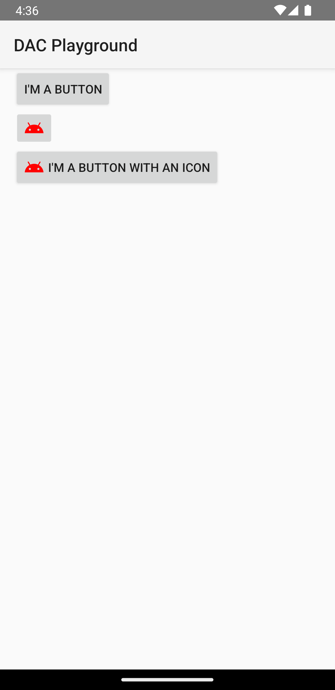
您可以透過下列三種方式在版面配置中建立按鈕,具體取決於您要建立的按鈕是否包含文字、圖示或兩者:
  <LinearLayout xmlns:android="http://schemas.android.com/apk/res/android"
      xmlns:app="http://schemas.android.com/apk/res-auto"
      android:layout_width="match_parent"
      android:layout_height="match_parent"
      android:paddingLeft="16dp"
      android:paddingRight="16dp"
      android:orientation="vertical" >

      <Button
          android:id="@+id/supabutton"
          android:layout_width="wrap_content"
          android:layout_height="wrap_content"
          android:text="I'm a button" />

      <ImageButton
          android:layout_width="wrap_content"
          android:layout_height="wrap_content"
          android:contentDescription="A tiny Android icon"
          android:src="@drawable/baseline_android_24"
          app:tint="#ff0000" />

      <Button
          android:layout_width="wrap_content"
          android:layout_height="wrap_content"
          android:drawableStart="@drawable/baseline_android_24"
          android:drawablePadding="4dp"
          android:drawableTint="#ff0000"
          android:text="I'm a button with an icon" />
  </LinearLayout>
上述程式碼會產生類似以下的內容:
回應點擊事件
使用者輕觸按鈕時,Button 物件會收到點擊事件。
如要透過程式宣告事件處理常式,請建立 View.OnClickListener 物件,並呼叫 setOnClickListener(View.OnClickListener) 將其指派給按鈕,如以下範例所示:
Kotlin
findViewById<Button>(R.id.supabutton)
  .setOnClickListener {
      Log.d("BUTTONS", "User tapped the Supabutton")
  }
Java
Button button = (Button) findViewById(R.id.supabutton);
button.setOnClickListener(new View.OnClickListener() {
    public void onClick(View v) {
      Log.d("BUTTONS", "User tapped the Supabutton");
    }
});
設定按鈕樣式
按鈕的外觀 (背景圖片和字型) 可能因裝置而異,這是因為不同製造商的裝置通常對輸入控制項會採用不同的預設樣式。
如果要自訂具備不同背景的個別按鈕,請指定包含可繪項目或顏色資源的 android:background 屬性。或者,您也可以為按鈕套用 style,其運作方式與 HTML 樣式類似,藉此定義背景、字型和大小等不同樣式的屬性。如要進一步瞭解如何套用樣式,請參閱「樣式與主題」。
無邊框按鈕
「無邊框」按鈕是一項實用的設計。無邊框按鈕與基本按鈕相似,差別在於前者沒有邊框或背景,但按鈕處於不同狀態 (例如在點按時) 時仍能改變外觀。
如要建立無邊框按鈕,請將 borderlessButtonStyle 樣式套用至按鈕,如以下範例所示:
<Button
  android:id="@+id/supabutton"
  style="?android:attr/borderlessButtonStyle"
  android:layout_width="wrap_content"
  android:layout_height="wrap_content"
  android:text="I'm a button" />
自訂背景
如果要重新定義按鈕的外觀,您可以指定自訂背景。然而,您提供的背景必須是狀態清單資源,會根據按鈕目前的狀態而改變外觀,而非提供簡單的點陣圖或顏色。
您可以在 XML 檔案中定義狀態清單,以定義要用於不同按鈕狀態的三種圖片或顏色。
如要為按鈕背景建立可繪製的狀態清單,請按照下列步驟操作:
- 為按鈕背景建立三個點陣圖,代表預設、輕觸和聚焦的按鈕狀態。如果要確保您的圖片適用於不同大小的按鈕,請建立點陣圖並設為 nine-patch 點陣圖。
- 將點陣圖放入專案的
res/drawable/目錄。請為每個點陣圖命名,以反映其代表的按鈕狀態,例如button_default.9.png、button_pressed.9.png和button_focused.9.png。 - 在
res/drawable/目錄中建立新的 XML 檔案。將其命名為button_custom.xml。按照下列方式插入 XML:<?xml version="1.0" encoding="utf-8"?> <selector xmlns:android="http://schemas.android.com/apk/res/android"> <item android:drawable="@drawable/button_pressed" android:state_pressed="true" /> <item android:drawable="@drawable/button_focused" android:state_focused="true" /> <item android:drawable="@drawable/button_default" /> </selector>
這會定義一個能根據按鈕目前的狀態來變更圖片的單一可繪製資源。
- 第一個
<item>定義輕觸按鈕 (啟用) 時要使用的點陣圖。 - 第二個
<item>定義按鈕聚焦 (例如使用軌跡球或方向鍵醒目顯示按鈕) 時要使用的點陣圖。 - 第三個
<item>定義在按鈕處於預設狀態 (未按下或聚焦) 時要使用的點陣圖。
這個 XML 檔案代表單一可繪製資源。當
Button參照其背景時,顯示的圖片會根據按鈕的狀態變化。 - 第一個
- 套用可繪製 XML 檔案做為按鈕背景:
<Button
    android:id="@+id/button_send"
    android:layout_width="wrap_content"
    android:layout_height="wrap_content"
    android:text="@string/button_send"
    android:onClick="sendMessage"
    android:background="@drawable/button_custom"  />
如要進一步瞭解這個 XML 語法,包括如何定義已停用、懸停或處於其他狀態的按鈕,請參閱 StateListDrawable。