
Bố cục chuẩn là bố cục linh hoạt, đã được chứng minh, mang lại trải nghiệm tối ưu cho người dùng trên nhiều hệ số hình dạng.
Bố cục chuẩn hỗ trợ điện thoại có màn hình nhỏ cũng như máy tính bảng, thiết bị có thể gập lại và thiết bị ChromeOS. Bắt nguồn từ hướng dẫn của Material Design, bố cục này vừa có tính thẩm mỹ vừa thiết thực.
Khung Android bao gồm các thành phần chuyên biệt giúp việc triển khai bố cục trở nên đơn giản và đáng tin cậy.
Bố cục chuẩn tạo giao diện người dùng hấp dẫn, nâng cao năng suất và là nền tảng cho các ứng dụng tuyệt vời.
Nếu bạn đã quen thuộc với bố cục chuẩn của ứng dụng thích ứng nhưng chưa quen biết nên sử dụng API Android nào, hãy chuyển đến phần Phạm vi áp dụng để giúp xác định bố cục phù hợp với các trường hợp sử dụng của ứng dụng.
Danh sách-chi tiết
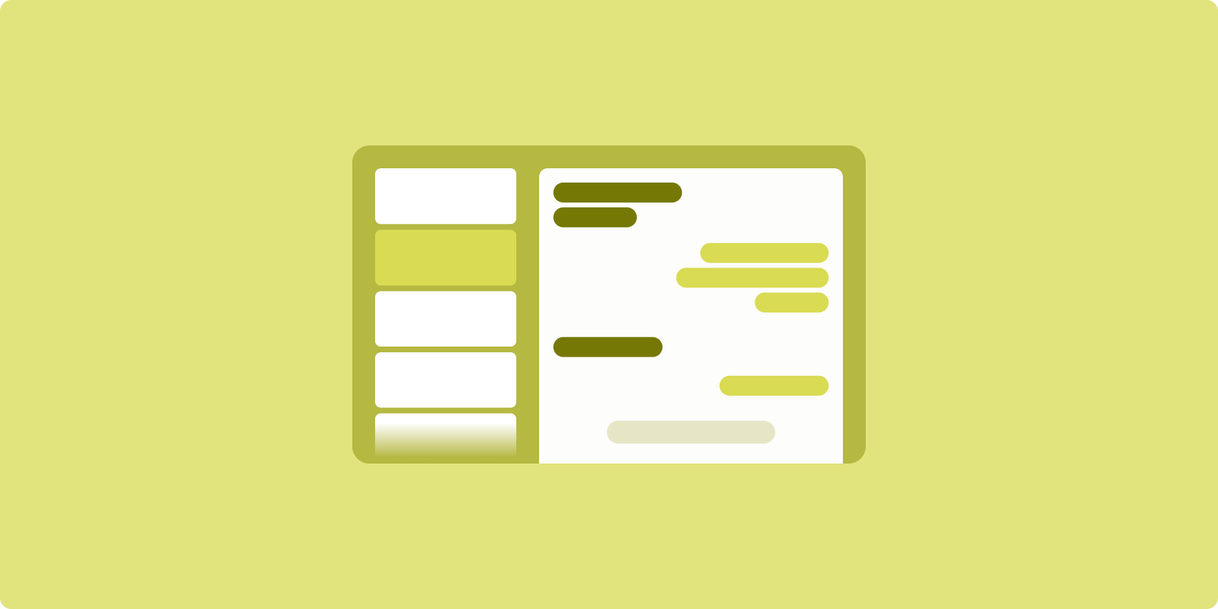
Bố cục danh sách-chi tiết cho phép người dùng khám phá danh sách các mục có thông tin mô tả, nội dung giải thích hoặc thông tin bổ sung khác — thông tin chi tiết của mục.
Bố cục chia cửa sổ ứng dụng thành 2 ngăn cạnh nhau: một ngăn cho danh sách, một ngăn cho thông tin chi tiết. Người dùng chọn các mục trong danh sách để làm hiện thông tin chi tiết của mục đó. Đường liên kết sâu trong thông tin chi tiết sẽ cho thấy nội dung bổ sung trong ngăn chi tiết.
Màn hình có chiều rộng mở rộng (xem Sử dụng các lớp kích thước cửa sổ) chứa cả danh sách lẫn thông tin chi tiết cùng một lúc. Thao tác chọn một mục trong danh sách sẽ cập nhật ngăn thông tin chi tiết để cho thấy nội dung liên quan cho mục đã chọn.
Màn hình có chiều rộng trung bình và nhỏ gọn cho thấy danh sách hoặc thông tin chi tiết, tuỳ thuộc vào lượt tương tác của người dùng với ứng dụng. Khi chỉ danh sách xuất hiện, thao tác chọn một mục trong danh sách sẽ cho thấy thông tin chi tiết thay cho danh sách. Khi chỉ thông tin chi tiết xuất hiện việc nhấn nút quay lại sẽ làm hiện lại danh sách.
Các thay đổi về cấu hình như thay đổi hướng thiết bị hoặc thay đổi kích thước cửa sổ ứng dụng có thể làm thay đổi lớp kích thước cửa sổ của màn hình. Bố cục danh sách‑chi tiết sẽ thích ứng theo, giúp duy trì trạng thái ứng dụng:
- Nếu màn hình có chiều rộng mở rộng, đang hiển thị cả ngăn danh sách và thông tin chi tiết, được thu hẹp đến trung bình hoặc nhỏ gọn, thì ngăn thông tin chi tiết vẫn được hiển thị và ngăn danh sách sẽ được ẩn
- Nếu màn hình có chiều rộng trung bình hoặc nhỏ gọn chỉ có ngăn thông tin chi tiết được hiển thị và lớp kích thước cửa sổ được mở ra thành mở rộng, thì danh sách và thông tin chi tiết sẽ cùng hiện ra, còn danh sách cho biết mục tương ứng với nội dung trong ngăn thông tin chi tiết thì được chọn
- Nếu màn hình có chiều rộng trung bình hoặc nhỏ gọn, chỉ có ngăn danh sách xuất hiện và được mở ra thành mở rộng, thì danh sách và ngăn thông tin chi tiết phần giữ chỗ sẽ cùng hiện ra
Bố cục danh sách-chi tiết rất lý tưởng cho ứng dụng nhắn tin, trình quản lý danh bạ, trình duyệt nội dung nghe nhìn tương tác hoặc bất kỳ ứng dụng nào với nội dung có thể được sắp xếp dưới dạng danh sách các mục để cho thấy thông tin bổ sung.
Triển khai
Có thể tạo bố cục danh sách-chi tiết bằng nhiều công nghệ, bao gồm cả Compose, khung hiển thị và tính năng nhúng hoạt động (dành cho các ứng dụng cũ). Xem phần Phạm vi áp dụng để quyết định công nghệ nào phù hợp nhất với ứng dụng của bạn.
Thư viện SlidingPaneLayout được thiết kế để triển khai bố cục danh sách-chi tiết dựa trên khung hiển thị hoặc mảnh.
Trước hết, hãy khai báo SlidingPaneLayout làm thành phần gốc của bố cục XML.
Tiếp theo, hãy thêm hai phần tử con (thành phần hiển thị hoặc mảnh) đại diện cho danh sách và nội dung thông tin chi tiết.
Triển khai một phương thức liên lạc để truyền dữ liệu giữa các mảnh hoặc khung hiển thị danh sách-chi tiết. Bạn nên dùng ViewModel nhờ khả năng lưu trữ logic kinh doanh và khả năng tồn tại trước thay đổi về cấu hình.
SlidingPaneLayout tự động xác định liệu sẽ hiện danh sách và thông tin chi tiết cùng lúc hay riêng rẽ. Trong cửa sổ có đủ không gian chiều ngang để chứa được cả hai, danh sách và thông tin chi tiết sẽ xuất hiện cạnh nhau. Trong cửa sổ không đủ không gian, chỉ danh sách hoặc thông tin chi tiết được hiện tuỳ thuộc vào tương tác của người dùng với ứng dụng.
Hãy xem mẫu Chi tiết danh sách bằng ngăn trượt để tham khảo ví dụ về cách triển khai.
Nhúng hoạt động
Hãy sử dụng tính năng nhúng hoạt động để cho phép ứng dụng cũ với nhiều hoạt động cho thấy hai hoạt động cạnh nhau trên cùng một màn hình hoặc xếp chồng lên nhau (một hoạt động phủ lên hoạt động khác). Nếu ứng dụng triển khai danh sách và thông tin chi tiết của một bố cục danh sách-chi tiết trong nhiều hoạt động riêng biệt, thì tính năng nhúng hoạt động cho phép dễ dàng tạo một bố cục danh sách-chi tiết mà không cần tái cấu trúc mã hoặc chỉ cần tái cấu trúc mã ở mức tối thiểu.
Hãy triển khai tính năng nhúng hoạt động bằng cách chỉ định chia cửa sổ tác vụ khi dùng tệp cấu hình XML. Thao tác chia tách xác định hoạt động chính, bắt đầu việc chia tách và một hoạt động phụ. Hãy chỉ định chiều rộng hiển thị tối thiểu để chia tách bằng cách sử dụng các điểm ngắt lớp kích thước cửa sổ. Khi chiều rộng hiển thị giảm xuống dưới điểm ngắt tối thiểu, các hoạt động sẽ xuất hiện chồng lên nhau. Ví dụ: nếu chiều rộng hiển thị tối thiểu là 600 dp, thì các hoạt động sẽ xuất hiện chồng lên nhau trên màn hình nhỏ gọn, nhưng xuất hiện cạnh nhau trên màn hình trung bình và mở rộng.
Tính năng nhúng hoạt động được hỗ trợ trên Android 12L (API cấp 32) trở lên, nhưng cũng có thể xuất hiện ở cấp API thấp hơn nếu được nhà sản xuất thiết bị triển khai. Khi tính năng nhúng hoạt động không dùng được trên một thiết bị, hành vi dự phòng sẽ dẫn đến hoạt động trong danh sách hoặc hoạt động chi tiết chiếm toàn bộ cửa sổ ứng dụng dựa trên tương tác của người dùng với ứng dụng.
Để biết thêm thông tin, hãy xem phần Nhúng hoạt động.
Để xem ví dụ về cách triển khai, hãy xem mẫu Chi tiết danh sách với tính năng nhúng hoạt động.
Nguồn cấp dữ liệu
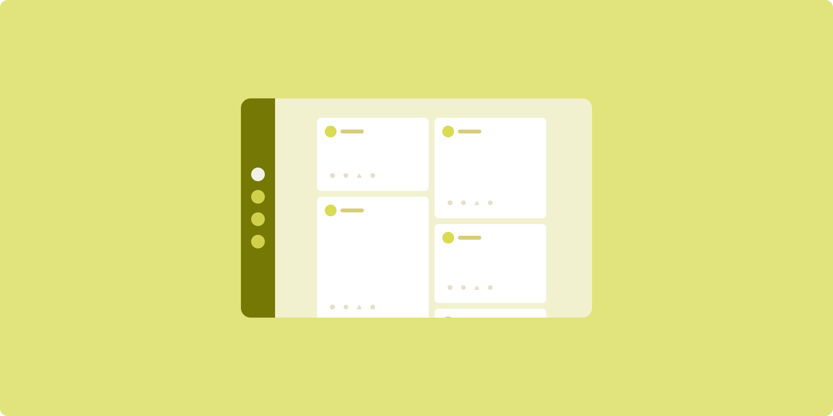
Bố cục nguồn cấp dữ liệu sắp xếp các thành phần với nội dung tương đương trong lưới có thể định cấu hình để thuận tiện xem nhanh một lượng lớn nội dung.
Kích thước và vị trí thiết lập mối quan hệ giữa các thành phần nội dung.
Nhóm nội dung được tạo bằng cách tạo ra các phần tử có cùng kích thước và đặt chúng vào cùng chỗ với nhau. Sự chú ý được thu hút đến các thành phần bằng cách làm cho chúng lớn hơn các thành phần lân cận.
Thẻ và danh sách là các thành phần phổ biến của bố cục nguồn cấp dữ liệu.
Bố cục nguồn cấp dữ liệu hỗ trợ màn hình ở hầu hết mọi kích thước do lưới có thể điều chỉnh từ một cột cuộn duy nhất đến nguồn cấp dữ liệu nội dung gồm nhiều cột xuất hiện nhờ thao tác cuộn.
Nguồn cấp dữ liệu đặc biệt phù hợp với các ứng dụng tin tức và mạng xã hội.
Triển khai
RecyclerView kết xuất hiệu quả số lượng lớn các mục trong một cột. GridLayoutManager bố trí các mục trong lưới, cho phép định cấu hình kích thước và khoảng của mục.
Định cấu hình các cột lưới dựa trên kích thước của khu vực hiển thị có sẵn để đặt chiều rộng tối thiểu cho phép cho các mục.
Có thể ghi đè chiến lược mở rộng mặc định của GridLayoutManager, là một khoảng cho mỗi mục bằng cách tạo SpanSizeLookup tuỳ chỉnh. Điều chỉnh span để làm nổi bật một số mục so với các mục khác.
Trên màn hình có chiều rộng nhỏ gọn mà chỉ đủ không gian cho một cột, hãy sử dụng LinearLayoutManager thay vì GridLayoutManager.
Hãy xem mẫu Nguồn cấp dữ liệu với khung hiển thị để tham khảo ví dụ về cách triển khai.
Ngăn hỗ trợ
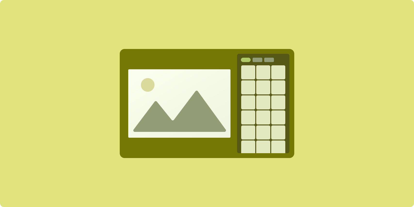
Bố cục ngăn bổ trợ bố trí nội dung ứng dụng vào các khu vực hiển thị chính và phụ.
Khu vực hiển thị chính chiếm phần lớn cửa sổ ứng dụng (thường vào khoảng hai phần ba) và chứa nội dung chính. Khu vực hiển thị phụ là một ngăn chiếm phần còn lại của cửa sổ ứng dụng và hiển thị nội dung hỗ trợ nội dung chính.
Bố cục ngăn bổ trợ hoạt động tốt trên màn hình có chiều rộng mở rộng (xem Sử dụng các lớp kích thước cửa sổ) theo hướng ngang. Màn hình có chiều rộng trung bình hoặc nhỏ gọn hỗ trợ hiển thị cả khu vực hiển thị chính và phụ nếu nội dung có thể thích ứng với không gian hiển thị hẹp hơn hoặc nếu nội dung bổ sung có thể được ẩn từ đầu trong một trang ở bên cạnh hoặc ở dưới cùng mà có thể tiếp cận bằng một chế độ điều khiển như trình đơn hoặc nút.
Bố cục ngăn bổ trợ khác với bố cục danh sách‑chi tiết về mối quan hệ giữa nội dung chính và nội dung phụ. Nội dung của ngăn phụ chỉ có ý nghĩa khi có mối quan hệ với nội dung chính; ví dụ: bản thân cửa sổ công cụ của ngăn bổ trợ là không liên quan. Tuy nhiên, nội dung bổ sung trong ngăn thông tin chi tiết của bố cục danh sách‑chi tiết có ý nghĩa ngay cả khi không có nội dung chính, ví dụ: nội dung mô tả về sản phẩm trên trang thông tin sản phẩm.
Các trường hợp sử dụng của ngăn bổ trợ gồm có:
- Ứng dụng cải thiện hiệu suất: Tài liệu hoặc bảng tính đi kèm nhận xét của người đánh giá trong ngăn bổ trợ
- Ứng dụng đa phương tiện: Một video phát trực tuyến và danh sách các video có liên quan trong ngăn bổ trợ hoặc nội dung mô tả đĩa nhạc bổ sung cho danh sách phát
- Công cụ và chế độ cài đặt: Một công cụ chỉnh sửa nội dung nghe nhìn có bảng màu, hiệu ứng và các chế độ cài đặt khác trong ngăn hỗ trợ
Triển khai
Triển khai bố cục ngăn bổ trợ bằng cách sử dụng bố cục trình trợ giúp, chẳng hạn như
LinearLayout hoặc ConstraintLayout. Thiết lập các lớp kích thước cửa sổ
để chia lượng không gian hiển thị ngang có sẵn cho ứng dụng thành
3 danh mục: nhỏ gọn (< 600dp), trung bình (>= 600dp) và mở rộng
(>= 840dp).
Đối với mỗi lớp kích thước cửa sổ, hãy xác định bố cục như sau:
- Thu gọn: Trong thư mục
layoutcủa tài nguyên ứng dụng, hãy đặt nội dung hiển thị ngăn bổ trợ bên dưới nội dung chính hoặc bên trong một bảng dưới cùng - Trung bình: Trong thư mục
layout-w600dp, hãy cung cấp nội dung của ngăn bổ trợ để nội dung chính và ngăn bổ trợ xuất hiện cạnh nhau, chia đều không gian hiển thị theo chiều ngang - Mở rộng: Trong thư mục
layout-w840dp, hãy thêm nội dung của ngăn bổ trợ để nội dung chính và ngăn bổ trợ xuất hiện cạnh nhau; tuy nhiên, ngăn bổ trợ chỉ chiếm 30% không gian theo chiều ngang, dành 70% không gian còn lại cho nội dung chính
Hãy sử dụng ViewModel cho hoạt động giao tiếp giữa nội dung chính và ngăn bổ trợ để xem liệu nên sử dụng khung hiển thị, mảnh hay kết hợp cả hai.
Để tham khảo ví dụ về cách triển khai, hãy xem các mẫu sau:
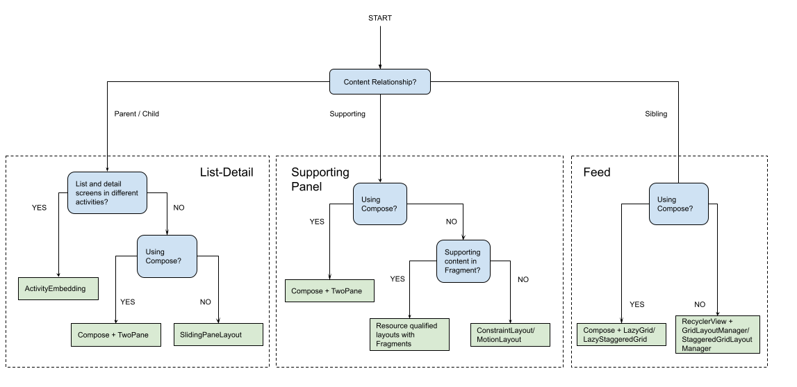
Phạm vi áp dụng
Bố cục chuẩn tạo ra các bản trình bày nội dung đa chiều để dễ dàng truy cập và khám phá chuyên sâu. Hãy sử dụng sơ đồ quy trình sau đây để xác định chiến lược bố cục và chiến lược triển khai phù hợp nhất cho các trường hợp sử dụng của ứng dụng của bạn.
Để tham khảo ví dụ về các bố cục chuẩn được triển khai trong từng loại ứng dụng, hãy xem thư viện màn hình lớn.
Tài nguyên khác
- Material Design – Bố cục chuẩn