
You can define a Grid container configuration to create flexible layouts that respond to different screen sizes and content types. This page describes how to do the following:
- Define a grid: Set up the basic structure of rows and columns.
- Place items in a grid: Understand how items are placed into grid cells and how to change flow direction.
- Manage track sizing: Use fixed, percentage, flexible, and intrinsic sizing to set track sizes.
- Set gaps: Manage the "gutters" between rows and columns.
Define a grid
A grid consists of columns and rows.
The Grid composable has a config parameter
that accepts a lambda to define the columns and rows
within GridConfigurationScope.
The following example defines a grid that has three rows and two columns,
each with a fixed size specified in Dp:
Grid( config = { repeat(2) { column(160.dp) } repeat(3) { row(90.dp) } } ) { }
Place items in a grid
Grid takes the UI elements
in the content lambda and places them into grid cells.
The grid lays out items regardless of
whether you have explicitly defined the rows and columns.
By default,
Grid tries to place a UI element in the available grid cell in the row;
if it can't, it places it in an available grid cell in the next row.
If there are no empty cells, Grid creates a new row.
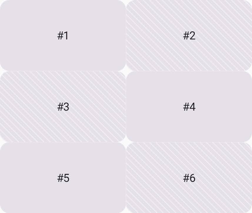
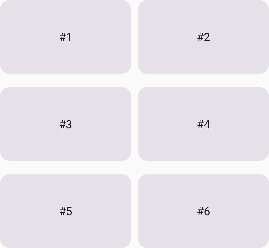
In the following example, the grid has six grid cells
and places a card into each one (Figure 1).
Each grid cell is 160dp x 90dp,
making the total grid size 320dp x 270dp.
Grid( config = { repeat(2) { column(160.dp) } repeat(3) { row(90.dp) } } ) { Card1() Card2() Card3() Card4() Card5() Card6() }
To change this default behavior to filling by column,
set the flow property to GridFlow.Column.
Grid( config = { repeat(2) { column(160.dp) } repeat(3) { row(90.dp) } gap(8.dp) flow = GridFlow.Column // Grid tries to place items to fill the column }, ) { Card1() Card2() Card3() Card4() Card5() Card6() }
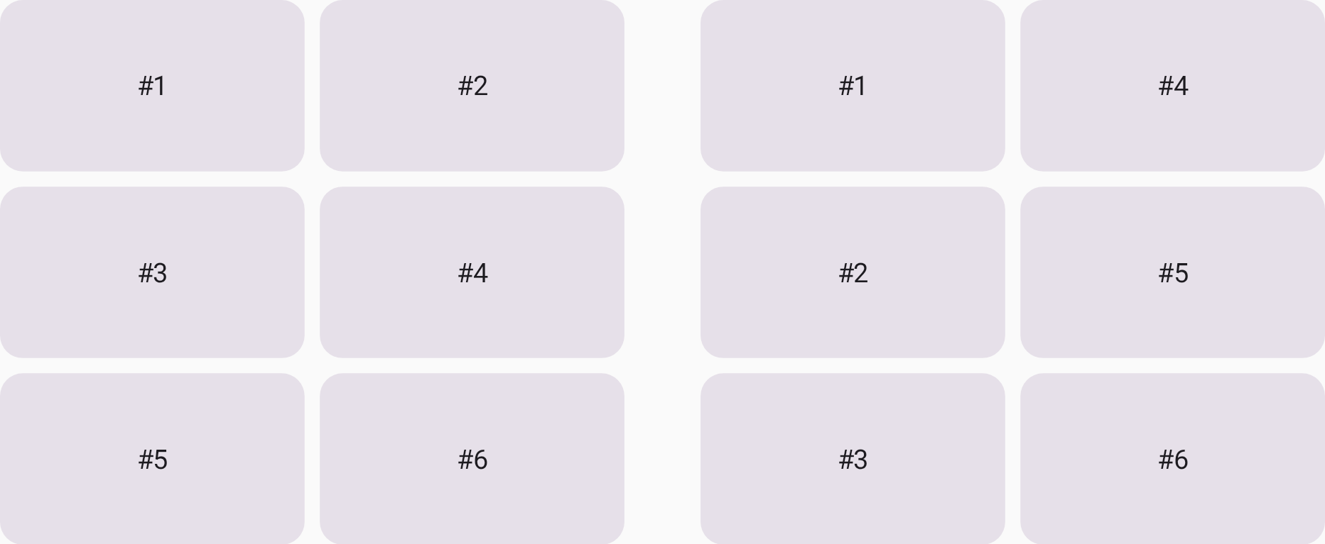
GridFlow.Row (left) and GridFlow.Column (right).
Manage track sizing
Rows and columns are collectively referred to as a grid track. You can specify the size of a grid track using one of the following methods:
- Fixed (
Dp): Allocates a specific size (e.g.,column(180.dp)). - Percentage (
Float): Allocates a percentage of the total available space from0.0fto1.0f(e.g.,row(0.5f)for 50%). - Flexible (
Fr): Distributes remaining space proportionally after fixed and percentage tracks are calculated. For example, if two rows are set to1.frand3.fr, the latter receives 75% of the remaining height. - Intrinsic: Sizes the track based on the content inside it. For more information, see Determine grid track size intrinsically.
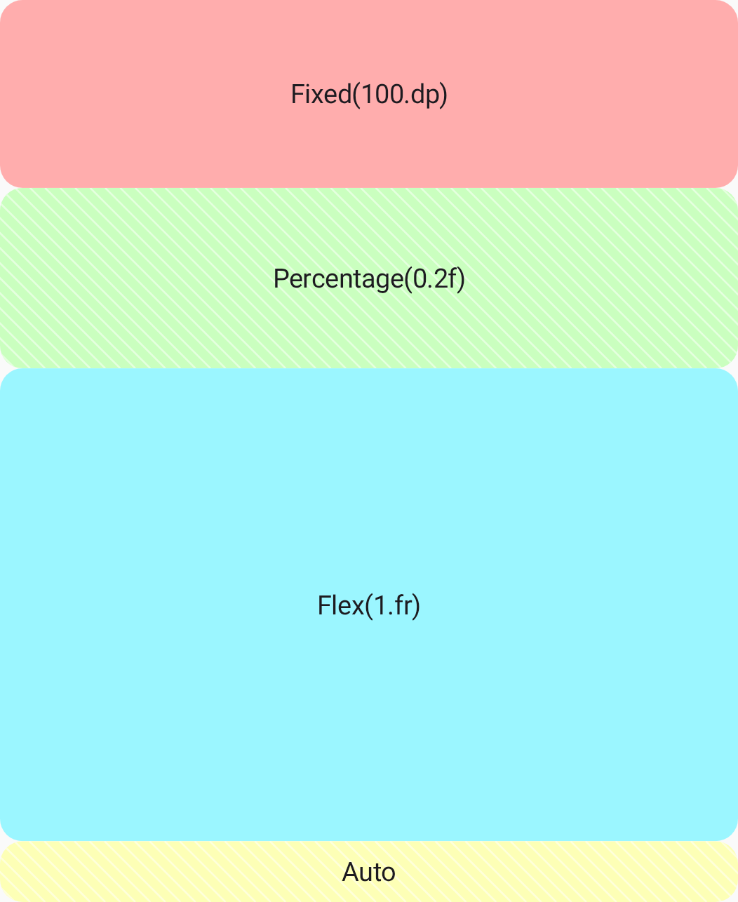
The following example uses the different track sizing options to define the row heights:
Grid( config = { column(1f) row(100.dp) row(0.2f) row(1.fr) row(GridTrackSize.Auto) }, modifier = Modifier.height(480.dp) ) { PastelRedCard("Fixed(100.dp)") PastelGreenCard("Percentage(0.2f)") PastelBlueCard("Flex(1.fr)") PastelYellowCard("Auto") }
Grid.
Determine grid track size intrinsically
You can use intrinsic sizing for a Grid
when you want the layout to adapt to the content,
rather than forcing it into a fixed container.
The grid track size is determined with the following values:
GridTrackSize.MaxContent: Use the content's maximum intrinsic size (e.g., the width is determined by the full length of the text in a text block with no wrapping).GridTrackSize.MinContent: Use the content's minimum intrinsic size (e.g., the width is determined by the longest single word in a text block).GridTrackSize.Auto: Use a flexible size for a track that adapts based on available space. It behaves likeMaxContentby default, but shrinks and wraps its content to fit within the parent container.
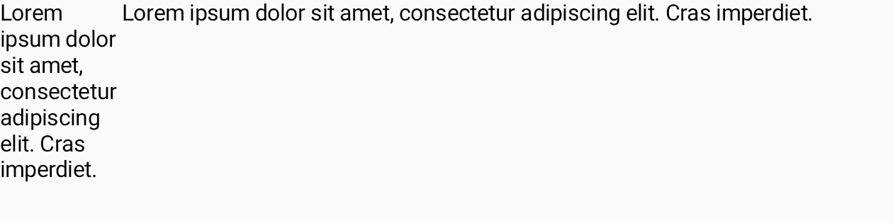
The following example places two texts side by side. The column size for the first text is determined by the required minimum width to display the text, and the second column width depends on the required maximum width of the text.
Grid( config = { column(GridTrackSize.MinContent) column(GridTrackSize.MaxContent) row(1.0f) }, modifier = Modifier.width(480.dp) ) { Text("Lorem ipsum dolor sit amet, consectetur adipiscing elit. Cras imperdiet.") Text("Lorem ipsum dolor sit amet, consectetur adipiscing elit. Cras imperdiet.") }
Set gaps between rows and columns
Once your grid tracks are sized,
you can modify the grid gap to refine the spacing between the tracks.
You can specify the column gap with the columnGap function,
and the row gap with rowGap. In the following example,
there is a 16dp gap between each row,
and an 8dp gap between each column (Figure 5).
Grid( config = { repeat(2) { column(160.dp) } repeat(3) { row(90.dp) } rowGap(16.dp) columnGap(8.dp) } ) { Card1() Card2() Card3() Card4() Card5() Card6() }
You can also use the convenience function gap
to define gaps of the same column and row size,
and to define column and gap sizes separately using a single function.
The following code adds 8dp gaps to the grid:
Grid( config = { repeat(2) { column(160.dp) } repeat(3) { row(90.dp) } gap(8.dp) // Equivalent to columnGap(8.dp) and rowGap(8.dp) } ) { Card1() Card2() Card3() Card4() Card5() Card6() }