This page describes how to handle sizes and provide flexible and responsive layouts with Glance, using existing Glance components.
Use Box, Column, and Row
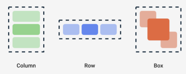
Glance has three main composable layouts:
Box: Places elements on top of another. It translates to aRelativeLayout.Column: Places elements after each other in the vertical axis. It translates to aLinearLayoutwith vertical orientation.Row: Places elements after each other in the horizontal axis. It translates to aLinearLayoutwith horizontal orientation.
Glance supports Scaffold objects. Place your Column, Row, and
Box composables within a given Scaffold object.

Each of these composables lets you define the vertical and horizontal alignments of its content and the width, height, weight, or padding constraints using modifiers. In addition, each child can define its modifier to change the space and placement inside the parent.
The following example shows you how to create a Row that evenly distributes
its children horizontally, as seen in Figure 1:
Row(modifier = GlanceModifier.fillMaxWidth().padding(16.dp)) { val modifier = GlanceModifier.defaultWeight() Text("first", modifier) Text("second", modifier) Text("third", modifier) }
The Row fills the max available width, and because each child has the same
weight, they evenly share the available space. You can define different weights,
sizes, paddings, or alignments to adapt layouts to your needs.
Use scrollable layouts
Another way to provide responsive content is to make it scrollable. This is
possible with the LazyColumn composable. This composable lets you define a set
of items to be displayed inside a scrollable container in the app widget.
The following snippets show different ways to define items inside the
LazyColumn.
You can provide the number of items:
// Remember to import Glance Composables // import androidx.glance.appwidget.layout.LazyColumn LazyColumn { items(10) { index: Int -> Text( text = "Item $index", modifier = GlanceModifier.fillMaxWidth() ) } }
Provide individual items:
LazyColumn { item { Text("First Item") } item { Text("Second Item") } }
Provide a list or array of items:
LazyColumn { items(peopleNameList) { name -> Text(name) } }
You can also use a combination of the preceding examples:
LazyColumn { item { Text("Names:") } items(peopleNameList) { name -> Text(name) } // or in case you need the index: itemsIndexed(peopleNameList) { index, person -> Text("$person at index $index") } }
Note that the previous snippet does not specify the itemId. Specifying the
itemId helps with improving the performance and maintaining the scroll
position through list and appWidget updates from Android 12 onwards (for
example, when adding or removing items from the list). The following example
shows how to specify an itemId:
items(items = peopleList, key = { person -> person.id }) { person -> Text(person.name) }
Define the SizeMode
AppWidget sizes may differ depending on the device, user choice, or launcher,
so it is important to provide flexible layouts as described in the Provide
flexible widget layouts page. Glance simplifies this with the SizeMode
definition and the LocalSize value. The following sections describe the three
modes.
SizeMode.Single
SizeMode.Single is the default mode. It indicates that only one type of
content is provided; that is, even if the AppWidget available size changes,
the content size is not changed.
class MyAppWidget : GlanceAppWidget() { override val sizeMode = SizeMode.Single override suspend fun provideGlance(context: Context, id: GlanceId) { // ... provideContent { MyContent() } } @Composable private fun MyContent() { // Size will be the minimum size or resizable // size defined in the App Widget metadata val size = LocalSize.current // ... } }
When using this mode, ensure that:
- The minimum and maximum size metadata values are properly defined based on the content size.
- The content is flexible enough within the expected size range.
In general, you should use this mode when either:
a) the AppWidget has a fixed size, or
b) it does not change its content when resized.
SizeMode.Responsive
This mode is the equivalent of providing responsive layouts, which allows
the GlanceAppWidget to define a set of responsive layouts bounded by specific
sizes. For each defined size, the content is created and mapped to the specific
size when the AppWidget is created or updated. The system then selects the
best fitting one based on the available size.
For example, in our destination AppWidget, you can define three sizes and its
content:
class MyAppWidget : GlanceAppWidget() { companion object { private val SMALL_SQUARE = DpSize(100.dp, 100.dp) private val HORIZONTAL_RECTANGLE = DpSize(250.dp, 100.dp) private val BIG_SQUARE = DpSize(250.dp, 250.dp) } override val sizeMode = SizeMode.Responsive( setOf( SMALL_SQUARE, HORIZONTAL_RECTANGLE, BIG_SQUARE ) ) override suspend fun provideGlance(context: Context, id: GlanceId) { // ... provideContent { MyContent() } } @Composable private fun MyContent() { // Size will be one of the sizes defined above. val size = LocalSize.current Column { if (size.height >= BIG_SQUARE.height) { Text(text = "Where to?", modifier = GlanceModifier.padding(12.dp)) } Row(horizontalAlignment = Alignment.CenterHorizontally) { Button() Button() if (size.width >= HORIZONTAL_RECTANGLE.width) { Button("School") } } if (size.height >= BIG_SQUARE.height) { Text(text = "provided by X") } } } }
In the previous example, the provideContent method is called three times and
mapped to the defined size.
- In the first call, the size evaluates to
100x100. The content doesn't include the extra button, nor the top and bottom texts. - In the second call, the size evaluates to
250x100. The content includes the extra button, but not the top and bottom texts. - In the third call, the size evaluates to
250x250. The content includes the extra button and both texts.
SizeMode.Responsive is a combination of the other two modes, and lets you
define responsive content within predefined bounds. In general, this mode
performs better and allows smoother transitions when the AppWidget is resized.
The following table shows the value of the size, depending on the SizeMode and
the AppWidget available size:
| Available size | 105 x 110 | 203 x 112 | 72 x 72 | 203 x 150 |
|---|---|---|---|---|
SizeMode.Single |
110 x 110 | 110 x 110 | 110 x 110 | 110 x 110 |
SizeMode.Exact |
105 x 110 | 203 x 112 | 72 x 72 | 203 x 150 |
SizeMode.Responsive |
80 x 100 | 80 x 100 | 80 x 100 | 150 x 120 |
| * The exact values are just for demo purposes. |
SizeMode.Exact
SizeMode.Exact is the equivalent of providing exact layouts, which
requests the GlanceAppWidget content each time the available AppWidget size
changes (for example, when the user resizes the AppWidget in the homescreen).
For example, in the destination widget, an extra button can be added if the available width is larger than a certain value.
class MyAppWidget : GlanceAppWidget() { override val sizeMode = SizeMode.Exact override suspend fun provideGlance(context: Context, id: GlanceId) { // ... provideContent { MyContent() } } @Composable private fun MyContent() { // Size will be the size of the AppWidget val size = LocalSize.current Column { Text(text = "Where to?", modifier = GlanceModifier.padding(12.dp)) Row(horizontalAlignment = Alignment.CenterHorizontally) { Button() Button() if (size.width > 250.dp) { Button("School") } } } } }
This mode provides more flexibility than the others, but it comes with a few caveats:
- The
AppWidgetmust be completely recreated each time the size changes. This can lead to performance issues and UI jumps when the content is complex. - The available size might differ depending on the launcher's implementation. For example, if the launcher does not provide the list of sizes, the minimum possible size is used.
- In pre-Android 12 devices, the size calculation logic might not work in all situations.
In general, you should use this mode if SizeMode.Responsive cannot be used
(that is, a small set of responsive layouts isn't feasible).
Access resources
Use LocalContext.current to access any Android resource, as shown in the
following example:
LocalContext.current.getString(R.string.glance_title)
We recommend providing resource IDs directly to reduce the size of the final
RemoteViews object and to enable dynamic resources, such as dynamic
colors.
Composables and methods accept resources using a "provider", such as
ImageProvider, or using an overload method like
GlanceModifier.background(R.color.blue). For example:
Column( modifier = GlanceModifier.background(R.color.default_widget_background) ) { /**...*/ } Image( provider = ImageProvider(R.drawable.ic_logo), contentDescription = "My image", )
Handle text
Glance 1.1.0 includes an API to set your text styles. Set text styles using
fontSize, fontWeight, or fontFamily attributes of the TextStyle class.
fontFamily supports all system fonts, as shown in the following example, but
custom fonts in apps aren't supported:
Text(
    style = TextStyle(
        fontWeight = FontWeight.Bold,
        fontSize = 18.sp,
        fontFamily = FontFamily.Monospace
    ),
    text = "Example Text"
)
Add compound buttons
Compound buttons were introduced in Android 12. Glance supports backwards compatibility for the following types of compound buttons:
These compound buttons each display a clickable view that represents the "checked" state.
var isApplesChecked by remember { mutableStateOf(false) } var isEnabledSwitched by remember { mutableStateOf(false) } var isRadioChecked by remember { mutableIntStateOf(0) } CheckBox( checked = isApplesChecked, onCheckedChange = { isApplesChecked = !isApplesChecked }, text = "Apples" ) Switch( checked = isEnabledSwitched, onCheckedChange = { isEnabledSwitched = !isEnabledSwitched }, text = "Enabled" ) RadioButton( checked = isRadioChecked == 1, onClick = { isRadioChecked = 1 }, text = "Checked" )
When the state changes, the provided lambda is triggered. You can store the check state, as shown in the following example:
class MyAppWidget : GlanceAppWidget() { override suspend fun provideGlance(context: Context, id: GlanceId) { val myRepository = MyRepository.getInstance() provideContent { val scope = rememberCoroutineScope() val saveApple: (Boolean) -> Unit = { scope.launch { myRepository.saveApple(it) } } MyContent(saveApple) } } @Composable private fun MyContent(saveApple: (Boolean) -> Unit) { var isAppleChecked by remember { mutableStateOf(false) } Button( text = "Save", onClick = { saveApple(isAppleChecked) } ) } }
You can also provide the colors attribute to CheckBox, Switch, and
RadioButton to customize their colors:
CheckBox( // ... colors = CheckboxDefaults.colors( checkedColor = ColorProvider(day = colorAccentDay, night = colorAccentNight), uncheckedColor = ColorProvider(day = Color.DarkGray, night = Color.LightGray) ), checked = isChecked, onCheckedChange = { isChecked = !isChecked } ) Switch( // ... colors = SwitchDefaults.colors( checkedThumbColor = ColorProvider(day = Color.Red, night = Color.Cyan), uncheckedThumbColor = ColorProvider(day = Color.Green, night = Color.Magenta), checkedTrackColor = ColorProvider(day = Color.Blue, night = Color.Yellow), uncheckedTrackColor = ColorProvider(day = Color.Magenta, night = Color.Green) ), checked = isChecked, onCheckedChange = { isChecked = !isChecked }, text = "Enabled" ) RadioButton( // ... colors = RadioButtonDefaults.colors( checkedColor = ColorProvider(day = Color.Cyan, night = Color.Yellow), uncheckedColor = ColorProvider(day = Color.Red, night = Color.Blue) ), )
Additional components
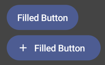
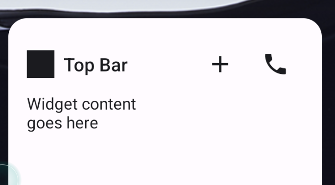
Glance 1.1.0 includes the release of additional components, as described in the following table:
| Name | Image | Reference link | Additional notes |
|---|---|---|---|
| Filled Button |

|
Component | |
| Outline Buttons |

|
Component | |
| Icon Buttons |
|
Component | Primary / Secondary / Icon-only |
| Title Bar |

|
Component | |
| Scaffold | Scaffold and Title bar are in the same demo. |
For more information on design specifics, see the component designs in this design kit on Figma.
For more information on canonical layouts visit Canonical widget layouts.
