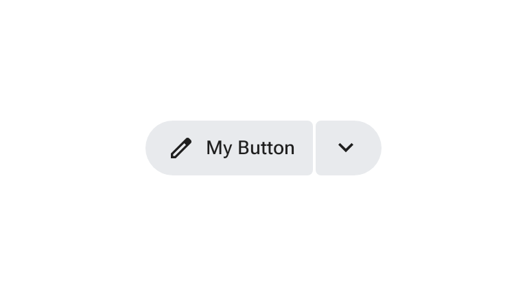
स्प्लिट बटन, दो बटन वाले ग्रुप को तय करता है. इसमें पहला बटन, मुख्य कार्रवाई करता है और दूसरा बटन, संदर्भ के हिसाब से काम के विकल्पों का दूसरा सेट खोलता है.
चालू होने पर, ट्रेलिंग मेन्यू बटन अपने आइकॉन को घुमाता है और आकार बदलता है. स्प्लिट बटन को अकेले या उसी साइज़ के अन्य बटन के साथ रखा जा सकता है.
स्प्लिट बटन का इस्तेमाल करना
- इससे एक मेन्यू खुलता है, जिसमें उपयोगकर्ताओं को मुख्य कार्रवाई से जुड़े अन्य विकल्प मिलते हैं.
- यह अकेले या स्टैंडर्ड बटन और आइकॉन बटन के साथ काम करता है.
- आम तौर पर, इससे कोई मेन्यू खुलता है. हालांकि, इसे कार्ड जैसे अन्य कॉम्पोनेंट खोलने के लिए भी पसंद के मुताबिक बनाया जा सकता है.
- यह बटन और आइकॉन बटन की तरह ही पांच साइज़ में उपलब्ध है: एक्स्ट्रा स्मॉल (XS), स्मॉल (S), मीडियम (M), लार्ज (L), और एक्स्ट्रा लार्ज (XL).
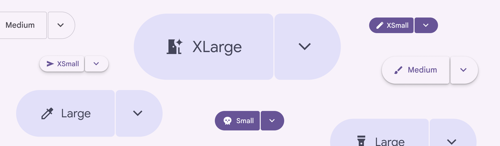
उदाहरण
भरा हुआ स्प्लिट बटन
भरा हुआ स्प्लिट बटन, ज़्यादा ज़ोर देने वाला वैरिएंट है. इसका इस्तेमाल ज़रूरी या आखिरी कार्रवाइयों के लिए किया जाता है. यहां दिए गए स्निपेट में, SplitButtonDefaults.LeadingButton और SplitButtonDefaults.TrailingButton के साथ SplitButtonLayout का इस्तेमाल करके, भरा हुआ स्प्लिट बटन लागू किया गया है:
@Composable fun FilledSplitButtonSample() { var checked by rememberSaveable { mutableStateOf(false) } SplitButtonLayout( leadingButton = { SplitButtonDefaults.LeadingButton(onClick = { /* Do Nothing */ }) { Icon( painter = rememberVectorPainter(AppIcons.Edit), modifier = Modifier.size(SplitButtonDefaults.LeadingIconSize), contentDescription = null, ) Spacer(Modifier.size(ButtonDefaults.IconSpacing)) Text("My Button") } }, trailingButton = { SplitButtonDefaults.TrailingButton( checked = checked, onCheckedChange = { checked = it }, modifier = Modifier.semantics { stateDescription = if (checked) "Expanded" else "Collapsed" contentDescription = "Toggle Button" }, ) { val rotation: Float by animateFloatAsState( targetValue = if (checked) 180f else 0f, label = "Trailing Icon Rotation", ) Icon( painter = rememberVectorPainter(AppIcons.KeyboardArrowDown), modifier = Modifier.size(SplitButtonDefaults.TrailingIconSize).graphicsLayer { this.rotationZ = rotation }, contentDescription = null, ) } }, ) }
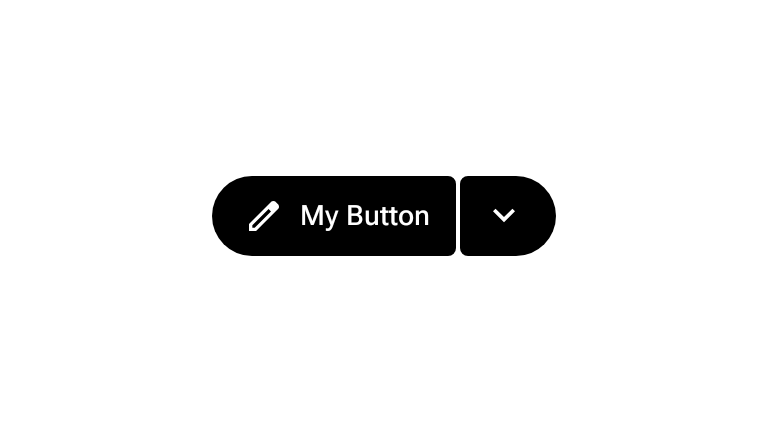
टोनल स्प्लिट बटन
टोनल स्प्लिट बटन, स्प्लिट बटन का मीडियम-एम्फ़सिस वैरिएंट होता है. यहां दिए गए स्निपेट में, SplitButtonLayout के अंदर SplitButtonDefaults.TonalLeadingButton और SplitButtonDefaults.TonalTrailingButton का इस्तेमाल किया गया है:
@Composable fun TonalSplitButtonSample() { var checked by rememberSaveable { mutableStateOf(false) } SplitButtonLayout( leadingButton = { SplitButtonDefaults.TonalLeadingButton(onClick = { /* Do Nothing */ }) { Icon( painter = rememberVectorPainter(AppIcons.Edit), modifier = Modifier.size(SplitButtonDefaults.LeadingIconSize), contentDescription = null, ) Spacer(Modifier.size(ButtonDefaults.IconSpacing)) Text("My Button") } }, trailingButton = { SplitButtonDefaults.TonalTrailingButton( checked = checked, onCheckedChange = { checked = it }, modifier = Modifier.semantics { stateDescription = if (checked) "Expanded" else "Collapsed" contentDescription = "Toggle Button" }, ) { val rotation: Float by animateFloatAsState( targetValue = if (checked) 180f else 0f, label = "Trailing Icon Rotation", ) Icon( painter = rememberVectorPainter(AppIcons.KeyboardArrowDown), modifier = Modifier.size(SplitButtonDefaults.TrailingIconSize).graphicsLayer { this.rotationZ = rotation }, contentDescription = null, ) } }, ) }