The navigation bar allows users to switch between destinations in an app. You should use navigation bars for:
- Three to five destinations of equal importance
- Compact window sizes
- Consistent destinations across app screens

This page shows you how to display a navigation bar in your app with related screens and basic navigation.
API surface
Use the NavigationBar and NavigationBarItem composables to
implement destination switching logic. Each NavigationBarItem represents a
singular destination.
NavigationBarItem includes the following key parameters:
selected: Determines whether the current item is visually highlighted.onClick(): Defines the action to be performed when the user clicks on the item. Logic for handling navigation events, updating the selected item state, or loading corresponding content belongs here.label: Displays text within the item. Optional.icon: Displays an icon within the item. Optional.
Example: Bottom navigation bar
The following snippet implements a bottom navigation bar with items so users can navigate between different screens in an app:
@Composable fun NavigationBarExample(modifier: Modifier = Modifier) { val navController = rememberNavController() val startDestination = Destination.SONGS var selectedDestination by rememberSaveable { mutableIntStateOf(startDestination.ordinal) } Scaffold( modifier = modifier, bottomBar = { NavigationBar(windowInsets = NavigationBarDefaults.windowInsets) { Destination.entries.forEachIndexed { index, destination -> NavigationBarItem( selected = selectedDestination == index, onClick = { navController.navigate(route = destination.route) selectedDestination = index }, icon = { Icon( destination.icon, contentDescription = destination.contentDescription ) }, label = { Text(destination.label) } ) } } } ) { contentPadding -> AppNavHost(navController, startDestination, modifier = Modifier.padding(contentPadding)) } }
Key points
NavigationBardisplays a collection of items, with each item corresponding to aDestination.val navController = rememberNavController()creates and remembers an instance ofNavHostController, which manages the navigation within aNavHost.var selectedDestination by rememberSaveable { mutableIntStateOf(startDestination.ordinal) }manages the state of the selected item.startDestination.ordinalgets the numerical index (position) of theDestination.SONGSenum entry.
- When an item is clicked,
navController.navigate(route = destination.route)is called to navigate to the corresponding screen. - The
onClicklambda of theNavigationBarItemupdates theselectedDestinationstate to visually highlight the clicked item. - The navigation logic calls the
AppNavHostcomposable, passing thenavControllerandstartDestination, to display the actual content of the selected screen.
Result
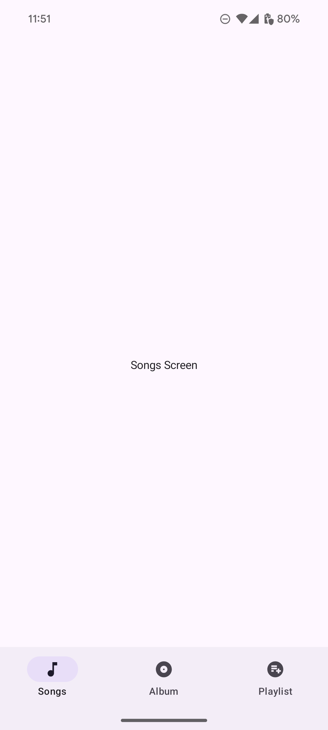
The following image shows the navigation bar resulting from the previous snippet: