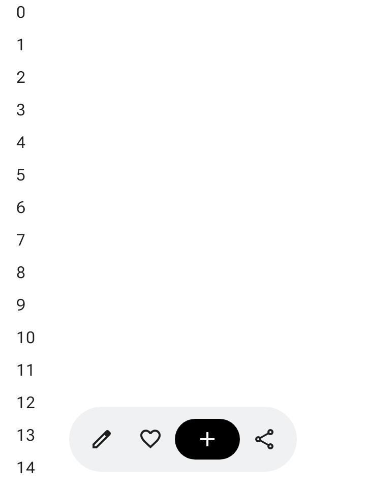
แถบเครื่องมือแบบลอยจะลอยอยู่เหนือเนื้อหาหลัก เหมาะที่สุดสำหรับการดำเนินการตามบริบทที่เกี่ยวข้องกับเนื้อหาหลักหรือหน้าเว็บที่เฉพาะเจาะจง
คุณสามารถวางแถบเครื่องมือแบบลอยไว้ที่ใดก็ได้บนหน้าจอเพื่อให้ลอยอยู่เหนือเนื้อหาอื่นๆ ซึ่งช่วยให้จัดวางได้หลากหลายและมีพื้นที่สำหรับการดำเนินการหลายอย่าง
การใช้แถบเครื่องมือแบบลอย
- แถบเครื่องมือแบบลอยจะแสดงการควบคุมที่เกี่ยวข้องกับหน้าปัจจุบัน
- แถบเครื่องมือแบบลอยสามารถทำหน้าที่เป็นตัวควบคุมการนำทางระหว่างหน้าที่เกี่ยวข้องในลำดับชั้นของผลิตภัณฑ์
- หากต้องการการดำเนินการเพิ่มเติม ให้ใช้เมนูรายการเพิ่มเติม
- คอนเทนเนอร์ของแถบเครื่องมือแบบลอยควรยังคงมองเห็นได้อย่างสมบูรณ์บนหน้าจอ
- เลือกการดำเนินการที่สำคัญที่สุดที่จะแสดงบนหน้าจอโดยค่าเริ่มต้น
เลย์เอาต์และสี
แถบเครื่องมือแบบลอยอาจเป็นแนวนอน (HorizontalFloatingToolbar) หรือแนวตั้ง (VerticalFloatingToolbar) และสามารถใช้รูปแบบสีมาตรฐานหรือสีสดใสจาก FloatingToolbarDefaults
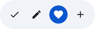
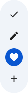
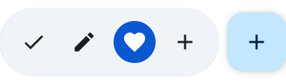
แถบเครื่องมือแบบลอยพร้อม FAB
ใช้ปุ่มการทำงานแบบลอย (FAB) ที่มาพร้อมกันสำหรับการดำเนินการที่มีลำดับความสำคัญสูงสุดในมุมมอง หรือเพื่อเสริมการควบคุมของแถบเครื่องมือ
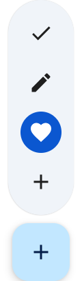
ตัวอย่าง
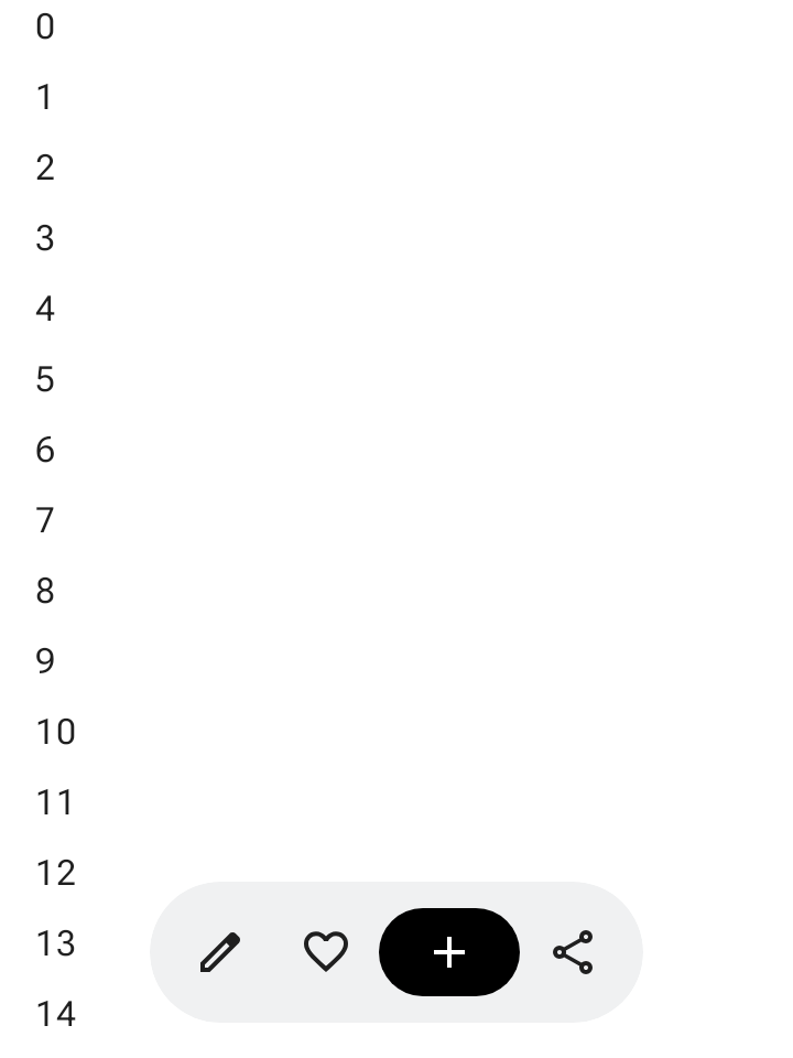
แถบเครื่องมือแบบลอยแนวนอนที่ขยายได้
ใช้ Modifier.floatingToolbarVerticalNestedScroll กับคอนเทนเนอร์ที่เลื่อนได้เพื่อให้ HorizontalFloatingToolbar ยุบการดำเนินการนำหน้าและต่อท้ายโดยอัตโนมัติเมื่อผู้ใช้เลื่อนลง และขยายเมื่อเลื่อนขึ้น
@Composable fun ExpandableHorizontalFloatingToolbarSample() { var expanded by rememberSaveable { mutableStateOf(true) } Scaffold { innerPadding -> Box(Modifier.padding(innerPadding)) { HorizontalFloatingToolbar( modifier = Modifier.align(Alignment.BottomCenter) .offset(y = -FloatingToolbarDefaults.ScreenOffset) .zIndex(1f), expanded = expanded, leadingContent = { IconButton(onClick = { /* doSomething() */ }) { Icon(painter = rememberVectorPainter(AppIcons.Edit), contentDescription = "Edit") } IconButton(onClick = { /* doSomething() */ }) { Icon(painter = rememberVectorPainter(AppIcons.Favorite), contentDescription = "Favorite") } }, trailingContent = { IconButton(onClick = { /* doSomething() */ }) { Icon(painter = rememberVectorPainter(AppIcons.Share), contentDescription = "Share") } }, content = { FilledIconButton( modifier = Modifier.width(64.dp), onClick = { /* doSomething() */ }, ) { Icon(painter = rememberVectorPainter(AppIcons.Add), contentDescription = "Add") } }, ) // ... } } }
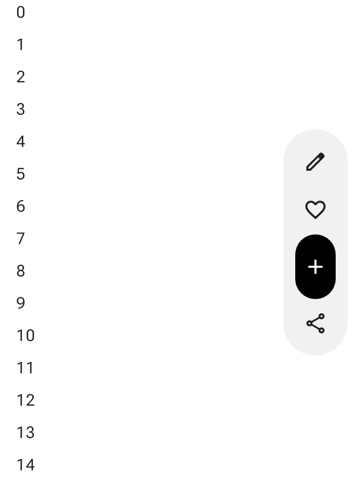
แถบเครื่องมือแบบลอยแนวตั้งที่ขยายได้
ใช้ VerticalFloatingToolbar ที่ยึดไว้ด้านข้างของหน้าจอเมื่อพื้นที่เลย์เอาต์แนวตั้งเหมาะกับลำดับชั้นของหน้าจอ เช่นเดียวกับตัวแปรแนวนอน
ซึ่งสามารถขยายและยุบเพื่อตอบสนองต่อท่าทางการเลื่อนได้
@Composable fun ExpandableVerticalFloatingToolbarSample() { var expanded by rememberSaveable { mutableStateOf(true) } Scaffold { innerPadding -> Box(Modifier.padding(innerPadding)) { VerticalFloatingToolbar( modifier = Modifier.align(Alignment.CenterEnd) .offset(x = -FloatingToolbarDefaults.ScreenOffset) .zIndex(1f), expanded = expanded, leadingContent = { IconButton(onClick = { /* doSomething() */ }) { Icon(painter = rememberVectorPainter(AppIcons.Edit), contentDescription = "Edit") } IconButton(onClick = { /* doSomething() */ }) { Icon(painter = rememberVectorPainter(AppIcons.Favorite), contentDescription = "Favorite") } }, trailingContent = { IconButton(onClick = { /* doSomething() */ }) { Icon(painter = rememberVectorPainter(AppIcons.Share), contentDescription = "Share") } }, content = { FilledIconButton( modifier = Modifier.height(64.dp), onClick = { /* doSomething() */ }, ) { Icon(painter = rememberVectorPainter(AppIcons.Add), contentDescription = "Add") } }, ) // ... } } }
แถบเครื่องมือแบบลอยที่เลื่อนได้
หากต้องการเลื่อนแถบเครื่องมือแบบลอยทั้งแถบออกจากหน้าจอขณะเลื่อนแทนที่จะยุบรายการ ให้ส่ง FloatingToolbarDefaults.exitAlwaysScrollBehavior ไปยังทั้ง Modifier.nestedScroll และพารามิเตอร์ scrollBehavior ของแถบเครื่องมือ ดังนี้
@Composable fun ScrollableHorizontalFloatingToolbarSample() { val exitAlwaysScrollBehavior = FloatingToolbarDefaults.exitAlwaysScrollBehavior( exitDirection = FloatingToolbarExitDirection.Bottom ) Scaffold(modifier = Modifier.nestedScroll(exitAlwaysScrollBehavior)) { innerPadding -> Box(Modifier.padding(innerPadding)) { HorizontalFloatingToolbar( modifier = Modifier.align(Alignment.BottomCenter) .offset(y = -FloatingToolbarDefaults.ScreenOffset) .zIndex(1f), expanded = true, leadingContent = { IconButton(onClick = { /* doSomething() */ }) { Icon(painter = rememberVectorPainter(AppIcons.Edit), contentDescription = "Edit") } IconButton(onClick = { /* doSomething() */ }) { Icon(painter = rememberVectorPainter(AppIcons.Favorite), contentDescription = "Favorite") } }, trailingContent = { IconButton(onClick = { /* doSomething() */ }) { Icon(painter = rememberVectorPainter(AppIcons.Share), contentDescription = "Share") } }, content = { FilledIconButton( modifier = Modifier.width(64.dp), onClick = { /* doSomething() */ }, ) { Icon(painter = rememberVectorPainter(AppIcons.Add), contentDescription = "Add") } }, scrollBehavior = exitAlwaysScrollBehavior, ) // ... } } }