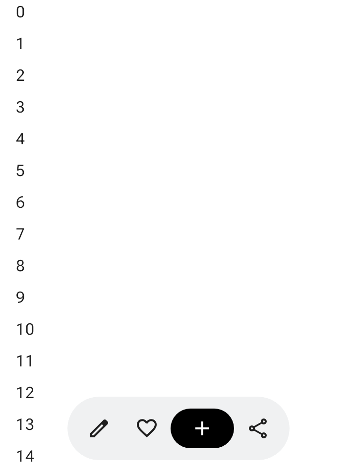
फ़्लोटिंग टूलबार, बॉडी कॉन्टेंट के ऊपर फ़्लोट करता है. इसका इस्तेमाल, मुख्य कॉन्टेंट या किसी खास पेज से जुड़ी काम की कार्रवाइयों के लिए किया जाता है.
फ़्लोटिंग टूलबार को स्क्रीन पर कहीं भी रखा जा सकता है, ताकि वह बाकी कॉन्टेंट के ऊपर फ़्लोट करे. इससे, टूलबार को अलग-अलग जगहों पर रखा जा सकता है और कई कार्रवाइयों के लिए जगह मिलती है.
फ़्लोटिंग टूलबार का इस्तेमाल करना
- फ़्लोटिंग टूलबार में, मौजूदा पेज से जुड़े कंट्रोल दिखते हैं.
- फ़्लोटिंग टूलबार, प्रॉडक्ट हैरारकी में मिलते-जुलते पेजों के बीच नेविगेशन कंट्रोल के तौर पर काम कर सकते हैं.
- अगर ज़्यादा कार्रवाइयों की ज़रूरत है, तो ओवरफ़्लो मेन्यू का इस्तेमाल करें.
- फ़्लोटिंग टूलबार का कंटेनर, स्क्रीन पर पूरी तरह से दिखना चाहिए.
- स्क्रीन पर डिफ़ॉल्ट रूप से दिखाने के लिए, सबसे ज़रूरी कार्रवाइयां चुनें.
लेआउट और रंग
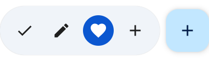
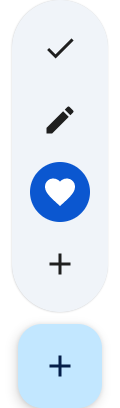
फ़्लोटिंग टूलबार हॉरिज़ॉन्टल (HorizontalFloatingToolbar) या वर्टिकल (VerticalFloatingToolbar) हो सकते हैं. साथ ही, इनमें FloatingToolbarDefaults की स्टैंडर्ड या वाइब्रेंट कलर स्कीम का इस्तेमाल किया जा सकता है.
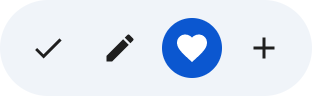

एफ़एबी के साथ फ़्लोटिंग टूलबार
व्यू में सबसे ज़्यादा प्राथमिकता वाली कार्रवाई के लिए, फ़्लोट करने वाले कार्रवाई बटन (एफ़एबी) का इस्तेमाल करें. इसके अलावा, टूलबार के कंट्रोल को बेहतर बनाने के लिए भी इसका इस्तेमाल किया जा सकता है.
उदाहरण
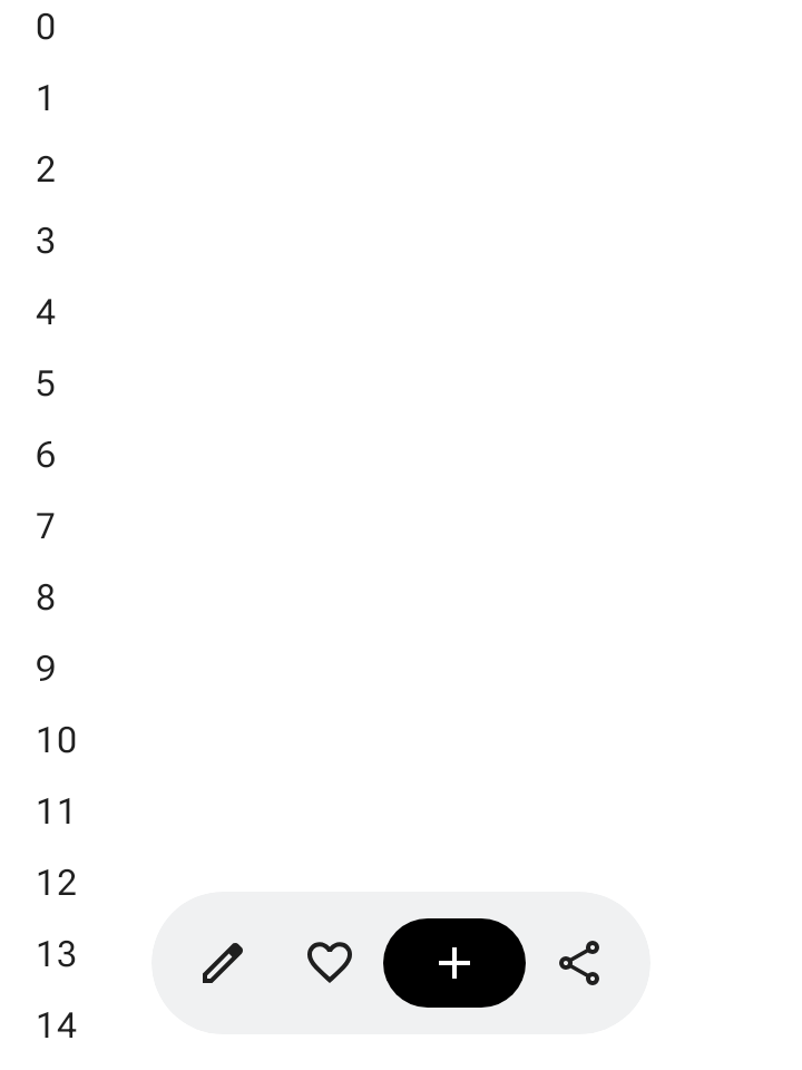
बड़ा किया जा सकने वाला हॉरिज़ॉन्टल फ़्लोटिंग टूलबार
स्क्रोल किए जा सकने वाले कंटेनर पर Modifier.floatingToolbarVerticalNestedScroll लागू करें, ताकि जब उपयोगकर्ता नीचे की ओर स्क्रोल करे, तो HorizontalFloatingToolbar अपने-आप अपनी शुरुआती और आखिरी कार्रवाइयों को छोटा कर दे. साथ ही, ऊपर की ओर स्क्रोल करने पर, उन्हें बड़ा कर दे:
@Composable fun ExpandableHorizontalFloatingToolbarSample() { var expanded by rememberSaveable { mutableStateOf(true) } Scaffold { innerPadding -> Box(Modifier.padding(innerPadding)) { HorizontalFloatingToolbar( modifier = Modifier.align(Alignment.BottomCenter) .offset(y = -FloatingToolbarDefaults.ScreenOffset) .zIndex(1f), expanded = expanded, leadingContent = { IconButton(onClick = { /* doSomething() */ }) { Icon(painter = rememberVectorPainter(AppIcons.Edit), contentDescription = "Edit") } IconButton(onClick = { /* doSomething() */ }) { Icon(painter = rememberVectorPainter(AppIcons.Favorite), contentDescription = "Favorite") } }, trailingContent = { IconButton(onClick = { /* doSomething() */ }) { Icon(painter = rememberVectorPainter(AppIcons.Share), contentDescription = "Share") } }, content = { FilledIconButton( modifier = Modifier.width(64.dp), onClick = { /* doSomething() */ }, ) { Icon(painter = rememberVectorPainter(AppIcons.Add), contentDescription = "Add") } }, ) // ... } } }
बड़ा किया जा सकने वाला वर्टिकल फ़्लोटिंग टूलबार
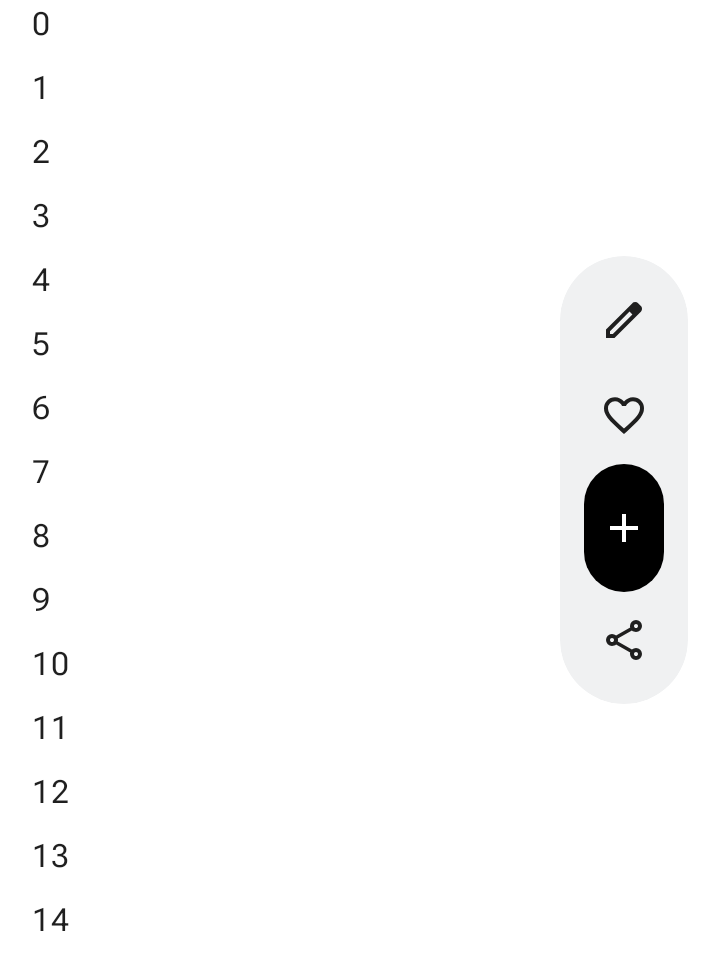
जब वर्टिकल लेआउट स्पेस आपकी स्क्रीन की हैरारकी के हिसाब से सही हो, तब स्क्रीन के किनारे पर ऐंकर किए गए VerticalFloatingToolbar का इस्तेमाल करें. हॉरिज़ॉन्टल वैरिएंट की तरह,
यह स्क्रोल जेस्चर के हिसाब से बड़ा और छोटा हो सकता है:
@Composable fun ExpandableVerticalFloatingToolbarSample() { var expanded by rememberSaveable { mutableStateOf(true) } Scaffold { innerPadding -> Box(Modifier.padding(innerPadding)) { VerticalFloatingToolbar( modifier = Modifier.align(Alignment.CenterEnd) .offset(x = -FloatingToolbarDefaults.ScreenOffset) .zIndex(1f), expanded = expanded, leadingContent = { IconButton(onClick = { /* doSomething() */ }) { Icon(painter = rememberVectorPainter(AppIcons.Edit), contentDescription = "Edit") } IconButton(onClick = { /* doSomething() */ }) { Icon(painter = rememberVectorPainter(AppIcons.Favorite), contentDescription = "Favorite") } }, trailingContent = { IconButton(onClick = { /* doSomething() */ }) { Icon(painter = rememberVectorPainter(AppIcons.Share), contentDescription = "Share") } }, content = { FilledIconButton( modifier = Modifier.height(64.dp), onClick = { /* doSomething() */ }, ) { Icon(painter = rememberVectorPainter(AppIcons.Add), contentDescription = "Add") } }, ) // ... } } }
स्क्रोल किया जा सकने वाला फ़्लोटिंग टूलबार
स्क्रोल करते समय, फ़्लोटिंग टूलबार के आइटम को छोटा करने के बजाय, पूरे टूलबार को स्क्रीन से बाहर स्लाइड करने के लिए, FloatingToolbarDefaults.exitAlwaysScrollBehavior को Modifier.nestedScroll और टूलबार के scrollBehavior पैरामीटर, दोनों को पास करें:
@Composable fun ScrollableHorizontalFloatingToolbarSample() { val exitAlwaysScrollBehavior = FloatingToolbarDefaults.exitAlwaysScrollBehavior( exitDirection = FloatingToolbarExitDirection.Bottom ) Scaffold(modifier = Modifier.nestedScroll(exitAlwaysScrollBehavior)) { innerPadding -> Box(Modifier.padding(innerPadding)) { HorizontalFloatingToolbar( modifier = Modifier.align(Alignment.BottomCenter) .offset(y = -FloatingToolbarDefaults.ScreenOffset) .zIndex(1f), expanded = true, leadingContent = { IconButton(onClick = { /* doSomething() */ }) { Icon(painter = rememberVectorPainter(AppIcons.Edit), contentDescription = "Edit") } IconButton(onClick = { /* doSomething() */ }) { Icon(painter = rememberVectorPainter(AppIcons.Favorite), contentDescription = "Favorite") } }, trailingContent = { IconButton(onClick = { /* doSomething() */ }) { Icon(painter = rememberVectorPainter(AppIcons.Share), contentDescription = "Share") } }, content = { FilledIconButton( modifier = Modifier.width(64.dp), onClick = { /* doSomething() */ }, ) { Icon(painter = rememberVectorPainter(AppIcons.Add), contentDescription = "Add") } }, scrollBehavior = exitAlwaysScrollBehavior, ) // ... } } }