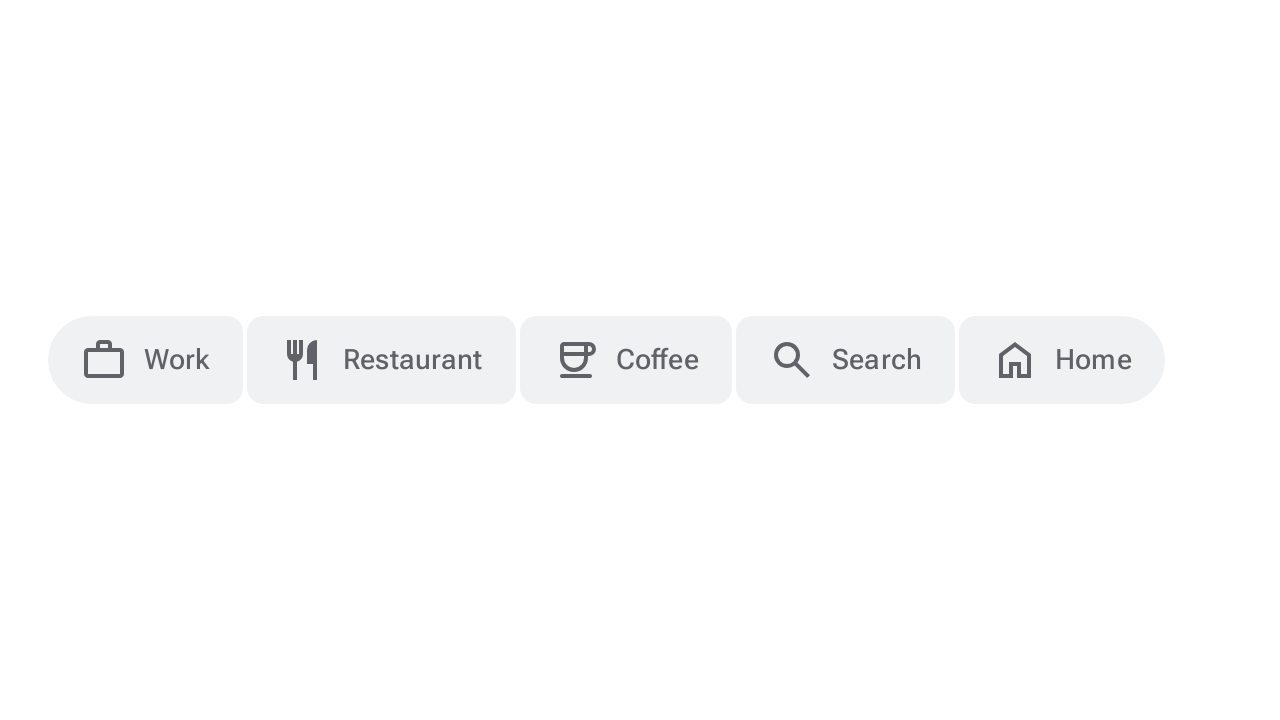
กลุ่มปุ่มจะจัดระเบียบปุ่มและเพิ่มการโต้ตอบระหว่างปุ่มโดยใช้การเปลี่ยนแปลงรูปร่าง การเคลื่อนไหว และความกว้างที่สอดคล้องกันกับปุ่มและปุ่มไอคอน กลุ่มปุ่มมี 2 รูปแบบ ได้แก่
- กลุ่มปุ่มมาตรฐาน: เพิ่มการโต้ตอบระหว่างปุ่มที่อยู่ติดกันเพื่อให้ปุ่มตอบสนองซึ่งกันและกันเมื่อกด
- กลุ่มปุ่มที่เชื่อมต่อกัน: จัดกลุ่มปุ่มเปิด/ปิดเพื่อให้ผู้ใช้เลือกตัวเลือก สลับมุมมอง หรือจัดเรียงองค์ประกอบในหน้าเว็บ
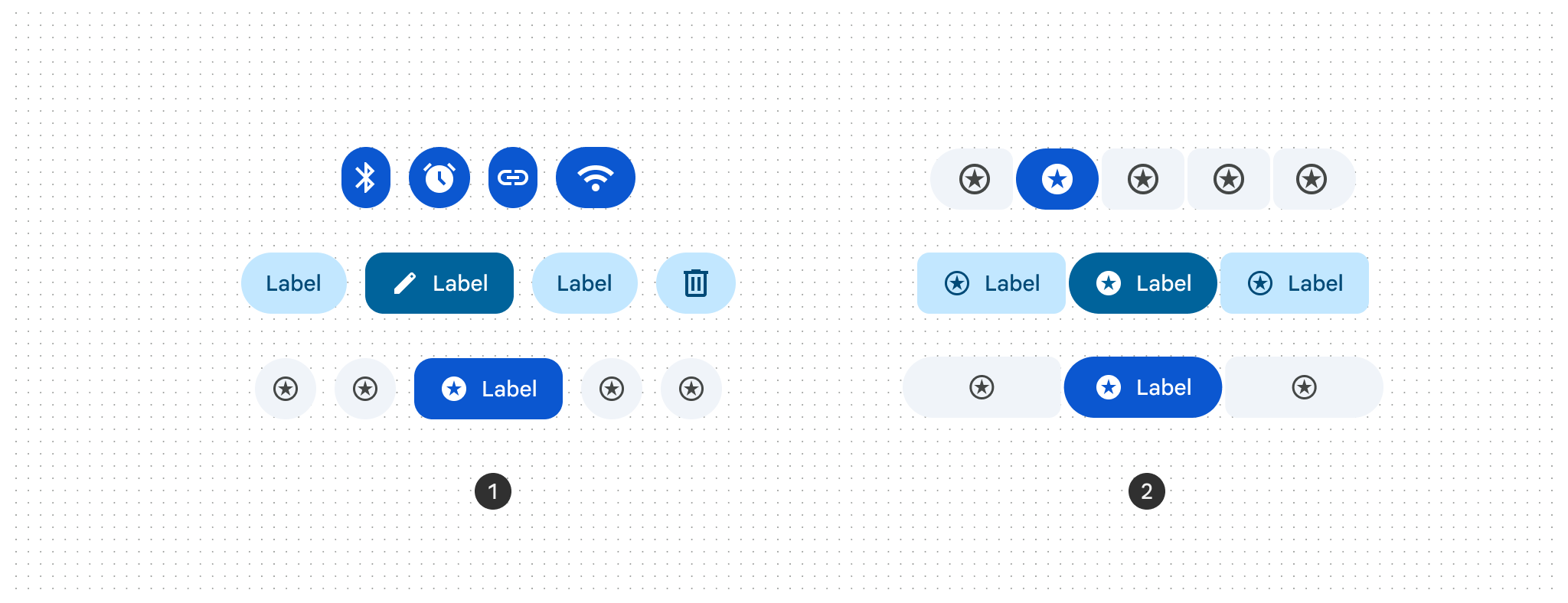
การใช้กลุ่มปุ่ม
- ใช้การเปลี่ยนรูปร่างเมื่อกดหรือเลือกปุ่ม
- กลุ่มปุ่มที่เชื่อมต่อจะแทนที่ปุ่มที่แบ่งกลุ่ม
- ใช้ได้กับปุ่มทุกขนาด ได้แก่ เล็กพิเศษ (XS), เล็ก (S), กลาง (M), ใหญ่ (L) และใหญ่พิเศษ (XL)
- รองรับรูปแบบการเลือกรายการเดียว การเลือกหลายรายการ และการเลือกที่จำเป็น
กลุ่มปุ่มมาตรฐาน
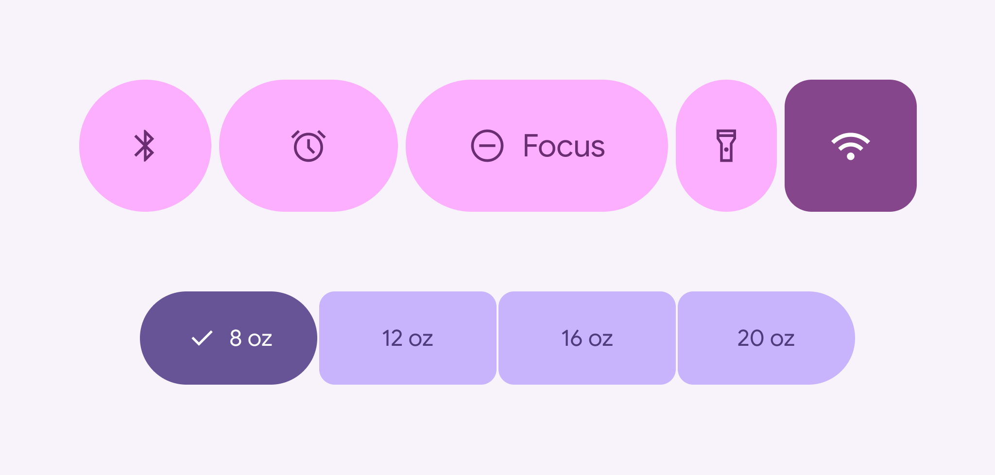
ใช้ Composable ButtonGroup เพื่อวางปุ่มในลำดับแนวนอนที่ขยายรายการที่กด บีบอัดรายการที่อยู่ใกล้เคียง และย้ายรายการเพิ่มเติมไปยังเมนูรายการเพิ่มเติมเมื่อมีพื้นที่จำกัด กลุ่มปุ่มควรอยู่ในบรรทัดเดียว ไม่ควรขึ้นบรรทัดใหม่
ข้อมูลโค้ดต่อไปนี้แสดงวิธีใช้กลุ่มปุ่มมาตรฐานที่มีตัวบ่งชี้เมนูรายการเพิ่มเติม
@Composable fun ButtonGroupSample() { val numButtons = 10 ButtonGroup( overflowIndicator = { menuState -> ButtonGroupDefaults.OverflowIndicator(menuState = menuState) } ) { for (i in 0 until numButtons) { clickableItem(onClick = {}, label = "$i") } } }
กลุ่มปุ่มที่เชื่อมต่อ
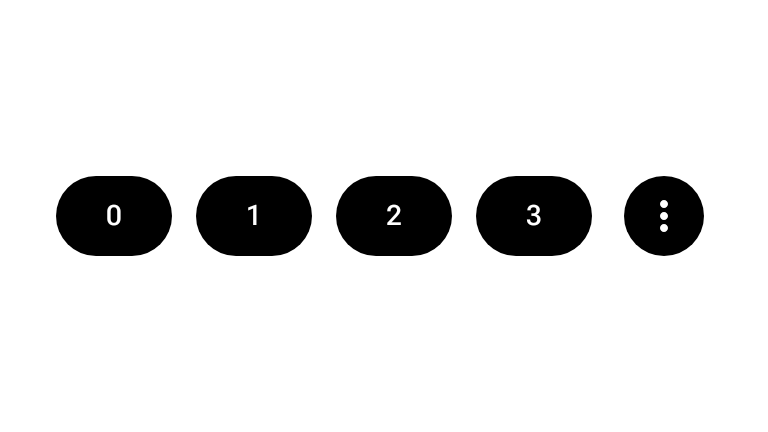
ใช้กลุ่มปุ่มที่เชื่อมต่อกันสำหรับรูปแบบการเลือกรายการเดียวหรือหลายรายการที่สร้างขึ้นด้วยคอมโพสิเบิล ToggleButton และรูปร่างที่เชื่อมต่อกัน ButtonGroupDefaults
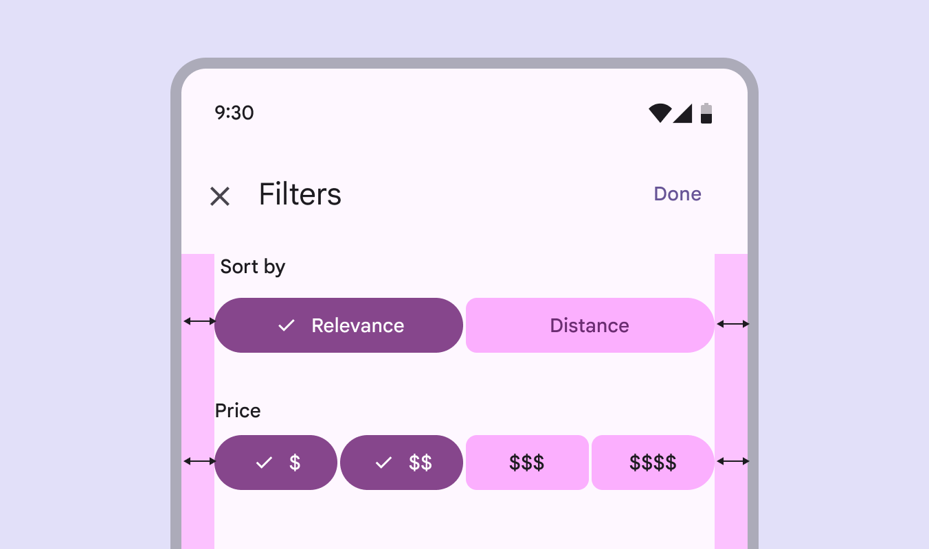
เลือกรายการเดียว
ใช้กลุ่มปุ่มที่เชื่อมต่อแบบเลือกได้รายการเดียวเมื่อผู้ใช้เลือกตัวเลือก 1 รายการจากชุดตัวเลือกที่แยกกันโดยสิ้นเชิง ข้อมูลโค้ดต่อไปนี้จะใช้กลุ่มปุ่มที่เชื่อมต่อแบบเลือกรายการเดียวโดยใช้ ToggleButton และ Role.RadioButton
@Composable fun SingleSelectConnectedButtonGroupSample() { val options = listOf("Work", "Restaurant", "Coffee", "Search", "Home") val unCheckedIcons = listOf( AppIcons.Work, AppIcons.Restaurant, AppIcons.Coffee, AppIcons.Search, AppIcons.Home, ) val checkedIcons = listOf( AppIcons.WorkFilled, AppIcons.Restaurant, AppIcons.CoffeeFilled, AppIcons.Search, AppIcons.HomeFilled, ) var selectedIndex by remember { mutableIntStateOf(0) } FlexBox( modifier = Modifier.padding(horizontal = 8.dp).fillMaxWidth(), config = { direction(FlexDirection.Row) wrap(FlexWrap.Wrap) columnGap(ButtonGroupDefaults.ConnectedSpaceBetween) rowGap(2.dp) }, ) { options.forEachIndexed { index, label -> ToggleButton( checked = selectedIndex == index, onCheckedChange = { selectedIndex = index }, shapes = when (index) { 0 -> ButtonGroupDefaults.connectedLeadingButtonShapes() options.lastIndex -> ButtonGroupDefaults.connectedTrailingButtonShapes() else -> ButtonGroupDefaults.connectedMiddleButtonShapes() }, modifier = Modifier.semantics { role = Role.RadioButton }, ) { Icon( painter = rememberVectorPainter( if (selectedIndex == index) checkedIcons[index] else unCheckedIcons[index] ), contentDescription = null, ) Spacer(Modifier.size(ToggleButtonDefaults.IconSpacing)) Text(label) } } } }
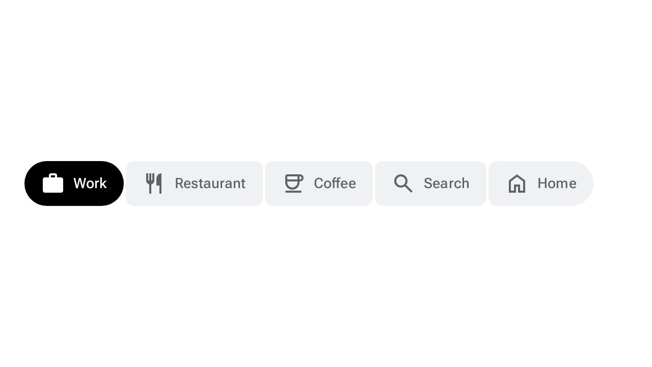
เลือกหลายรายการ
ใช้กลุ่มปุ่มที่เชื่อมต่อแบบเลือกได้หลายรายการเมื่อผู้ใช้สามารถสลับตัวเลือกอย่างน้อย 0 รายการได้อย่างอิสระ ข้อมูลโค้ดต่อไปนี้จะใช้กลุ่มปุ่มที่เชื่อมต่อแบบเลือกได้หลายรายการโดยใช้ ToggleButton และ mutableStateListOf
@Composable fun MultiSelectConnectedButtonGroupSample() { val options = listOf("Work", "Restaurant", "Coffee", "Search", "Home") val unCheckedIcons = listOf( AppIcons.Work, AppIcons.Restaurant, AppIcons.Coffee, AppIcons.Search, AppIcons.Home, ) val checkedIcons = listOf( AppIcons.WorkFilled, AppIcons.Restaurant, AppIcons.CoffeeFilled, AppIcons.Search, AppIcons.HomeFilled, ) val checked = remember { mutableStateListOf(false, false, false, false, false) } FlexBox( modifier = Modifier.padding(horizontal = 8.dp).fillMaxWidth(), config = { direction(FlexDirection.Row) wrap(FlexWrap.Wrap) columnGap(ButtonGroupDefaults.ConnectedSpaceBetween) rowGap(2.dp) }, ) { options.forEachIndexed { index, label -> ToggleButton( checked = checked[index], onCheckedChange = { checked[index] = it }, shapes = when (index) { 0 -> ButtonGroupDefaults.connectedLeadingButtonShapes() options.lastIndex -> ButtonGroupDefaults.connectedTrailingButtonShapes() else -> ButtonGroupDefaults.connectedMiddleButtonShapes() }, ) { Icon( painter = rememberVectorPainter( if (checked[index]) checkedIcons[index] else unCheckedIcons[index] ), contentDescription = null, ) Spacer(Modifier.size(ToggleButtonDefaults.IconSpacing)) Text(label) } } } }