
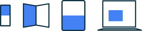
Durch die Unterstützung verschiedener Displaygrößen können Sie Ihre App auf einer Vielzahl von Geräten und von einer großen Anzahl von Nutzern verwenden lassen.
Um möglichst viele Displaygrößen zu unterstützen – egal ob verschiedene Gerätebildschirme oder verschiedene App-Fenster im Multifenstermodus – sollten Sie Ihre App-Layouts responsiv und adaptiv gestalten. Responsive/adaptive Layouts bieten unabhängig von der Anzeigegröße eine optimierte Nutzererfahrung. So kann Ihre App auf Smartphones, Tablets, faltbaren Geräten, ChromeOS-Geräten, im Hoch- und Querformat sowie mit anpassbaren Displaykonfigurationen wie dem Splitscreen-Modus und dem Desktop-Freiform-Fenster-Modus verwendet werden.
Responsive/adaptive Layouts ändern sich je nach verfügbarem Displayplatz. Die Änderungen reichen von kleinen Layoutanpassungen, die den Platz ausfüllen (responsives Design), bis hin zum vollständigen Ersetzen eines Layouts durch ein anderes, damit Ihre App verschiedene Displaygrößen optimal nutzen kann (adaptives Design).
Als deklaratives UI-Toolkit ist Jetpack Compose ideal für das Entwerfen und Implementieren von Layouts, die sich dynamisch ändern, um Inhalte auf verschiedenen Displaygrößen unterschiedlich darzustellen.
Umfangreiche Layoutänderungen für Composables auf Inhaltsebene explizit machen
Composables auf App- und Inhaltsebene nehmen den gesamten für Ihre App verfügbaren Displayplatz ein. Für diese Arten von Composables kann es sinnvoll sein, das Gesamtlayout Ihrer App auf großen Displays zu ändern.
Verwenden Sie keine Werte für physische Hardware, um Layoutentscheidungen zu treffen. Es mag verlockend sein, Entscheidungen auf der Grundlage eines festen, greifbaren Werts zu treffen (Ist das Gerät ein Tablet? Hat der physische Bildschirm ein bestimmtes Seitenverhältnis?), aber die Antworten auf diese Fragen sind möglicherweise nicht hilfreich, um den für Ihre UI verfügbaren Platz zu bestimmen.
Auf Tablets wird eine App möglicherweise im Multifenstermodus ausgeführt, d. h., die App teilt sich den Bildschirm mit einer anderen App. Im Desktop-Freiform-Fenster-Modus oder auf ChromeOS befindet sich eine App möglicherweise in einem Fenster mit anpassbarer Größe. Es kann sogar mehr als einen physischen Bildschirm geben, z. B. bei einem faltbaren Gerät. In all diesen Fällen ist die physische Bildschirmgröße nicht relevant, um zu entscheiden, wie Inhalte angezeigt werden.
Treffen Sie stattdessen Entscheidungen auf der Grundlage des tatsächlichen Teils des Bildschirms, der Ihrer App zugewiesen ist. Dieser wird durch die aktuellen Fenstermesswerte beschrieben, die von der Jetpack WindowManager-Bibliothek bereitgestellt werden. Ein Beispiel für die Verwendung von WindowManager in einer Compose-App finden Sie im JetNews Beispiel.
Wenn Sie Ihre Layouts an den verfügbaren Displayplatz anpassen, wird auch der Aufwand für die spezielle Verarbeitung reduziert, die zur Unterstützung von Plattformen wie ChromeOS und Formfaktoren wie Tablets und faltbaren Geräten erforderlich ist.
Nachdem Sie die Messwerte für den für Ihre App verfügbaren Platz ermittelt haben, wandeln Sie die Rohgröße in eine Fenstergrößenklasse um, wie unter Fenstergrößenklassen verwenden beschrieben. Fenstergrößenklassen sind Breakpoints, die die Einfachheit der App-Logik mit der Flexibilität in Einklang bringen sollen, Ihre App für die meisten Displaygrößen zu optimieren.
Fenstergrößenklassen beziehen sich auf das gesamte Fenster Ihrer App. Verwenden Sie die Klassen daher für Layoutentscheidungen, die sich auf das Gesamtlayout Ihrer App auswirken. Sie können Fenstergrößenklassen als Status weitergeben oder zusätzliche Logik ausführen, um abgeleiteten Status zu erstellen, der an verschachtelte Composables weitergegeben werden kann.
@Composable fun MyApp( windowSizeClass: WindowSizeClass = currentWindowAdaptiveInfo(supportLargeAndXLargeWidth = true).windowSizeClass ) { // Decide whether to show the top app bar based on window size class. val showTopAppBar = windowSizeClass.isHeightAtLeastBreakpoint(WindowSizeClass.HEIGHT_DP_MEDIUM_LOWER_BOUND) // MyScreen logic is based on the showTopAppBar boolean flag. MyScreen( showTopAppBar = showTopAppBar, /* ... */ ) }
Ein mehrschichtiger Ansatz beschränkt die Logik für die Anzeigegröße auf einen einzigen Ort, anstatt sie an vielen Stellen in Ihrer App zu verteilen, die synchronisiert werden müssen. An einem einzigen Ort wird ein Status erzeugt, der wie jeder andere App-Status explizit an andere Composables weitergegeben werden kann. Durch die explizite Weitergabe des Status werden einzelne Composables vereinfacht, da die Composables die Fenstergrößenklasse oder die angegebene Konfiguration zusammen mit anderen Daten übernehmen.
Flexible verschachtelte Composables sind wiederverwendbar
Composables sind wiederverwendbarer, wenn sie an vielen verschiedenen Stellen platziert werden können. Wenn ein Composable an einer bestimmten Stelle mit einer bestimmten Größe platziert werden muss, ist es wahrscheinlich nicht in anderen Kontexten wiederverwendbar. Das bedeutet auch, dass einzelne, wiederverwendbare Composables nicht implizit von globalen Informationen zur Anzeigegröße abhängen sollten.
Stellen Sie sich ein verschachteltes Composable vor, das ein Listen-Detailansicht-Layout implementiert, in dem entweder ein einzelner Bereich oder zwei Bereiche nebeneinander angezeigt werden können:
Die Entscheidung für die Listen-Detailansicht sollte Teil des Gesamtlayouts für die App sein. Daher wird die Entscheidung von einer komponierbaren Funktion auf Inhaltsebene weitergegeben:
@Composable fun AdaptivePane( showOnePane: Boolean, /* ... */ ) { if (showOnePane) { OnePane(/* ... */) } else { TwoPane(/* ... */) } }
Was ist, wenn Sie stattdessen möchten, dass ein Composable sein Layout unabhängig vom verfügbaren Displayplatz ändert, z. B. eine Karte, auf der zusätzliche Details angezeigt werden, wenn genügend Platz vorhanden ist? Sie möchten eine bestimmte Logik basierend auf einer verfügbaren Anzeigegröße ausführen, aber welche Größe genau?

Versuchen Sie nicht, die Größe des tatsächlichen Bildschirms des Geräts zu verwenden. Diese ist für verschiedene Arten von Bildschirmen nicht genau und auch nicht, wenn die App nicht im Vollbildmodus ausgeführt wird.
Da das Composable kein Composable auf Inhaltsebene ist, verwenden Sie die aktuellen Fenstermesswerte nicht direkt.
Wenn die Komponente mit Padding platziert wird (z. B. mit Insets) oder wenn die App Komponenten wie Navigationsleisten oder App-Leisten enthält, kann sich der für das Composable verfügbare Displayplatz erheblich vom für die App insgesamt verfügbaren Platz unterscheiden.
Verwenden Sie die Breite, die dem Composable tatsächlich zugewiesen ist, um es zu rendern. Sie haben zwei Möglichkeiten, diese Breite zu ermitteln:
Wenn Sie ändern möchten, wo oder wie Inhalte angezeigt werden, verwenden Sie eine Sammlung von Modifikatoren oder ein benutzerdefiniertes Layout, um das Layout responsiv zu gestalten. Das kann so einfach sein, dass ein untergeordnetes Element den gesamten verfügbaren Platz ausfüllt oder untergeordnete Elemente in mehreren Spalten angeordnet werden, wenn genügend Platz vorhanden ist.
Wenn Sie ändern möchten, was angezeigt wird, verwenden Sie
BoxWithConstraintsals leistungsstärkere Alternative.BoxWithConstraintsbietet Mess beschränkungen, mit denen Sie verschiedene Composables basierend auf dem verfügbaren Displayplatz aufrufen können. Das hat jedoch seinen Preis, daBoxWithConstraintsdie Komposition bis zur Layoutphase verschiebt, wenn diese Beschränkungen bekannt sind. Dadurch wird mehr Arbeit während des Layouts ausgeführt.
@Composable fun Card(/* ... */) { BoxWithConstraints { if (maxWidth < 400.dp) { Column { Image(/* ... */) Title(/* ... */) } } else { Row { Column { Title(/* ... */) Description(/* ... */) } Image(/* ... */) } } } }
Alle Daten für verschiedene Displaygrößen verfügbar machen
Wenn Sie ein Composable implementieren, das zusätzlichen Displayplatz nutzt, sind Sie möglicherweise versucht, Daten als Nebeneffekt der aktuellen Displaygröße zu laden.
Dies widerspricht jedoch dem Prinzip des unidirektionalen Datenflusses, bei dem Daten angehoben und Composables zur Verfügung gestellt werden können, damit sie entsprechend gerendert werden. Dem Composable sollten genügend Daten zur Verfügung gestellt werden, damit es immer genügend Inhalte für jede Anzeigegröße hat, auch wenn ein Teil der Inhalte möglicherweise nicht immer verwendet wird.
@Composable fun Card( imageUrl: String, title: String, description: String ) { BoxWithConstraints { if (maxWidth < 400.dp) { Column { Image(imageUrl) Title(title) } } else { Row { Column { Title(title) Description(description) } Image(imageUrl) } } } }
Im Beispiel Card wird die description immer an die Card übergeben. Obwohl die description nur verwendet wird, wenn die Breite ihre Anzeige zulässt, ist sie für Card immer erforderlich, unabhängig von der verfügbaren Breite.description
Wenn immer genügend Inhalte übergeben werden, werden adaptive Layouts vereinfacht, da sie weniger zustandsorientiert sind. Außerdem werden keine Nebeneffekte ausgelöst, wenn zwischen Displaygrößen gewechselt wird (was aufgrund einer Fenstergrößenänderung, einer Ausrichtungsänderung oder des Auf- und Zuklappens eines Geräts auftreten kann).
Dieses Prinzip ermöglicht auch, den Status bei Layoutänderungen beizubehalten. Wenn Sie Informationen anheben, die bei allen Displaygrößen möglicherweise nicht verwendet werden, können Sie den App-Status beibehalten, wenn sich die Layoutgröße ändert.
Sie können beispielsweise ein boolesches Flag showMore anheben, damit der App-Status beibehalten wird, wenn die Größe des Displays geändert wird und das Layout zwischen dem Ausblenden und Anzeigen von Inhalten wechselt:
@Composable fun Card( imageUrl: String, title: String, description: String ) { var showMore by remember { mutableStateOf(false) } BoxWithConstraints { if (maxWidth < 400.dp) { Column { Image(imageUrl) Title(title) } } else { Row { Column { Title(title) Description( description = description, showMore = showMore, onShowMoreToggled = { newValue -> showMore = newValue } ) } Image(imageUrl) } } } }
Weitere Informationen
Weitere Informationen zu adaptiven Layouts in Compose finden Sie in den folgenden Ressourcen:
Beispiel-Apps
- CanonicalLayouts ist ein Repository mit bewährten Designmustern , die eine optimale Nutzererfahrung auf großen Displays bieten.
- JetNews zeigt, wie Sie eine App entwerfen, deren UI sich an den verfügbaren Displayplatz anpasst .
- Reply ist ein adaptives Beispiel für die Unterstützung von Smartphones, Tablets und faltbaren Geräten.
- Now in Android ist eine App, die adaptive Layouts verwendet, um verschiedene Displaygrößen zu unterstützen.
Videos