
Jeśli używasz układu opartego na View, masz 3 główne opcje implementacji przełączników. Zalecamy użycie komponentu SwitchMaterial z biblioteki MaterialComponents:
<androidx.constraintlayout.widget.ConstraintLayout xmlns:android="http://schemas.android.com/apk/res/android"
    xmlns:app="http://schemas.android.com/apk/res-auto"
    android:layout_width="match_parent"
    android:layout_height="match_parent"
    android:padding="16dp">

    <com.google.android.material.switchmaterial.SwitchMaterial
        android:id="@+id/material_switch"
        android:layout_width="wrap_content"
        android:layout_height="wrap_content"
        android:text="@string/material_switch"
        app:layout_constraintEnd_toEndOf="parent"
        app:layout_constraintStart_toStartOf="parent"
        app:layout_constraintTop_toTopOf="parent" />

</androidx.constraintlayout.widget.ConstraintLayout>
Starsze aplikacje mogą nadal używać starszego komponentu AppCompat SwitchCompat, jak w tym przykładzie:
<androidx.constraintlayout.widget.ConstraintLayout xmlns:android="http://schemas.android.com/apk/res/android"
    xmlns:app="http://schemas.android.com/apk/res-auto"
    android:layout_width="match_parent"
    android:layout_height="match_parent"
    android:padding="16dp">

    <androidx.appcompat.widget.SwitchCompat
        android:id="@+id/switchcompat"
        android:layout_width="wrap_content"
        android:layout_height="wrap_content"
        android:text="@string/switchcompat"
        app:layout_constraintEnd_toEndOf="parent"
        app:layout_constraintStart_toStartOf="parent"
        app:layout_constraintTop_toTopOf="parent" />

</androidx.constraintlayout.widget.ConstraintLayout>
Ten przykład przedstawia AppCompatToggleButton, czyli kolejny starszy komponent, który wyraźnie różni się interfejsem użytkownika:
<androidx.constraintlayout.widget.ConstraintLayout xmlns:android="http://schemas.android.com/apk/res/android"
    xmlns:app="http://schemas.android.com/apk/res-auto"
    android:layout_width="match_parent"
    android:layout_height="match_parent"
    android:padding="16dp">

    <TextView
        android:id="@+id/toggle_button_label"
        android:layout_width="wrap_content"
        android:layout_height="wrap_content"
        app:layout_constraintStart_toStartOf="parent"
        app:layout_constraintEnd_toStartOf="@id/toggle"
        app:layout_constraintHorizontal_chainStyle="packed"
        app:layout_constraintBaseline_toBaselineOf="@id/toggle"
        android:text="@string/toggle_button" />

    <androidx.appcompat.widget.AppCompatToggleButton
        android:id="@+id/toggle"
        android:layout_width="wrap_content"
        android:layout_height="wrap_content"
        app:layout_constraintEnd_toEndOf="parent"
        app:layout_constraintStart_toEndOf="@id/toggle_button_label"
        app:layout_constraintTop_toTopOf="parent"
        app:layout_constraintBottom_toBottomOf="parent"/>

</androidx.constraintlayout.widget.ConstraintLayout>
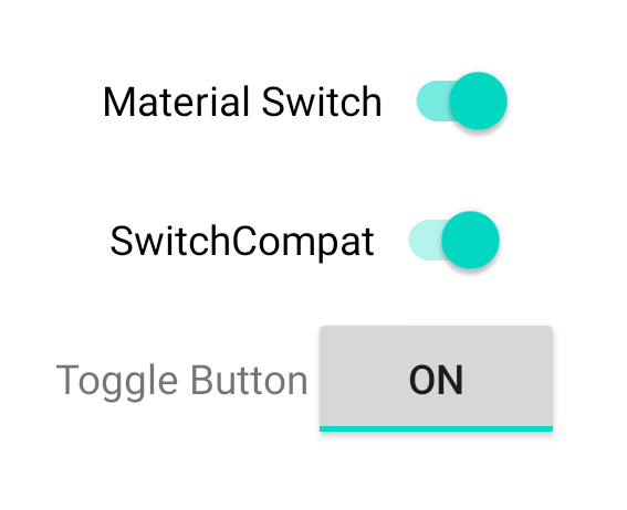
Te 3 komponenty działają tak samo, ale wyglądają inaczej. Różnice między SwitchMaterial a SwitchCompat są subtelne, ale AppCompatToggleButton jest wyraźnie inna:
Zmiany stanu obsługi
SwitchMaterial, SwitchCompat i AppCompatToggleButton to podklasy klasy CompoundButton, co daje im wspólny mechanizm obsługi zmian stanu zaznaczonego. Wdroż instancję interfejsu CompoundButton.OnCheckedChangeListener i dodaj ją do przycisku, jak pokazano w tym przykładzie:
Kotlin
class MainActivity : AppCompatActivity() {
    override fun onCreate(savedInstanceState: Bundle?) {
        super.onCreate(savedInstanceState)

        val binding: SwitchLayoutBinding = SwitchLayoutBinding.inflate(layoutInflater)
        setContentView(binding.root)

        binding.materialSwitch.setOnCheckedChangeListener { _, isChecked ->
            if (isChecked) {
                // The switch is checked.
            } else {
                // The switch isn't checked.
            }
        }
    }
}
Java
public class MainActivity extends AppCompatActivity {

    @Override
    protected void onCreate(Bundle savedInstanceState) {
        super.onCreate(savedInstanceState);

        SwitchLayoutBinding binding = SwitchLayoutBinding.inflate(getLayoutInflater());
        setContentView(binding.getRoot());

        binding.materialSwitch.setOnCheckedChangeListener((buttonView, isChecked) -> {
            if (isChecked) {
                // The switch is checked.
            } else {
                // The switch isn't checked.
            }
        });
    }
}
CompoundButton.OnCheckedChangeListener to pojedynczy interfejs abstrakcyjnej metody (lub interfejs SAM), więc możesz go zaimplementować jako funkcję lambda. Funkcja lambda jest wywoływana za każdym razem, gdy zmienia się stan pola checked, a wartość logiczna isChecked przekazana do funkcji lambda wskazuje nowy stan pola checked.