
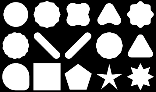
Compose では、ポリゴンで構成されたシェイプを作成できます。たとえば、次のような図形を作成できます。
Compose でカスタムの丸みを帯びたポリゴンを作成するには、app/build.gradle に graphics-shapes 依存関係を追加します。
implementation "androidx.graphics:graphics-shapes:1.0.1"
このライブラリを使用すると、ポリゴンで構成された図形を作成できます。多角形は直線的な辺と鋭い角のみで構成されますが、これらのシェイプでは角を丸くすることもできます。2 つの異なるシェイプ間で簡単にモーフィングできます。任意のシェイプ間のモーフィングは難しく、デザイン時の問題になりがちです。このライブラリでは、同様の多角形構造を持つこれらのシェイプ間をモーフィングすることで、簡単に実現できます。
ポリゴンを作成する
次のスニペットは、描画領域の中央に 6 つのポイントを持つ基本的なポリゴン形状を作成します。
Box( modifier = Modifier .drawWithCache { val roundedPolygon = RoundedPolygon( numVertices = 6, radius = size.minDimension / 2, centerX = size.width / 2, centerY = size.height / 2 ) val roundedPolygonPath = roundedPolygon.toPath().asComposePath() onDrawBehind { drawPath(roundedPolygonPath, color = Color.Blue) } } .fillMaxSize() )
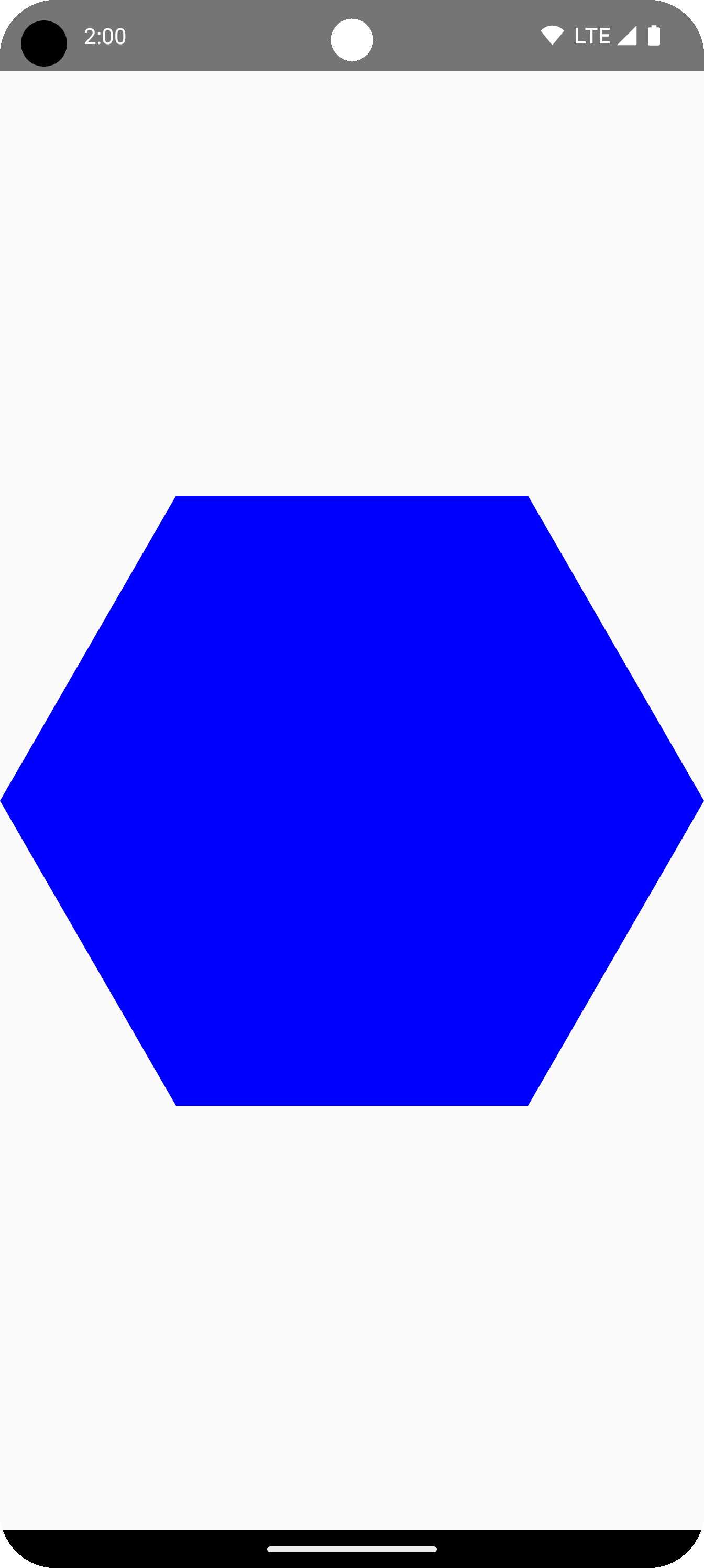
この例では、ライブラリは、リクエストされたシェイプを表すジオメトリを保持する RoundedPolygon を作成します。Compose アプリでそのシェイプを描画するには、そこから Path オブジェクトを取得して、Compose が描画方法を認識できる形式でシェイプを取得する必要があります。
ポリゴンの角を丸める
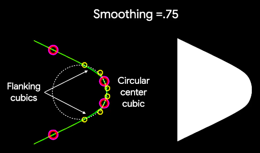
ポリゴンの角を丸めるには、CornerRounding パラメータを使用します。この関数は、radius と smoothing の 2 つのパラメータを取ります。各角丸は 1 ~ 3 個の 3 次曲線で構成され、その中央は円弧の形状を持ち、両側の曲線は形状の端から中央の曲線に移行します。
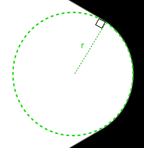
半径
radius は、頂点を丸めるために使用される円の半径です。
たとえば、次の丸角の三角形は次のように作成されます。

r は、丸められた角の円形の丸めサイズを決定します。Smoothing
スムージングは、角の丸い部分から端までにかかる時間を決定する要素です。平滑化係数が 0(平滑化なし、CornerRounding のデフォルト値)の場合、角の丸めは完全に円形になります。ゼロ以外の平滑化係数(最大 1.0)を指定すると、角が 3 つの別々の曲線で丸められます。
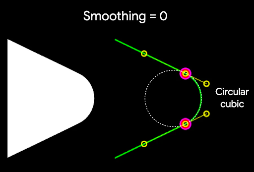
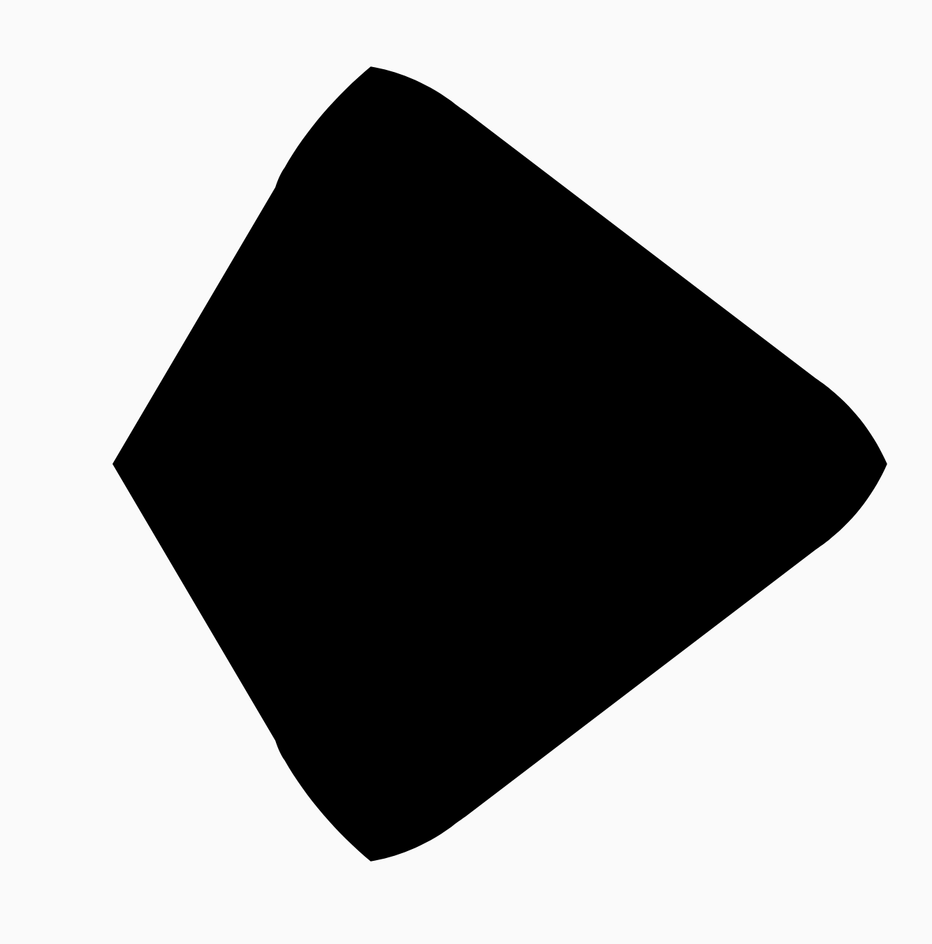
たとえば、次のスニペットは、スムージングを 0 に設定した場合と 1 に設定した場合の微妙な違いを示しています。
Box( modifier = Modifier .drawWithCache { val roundedPolygon = RoundedPolygon( numVertices = 3, radius = size.minDimension / 2, centerX = size.width / 2, centerY = size.height / 2, rounding = CornerRounding( size.minDimension / 10f, smoothing = 0.1f ) ) val roundedPolygonPath = roundedPolygon.toPath().asComposePath() onDrawBehind { drawPath(roundedPolygonPath, color = Color.Black) } } .size(100.dp) )

サイズと位置
デフォルトでは、形状は中心(0, 0)から 1 の半径で作成されます。この半径は、形状のベースとなるポリゴンの中心と外側の頂点間の距離を表します。角を丸めると、丸められた角が丸められる頂点よりも中心に近くなるため、図形が小さくなります。ポリゴンのサイズを変更するには、radius の値を調整します。位置を調整するには、ポリゴンの centerX または centerY を変更します。または、標準の DrawScope 変換関数(DrawScope#translate() など)を使用して、オブジェクトを変換してサイズ、位置、回転を変更します。
図形をモーフィングする
Morph オブジェクトは、2 つの多角形間のアニメーションを表す新しいシェイプです。2 つのシェイプ間でモーフィングするには、2 つの RoundedPolygons と、これらの 2 つのシェイプを受け取る Morph オブジェクトを作成します。開始シェイプと終了シェイプの間のシェイプを計算するには、0 ~ 1 の progress 値を指定して、開始シェイプ(0)と終了シェイプ(1)の間のフォームを決定します。
Box( modifier = Modifier .drawWithCache { val triangle = RoundedPolygon( numVertices = 3, radius = size.minDimension / 2f, centerX = size.width / 2f, centerY = size.height / 2f, rounding = CornerRounding( size.minDimension / 10f, smoothing = 0.1f ) ) val square = RoundedPolygon( numVertices = 4, radius = size.minDimension / 2f, centerX = size.width / 2f, centerY = size.height / 2f ) val morph = Morph(start = triangle, end = square) val morphPath = morph .toPath(progress = 0.5f).asComposePath() onDrawBehind { drawPath(morphPath, color = Color.Black) } } .fillMaxSize() )
上記の例では、進行状況は 2 つのシェイプ(丸みを帯びた三角形と正方形)の中間にあるため、次の結果が生成されます。
ほとんどの場合、モーフィングはアニメーションの一部として行われ、静的なレンダリングだけではありません。この 2 つの間をアニメーション化するには、標準の Compose のアニメーション API を使用して、進行状況の値を時間とともに変更します。たとえば、次のコードでは、2 つのシェイプ間のモーフィングを無限にアニメーション化しています。
val infiniteAnimation = rememberInfiniteTransition(label = "infinite animation") val morphProgress = infiniteAnimation.animateFloat( initialValue = 0f, targetValue = 1f, animationSpec = infiniteRepeatable( tween(500), repeatMode = RepeatMode.Reverse ), label = "morph" ) Box( modifier = Modifier .drawWithCache { val triangle = RoundedPolygon( numVertices = 3, radius = size.minDimension / 2f, centerX = size.width / 2f, centerY = size.height / 2f, rounding = CornerRounding( size.minDimension / 10f, smoothing = 0.1f ) ) val square = RoundedPolygon( numVertices = 4, radius = size.minDimension / 2f, centerX = size.width / 2f, centerY = size.height / 2f ) val morph = Morph(start = triangle, end = square) val morphPath = morph .toPath(progress = morphProgress.value) .asComposePath() onDrawBehind { drawPath(morphPath, color = Color.Black) } } .fillMaxSize() )
ポリゴンをクリップとして使用
Compose で clip 修飾子を使用して、コンポーザブルのレンダリング方法を変更し、クリッピング領域の周囲に描画されるシャドウを利用することは一般的です。
fun RoundedPolygon.getBounds() = calculateBounds().let { Rect(it[0], it[1], it[2], it[3]) } class RoundedPolygonShape( private val polygon: RoundedPolygon, private var matrix: Matrix = Matrix() ) : Shape { private var path = Path() override fun createOutline( size: Size, layoutDirection: LayoutDirection, density: Density ): Outline { path.rewind() path = polygon.toPath().asComposePath() matrix.reset() val bounds = polygon.getBounds() val maxDimension = max(bounds.width, bounds.height) matrix.scale(size.width / maxDimension, size.height / maxDimension) matrix.translate(-bounds.left, -bounds.top) path.transform(matrix) return Outline.Generic(path) } }
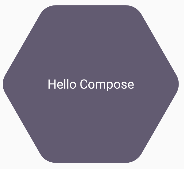
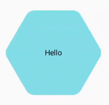
次のスニペットに示すように、ポリゴンをクリップとして使用できます。
val hexagon = remember { RoundedPolygon( 6, rounding = CornerRounding(0.2f) ) } val clip = remember(hexagon) { RoundedPolygonShape(polygon = hexagon) } Box( modifier = Modifier .clip(clip) .background(MaterialTheme.colorScheme.secondary) .size(200.dp) ) { Text( "Hello Compose", color = MaterialTheme.colorScheme.onSecondary, modifier = Modifier.align(Alignment.Center) ) }
これにより、次のようになります。
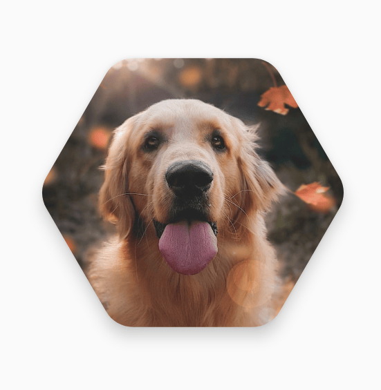
以前のレンダリングとあまり変わらないように見えるかもしれませんが、Compose の他の機能を活用できるようになります。たとえば、この手法を使用して画像を切り抜き、切り抜いた領域の周囲に影を適用できます。
val hexagon = remember { RoundedPolygon( 6, rounding = CornerRounding(0.2f) ) } val clip = remember(hexagon) { RoundedPolygonShape(polygon = hexagon) } Box( modifier = Modifier.fillMaxSize(), contentAlignment = Alignment.Center ) { Image( painter = painterResource(id = R.drawable.dog), contentDescription = "Dog", contentScale = ContentScale.Crop, modifier = Modifier .graphicsLayer { this.shadowElevation = 6.dp.toPx() this.shape = clip this.clip = true this.ambientShadowColor = Color.Black this.spotShadowColor = Color.Black } .size(200.dp) ) }
クリック時にボタンをモーフィングする
graphics-shape ライブラリを使用して、押すと 2 つのシェイプ間で変化するボタンを作成できます。まず、Shape を拡張する MorphPolygonShape を作成し、適切に収まるようにスケーリングと変換を行います。シェイプをアニメーション化できるように、進行状況が渡されていることに注意してください。
class MorphPolygonShape( private val morph: Morph, private val percentage: Float ) : Shape { private val matrix = Matrix() override fun createOutline( size: Size, layoutDirection: LayoutDirection, density: Density ): Outline { // Below assumes that you haven't changed the default radius of 1f, nor the centerX and centerY of 0f // By default this stretches the path to the size of the container, if you don't want stretching, use the same size.width for both x and y. matrix.scale(size.width / 2f, size.height / 2f) matrix.translate(1f, 1f) val path = morph.toPath(progress = percentage).asComposePath() path.transform(matrix) return Outline.Generic(path) } }
このモーフィング シェイプを使用するには、2 つのポリゴン shapeA と shapeB を作成します。Morph を作成して記憶します。次に、押下時の interactionSource をアニメーションの原動力として使用し、クリップ アウトラインとしてボタンにモーフィングを適用します。
val shapeA = remember { RoundedPolygon( 6, rounding = CornerRounding(0.2f) ) } val shapeB = remember { RoundedPolygon.star( 6, rounding = CornerRounding(0.1f) ) } val morph = remember { Morph(shapeA, shapeB) } val interactionSource = remember { MutableInteractionSource() } val isPressed by interactionSource.collectIsPressedAsState() val animatedProgress = animateFloatAsState( targetValue = if (isPressed) 1f else 0f, label = "progress", animationSpec = spring(dampingRatio = 0.4f, stiffness = Spring.StiffnessMedium) ) Box( modifier = Modifier .size(200.dp) .padding(8.dp) .clip(MorphPolygonShape(morph, animatedProgress.value)) .background(Color(0xFF80DEEA)) .size(200.dp) .clickable(interactionSource = interactionSource, indication = null) { } ) { Text("Hello", modifier = Modifier.align(Alignment.Center)) }
これにより、ボックスがタップされたときに次のアニメーションが生成されます。
図形のモーフィングを無限にアニメーション化する
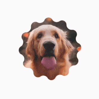
モーフィング シェイプを無限にアニメーション化するには、rememberInfiniteTransition を使用します。以下は、時間とともに形状が無限に変化(回転)するプロフィール写真の例です。このアプローチでは、上記の MorphPolygonShape を少し調整します。
class CustomRotatingMorphShape( private val morph: Morph, private val percentage: Float, private val rotation: Float ) : Shape { private val matrix = Matrix() override fun createOutline( size: Size, layoutDirection: LayoutDirection, density: Density ): Outline { // Below assumes that you haven't changed the default radius of 1f, nor the centerX and centerY of 0f // By default this stretches the path to the size of the container, if you don't want stretching, use the same size.width for both x and y. matrix.scale(size.width / 2f, size.height / 2f) matrix.translate(1f, 1f) matrix.rotateZ(rotation) val path = morph.toPath(progress = percentage).asComposePath() path.transform(matrix) return Outline.Generic(path) } } @Preview @Composable private fun RotatingScallopedProfilePic() { val shapeA = remember { RoundedPolygon( 12, rounding = CornerRounding(0.2f) ) } val shapeB = remember { RoundedPolygon.star( 12, rounding = CornerRounding(0.2f) ) } val morph = remember { Morph(shapeA, shapeB) } val infiniteTransition = rememberInfiniteTransition("infinite outline movement") val animatedProgress = infiniteTransition.animateFloat( initialValue = 0f, targetValue = 1f, animationSpec = infiniteRepeatable( tween(2000, easing = LinearEasing), repeatMode = RepeatMode.Reverse ), label = "animatedMorphProgress" ) val animatedRotation = infiniteTransition.animateFloat( initialValue = 0f, targetValue = 360f, animationSpec = infiniteRepeatable( tween(6000, easing = LinearEasing), repeatMode = RepeatMode.Reverse ), label = "animatedMorphProgress" ) Box( modifier = Modifier.fillMaxSize(), contentAlignment = Alignment.Center ) { Image( painter = painterResource(id = R.drawable.dog), contentDescription = "Dog", contentScale = ContentScale.Crop, modifier = Modifier .clip( CustomRotatingMorphShape( morph, animatedProgress.value, animatedRotation.value ) ) .size(200.dp) ) } }
このコードを実行すると、次の結果が得られます。
カスタム ポリゴン
正多角形から作成されたシェイプがユースケースに対応していない場合は、頂点のリストを使用して、よりカスタムなシェイプを作成できます。たとえば、次のようなハート形を作成できます。

このシェイプの個々の頂点は、x、y 座標の float 配列を受け取る RoundedPolygon オーバーロードを使用して指定できます。
ハートのポリゴンを分解するには、点を指定する極座標系を使用すると、直交座標系(x,y)を使用するよりも簡単になることに注意してください。0° は右側から始まり、時計回りに進み、270° は 12 時の位置にあります。
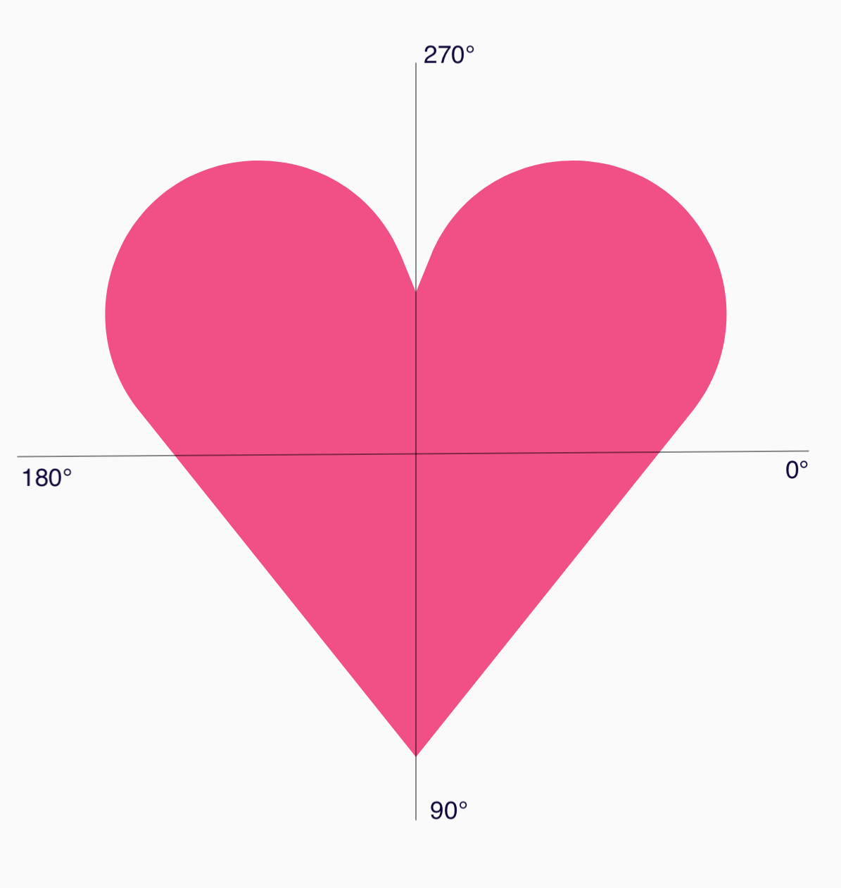
各ポイントの中心からの角度(𝜭)と半径を指定することで、形状をより簡単に定義できるようになりました。
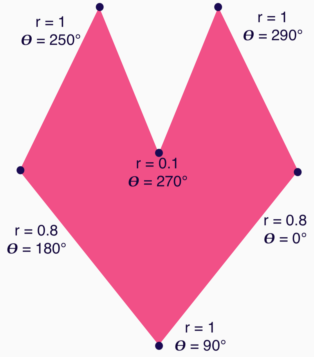
これで、頂点を作成して RoundedPolygon 関数に渡すことができます。
val vertices = remember { val radius = 1f val radiusSides = 0.8f val innerRadius = .1f floatArrayOf( radialToCartesian(radiusSides, 0f.toRadians()).x, radialToCartesian(radiusSides, 0f.toRadians()).y, radialToCartesian(radius, 90f.toRadians()).x, radialToCartesian(radius, 90f.toRadians()).y, radialToCartesian(radiusSides, 180f.toRadians()).x, radialToCartesian(radiusSides, 180f.toRadians()).y, radialToCartesian(radius, 250f.toRadians()).x, radialToCartesian(radius, 250f.toRadians()).y, radialToCartesian(innerRadius, 270f.toRadians()).x, radialToCartesian(innerRadius, 270f.toRadians()).y, radialToCartesian(radius, 290f.toRadians()).x, radialToCartesian(radius, 290f.toRadians()).y, ) }
頂点は、次の radialToCartesian 関数を使用してデカルト座標に変換する必要があります。
internal fun Float.toRadians() = this * PI.toFloat() / 180f internal val PointZero = PointF(0f, 0f) internal fun radialToCartesian( radius: Float, angleRadians: Float, center: PointF = PointZero ) = directionVectorPointF(angleRadians) * radius + center internal fun directionVectorPointF(angleRadians: Float) = PointF(cos(angleRadians), sin(angleRadians))
上記のコードでは、ハートの未加工の頂点が取得されますが、選択したハートの形にするには、特定の角を丸める必要があります。90° と 270° の角は丸められていませんが、他の角は丸められています。個々の角をカスタムで丸めるには、perVertexRounding パラメータを使用します。
val rounding = remember { val roundingNormal = 0.6f val roundingNone = 0f listOf( CornerRounding(roundingNormal), CornerRounding(roundingNone), CornerRounding(roundingNormal), CornerRounding(roundingNormal), CornerRounding(roundingNone), CornerRounding(roundingNormal), ) } val polygon = remember(vertices, rounding) { RoundedPolygon( vertices = vertices, perVertexRounding = rounding ) } Box( modifier = Modifier .drawWithCache { val roundedPolygonPath = polygon.toPath().asComposePath() onDrawBehind { scale(size.width * 0.5f, size.width * 0.5f) { translate(size.width * 0.5f, size.height * 0.5f) { drawPath(roundedPolygonPath, color = Color(0xFFF15087)) } } } } .size(400.dp) )
結果として、ピンクのハートが表示されます。
上記のシェイプでユースケースをカバーできない場合は、Path クラスを使用してカスタムシェイプを描画するか、ディスクから ImageVector ファイルを読み込むことを検討してください。graphics-shapes ライブラリは任意の形状での使用を想定しておらず、丸みを帯びたポリゴンの作成とそれらの間のモーフィング アニメーションを簡素化することを目的としています。
参考情報
詳細と例については、次のリソースをご覧ください。