
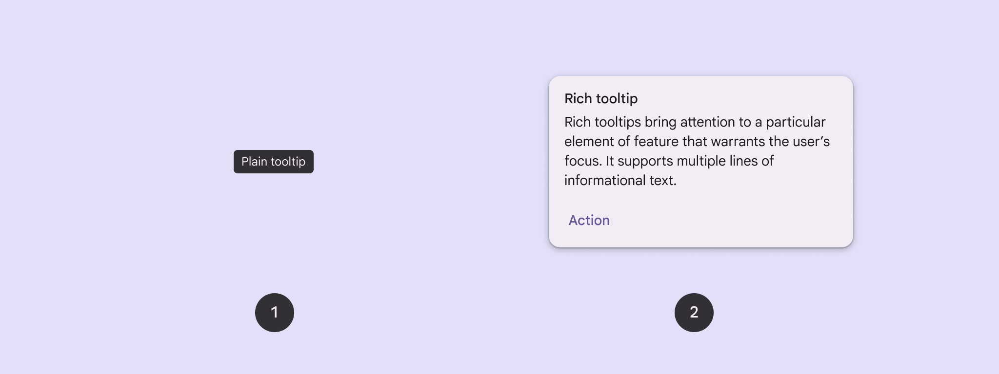
Use tooltips to add context to a button or other UI element. There are two types of tooltips:
- Plain tooltips: Describe elements or actions of icon buttons.
- Rich tooltips: Provide more detail, such as describing the value of a feature. Can also include an optional title, link, and buttons.
API surface
You can use the TooltipBox composable to implement tooltips in your app.
You control TooltipBox appearance with these main parameters:
positionProvider: Places the tooltip relative to the anchor content. You typically use a default position provider from theTooltipDefaults, or you can provide your own if you need custom positioning logic.tooltip: The composable that contains the tooltip's content. You typically use either thePlainTooltiporRichTooltipcomposables.- Use
PlainTooltipto describe elements or actions of icon buttons. - Use
RichTooltipto provide more details, like describing the value of a feature. Rich tooltips can include an optional title, link, and buttons.
- Use
state: The state holder that contains the UI logic and element state for this tooltip.content: The composable content that the tooltip is anchored to.
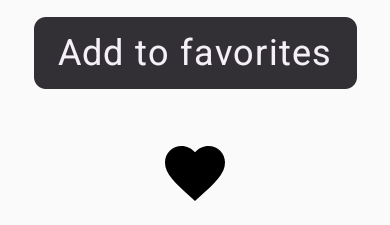
Display a plain tooltip
Use a plain tooltip to briefly describe a UI element. This code snippet displays a plain tooltip on top of an icon button, labeled "Add to favorites":
@Composable fun PlainTooltipExample( modifier: Modifier = Modifier, plainTooltipText: String = "Add to favorites" ) { TooltipBox( modifier = modifier, positionProvider = TooltipDefaults.rememberPlainTooltipPositionProvider(), tooltip = { PlainTooltip { Text(plainTooltipText) } }, state = rememberTooltipState() ) { IconButton(onClick = { /* Do something... */ }) { Icon( imageVector = Icons.Filled.Favorite, contentDescription = "Add to favorites" ) } } }
Key points about the code
TooltipBoxgenerates a tooltip with the text "Add to favorites".TooltipDefaults.rememberPlainTooltipPositionProvider()provides default positioning for plain tooltips.tooltipis a lambda function that defines the tooltip's content using thePlainTooltipcomposable.Text(plainTooltipText)displays the text within the tooltip.tooltipStatecontrols the state of the tooltip.
IconButtoncreates a clickable button with an icon.Icon(...)displays a heart icon within the button.- When a user interacts with the
IconButton,TooltipBoxshows the tooltip with the text "Add to favorites". Depending on the device, users can trigger the tooltip in the following ways: - Hovering over the icon with a cursor
- Long-pressing the icon on a mobile device
Result
This example produces a plain tooltip on top of an icon:
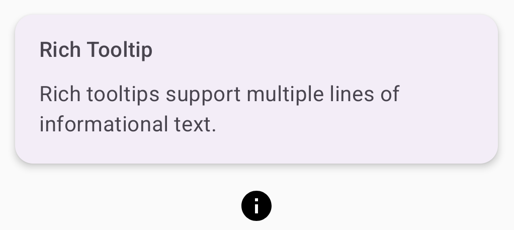
Display a rich tooltip
Use a rich tooltip to provide additional context about a UI element. This
example creates a multi-line rich tooltip with a title that is anchored to an
Icon:
@Composable fun RichTooltipExample( modifier: Modifier = Modifier, richTooltipSubheadText: String = "Rich Tooltip", richTooltipText: String = "Rich tooltips support multiple lines of informational text." ) { TooltipBox( modifier = modifier, positionProvider = TooltipDefaults.rememberRichTooltipPositionProvider(), tooltip = { RichTooltip( title = { Text(richTooltipSubheadText) } ) { Text(richTooltipText) } }, state = rememberTooltipState() ) { IconButton(onClick = { /* Icon button's click event */ }) { Icon( imageVector = Icons.Filled.Info, contentDescription = "Show more information" ) } } }
Key points about the code
TooltipBoxhandles the event listeners for user interactions and updatesTooltipStateaccordingly. WhenTooltipStateindicates that the tooltip should be shown, the tooltip lambda executes, andTooltipBoxdisplays theRichTooltip. TheTooltipBoxacts as the anchor and container for both content and the tooltip.- In this case, the content is an
IconButtoncomponent, which provides the tappable action behavior. When long-pressed (on touch devices) or hovered over (as with the mouse pointer) anywhere inTooltipBox's content, the tooltip will display to show more information.
- In this case, the content is an
- The
RichTooltipcomposable defines the tooltip's content, including the title and body text.TooltipDefaults.rememberRichTooltipPositionProvider()provides positioning information for rich tooltips.
Result
This example produces a rich tooltip with a title attached to an information icon:
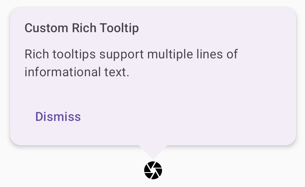
Customize a rich tooltip
This code snippet displays a rich tooltip with a title, custom actions, and a custom caret (arrow) displayed on top of a camera icon button:
@Composable fun AdvancedRichTooltipExample( modifier: Modifier = Modifier, richTooltipSubheadText: String = "Custom Rich Tooltip", richTooltipText: String = "Rich tooltips support multiple lines of informational text.", richTooltipActionText: String = "Dismiss" ) { val tooltipState = rememberTooltipState() val coroutineScope = rememberCoroutineScope() TooltipBox( modifier = modifier, positionProvider = TooltipDefaults.rememberRichTooltipPositionProvider(), tooltip = { RichTooltip( title = { Text(richTooltipSubheadText) }, action = { Row { TextButton(onClick = { coroutineScope.launch { tooltipState.dismiss() } }) { Text(richTooltipActionText) } } }, ) { Text(richTooltipText) } }, state = tooltipState ) { IconButton(onClick = { coroutineScope.launch { tooltipState.show() } }) { Icon( imageVector = Icons.Filled.Camera, contentDescription = "Open camera" ) } } }
Key points about the code
- A
RichToolTipdisplays a tooltip with a title and dismiss action. - When activated, either by a long-press or hovering over the
ToolTipBoxcontent with the mouse pointer, the tooltip is displayed for about one second. You can dismiss this tooltip by either tapping elsewhere on the screen or using the dismiss action button. - When the dismiss action executes, the system launches a coroutine to call
tooltipState.dismiss. This verifies the action execution isn't blocked while the tooltip is displayed. onClick = coroutineScope.launch { tooltipState.show() } }launches a coroutine to manually show the tooltip usingtooltipState.show.- The
actionparameter allows for the adding of interactive elements to a tooltip, such as a button. - The
caretSizeparameter modifies the size of the tooltip's arrow.
Result
This example produces the following:
Additional resources
- Material Design: Tooltips