
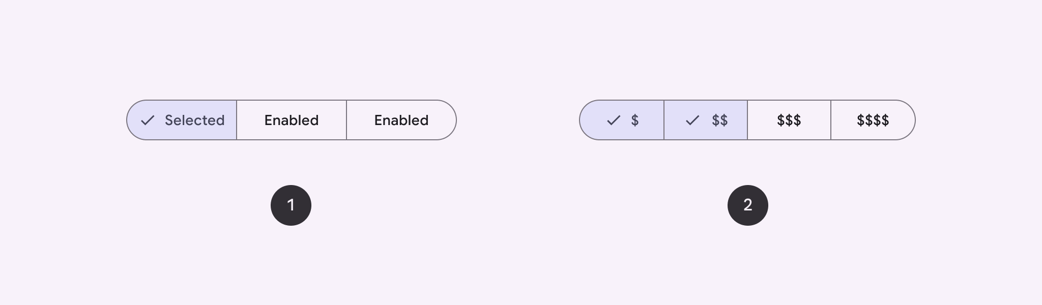
सेगमेंट वाले बटन का इस्तेमाल करके, उपयोगकर्ताओं को एक साथ कई विकल्प चुनने की सुविधा दें. सेगमेंट वाले बटन दो तरह के होते हैं:
- एक विकल्प चुनने वाला बटन: इससे उपयोगकर्ता एक विकल्प चुन सकते हैं.
- एक से ज़्यादा विकल्प चुनने वाला बटन: इससे उपयोगकर्ता दो से पांच आइटम चुन सकते हैं. ज़्यादा जटिल विकल्प चुनने या पांच से ज़्यादा आइटम चुनने के लिए, चिप का इस्तेमाल करें.
एपीआई सरफ़ेस
सेगमेंट वाले बटन बनाने के लिए, SingleChoiceSegmentedButtonRow और
MultiChoiceSegmentedButtonRow लेआउट का इस्तेमाल करें. इन
लेआउट से, SegmentedButtons सही जगह पर और सही साइज़ में दिखते हैं.
साथ ही, इनमें ये अहम पैरामीटर शामिल होते हैं:
space: इससे बटन के बीच ओवरलैप को अडजस्ट किया जाता है.content: इसमें सेगमेंट वाले बटन की लाइन का कॉन्टेंट शामिल होता है. आम तौर पर, यहSegmentedButtonकी एक सीरीज़ होती है.
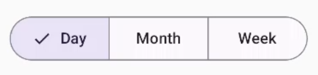
एक विकल्प चुनने वाला सेगमेंट बटन बनाना
इस उदाहरण में, एक विकल्प चुनने वाला सेगमेंट बटन बनाने का तरीका बताया गया है:
@Composable fun SingleChoiceSegmentedButton(modifier: Modifier = Modifier) { var selectedIndex by remember { mutableIntStateOf(0) } val options = listOf("Day", "Month", "Week") SingleChoiceSegmentedButtonRow { options.forEachIndexed { index, label -> SegmentedButton( shape = SegmentedButtonDefaults.itemShape( index = index, count = options.size ), onClick = { selectedIndex = index }, selected = index == selectedIndex, label = { Text(label) } ) } } }
कोड के बारे में अहम बातें
- चुने गए बटन के इंडेक्स को ट्रैक करने के लिए,
rememberऔरmutableIntStateOfका इस्तेमाल करके,selectedIndexवैरिएबल को शुरू करता है. optionsकी एक सूची तय करता है, जो बटन के लेबल को दिखाता है.SingleChoiceSegmentedButtonRowसे, सिर्फ़ एक बटन चुना जा सकता है.forEachIndexedलूप में, हर विकल्प के लिए एकSegmentedButtonबनाता है:shape,SegmentedButtonDefaults.itemShapeका इस्तेमाल करके, इंडेक्स और विकल्पों की कुल संख्या के आधार पर बटन का आकार तय करता है.onClick, क्लिक किए गए बटन के इंडेक्स के साथselectedIndexको अपडेट करता है.selected,selectedIndexके आधार पर बटन की चुनी गई स्थिति सेट करता है.label,Textकंपोज़ेबल का इस्तेमाल करके बटन का लेबल दिखाता है.
नतीजा
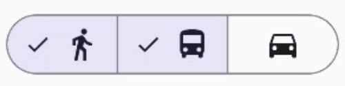
एक से ज़्यादा विकल्प चुनने वाला सेगमेंट बटन बनाना
इस उदाहरण में, आइकॉन के साथ एक से ज़्यादा विकल्प चुनने वाला सेगमेंट बटन बनाने का तरीका बताया गया है. इससे उपयोगकर्ता एक से ज़्यादा विकल्प चुन सकते हैं:
@Composable fun MultiChoiceSegmentedButton(modifier: Modifier = Modifier) { val selectedOptions = remember { mutableStateListOf(false, false, false) } val options = listOf("Walk", "Ride", "Drive") MultiChoiceSegmentedButtonRow { options.forEachIndexed { index, label -> SegmentedButton( shape = SegmentedButtonDefaults.itemShape( index = index, count = options.size ), checked = selectedOptions[index], onCheckedChange = { selectedOptions[index] = !selectedOptions[index] }, icon = { SegmentedButtonDefaults.Icon(selectedOptions[index]) }, label = { when (label) { "Walk" -> Icon( imageVector = Icons.AutoMirrored.Filled.DirectionsWalk, contentDescription = "Directions Walk" ) "Ride" -> Icon( imageVector = Icons.Default.DirectionsBus, contentDescription = "Directions Bus" ) "Drive" -> Icon( imageVector = Icons.Default.DirectionsCar, contentDescription = "Directions Car" ) } } ) } } }
कोड के बारे में अहम बातें
- कोड,
rememberऔरmutableStateListOfका इस्तेमाल करके,selectedOptionsवैरिएबल को शुरू करता है. इससे हर बटन की चुनी गई स्थिति को ट्रैक किया जाता है. - कोड, बटन को शामिल करने के लिए
MultiChoiceSegmentedButtonRowका इस्तेमाल करता है. forEachIndexedलूप में, कोड हर विकल्प के लिए एकSegmentedButtonबनाता है:shape, इंडेक्स और विकल्पों की कुल संख्या के आधार पर बटन का आकार तय करता है.checked,selectedOptionsमें मौजूद वैल्यू के आधार पर बटन की चुनी गई स्थिति सेट करता है.onCheckedChangeबटन पर क्लिक करने पर,selectedOptionsमें मौजूद आइटम की चुनी गई स्थिति को टॉगल करता है.icon,SegmentedButtonDefaults.Iconऔर बटन की चुनी गई स्थिति के आधार पर एक आइकॉन दिखाता है.label, सही इमेज वेक्टर और कॉन्टेंट के ब्यौरे के साथIconकंपोज़ेबल का इस्तेमाल करके, लेबल के हिसाब से एक आइकॉन दिखाता है.
नतीजा
अन्य संसाधन
- Material 3: सेगमेंट वाले बटन