
یک دکمه رادیویی به کاربر اجازه میدهد تا از بین مجموعهای از گزینهها، یک گزینه را انتخاب کند. شما زمانی از دکمه رادیویی استفاده میکنید که فقط بتوان یک مورد را از یک لیست انتخاب کرد. اگر کاربران نیاز به انتخاب بیش از یک مورد دارند، به جای آن از یک سوئیچ استفاده کنید.

سطح API
از کامپوننت RadioButton برای فهرست کردن گزینههای موجود استفاده کنید. هر گزینه RadioButton و برچسب آن را درون یک کامپوننت Row قرار دهید تا آنها را با هم گروهبندی کنید.
RadioButton شامل پارامترهای کلیدی زیر است:
-
selected: نشان میدهد که آیا دکمه رادیویی انتخاب شده است یا خیر. -
onClick: یک تابع لامبدا که برنامه شما هنگام کلیک کاربر روی دکمه رادیویی اجرا میکند. اگر اینnullباشد، کاربر نمیتواند مستقیماً با دکمه رادیویی تعامل داشته باشد. -
enabled: فعال یا غیرفعال بودن دکمه رادیویی را کنترل میکند. کاربران نمیتوانند با دکمههای رادیویی غیرفعال تعامل داشته باشند. -
interactionSource: به شما امکان میدهد وضعیت تعاملی دکمه را مشاهده کنید، برای مثال، اینکه آیا فشرده شده، در حالت hover قرار دارد یا focus شده است.
یک دکمه رادیویی ساده ایجاد کنید
قطعه کد زیر لیستی از دکمههای رادیویی را درون یک Column رندر میکند:
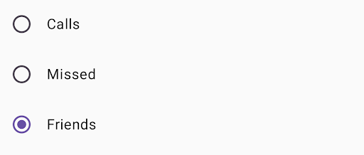
@Composable fun RadioButtonSingleSelection(modifier: Modifier = Modifier) { val radioOptions = listOf("Calls", "Missed", "Friends") val (selectedOption, onOptionSelected) = remember { mutableStateOf(radioOptions[0]) } // Note that Modifier.selectableGroup() is essential to ensure correct accessibility behavior Column(modifier.selectableGroup()) { radioOptions.forEach { text -> Row( Modifier .fillMaxWidth() .height(56.dp) .selectable( selected = (text == selectedOption), onClick = { onOptionSelected(text) }, role = Role.RadioButton ) .padding(horizontal = 16.dp), verticalAlignment = Alignment.CenterVertically ) { RadioButton( selected = (text == selectedOption), onClick = null // null recommended for accessibility with screen readers ) Text( text = text, style = MaterialTheme.typography.bodyLarge, modifier = Modifier.padding(start = 16.dp) ) } } } }
نکات کلیدی در مورد کد
-
radioOptionsبرچسبهای مربوط به دکمههای رادیویی را نشان میدهد. - تابع ترکیبی
rememberیک متغیر وضعیتselectedOptionو یک تابع برای بهروزرسانی آن وضعیت به نامonOptionSelectedایجاد میکند. این وضعیت، گزینه دکمه رادیویی انتخاب شده را در خود نگه میدارد.-
mutableStateOf(radioOptions[0])مقدار اولیهی state را برابر با اولین آیتم موجود در لیست قرار میدهد. "Calls" اولین آیتم است، بنابراین به طور پیشفرض دکمهی رادیویی انتخاب شده است.
-
-
Modifier.selectableGroup()رفتار دسترسیپذیری مناسب را برای صفحهخوانها تضمین میکند. این تابع به سیستم اطلاع میدهد که عناصر درون اینColumnبخشی از یک گروه قابل انتخاب هستند که پشتیبانی مناسب از صفحهخوان را امکانپذیر میسازد. -
Modifier.selectable()باعث میشود کلRow) به عنوان یک آیتم قابل انتخاب عمل کند.- مشخص
selectedکه آیاRowفعلی بر اساس حالتselectedOptionانتخاب شده است یا خیر. - تابع لامبدا
onClickوضعیتselectedOptionرا هنگام کلیک رویRow، به گزینه کلیک شده بهروزرسانی میکند. -
role = Role.RadioButtonبه سرویسهای دسترسی اطلاع میدهد کهRowبه عنوان یک دکمه رادیویی عمل میکند.
- مشخص
-
RadioButton(...)یکRadioButtonقابل ترکیب ایجاد میکند.-
onClick = nullدرRadioButtonدسترسیپذیری را بهبود میبخشد. این کار مانع از آن میشود که دکمه رادیویی مستقیماً رویداد کلیک را مدیریت کند و به اصلاحکنندهselectableمربوط بهRowاجازه میدهد تا وضعیت انتخاب و رفتار دسترسیپذیری را مدیریت کند.
-
نتیجه
منابع اضافی
- طراحی متریال: دکمهها